- Creating Glow Effects with CSS
- The Basics
- Browser Support
- Circles and Stacking
- Insets and Offsets
- Putting It All Together
- CSS Outer Glow
- Multiple Glows
- Text Glow
- Simple Glow
- Multi Glow
- Glow on Hover
- Transition
- Examples
- Conclusion
- Кроссбраузерные отражения, свечения и размытия CSS
- Предпосылки
- Box-reflect vs. «Свой метод»
- Выбор…
- Дополнительно: подготовка
Creating Glow Effects with CSS
The CSS box-shadow property is deceptively awesome. When used “traditionally”, it’s a simple way to add a shadow effect to an element. I use this for images in my blog. It’s nice. But get saucier with it and you can pull off some really interesting things. I’ve already talked about the pixel art hack. This time I’m going to share how to create colorful glow effects.
The Basics
Here’s a simple example to illustrate how box-shadow works:
div
width: 150px;
height: 150px;
background-color: #fff;

box-shadow: 120px 80px 40px 20px #0ff;
/* in order: x offset, y offset, blur size, spread size, color */
/* blur size and spread size are optional (they default to 0) */
>
And here’s a diagram of the result:
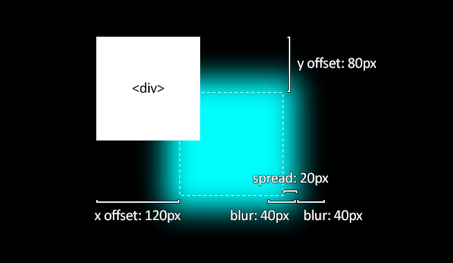
Easy enough. This is what we’ll be building upon.
Browser Support
Let’s pause for a moment to talk about browser support for box-shadow . Thankfully, it’s pretty good. IE9+ and all the other major browsers support it unprefixed. However, the blur value seems to be applied inconsistently across browsers. Chrome in particular renders it at about half the size you would expect. Not a showstopper, but something to be aware of.
Circles and Stacking
box-shadow takes the shape of the element it’s on. If we make an element round with border-radius: 50% , then box-shadow will follow suit.
We can stack multiple glow effects on an element by giving box-shadow multiple sets of values, separated by commas. The glow effects will be stacked with first on top, last on bottom.
Alright, let’s try these 2 techniques together:
div
width: 40px;
height: 40px;
border-radius: 50%;
background-color: #fff;
box-shadow:
0 0 60px 30px #fff, /* inner white */
0 0 100px 60px #f0f, /* middle magenta */
0 0 140px 90px #0ff; /* outer cyan */
>
Not bad! At this point you already know enough to make some impressive visuals. As an example, here’s what you can make by adding a little bit of animation to the box-shadow techniques already covered (you can click the circles, too):
Insets and Offsets
Now let’s play with inset glows. By adding inset to your box-shadow declaration, you can change it from an outer glow to an inner glow. Combine this with x/y offset values to create an effect where a color is glowing inward from one side. Applying this CSS:
div
width: 400px;
height: 200px;
background-color: #fff;
border: solid 2px #fff;
box-shadow:
inset 60px 0 120px #f0f, /* left magenta */
inset -60px 0 120px #0ff; /* right cyan */
>
Putting It All Together
Now let’s combine all these techniques to create a glowing translucent marble. Here’s the CSS:
div
width: 300px;
height: 300px;
border-radius: 50%;
box-shadow:
inset 0 0 50px #fff, /* inner white */
inset 20px 0 80px #f0f, /* inner left magenta short */
inset -20px 0 80px #0ff, /* inner right cyan short */
inset 20px 0 300px #f0f, /* inner left magenta broad */
inset -20px 0 300px #0ff, /* inner right cyan broad */
0 0 50px #fff, /* outer white */
-10px 0 80px #f0f, /* outer left magenta */
10px 0 80px #0ff; /* outer right cyan */
>
And here’s the final result:
Pretty nice for just a few lines of CSS, eh? There’s more that can be done, but this is a good start. Now go forth and create shiny, glowing, colorful things!
Thanks for scrolling all the way down here! If any of my articles, demos, or open source projects have helped you, consider supporting me.
CSS Outer Glow
CSS offers a very powerful property of box-shadow. It enables developers to simulate the drop-shadows — as if our HTML elements are in a true 3D space and can be moved along the z-axis to rise above the background content or submerge in it.
Let’s visualize it by considering the following example. We have two buttons in our view. One is without a box-shadow while the other has it. It can be observed that without a box-shadow, the entire perspective remains 2D as if a button is drawn with a pencil on paper. But with a box-shadow, our brains start to process the view as a 3D perspective. We feel as if the box is a true 3D element, placed or hovering above a true 3D plane. This is the power of box-shadow.
A box-shadow is described by
- Horizontal and Vertical Offsets from the target element’s edges
- Blur Radius
- Spread Radius
- Color
You can explore the details of these properties and experiment with them on the MDN resource page.
Now that we have a brief introduction to the world of box-shadows, we will pay attention to the main topic of this article — outer glow.
The glowing effect is observed when an element radiates steady light around the edges of its body. For example, the effect that can be seen around the edges of the button in the following example.
Let’s create this effect using box-shadow.
Firstly, we will create a black container as glow stands out with a dark background. We will center its content in both dimensions. The content will, in our case, be just a text in a box. We call it simply a card.
We have our card centered in a dark container and the only thing left is the outer glow.
Interestingly, the outer glow is only 1 line of CSS away. We achieve the right blurring of box-shadow by calibrating values of blur and spread radii. For better understanding this, here is the breakdown of how box-shadow is applied:
- First, the browser renders the element as a solid color (of course we get to choose this color)
- Second, the browser then makes this image larger by the spread radius. If the element has a border-radius applied, then the larger image will also have rounded corners. If no border-radius is applied, then the larger image will have square corners
- Thirdly, the browser applies a gaussian blur over the image using the blur radius
Here is a video demonstrating how changing the values of blur and spread radii affects the shadow.
Coming back to the outer glow, let’s apply the required CSS declaration.
Note that our overall color scheme, and values for spread and blur radii of the box-shadow matter the most in creating this effect. With the right calibration of these values, we were able to leverage box-shadows to mimic the effect of glowing.
CSS supports the rendering of multiple shadows using a comma-separated list. The shadows are rendered front-to-back in the order of declaration. So the first shadow in the list will be on the front.
Let’s update the box-shadow in the above example to render multiple shadows.
Multiple Glows
Text Glow
CSS offers another great property that can be leveraged to create glowing effects of texts. The text-shadow property. Consider the following example of text-glow.
Let’s build it from scratch.
As seen, the glow was added easily using one line of CSS — the text-shadow.
text-shadow: rebeccapurple 0 0 10px;
We can even apply transitions to box-shadow and text shadows to create eye-catching effects. For example, such transitions can mimic Neon Signs.
Let’s animate into our above examples, a transition of text-shadow colors. Note that we need to set the same shadow in the initial (0% frame) and final (100% frame) state of the animation. Otherwise, we will see a glitch as the final shadow color will immediately change to the initial shadow color when the animation loop resets.
@keyframes shadows < 0% < text-shadow: #48abe0 0 0 10px; >50% < text-shadow: blueviolet 0 0 10px; >75% < text-shadow: rebeccapurple 0 0 10px;>100% < text-shadow: #48abe0 0 0 10px; >> The same applies to box shadows. Following codepen demonstrates both, outer and text glow, and their animation.
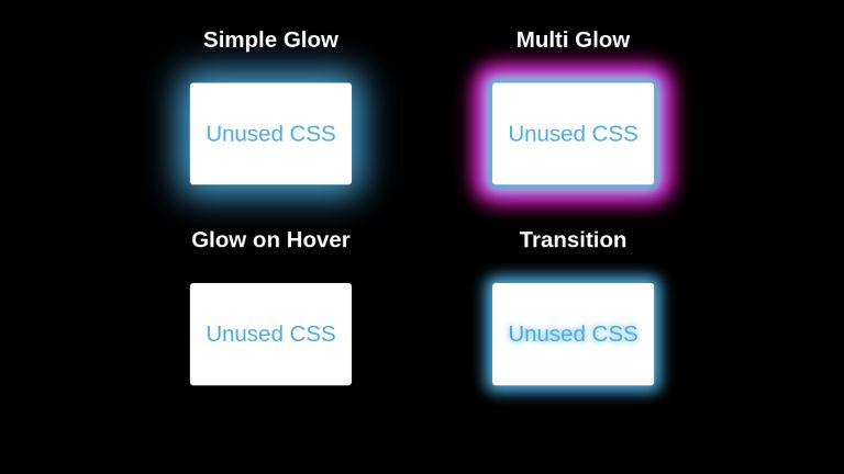
Simple Glow
Unused CSS
Multi Glow
Unused CSS
Glow on Hover
Unused CSS
Transition
Unused CSS
body < font-family: sans-serif; background-color: black; >.parent < display: flex; flex-direction: row; justify-content: center; align-items: center; flex-wrap: wrap; >.parent h4 < color: white; margin-top : 0; >.glow-item < text-align: center; margin: 30px 100px; >.card < width: fit-content; height: fit-content; padding: 0.7rem; display: flex; justify-content: center; align-items: center; background: white; color: #48abe0; text-align: center; border-radius: 5px; cursor: pointer; box-shadow: 0 0 50px 15px #48abe0; >.card.reactive < box-shadow: none; >.card.reactive:hover < box-shadow: 0 0 50px 15px #48abe0; >.multi-glow .card < box-shadow: 0 0 10px 5px #48abe0, 0 0 20px 7px #ebecca, 0 0 25px 20px #8a2be2, 0 0 30px 25px #ff1493; >.card.shadow-animate < box-shadow: 0px 0px 20px 10px #48abe0; animation: shadows 1.5s infinite; >@keyframes shadows < 0% < text-shadow: #48abe0 0 0 10px; box-shadow: 0px 0px 20px 10px #48abe0; >50% < text-shadow: blueviolet 0 0 10px; box-shadow: 0px 0px 20px 10px blueviolet; >75% < text-shadow: rebeccapurple 0 0 10px; box-shadow: 0px 0px 20px 10px rebeccapuprle; >100% < text-shadow: #48abe0 0 0 10px; box-shadow: 0px 0px 20px 10px #48abe0; >>
Examples
Glowing social medial icons.
Transitioning glow on text — An effect useful for navigating the user’s focus.
Conclusion
Box-Shadow and Text-Shadow are very useful properties. Using the right calibration of values, we can create attractive glow effects that can navigate users’ focus while adding to the stylistic beauty of our web pages.
UnusedCSS helps website owners remove their unused CSS every day. Sign Up to see how much you could remove.
You Might Also Be Interested In
Кроссбраузерные отражения, свечения и размытия CSS
От автора: отражения способны добавить объектам интересную размерность, ссужая их оттенком реализма и наделяя внутри окружающей среды некоторым контекстом. Давайте рассмотрим достижение эффекта отражения с помощью CSS, а также для сравнения исследуем свечение и кроссбраузерное размытие..


Предпосылки
Изучение данного материала предполагает, что:
— Вы знакомы с селекторами CSS и CSS2;

Онлайн курс по JavaScript
Научитесь создавать приложения со сложными интерфейсами
Это основной язык для современной веб-разработки — почти 100% сайтов работает на JavaScript. Освойте его с нуля всего за 4 месяца, и вы сможете зарабатывать от 70 000 рублей.
— Если хотите в точности воспроизвести образец, то должны знать, как работает тень блока box-shadow. Она в этом учебнике не является ключевой, так что вам придется постигать ее самим. Если понадобится объяснение, предлагаю вам взглянуть на статью CSS3 vs. Photoshop : закругленные углы и тени блока.
Box-reflect vs. «Свой метод»
Box-reflect — свойство CSS, как раз предназначенное для этой цели: создания отражений. Мы не станем применять box-reflect и mask-image, потому что:
— На момент написания этой статьи оба свойства поддерживаются только webkit (Chrome и Safari).
— Реализация кишит ошибками, если не сказать более.
Когда Microsoft представил свои эффекты фильтра (вспомните эпоху IE 4, вложенные таблицы для разметки и изображения для отражений), устаревшие фильтры не применялись ко всему данному элементу. Думаю, они использовали некий вид граничного блока из верхнего левого к нижнему правому углу элемента, что имело смысл, так как, насколько я знаю, не было способа выйти за пределы этого блока. Однако, так и не исправили это.
Сейчас, в век Chrome 17, webkit сделал ту же ошибку. Рисунки маски, ключ к -webkit-box-reflect, делают некий вид динамического снэпшота внутри граничного блока, вставляют его снизу и меняют непрозрачность. Я постарался восстановить демо-образец с помощью -webkit-box-reflect:

Я его не закончил, но проблема ясна. У отображаемого элемента (будем называть его ETBR — Element to be Reflected) есть border-radius и box-shadow. Тень блока видна внутри, а не снаружи граничного блока.
В моем собственном методе матрица видоизменяется, вставленная тень блока и непрозрачность заменят box-reflect и mask-image. Ограничения:
— Самое большое ограничение заключается в том, что вставленная тень блока не делает отражение полностью прозрачным. Это сочетание настоящей и фальшивой прозрачности будет работать в большинстве случаях, но не всегда.
— Встроенная тень блока не влияет на текст отображаемого элемента (ETBR). Это происходит, если цвет текста не такой же, как фоновый цвет поверхности.
Цвет текста не становится темнее там, где это делает фон. Поэтому, кажется, нельзя получить другой цвет и тень блока одновременно.
Выбор…
Кстати говоря, о матрицах и отражениях…

«Выбираете синюю таблетку – я показываю, как воссоздать демо-образец шаг за шагом. Выбираете красную – покажу, как сделать отражения чего угодно и расскажу, где можно купить отражающие тени по очень привлекательной цене»
Проще говоря, некоторые из следующих этапов дополнительные, в зависимости от того, желаете ли вы восстановить демо-образец пиксель за пикселем.
Дополнительно: подготовка
Демо-образец начинается с шаблона HTML5…