- Create Sidebar Dropdown Menu using HTML , CSS And Javascript
- Step1: HTML code For Sidebar Dropdown Menu
- Step2: CSS code For Sidebar Dropdown Menu
- Step3: javascript code For Sidebar Dropdown Menu
- Create Sidebar Menu in HTML CSS & JavaScript
- Video Tutorial of Sidebar Menu in HTML CSS & JavaScript
- Steps for Creating a Sidebar Menu in HTML CSS & JavaScript
Create Sidebar Dropdown Menu using HTML , CSS And Javascript
Hello Readers!!Today we will learn how to make a responsive Sidebar Dropdown Menu with HTML, CSS, and JavaScript. The term «sidebar» refers to a section of a website on the right or left side that contains important navigation links that the user can open or close. A «dropdown» menu is similar to a list of options, but it is hidden within a button or another element, and when the user clicks on the button, the dropdown menu appears. In today’s blog, we’ll look at how to create a sidebar dropdown menu with HTML, and JavaScript. I hope you must have got an idea about the project. So, Let’s sidebar dropdown menu Project By Adding The Source Codes. For That, First, We Are Using The Html Code.
Step1: HTML code For Sidebar Dropdown Menu
HTML is used to design the website’s layout. So, first, we create the layout, then we style it, and finally, we add features to the button (on clicking the button menu opens ). Now we’ll look at our HTML code.


The HTML code used here is very simple; you will understand it right away. Simply read the article carefully, and you can also copy this code into your IDE for easy access. We’ve added a header section where we’ll build our sidebar dropdown menu. We added some SVG icons to our header section, followed by the main heading of our webpage using the h1 tag. Now, for our sidebar, we’ve added a nav tag, and within that, we’ve added a div tag. To create the navbar menu items, we used an unordered list with anchor tags to create the different navlinks. To include a drop-down menu in our sidebar bar, we nested another unordered list within some of the menu items and created a drop-down within that menu item. To make our webpage more visually appealing, we used the img tag to insert an image within it. Let’s take a look at our HTML structure without any styling.
Step2: CSS code For Sidebar Dropdown Menu
CSS is an abbreviation for Cascading Style Sheet. CSS will be used to style our webpage so that it looks appealing, and CSS is used to improve the user experience. Now let’s take a look at our CSS code.
*, *::before, *::after < padding: 0; margin: 0; box-sizing: border-box; list-style: none; list-style-type: none; text-decoration: none; -moz-osx-font-smoothing: grayscale; -webkit-font-smoothing: antialiased; text-rendering: optimizeLegibility; >body < font-family: "Segoe UI", Tahoma, Geneva, Verdana, sans-serif; font-size: 1rem; font-weight: normal; line-height: 1.5; color: #252a32; background: #f1f5f8; overflow: hidden; >img < display: block; width: 60%; height: 50%; margin: 1rem 20rem; >a, button < font-family: inherit; font-size: inherit; cursor: pointer; border: none; outline: none; background: none; text-decoration: none; >.open-menu, .close-menu < cursor: pointer; border: none; outline: none; color: #252a32; background: none; >.close-menu < position: absolute; top: 0; right: 1rem; border: none; outline: none; color: #252a32; background: none; >.brand < font-family: inherit; font-size: 1.75rem; font-weight: 700; line-height: 1.5; color: #d32f2f; text-transform: uppercase; text-rendering: optimizeLegibility; >.header < position: relative; width: 100%; height: auto; padding: 0.75rem 1.5rem; color: #252a32; background: #fff; box-shadow: 0 1px 3px rgba(0, 0, 0, 0.12), 0 1px 3px rgba(0, 0, 0, 0.24); >.header .navbar < display: flex; align-items: center; justify-content: space-between; >.header .navbar .menu-wrapper::before < content: ""; position: fixed; top: 0; left: 0; right: 0; bottom: 0; z-index: -1; transition: background 0.5s; >.header .navbar .menu-wrapper.offcanvas .menu < transform: translate3d(0, 0, 0); transition-duration: 0.7s; transition-delay: 0.2s; >.header .navbar .menu-wrapper.offcanvas::before < background: rgba(37, 42, 50, 0.6); z-index: 1; >.header .navbar .menu < position: fixed; display: flex; flex-direction: column; top: 0; left: 0; bottom: 0; max-width: 20rem; width: 100%; padding: 1.5rem 1rem; z-index: 2; overflow-y: auto; color: #252a32; background: #fff; box-shadow: 0 1px 3px rgba(0, 0, 0, 0.12), 0 1px 3px rgba(0, 0, 0, 0.24); transform: translate3d(-100%, 0, 0); transition: transform 0.5s cubic-bezier(0.23, 1, 0.32, 1); >.header .navbar .menu-block < position: relative; display: flex; align-items: center; justify-content: space-between; margin-bottom: 3rem; >.header .navbar .menu-link < font-family: inherit; font-size: 1rem; font-weight: 600; line-height: inherit; text-transform: uppercase; transition: color 0.35s ease-out; >.header .navbar .menu-link:hover < color: #d32f2f; >.header .navbar .menu-item < position: relative; >.header .navbar .menu-item a < font-family: inherit; font-size: 1rem; font-weight: 600; line-height: inherit; text-transform: uppercase; padding: 0.5rem 1rem; display: block; color: #252a32; transition: color 0.35s ease-out; >.header .navbar .menu-item a:hover < color: #d32f2f; >.header .navbar .menu-item.has-collapsible < position: relative; >.header .navbar .menu-item.has-collapsible .menu-child < display: none; >.header .navbar .menu-item.has-collapsible .menu-child .menu-child-item a < font-family: inherit; font-size: 1rem; font-weight: 600; line-height: inherit; padding: 0.25rem; color: #252a32; padding-left: 2.5rem; text-transform: uppercase; transition: color 0.35s ease-out; >.header .navbar .menu-item.has-collapsible .menu-child .menu-child-item a:hover < color: #d32f2f; >.header .navbar .menu-item.has-collapsible span::after < font-family: "Material Icons"; content: "\2B9A"; font-size: 1.5rem; font-weight: 400; line-height: inherit; position: absolute; top: 0.15rem; right: 1rem; color: #252a32; transition: all 0.35s ease; >.header .navbar .menu-item.has-collapsible span::after:hover < color: #d32f2f; >.header .navbar .menu-item.active.has-collapsible .menu-child < display: block; transition: all 0.35s ease; >.header .navbar .menu-item.active.has-collapsible span::after < transform: rotate(90deg); >@media screen and (max-width:900px) < img< width: 90%; height: 500px; margin: 10px 30px; background-color: #d32f2f; >> @media screen and (max-width:500px) < img< width: 70%; height: 300px; margin: 10px 30px; background-color: #d32f2f; >> Now that we’ve included our CSS code in our article, let’s go over it step by step. Step1: First, we used the universal selector to set the margin, padding, and box-sizing to border box. We’ve also changed the list style to «none» and the webscrolling to «smooth.» We will now style all of the elements in our html body using the body tag. We named the font family «Segoe UI» and set the font size and weight to normal. We also set the background colour to smoke white and the overflow to hidden in our body tag.
Step2: We have now defined the width and height of our image using the image tag as «280» and «260px,» respectively, and we have also added some margin to our image. Use the anchor «a» tag to which we added font family and font size as «inherit» from our body tag. In addition, we changed the text-decoration to «none» and the cursor to «pointer.»
Step3: We’ll set the width and height of the main heading, as well as the svg icon that opens the sidebar we define the position as absolute, the cursor to a pointer, and the colour to dark grey. To style our webpage’s main heading, we used the (.brand) class font size of «1.75rem» and colour red. The text is in the centre of the page. we also define the text-transform property to uppercase all the letters of our heading.
.open-menu, .close-menu < cursor: pointer; border: none; outline: none; color: #252a32; background: none; >.close-menu < position: absolute; top: 0; right: 1rem; border: none; outline: none; color: #252a32; background: none; >.brand < font-family: inherit; font-size: 1.75rem; font-weight: 700; line-height: 1.5; color: #d32f2f; text-transform: uppercase; text-rendering: optimizeLegibility; >.title-large
Step4: Now we’ll style the header, with relative positioning and padding of «0.75rem 1.5rem.» The font is a dark grey, and the background has a box shadow. The header’s navigation is displayed as flex, and the items are centre aligned.
.header < position: relative; width: 100%; height: auto; padding: 0.75rem 1.5rem; color: #252a32; background: #fff; box-shadow: 0 1px 3px rgba(0, 0, 0, 0.12), 0 1px 3px rgba(0, 0, 0, 0.24); >.header .navbar < display: flex; align-items: center; justify-content: space-between; >.header .navbar .menu-wrapper::before < content: ""; position: fixed; top: 0; left: 0; right: 0; bottom: 0; z-index: -1; transition: background 0.5s; >.header .navbar .menu-wrapper.offcanvas .menu < transform: translate3d(0, 0, 0); transition-duration: 0.7s; transition-delay: 0.2s; >.header .navbar .menu-wrapper.offcanvas::before
Step5: Now it’s time to style the sidebar menu; the position is set to relative, the display to flex, the content is justified in the center, the font size is inherited, and the font-weight is «600» with the transition «ease-out.» We’ve added the hover property to the menu. The font colour changes to red as the user hovers over the menu item. The transform property was updated to rotate 90 degrees vertically.
.header .navbar < display: flex; align-items: center; justify-content: space-between; >.header .navbar .menu-wrapper::before < content: ""; position: fixed; top: 0; left: 0; right: 0; bottom: 0; z-index: -1; transition: background 0.5s; >.header .navbar .menu-wrapper.offcanvas .menu < transform: translate3d(0, 0, 0); transition-duration: 0.7s; transition-delay: 0.2s; >.header .navbar .menu-wrapper.offcanvas::before < background: rgba(37, 42, 50, 0.6); z-index: 1; >.header .navbar .menu < position: fixed; display: flex; flex-direction: column; top: 0; left: 0; bottom: 0; max-width: 20rem; width: 100%; padding: 1.5rem 1rem; z-index: 2; overflow-y: auto; color: #252a32; background: #fff; box-shadow: 0 1px 3px rgba(0, 0, 0, 0.12), 0 1px 3px rgba(0, 0, 0, 0.24); transform: translate3d(-100%, 0, 0); transition: transform 0.5s cubic-bezier(0.23, 1, 0.32, 1); >.header .navbar .menu-block < position: relative; display: flex; align-items: center; justify-content: space-between; margin-bottom: 3rem; >.header .navbar .menu-link < font-family: inherit; font-size: 1rem; font-weight: 600; line-height: inherit; text-transform: uppercase; transition: color 0.35s ease-out; >.header .navbar .menu-link:hover < color: #d32f2f; >.header .navbar .menu-item < position: relative; >.header .navbar .menu-item a < font-family: inherit; font-size: 1rem; font-weight: 600; line-height: inherit; text-transform: uppercase; padding: 0.5rem 1rem; display: block; color: #252a32; transition: color 0.35s ease-out; >.header .navbar .menu-item a:hover < color: #d32f2f; >.header .navbar .menu-item.has-collapsible < position: relative; >.header .navbar .menu-item.has-collapsible .menu-child < display: none; >.header .navbar .menu-item.has-collapsible .menu-child .menu-child-item a < font-family: inherit; font-size: 1rem; font-weight: 600; line-height: inherit; padding: 0.25rem; color: #252a32; padding-left: 2.5rem; text-transform: uppercase; transition: color 0.35s ease-out; >.header .navbar .menu-item.has-collapsible .menu-child .menu-child-item a:hover < color: #d32f2f; >.header .navbar .menu-item.has-collapsible span::after < font-family: "Material Icons"; content: "\2B9A"; font-size: 1.5rem; font-weight: 400; line-height: inherit; position: absolute; top: 0.15rem; right: 1rem; color: #252a32; transition: all 0.35s ease; >.header .navbar .menu-item.has-collapsible span::after:hover < color: #d32f2f; >.header .navbar .menu-item.active.has-collapsible .menu-child < display: block; transition: all 0.35s ease; >.header .navbar .menu-item.active.has-collapsible span::after
**Step6: **Now we’ll add responsiveness to the page and specify the two maximum screen widths (900 and 500 px) If the screen size is equal to or less than the specified width, the image size will be adjusted in accordance with the specified height and width.
@media screen and (max-width:900px) < img< width: 90%; height: 500px; margin: 10px 30px; background-color: #d32f2f; >> @media screen and (max-width:500px) < img< width: 70%; height: 300px; margin: 10px 30px; background-color: #d32f2f; >> Step3: javascript code For Sidebar Dropdown Menu
Even after applying the CSS and HTML, our button does not work and does not open our sidebar. This is due to the fact that functionalities to any HTML element can only be added through Javascript, and we have not yet added Javascript code. When I click the button, we’ll use some fundamental Javascript concepts to tag and style the element with JS.
const openMenu = document.querySelector(".open-menu"); const closeMenu = document.querySelector(".close-menu"); const menuWrapper = document.querySelector(".menu-wrapper"); const hasCollapsible = document.querySelectorAll(".has-collapsible"); // Sidenav Toggle openMenu.addEventListener("click", function () < menuWrapper.classList.add("offcanvas"); >); closeMenu.addEventListener("click", function () < menuWrapper.classList.remove("offcanvas"); >); // Collapsible Menu hasCollapsible.forEach(function (collapsible) < collapsible.addEventListener("click", function () < collapsible.classList.toggle("active"); // Close Other Collapsible hasCollapsible.forEach(function (otherCollapsible) < if (otherCollapsible !== collapsible) < otherCollapsible.classList.remove("active"); >>); >); >); In our JavaScript code, we first define four constant variables that will be used to store the value of the selected element using document.queryselector by their class. Now we’ll add the functionality; we’ve added an event listener that will listen for the click event. When the user clicks on the navbar, it checks to see if the selected element has an offcanvas class; if not, it will add that class to the navbar, and vice versa. Now will we add the functionality to our dropdown menu here we have check whether dropdown menu have the collapsible class active or not if not it will active that class by click event . basically it will toggle between whether the class is active or not. We now have the functionality in our sidebar drop-down menu. Let’s watch a quick video to see how it works. Now We have Successfully created our Responsive Sidebar Dropdown Menu poject. You can use this project for your personal webpage and We hope you understood the project , If you any doub’t feel free to comment!! If you find out this Blog helpful, then make sure to search code with random on google for Front End Projects with Source codes and make sure to Follow the Code with Random Instagram page. Follow: codewithrandom Written By : arun
Create Sidebar Menu in HTML CSS & JavaScript
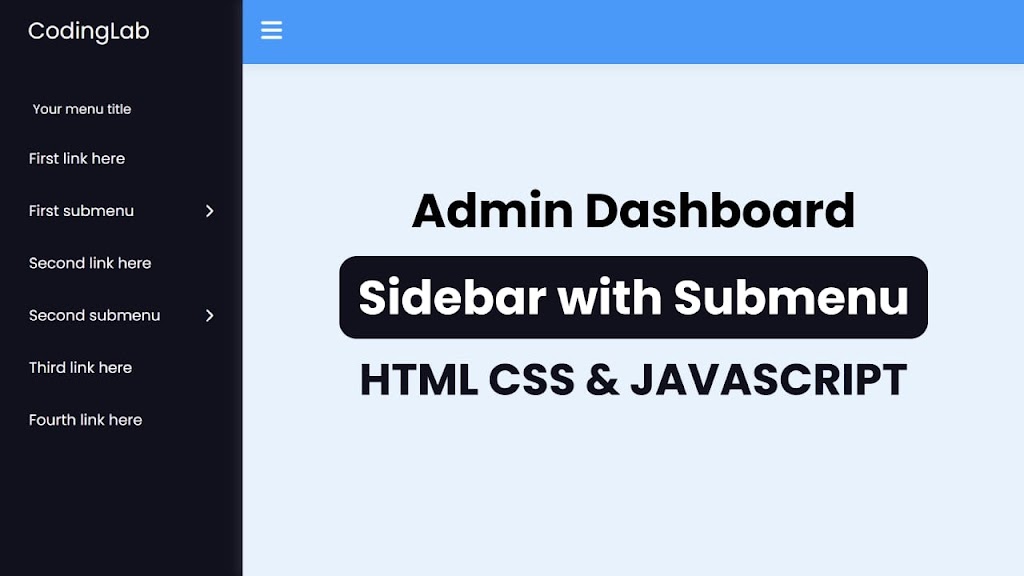
Developing proficiency in creating a sidebar menu with a dropdown is a valuable skill in the domain of web development. Although the sidebar is a fundamental component of a website, it can be created using a concise combination of HTML, CSS, and JavaScript.
Today in this blog post, you will be taught how to build a Sidebar Menu using HTML, CSS, and JavaScript, which will include the functionality of dropdown menus. I have also published a blog featuring 5 Free Sidebar Templates. I trust that they will also prove advantageous to you.
Video Tutorial of Sidebar Menu in HTML CSS & JavaScript
As demonstrated in the video tutorial of the Sidebar Menu, it has the ability to expand and collapse, and it includes a submenu feature that becomes visible upon clicking on the navigation link. The sidebar has the potential to accommodate numerous navigation links since it is scrollable.
I would highly recommend you watch the video tutorial of the Sidebar Menu. It will really help you to create this sidebar menu step by step as well as to understand HTML CSS & JavaScript code.
Steps for Creating a Sidebar Menu in HTML CSS & JavaScript
To create a sidebar using HTML, CSS, and vanilla JavaScript, follow the given steps line by line:
- Create a folder. You can name this folder whatever you want, and inside this folder, create the mentioned files.
- Create an index.html file. The file name must be index and its extension .html
- Create a style.css file. The file name must be style and its extension .css
- Create a script.js file. The file name must be script and its extension .js
Once you create these files, paste the given codes into the specified files. If you don’t want to do these then scroll down and download all the source code files of the Sidebar Menu, by clicking on the given download button.
First, paste the following codes into your index.html file.
Second, paste the following codes into your style.css file.
/* Import Google font — Poppins */ @import url(«https://fonts.googleapis.com/css2?family=Poppins:wght@200;300;400;500;600;700&display=swap»); * < margin: 0; padding: 0; box-sizing: border-box; font-family: "Poppins", sans-serif; >.sidebar < position: fixed; height: 100%; width: 260px; background: #11101d; padding: 15px; z-index: 99; >.logo < font-size: 25px; padding: 0 15px; >.sidebar a < color: #fff; text-decoration: none; >.menu-content < position: relative; height: 100%; width: 100%; margin-top: 40px; overflow-y: scroll; >.menu-content::-webkit-scrollbar < display: none; >.menu-items < height: 100%; width: 100%; list-style: none; transition: all 0.4s ease; >.submenu-active .menu-items < transform: translateX(-56%); >.menu-title < color: #fff; font-size: 14px; padding: 15px 20px; >.item a, .submenu-item < padding: 16px; display: inline-block; width: 100%; border-radius: 12px; >.item i < font-size: 12px; >.item a:hover, .submenu-item:hover, .submenu .menu-title:hover < background: rgba(255, 255, 255, 0.1); >.submenu-item < display: flex; justify-content: space-between; align-items: center; color: #fff; cursor: pointer; >.submenu < position: absolute; height: 100%; width: 100%; top: 0; right: calc(-100% - 26px); height: calc(100% + 100vh); background: #11101d; display: none; >.show-submenu ~ .submenu < display: block; >.submenu .menu-title < border-radius: 12px; cursor: pointer; >.submenu .menu-title i < margin-right: 10px; >.navbar, .main < left: 260px; width: calc(100% - 260px); transition: all 0.5s ease; z-index: 1000; >.sidebar.close ~ .navbar, .sidebar.close ~ .main < left: 0; width: 100%; >.navbar < position: fixed; color: #fff; padding: 15px 20px; font-size: 25px; background: #4070f4; cursor: pointer; >.navbar #sidebar-close < cursor: pointer; >.main < position: relative; display: flex; align-items: center; justify-content: center; height: 100vh; z-index: 100; background: #e7f2fd; >.main h1
Third, paste the following codes into your script.js file.
const sidebar = document.querySelector(".sidebar"); const sidebarClose = document.querySelector("#sidebar-close"); const menu = document.querySelector(".menu-content"); const menuItems = document.querySelectorAll(".submenu-item"); const subMenuTitles = document.querySelectorAll(".submenu .menu-title"); sidebarClose.addEventListener("click", () => sidebar.classList.toggle("close")); menuItems.forEach((item, index) => < item.addEventListener("click", () => < menu.classList.add("submenu-active"); item.classList.add("show-submenu"); menuItems.forEach((item2, index2) => < if (index !== index2) < item2.classList.remove("show-submenu"); >>); >); >); subMenuTitles.forEach((title) => < title.addEventListener("click", () =>< menu.classList.remove("submenu-active"); >); >); If you face any difficulties while creating your Sidebar Menu or your code is not working as expected, you can download the source code files for this Sidebar Menu for free by clicking on the download button, and you can also view a live demo of this card slider by clicking on the view live button.