Getting started with Semantic UI React
In this tutorial, we are going to learn about how to use semantic ui framework in react apps.
Semantic ui is a development framework which helps us to create beautiful,resposive layouts using human-friendly HTML.
Semantic ui is completely designed with em units which makes responsive sizing.
Semantic UI react provides us react components that implements Semantic UI design.
First, we need to create a new react app by using the create-react-app command line tool.
Open your terminal and run following commands.
npx create-react-app react-semanticNext, we need to change our working directory by using below commands.
cd react-semantic npm startnpm start is used to run the development server.
Let’s install the semantic ui react framework by running the below commands.
npm i semantic-ui-react npm i semantic-ui-cssNow open your react-semantic folder in your favorite code editor.
Navigate to your index.js file and add the below highlighted line.
import React from 'react'; import ReactDOM from 'react-dom'; import './index.css'; import 'semantic-ui-css/semantic.min.css'import App from './App'; ReactDOM.render(App />, document.getElementById('root'));Here we imported semantic UI css to our App.
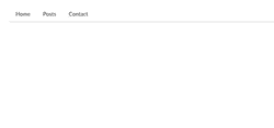
Let’s design Navigation bar for our App using semantic UI react components.
Inside your src folder create a new file called navigation.js and add the below code.
import React, useState > from 'react'; import Menu > from 'semantic-ui-react' function NavigationBar() return ( Menu pointing secondary> Menu.Item name='home' href="/somelink"/> Menu.Item name='posts' href="/somelink"/> Menu.Item name='contact' href="/somelink"/> /Menu> ) > export default NavigationBar;In the above code, we first imported the Menu component from the semantic-UI-react .Inside NavigationBar component, we wrapped Menu.Item components with Menu component so that semantic UI gives us back an html div with 3 link tags.
Inside Menu.Item component we passed a name prop and href prop.
Now inside the App component add the NavigationBar component by importing it from navigation.js file.
import React from 'react'; import './App.css'; import NavigationBar from './navigation'; function App() return ( div className="App"> NavigationBar /> /div > ); > export default App;Add these styles to your App.css file
.App max-width: 1000px; margin: 0 auto; padding: 2rem; > .form,.posts margin-top: 3rem; >Now open your terminal and run the below command to start your development server.
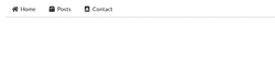
We successfully created a Navigation bar for our app, semantic ui can also provide us inbuilt icon packages so that now we are adding icons to our Menu.item component by using icon prop.
update your navigation.js file with below code.
import React, useState > from 'react'; import Menu > from 'semantic-ui-react' function NavigationBar() return ( Menu pointing secondary> Menu.Item icon="home" name='home' href="/somelink"/> Menu.Item icon="box" name='posts' href="/somelink"/> Menu.Item icon="address book" name='contact' href="/somelink"/> /Menu> ) > export default NavigationBar;after adding icons our NavigationBar look like below image.
Semantic UI also provides us Grid component which helps us to create responsive grid layouts in our app, so that it can look better in all devices.
create two files called dummy-posts.js and post.js inside your src folder.
const posts = [ title: "My first post", excerpt: "This is my first post with more content inside", image: "https://via.placeholder.com/410x220" >, title: "My second post", excerpt: "This is my second post with more content inside", image: "https://via.placeholder.com/410x220" >, title: "My third post", excerpt: "This is my third post with more content inside", image: "https://via.placeholder.com/410x220" >, title: "My fourth post", excerpt: "This is my fourth post with more content inside", image: "https://via.placeholder.com/410x220" >, title: "My fifth post", excerpt: "This is my fifth post with more content inside", image: "https://via.placeholder.com/410x220" >, title: "My sixth post", excerpt: "This is my sixth post with more content inside", image: "https://via.placeholder.com/410x210" > ] export posts >import React from 'react'; import Segment, Header, Grid, Image,Button > from 'semantic-ui-react'import posts > from './dummy-posts'; function Posts() return ( div className="posts"> Grid centered columns=3> doubling> posts.map(post => Grid.Column key=post.title>> Segment> Image src=post.image> /> Header as="h1">post.title>/Header> p>post.excerpt>/p> Button primary basic as="a" href="/"> Learn more/Button> /Segment> /Grid.Column>)> /Grid> /div> ) > export default Posts;In the above code, we imported 5 components from the semantic-ui-react .
In Grid Component we passed three props centered , columns , doubling .
centered: It makes all grid items in the center.
columns: we need to specify how many columns we need initially.
doubling: it helps us to automatically adjust the grid item widths according to the device sizes (Mobile, tablet).
Component is used to group particular items.
component helps us to add the images.
In component we added as prop value to h1 so that we can render h1 html element (supporting values h1,h2,h3,h4,h5,h6).
Now inside App component add the Posts component by importing it from posts.js file.
import React from 'react'; import NavigationBar from './navigation'; import Posts from './posts';import './App.css'; function App() return ( div className="App"> NavigationBar /> Posts /> /div > ); > export default App; 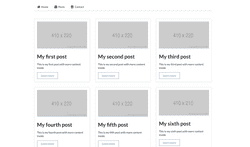
Let’s create a contact form using semantic ui Form , Form.Field components.
create a new file called contact.js in your src folder and add the below code.
import React from 'react' import Button, Form, Segment, Header > from 'semantic-ui-react' function ContactForm() return ( div className="form"> Segment> Header as="h2">Contact Form/Header> /Segment> Form> Form.Field> label>First Name/label> input placeholder='First Name' /> /Form.Field> Form.Field> label>Last Name/label> input placeholder='Last Name' /> /Form.Field> Form.TextArea label='About' placeholder='Tell us more about you. ' /> Button type='submit' color="blue">Submit/Button> /Form> /div> ) > export default ContactForm;Inside Form.Field component we added label and input field.
Form.TextArea component will accept the label , placeholder prop
In Button component we passed color=blue so that we can get a button with the blue color.
Semantic UI React
Semantic UI React is the official React integration for Semantic UI .
Installation instructions are provided in the Usage section.
jQuery Free
jQuery is a DOM manipulation library. It reads from and writes to the DOM. React uses a virtual DOM (a JavaScript representation of the real DOM). React only writes patch updates to the DOM, but never reads from it.
It is not feasible to keep real DOM manipulations in sync with React’s virtual DOM. Because of this, all jQuery functionality has been re-implemented in React.
Declarative API
Declarative APIs provide for robust features and prop validation.
Augmentation
Control the rendered HTML tag, or render one component as another component. Extra props are passed to the component you are rendering as .
Augmentation is powerful. You can compose component features and props without adding extra nested components. This is essential for working with MenuLinks and react-router .
Shorthand Props
Shorthand props generate markup for you, making many use cases a breeze. All object props are spread on the child components.
Child Object Arrays
Components with repeating children accept arrays of plain objects. Facebook is fond of this over using context to handle parent-child coupling and so are we.
icon=
The icon prop is standard for many components. It can accept an Icon name , an Icon props object, or an instance.
image=
The image prop is standard for many components. It can accept an image src , an Image props object, or an instance.
Sub Components
Sub components give you complete access to the markup. This is essential for flexibility in customizing components.
Auto Controlled State
React has the concept of controlled and uncontrolled components.
Our stateful components self manage their state out of the box, without wiring. Dropdowns open on click without wiring onClick to the open prop. The value is also stored internally, without wiring onChange to value .
If you add a value prop or an open prop, the Dropdown delegates control for that one prop to your value. The other props remain auto controlled. Mix and match any number of controlled and uncontrolled props. Add and remove control at any time by adding or removing props. Everything just works.
Take a look at our ModernAutoControlledComponent to see how this was done. See the docs try it out live.
Get Started
Semantic UI React provides React components while Semantic UI provides themes as CSS stylesheets. Install the React components and choose a theme that suits your needs.
Option 1: Package Manager
React components can be installed via yarn or npm :
After install, import the minified CSS file in your app’s entry file:
The Semantic UI CSS package is automatically synced with the main Semantic UI repository to provide a lightweight CSS only version of Semantic UI.
If you are using TypeScript, you don’t need to install anything, typings are included with the package.
Option 2: CDN (no bundler)
This is the quickest way to get started however we still recommend to use Create React App, Next.js or other preconfigured tooling.
Follow React’s guide to prepare your enrivonment: Add React in One Minute. And then just add this link and script tag to the after initializing React in your index.html file.
Custom themes
Detailed documentation on Semantic UI theming is provided in our Theming guide.
Supported Bundling Options
Semantic UI React is fully supported by all modern JavaScript bundlers.
Create React App
Semantic UI React is fully compatible with create-react-app and works out the box. Setting up of custom theme is covered in Theming guide.
Webpack 4/5
Semantic UI React is fully supported by Webpack 4/5. Please ensure that you build your app in production mode before release. Semantic UI React includes several optimizations in production mode, such as stripping propTypes from your build.
Examples
For examples on how to import and use Semantic UI React components, click the code icon ( ) next to any example. Here are a few direct links: