Matplotlib Scatter Plot Color by Category in Python
Matplotlib scatter has a parameter c which allows an array-like or a list of colors. The code below defines a colors dictionary to map your Continent colors to the plotting colors.
import matplotlib.pyplot as plt import numpy as np import pandas as pd population = np.random.rand(100) Area = np.random.randint(100,600,100) continent =['North America','Europe', 'Asia', 'Australia']*25 df = pd.DataFrame(dict(population=population, Area=Area, continent = continent)) fig, ax = plt.subplots() colors = 'North America':'red', 'Europe':'green', 'Asia':'blue', 'Australia':'yellow'> ax.scatter(df['population'], df['Area'], c=df['continent'].map(colors)) plt.show() 
Color by Category using Seaborn
Seaborn has a scatter plot that shows relationship between x and y can be shown for different subsets of the data using the hue , size , and style parameters. These parameters control what visual semantics are used to identify the different subsets
The hue parameter is used for Grouping variable that will produce points with different colors. Can be either categorical or numeric, although color mapping will behave differently in latter case.
import seaborn as sns sns.scatterplot('population', 'Area', data=df, hue='continent') plt.show() Alternatively, we can also use lmplot function that combines regplot() and FacetGrid . It is intended as a convenient interface to fit regression models across conditional subsets of a dataset.
We will set the fit_reg parameter to False because we don’t want to estimate and plot a regression model relating the x and y variables
import seaborn as sns sns.lmplot('population', 'Area', data=df, hue='continent', fit_reg=False) plt.show() 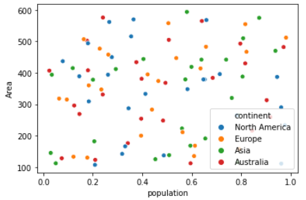
Color by Category using Pandas Groupby
We will loop over pandas grouped object(df.groupby) and create individual scatters and manually assign colors
This code assumes the same DataFrame as above and then groups it based on color . It then iterates over these groups, plotting for each one.
To select a color I’ve created a colors dictionary which can map the Continent color (for instance North America ) to a real color (for instance red ).
fig, ax = plt.subplots() colors = 'North America':'red', 'Europe':'green', 'Asia':'blue', 'Australia':'yellow'> grouped = df.groupby('continent') for key, group in grouped: group.plot(ax=ax, kind='scatter', x='population', y='Area', label=key, color=colors[key]) plt.show() 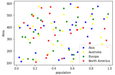
Seaborn Color Palette
This function provides an interface to many of the possible ways you can generate colors in seaborn. It return a list of colors defining a color palette.
It takes 2 parameters i.e. Name of Palette and Number of colors in the palette
We will create the color palette first
sns.palplot(sns.color_palette("muted")) 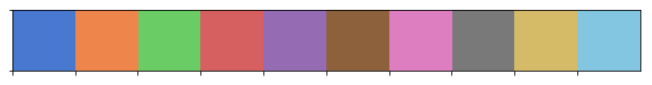
And then map this color palette with the Color Labels i.e. Unique Continents in our data set
# Get Unique continents color_labels = df['continent'].unique() # List of colors in the color palettes rgb_values = sns.color_palette("Set2", 4) # Map continents to the colors color_map = dict(zip(color_labels, rgb_values)) # Finally use the mapped values plt.scatter(df['population'], df['Area'], c=df['continent'].map(color_map)) 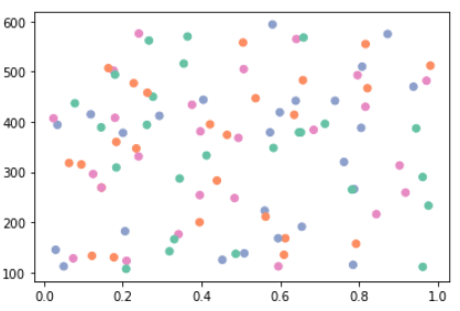
Matplotlib Colormap
Colormap instances are used to convert data values (floats) from the interval [0, 1] to the RGBA color that the respective Colormap represents
With this scatter plot we can visualize the different dimension of the data: the x,y location corresponds to Population and Area, the size of point is related to the total population and color is related to particular continent
rng = np.random.RandomState(0) x = df['population'] y = df['Area'] colors = 'North America':'red', 'Europe':'green', 'Asia':'blue', 'Australia':'yellow'> plt.scatter(x, y, s=100*df['population'], alpha=0.3, c= df['continent'].map(colors), cmap='viridis') plt.colorbar(); 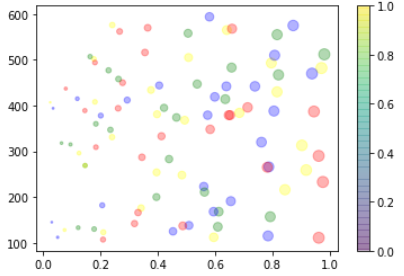
Multicolor and multifeature scatter plots like this can be useful for both exploration and presentation of data
Updated: August 30, 2020
matplotlib.pyplot.scatter#
matplotlib.pyplot. scatter ( x , y , s = None , c = None , marker = None , cmap = None , norm = None , vmin = None , vmax = None , alpha = None , linewidths = None , * , edgecolors = None , plotnonfinite = False , data = None , ** kwargs ) [source] #
A scatter plot of y vs. x with varying marker size and/or color.
Parameters : x, y float or array-like, shape (n, )
s float or array-like, shape (n, ), optional
The marker size in points**2 (typographic points are 1/72 in.). Default is rcParams[‘lines.markersize’] ** 2 .
c array-like or list of colors or color, optional
The marker colors. Possible values:
- A scalar or sequence of n numbers to be mapped to colors using cmap and norm.
- A 2D array in which the rows are RGB or RGBA.
- A sequence of colors of length n.
- A single color format string.
Note that c should not be a single numeric RGB or RGBA sequence because that is indistinguishable from an array of values to be colormapped. If you want to specify the same RGB or RGBA value for all points, use a 2D array with a single row. Otherwise, value-matching will have precedence in case of a size matching with x and y.
If you wish to specify a single color for all points prefer the color keyword argument.
Defaults to None . In that case the marker color is determined by the value of color, facecolor or facecolors. In case those are not specified or None , the marker color is determined by the next color of the Axes ‘ current «shape and fill» color cycle. This cycle defaults to rcParams[«axes.prop_cycle»] (default: cycler(‘color’, [‘#1f77b4’, ‘#ff7f0e’, ‘#2ca02c’, ‘#d62728’, ‘#9467bd’, ‘#8c564b’, ‘#e377c2’, ‘#7f7f7f’, ‘#bcbd22’, ‘#17becf’]) ).
The marker style. marker can be either an instance of the class or the text shorthand for a particular marker. See matplotlib.markers for more information about marker styles.
cmap str or Colormap , default: rcParams[«image.cmap»] (default: ‘viridis’ )
The Colormap instance or registered colormap name used to map scalar data to colors.
This parameter is ignored if c is RGB(A).
norm str or Normalize , optional
The normalization method used to scale scalar data to the [0, 1] range before mapping to colors using cmap. By default, a linear scaling is used, mapping the lowest value to 0 and the highest to 1.
If given, this can be one of the following:
- An instance of Normalize or one of its subclasses (see Colormap Normalization ).
- A scale name, i.e. one of «linear», «log», «symlog», «logit», etc. For a list of available scales, call matplotlib.scale.get_scale_names() . In that case, a suitable Normalize subclass is dynamically generated and instantiated.
This parameter is ignored if c is RGB(A).
vmin, vmax float, optional
When using scalar data and no explicit norm, vmin and vmax define the data range that the colormap covers. By default, the colormap covers the complete value range of the supplied data. It is an error to use vmin/vmax when a norm instance is given (but using a str norm name together with vmin/vmax is acceptable).
This parameter is ignored if c is RGB(A).
alpha float, default: None
The alpha blending value, between 0 (transparent) and 1 (opaque).
linewidths float or array-like, default: rcParams[«lines.linewidth»] (default: 1.5 )
The linewidth of the marker edges. Note: The default edgecolors is ‘face’. You may want to change this as well.
edgecolors None> or color or sequence of color, default: rcParams[«scatter.edgecolors»] (default: ‘face’ )
The edge color of the marker. Possible values:
- ‘face’: The edge color will always be the same as the face color.
- ‘none’: No patch boundary will be drawn.
- A color or sequence of colors.
For non-filled markers, edgecolors is ignored. Instead, the color is determined like with ‘face’, i.e. from c, colors, or facecolors.
plotnonfinite bool, default: False
Whether to plot points with nonfinite c (i.e. inf , -inf or nan ). If True the points are drawn with the bad colormap color (see Colormap.set_bad ).
Returns : PathCollection Other Parameters : data indexable object, optional
If given, the following parameters also accept a string s , which is interpreted as data[s] (unless this raises an exception):
**kwargs Collection properties
To plot scatter plots when markers are identical in size and color.
- The plot function will be faster for scatterplots where markers don’t vary in size or color.
- Any or all of x, y, s, and c may be masked arrays, in which case all masks will be combined and only unmasked points will be plotted.
- Fundamentally, scatter works with 1D arrays; x, y, s, and c may be input as N-D arrays, but within scatter they will be flattened. The exception is c, which will be flattened only if its size matches the size of x and y.