Rainbow Text Animation Using HTML and CSS
Hello and welcome to the Codewithrandom blog. We’ll look at how to make a Rainbow Text Animation Using HTML and CSS. I hope you will enjoy our blog. We will teach you how to create rainbow text animation. On Web pages, we frequently use various types of headings. In that heading, I want to use a variety of animations. This rainbow text effect will add a lot of interest to your plain text. To make these animated rainbow text effects, I first created an HTML text. Then I used CSS to add colour here. A total of seven different colours have been used here. Step1: Lets Start with adding some Basic HTML for Rainbow Text Animation The HTML is hypertext markup language is the main structure of our webpage which will help us to display our content to the browser. All the HTML document must start with this helps the browser to understand the code written follows the lastest HTML format. The HTML document itself begin With and end with . The content that will be displayed in the brower comes under the body section .Inside the body tag main content lies. Now let’s take a look at our HTML Code.
Code With Random We’ve included an external style link in our HTML’s header.
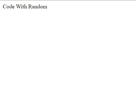
We’ve added a div tag in the body of our HTML to contain our main text («CodeWithRandom»). We will add the rainbow animation using CSS only in this text. Now let’s take look at our output without styling. So we have added the HTML tags and Their contents, Now it’s time to make it attractive by adding the CSS code.
Step2: CSS code for Star Rating
Cascading Style Sheets is a style sheet language that is used to describe the presentation of a document written in a markup language like HTML or XML. Now we will look at our CSS code.
body < background-color: #333; display: flex; justify-content:center; align-items: center; height: 100vh; >.rainbowText < font-family:arial black; font-size:70px; background-image: linear-gradient(to right, red,orange,yellow,green,blue,indigo,violet); -webkit-background-clip: text; -webkit-text-fill-color: transparent; animation: move 35s linear infinite; >@keyframes move < to < background-position: 4500vh; >> @media screen and (max-width:900px) < .rainbowText< font-size:2rem; >> @media screen and (max-width:600px) < .rainbowText< font-size:1rem; >> Now that we’ve included our CSS code in our article, let’s go over it step by step. Step1: First, we’ll add a black background to the body of our webpage. The display is set to «flex,» and the content is set to «centre.» The height is defined as 100 vh.
Step2: We will now add different colours to our text by using the «.rainbowText» class. The font family is «Arial,» and the font size is «70px.» Using the background-image property, we will now add a linear gradient with seven different colours to our text. We’ve also added a «move» animation with an infinite loop.
Step3: We also added some keyframes to our animation so that we can see the gradual changes of different colours in our text, which will look like a rainbow.
Step4: Now we’ll make our website more responsive. To add responsiveness, we used media query. We have defined two maximum screen widths (max-width: 900px): if the screen size of our window is equal to or less than the defined width, the font size of our text will change to 2 rem; another maximum screen width is defined at 600px; if the screen size of our window is less than the defined screen size, the font size of our text will change to 1.5 rem.
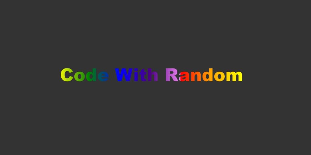
@media screen and (max-width:900px) < .rainbowText< font-size:2rem; >> @media screen and (max-width:600px) < .rainbowText< font-size:1rem; >> Now we have completed our css code. We’ve finished styling our website. Let’s take a look at our video preview now so we can fully grasp the concept of rainbow text animation. We’ve finished our rainbow text animation project with HTML and CSS. This project was simple, but it taught you how to add different colours to text and how to add animation to text. Now We have Successfully created our Rainbow Text Animation Project. You can use this project for your personal webpage and We hope you understood the project , If you any doub’t feel free to comment!! If you find out this Blog helpful, then make sure to search code with random on google for Front End Projects with Source codes and make sure to Follow the Code with Random Instagram page. Follow: codewithrandom Written By : Arun Code by : Arun
Pure CSS Rainbow text with Animation effects
Rainbow text with CSS is pretty easy thing to create while playing with some background properties.
No, you don’t have to separately style the characters of your text. All you need here is the rainbow colors, and a couple of CSS background properties.
In case you don’t know, a rainbow has 7 different colors naming:
You can remember all these colors as VIBGYOR, in which each character stands for a color name.
Well, I’m not going to drag you into the whole story of what a rainbow is, but if you want to know more about it, read this wiki.
Coming back to the topic, see the demo of what we are going to create. Now we know the colors we’ve to play with, lets start coding.
The Markup
Firstly, say we have our text in an tag, just like below:
I gave it a CSS class called .rainbow-text which we will be fiddling with later on.
As I told above, I’m not gonna separate or target any individual character in our text. Why? Because I need to spread the rainbow all across my text and not just one character.
Next up, we’ll be making use of plain CSS to get things done.
The CSS
Secondly, following the VIBGYOR, let’s add a gradient background to our text which is possible with linear-gradient function.
.rainbow-text < background-image: linear-gradient(to left, violet, indigo, blue, green, yellow, orange, red); >Above, we have spread out gradient from left to right with all those colors of the rainbow. You may change the marked area to other directions like top, right, an angle in degrees etc. whatever suits the best to your requirement.
We aren’t done yet, as this is just the rainbow background, and not the rainbow text. Clueless? Maybe not.
Here comes the rarely used background-clip property, that turn things around for us. See below its implementation with the previously added gradient background.
And voila! It clipped our gradient background to the text which does look some gradient-like thing, but not exactly the rainbow.
One more magic trick we need here to finish the rainbow effect. Any guesses?
It’s nothing but making the text color transparent, which can simple be done as show below:
Alternatively, for webkit, another way to make the text transparent for this effect could be the -webkit-text-fill-color property.
Animated Rainbow text
Below are some quick notes if you want to animated a bit the so obtained rainbow text effect.
- Use repeating-linear-gradient function instead of linear-gradient . In order to remove the seam from the end, repeat the color at the beginning one more time at the end as well.
- Move the background-position at different keyframes. You’ll need to set a huge background-size for the text element so that you could animate the position of the background well enough.
- Loop the animation infinitely for a general animated text use case. Keep the transition function ease-friendly.
- I created this quick demonstration for you to get an overview of animated rainbow text.
And that was it my friend.
In conclusion, the final demonstration consists a variety of examples to show how well the CSS rainbow text renders with different elements. The animated text may not suit well if the readability is the priority.
Read further
How To Make A Rainbow Text Animation Using HTML and CSS?
Hello and welcome to the Codewithrandom blog. We’ll look at how to make a Rainbow Text Animation Using HTML and CSS. I hope you will enjoy our blog. We will teach you how to create rainbow text animation.
On Web pages, we frequently use various types of headings. In that heading, I want to use a variety of animations. This rainbow text effect will add a lot of interest to your plain text.
Do you want to learn HTML to JavaScript? 🔥
If yes, then here is our Master Frontend: Zero to Hero eBook! 📚 In this eBook, you’ll learn complete HTML, CSS, Bootstrap, and JavaScript from beginner to advance level. 💪 It includes 450 Projects with source code.
To make these animated rainbow text effects, I first created an HTML text. Then I used CSS to add colour here. A total of seven different colours have been used here.
So we have added the HTML tags and Their contents, Now it’s time to make it attractive by adding the CSS code.
Step2: CSS code for Star Rating
Cascading Style Sheets is a style sheet language that is used to describe the presentation of a document written in a markup language like HTML or XML.
Now we will look at our CSS code.
body < background-color: #333; display: flex; justify-content:center; align-items: center; height: 100vh; >.rainbowText < font-family:arial black; font-size:70px; background-image: linear-gradient(to right, red,orange,yellow,green,blue,indigo,violet); -webkit-background-clip: text; -webkit-text-fill-color: transparent; animation: move 35s linear infinite; >@keyframes move < to < background-position: 4500vh; >> @media screen and (max-width:900px) < .rainbowText< font-size:2rem; >> @media screen and (max-width:600px) < .rainbowText< font-size:1rem; >>
Now that we’ve included our CSS code in our article, let’s go over it step by step.
Step1: First, we’ll add a black background to the body of our webpage. The display is set to “flex,” and the content is set to “centre.” The height is defined as 100 vh.
Step2: We will now add different colours to our text by using the “.rainbowText” class. The font family is “Arial,” and the font size is “70px.” Using the background-image property, we will now add a linear gradient with seven different colours to our text. We’ve also added a “move” animation with an infinite loop.
Step3: We also added some keyframes to our animation so that we can see the gradual changes of different colours in our text, which will look like a rainbow.
Step4: Now we’ll make our website more responsive. To add responsiveness, we used media query. We have defined two maximum screen widths (max-width: 900px): if the screen size of our window is equal to or less than the defined width, the font size of our text will change to 2 rem; another maximum screen width is defined at 600px; if the screen size of our window is less than the defined screen size, the font size of our text will change to 1.5 rem.
@media screen and (max-width:900px) < .rainbowText< font-size:2rem; >> @media screen and (max-width:600px) < .rainbowText< font-size:1rem; >>
Now we have completed our css code and below👇here is the output after styling our webpage.
We’ve finished styling our website. Let’s take a look at our video preview now so we can fully grasp the concept of rainbow text animation.
We’ve finished our rainbow text animation project with HTML and CSS. This project was simple, but it taught you how to add different colours to text and how to add animation to text.
Video output:
Now We have Successfully created our Rainbow Text Animation Project. You can use this project for your personal webpage and We hope you understood the project , If you any doub’t feel free to comment!!
If you find out this Blog helpful, then make sure to search code with random on google for Front End Projects with Source codes and make sure to Follow the Code with Random Instagram page.


