Create Rainbow Text with CSS: Three Different Methods
I really like adding rainbow text to my apps 🌈. There are three methods I usually use for this, so I thought I’d aggregate them into one post.
Text Shadow
One method for adding a rainbow is to do stacked text shadows. In this example, I have 9 different text shadows all offset by 4px. For example, the first shadow is -4px 4px #ef3550, . The first negative value places the shadow to the left of the letter. The second positive value puts the shadow 4px below the letter. Then, we have the color! The next shadow is -8px 8px #f48fb1 which offsets the shadow by 4 additional pixels in each direction.
Rainbow Letters
Another method is to make each letter a different color. For this one, there’s a catch: you need to make each letter into its own HTML element. In this case, I used a span . I then used the :nth-child selector to apply different colors to each span.
For my portfolio site, I have 10 colors I rotate through — so I use multiples of 10. :nth-child(10n) . I then need to add an offset to all but the first color — :nth-child(10n + 2) for example. This will still apply the color to each 10th element, but starting at the second element instead of the first. This makes it so that the 2nd, 12th, 22nd and so on character have that color applied.
I would think about accessibility when using this method — screen readers are going to read each letter as a letter instead of putting them together to form a word. So, you may want to hide the rainbow letters to the screen reader and then have another header on the page that is hidden for users reading the page.
Rainbow Gradient
The third method is to create a CSS gradient! I am hopeless at creating these by hand, so I use tools like this to help out.
Hope this will help add some fun 🌈s to your apps!
CSS Rainbow Text
In this article, we’ll talk about what is a Rainbow text and demonstrate building one through a basic example. If you are interested in generating code for text with any gradient color, check out our CSS Text Gradient Generator tool.
Rainbow Text is a text with a color pattern associated with it, representing the 7 colors of Rainbow; namely Violet, Indigo, Blue, Green, Yellow, Orange, and Red. Using different tricks, this pattern can be applied to any color property such as color, border, or shadow. Mostly, it is the color.
Let’s start writing basic HTML and CSS for building different types of Rainbow texts.
To give it a rainbow background, we will first give the whole element a background gradient.
background-image: linear-gradient(to left, violet, indigo, blue, green, yellow, orange, red); We don’t want the background gradient to cover the entire element background gradient, rather be clipped to the text.
-webkit-background-clip: text; Setting the background-clip property to text is non-standard but happens to be well supported in modern browsers, with the exceptions of IE and Opera Mini, which aren’t widely used. You can find the support details here. The -webkit-background-clip prefix is required by some modern browsers and supported by the remainder so it’s OK to just use the prefix if you want minimal CSS. To be on the safe side, it’s probably best to futureproof it by including the unprefixed background-clip property as well.
The rainbow pattern is there but we can’t really see it until we set the text’s own color as transparent.
So our final CSS will be (along with other deemed-as-necessary adjustments)
The background-image property accepts the following types of gradients
- Linear (Takes direction as optional first arguments)
- Radial ( Takes shape, size and position as optional first arguments)
- Conic ( Takes rotation angle and centre position as optional first arguments)
Using this combination of background-image and background-clip property values, we can create countless variations of Rainbow texts. Some of them will be shown in the Codepen to follow.
In some cases, you may need to show rainbow colors one by one for a text, and loop it infinitely. This can be achieved by applying an animation that changes the colors and then repeats.
@keyframes rainbow < 0%10% 20% 30% 50% 60% 70% 80% 90% 100% > We can use the power of multiple text shadows to create a rainbow shadow pattern.
font-size: 70px; font-weight: 100; color: #ef3550; letter-spacing: 8px; text-shadow: 1px 0 #f48fb1, 2px 0 #7e57c2, 3px 0 #2196f3, 4px 0 #26c6da, 5px 0 #43a047, 6px 0 #eeff41, 7px 0 #f9a825, 8px 0 #ff5722, -1px 0 #f48fb1, -2px 0 #7e57c2, -3px 0 #2196f3, -4px 0 #26c6da, -5px 0 #43a047, -6px 0 #eeff41, -7px 0 #f9a825, -8px 0 #ff5722; The shadows may not be very useful but there could be some possible use cases.
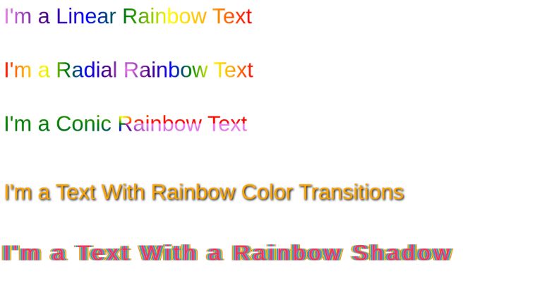
I’m a Linear Rainbow Text
I’m a Radial Rainbow Text
I’m a Conic Rainbow Text
I’m a Text With Rainbow Color Transitions
I’m a Text With a Rainbow Shadow
body < font-family: sans-serif; >.rainbow-text < font-size: 1.5rem; background-image: linear-gradient(to right, violet, indigo, blue, green, yellow, orange, red); color: transparent; -webkit-background-clip: text; display: inline-block; margin-bottom: 2rem; >.rainbow-text:nth-of-type(2) < background-image: radial-gradient(circle, violet, indigo, blue, green, yellow, orange, red); color: transparent; >.rainbow-text:nth-of-type(3) < background-image: conic-gradient(from 90deg, violet, indigo, blue, green, yellow, orange, red); color: transparent; >.rainbow-text-loop < font-size: 1.5rem; display: inline-block; margin-top: 1rem; text-shadow: 2px 2px 4px #000000; -webkit-animation: rainbow 5s infinite; >@-webkit-keyframes rainbow < 0%10% 20% 30% 40% 50% 60% 70% 80% 90% 100% > .rainbow-text-shadow
Conclusion
In this article, we went through how we can create variations of rainbow texts using powerful CSS properties. Note that the properties are generic, so the rainbow pattern is one of the many color patterns you can create using these properties.
UnusedCSS helps website owners remove their unused CSS every day. See how much you could save on your website:
You Might Also Be Interested In
Creating the perfect rainbow gradient in CSS
But look at it! This gradient is aesthetically horrifying. It’s streaky, there’s ugly strips of pure colour where the endpoints meet, it doesn’t loop very well, it’s not smooth, and the colours clearly contrast against each other when they should seamlessly blend. In short: it’s a terrible gradient. I’d like to find the perfect gradient. One that encompasses the rainbow in a slick, smooth way, one that doesn’t leave any obvious bumps or visual tearing. Instead of a spiky mess, this gradient is a smooth curve. Does this gradient exist?
7 Answers 7
You need to choose colors that will blend nicely together and more color steps.
background: linear-gradient(90deg, rgba(255,0,0,1) 0%, rgba(255,154,0,1) 10%, rgba(208,222,33,1) 20%, rgba(79,220,74,1) 30%, rgba(63,218,216,1) 40%, rgba(47,201,226,1) 50%, rgba(28,127,238,1) 60%, rgba(95,21,242,1) 70%, rgba(186,12,248,1) 80%, rgba(251,7,217,1) 90%, rgba(255,0,0,1) 100%); 

I made it using CSS gradient generator: https://cssgradient.io/
You can get something that looks better by overlaying the individual red, green, and blue colours, trying to match the human colour cone sensitivities.
Here’s an example, but it could be improved by adjusting some of the % numbers in the linear-gradients, and by having smother gradient shapes (currently triangles with cut-off tops).

* < box-sizing: border-box; >.separate < width: 100%; height: 10em; >.separate>* < width: 100%; height: 100%; margin-top: 1em; >.overlay < width: 100%; height: 10em; filter: brightness(3); >.overlay>* < width: 100%; height: 100%; position: absolute; >.overlay>:nth-of-type(1) < opacity: 1; >.overlay>:nth-of-type(2) < opacity: .5; >.overlay>:nth-of-type(3) < opacity: .33; >.overlay>:nth-of-type(4) < opacity: .25; >.blue < background: linear-gradient( 90deg, rgb(0,0,256) 0%, rgb(0,0,256) 5%, rgb(0,0,0) 20% ); >.green < background: linear-gradient( 90deg, rgb(0,0,0) 0%, rgb(0,256,0) 25%, rgb(0,256,0) 35%, rgb(0,0,0) 55% ); >.red < background: linear-gradient( 90deg, rgb(0,0,0) 15%, rgb(256,0,0) 35%, rgb(256,0,0) 45%, rgb(0,0,0) 100% ); >.blue2 Rainbow
«Rainbow» or «Color wheel» is often referred to as Hue.
CSS has the hsl() function (stands for Hue, Saturation, Lightness).
To create the gradients, simply divide the 360 hue degrees by 12 main colors (= 30 deg. steps).
Apply increments on the Hue by 30 degrees:
In the near future you can do it easily like below thanks to the new color interpolation. We tell the browser to take the longer route between red and red in the hue color space.

It’ll be interesting to see what this looks like, when a browser eventually supports it. (tested Firefox Nightly 113.0a1)
@snazzybouche you can consider the last Chrome version with Dev flag enabled. I have added a screenshot as well
I’m not a CSS programmer, but just using the linear gradient fill in MS Word/Excel/PowerPoint, I like to create my rainbow with just the following 4 RGB colors: (255,0,0) ; (255,255,0) ; (0,192,255) ; (192,0,255). That looks pretty good to me, and with very little effort! >>


Another variation of the rainbow above is “Sunset over the Ocean”. (It will make a great background for a webpage). Start with the rainbow, replace the last (purple) color with the following dark blue one: (60,70,200). Then move the yellow slider right up against the light blue one (mine is at 60% and 61%). And that’s it! >>

I managed to do it in CSS! 🙂 >>
.Rainbow-4Color-Mix < width:200px; height:350px; background: linear-gradient(180deg, rgba(255, 0, 0, 1) 0%, rgba(255, 255, 0, 1) 33%, rgba(0, 192, 255, 1) 66%, rgba(192, 0, 255, 1) 100%); >.Gap .Ocean-Sunset
Rainbow Logo

p5.js Tutorials

JavaScript Tutorials
Processing Tutorials

Java Tutorials

Server Tutorials
Google Cloud

Android Tutorials

LibGDX Tutorials

How-To Guides

Gallery
Blog
Teaching


Tutorials
HTML Tutorials
CSS
Rainbow Logo
CSS
Rainbow Logo
This program uses the class to style each individual letter in the text Happy Coding! . It then uses a mix of internal styles inside the section and inline styles on each tag to create a rainbow logo on a black background.
Happy Coding body background:black; text-align:center; font-size:96pt; font-family: "Lucida Console", Monaco, monospace; > p line-height: 0pt; > style="color:orange">H style="color:yellow">a style="color:green">p style="color:blue">p style="color:indigo">y style="color:red">C style="color:orange">o style="color:yellow">d style="color:green">i style="color:blue">n style="color:indigo">g style="color:violet">! See the Pen by Happy Coding (@KevinWorkman) on CodePen.
If this seems confusing, try to split the tags up to better see what they’re doing:
style="color:orange">H style="color:yellow">a style="color:green">p style="color:blue">p style="color:indigo">y style="color:red">C style="color:orange">o style="color:yellow">d style="color:green">i style="color:blue">n style="color:indigo">g style="color:violet">! (Note that actually formatting this way will add spaces between our letters. This is just to make it easier to see what’s going on.)
The tag is just a block of text that doesn’t get its own line like the
tag, so it can be used to style a part of a paragraph, or even a single letter like above. Then we just use inline styles to give each letter a different color. The rest of the styles (the black background, font size, and centered text) come from the internal styles in the section.
Tweak Ideas
- Change the colors so they fade from one color to another instead of a rainbow.
- Use this type of logic to create a logo for your own personal webpage.
CSS