32 CSS Circle Button Examples
A curated assembly of free HTML and CSS circle button code examples. Each of these carefully selected CSS circular buttons contains uniquely implemented code, animations, effects, colors, and designs that make them practical and ideal for app and web design.
Title:
Arrow button hover effect
Author:
Created on:
Made with:
Responsive:
Dependencies:
Compatible browsers:
Chrome, Brave, Firefox, Opera, Edge
Code description:
A stylish, sophisticated learn more CSS circle button created using HTML and SCSS. When this button is hovered, it will slide to the right filling the background of the learn more text while also toggling the arrow icons in a smooth animation.
Title:
Author:
Created on:
Made with:
Responsive:
Dependencies:
Compatible browsers:
Chrome, Brave, Firefox, Opera, Edge
Code description:
A set of elegant white CSS circle buttons created using HTML and SCSS. These circular buttons have a smooth animation effect from solid to outlined when hovered.
Title:
Author:
Created on:
Made with:
Responsive:
Dependencies:
Compatible browsers:
Chrome, Brave, Firefox, Opera, Edge
Code description:
Simple yet beautifully elegant CSS circle buttons created using HTML and SCSS. When you hover over the buttons, there is a pulse animation as their background color change to grey.
Title:
Author:
Created on:
Made with:
Responsive:
Dependencies:
Compatible browsers:
Chrome, Brave, Firefox, Opera, Edge
Code description:
A stylish, modern circular button created using HTML, CSS, and Javascript. This CSS circle button has a continuously pulsing animation that when you hover over will stop. When you click on this button, it will change the state and toggles the color between its gradient background and grey.
Title:
Author:
Created on:
Made with:
Responsive:
Dependencies:
Compatible browsers:
Opera, Brave, Firefox, Google Chrome, Edge
Code description:
A creative CSS circle button with a face created using HTML, SCSS, and Javascript. When you hover over the button, it will show the eyes of the face towards how you will move your mouse with realisitic animation effects.
Title:
Minimal Circular 3D Buttons
Author:
Created on:
Made with:
Responsive:
Dependencies:
Compatible browsers:
Opera, Brave, Firefox, Google Chrome, Edge
Code description:
An attractive set minial yet elegant circle buttons created using HTML and CSS. There is a subtle shift in the icon and background color of these circular buttons when you hover over them.
Title:
CSS animation circle buttons
Author:
Created on:
Made with:
Responsive:
Dependencies:
Compatible browsers:
Opera, Brave, Firefox, Google Chrome, Edge
Code description:
A cool, multi-functional circle button with smooth hover effects, can also be used for logo embeds. Great for headers an an interactive lego section.
Title:
Author:
Created on:
Made with:
Responsive:
Dependencies:
Compatible browsers:
Opera, Brave, Firefox, Google Chrome, Edge
Code description:
A fun set of interactive css circle buttons. Gives out a cool zoom in effect on hover.
Title:
Colorful flower popup menu
Author:
Created on:
Made with:
Responsive:
Dependencies:
Compatible browsers:
Opera, Brave, Firefox, Google Chrome, Edge
Code description:
A beautiful, innovative colorful flower popup menu button is created using pure HTML and CSS. When you hover over the button, it will shrink the button. When you click on the button, It will show the other menu buttons with amazing animation effects.
Title:
Author:
Created on:
Made with:
Responsive:
Dependencies:
Compatible browsers:
Opera, Brave, Firefox, Google Chrome, Edge
Code description:
A beautiful CSS circle button with hover effects created using HTML and SCSS. When you hover over the button, it will animate the button icon with spinning effect and show rounded layered borders around the button that looks great with the dark color scheme.
Title:
Author:
Created on:
Made with:
Responsive:
Dependencies:
Compatible browsers:
Opera, Brave, Firefox, Google Chrome, Edge
Code description:
A stylish, modern add CSS circle button is created using HTML, SCSS, and Javascript. When you click on the button, it will shrink the button to capsule shape and show all the menu items and toggle its state back when you click again with smooth animations.
Title:
Author:
Created on:
Made with:
Responsive:
Dependencies:
Compatible browsers:
Opera, Brave, Firefox, Google Chrome, Edge
Code description:
A simple circle button with hovering effects created using pure HTML and CSS. When you hover over the button, it will fill the background color and toggle the icon size with smooth animation effects.
Title:
Circle button with outside border
Author:
Created on:
Made with:
Responsive:
Dependencies:
Compatible browsers:
Opera, Brave, Firefox, Google Chrome, Edge
Code description:
A beautiful circle button with hover effects created using pure HTML and CSS. When you hover over the button, It will animate the outside border of the button and make the background brighter so the button looks shiny.
Title:
Author:
Created on:
Made with:
Responsive:
Dependencies:
Compatible browsers:
Opera, Brave, Firefox, Google Chrome, Edge
Code description:
A beautiful circular button with hovering effects created using HTML and SCSS. When you hover over the button, it will expand the button and make it like a capsule button with “see more” text with smooth animation effects.
Title:
Author:
Created on:
Made with:
Responsive:
Dependencies:
Compatible browsers:
Opera, Brave, Firefox, Google Chrome, Edge
Code description:
An animated CSS circle button created using HTML and SCSS. When you hover over the button, it will fill the border in a clockwise direction with a smooth animation effect and also shrink the button background a little bit giving an amazing look to the web page.
Title:
Author:
Created on:
Made with:
Responsive:
Dependencies:
Compatible browsers:
Opera, Brave, Firefox, Google Chrome, Edge
Code description:
A simple social share circle button created using HTML, SCSS, and jQuery. When you click on the button, it will change the background color to white from the center and show three buttons in different color. It toggles the state when you click back on the page.
Title:
Author:
Created on:
Made with:
Responsive:
Dependencies:
Compatible browsers:
Opera, Brave, Firefox, Google Chrome, Edge
Code description:
A stylish and elegant CSS circle button created using HTML, Sass, and jQuery. When you click on the button, it will animate the icon with a spinning effect and show a model with quick animation effects. It also toggle the state when you click it again.
Title:
Author:
Created on:
Made with:
Responsive:
Dependencies:
Compatible browsers:
Opera, Brave, Firefox, Google Chrome, Edge
Code description:
A delightful, awesome slide-out social CSS circle buttons created using HTML and SCSS. When you hover over the button,it will show the social platform name with a smooth slide-out effect from the button and toggle its state back when you are not hovering.
Title:
Button morphing into form
Author:
Created on:
Made with:
Responsive:
Dependencies:
Compatible browsers:
Opera, Brave, Firefox, Google Chrome, Edge
Code description:
A delightful, amazing add product circle button created using HTML, SCSS, and Vue.js. When you click on the button, it will show the add product form with a nice morphing animation effect from the button that looks amazing.
Title:
Author:
Created on:
Made with:
Responsive:
Dependencies:
Compatible browsers:
Opera, Brave, Firefox, Google Chrome, Edge
Code description:
A sophisticated, material CSS circle button created using HTML and Sass. When you click on the button, it will show a spinning animation effect on the icon. When you click back on the web page, it will toggle the button state.
Title:
Author:
Created on:
Made with:
Responsive:
Dependencies:
Compatible browsers:
Opera, Brave, Firefox, Google Chrome, Edge
Code description:
A simple circle button is created using pure HTML and CSS. When you hover over the button, it will fill the button with the transparent background leaving the border. When you click on the button, it will fill the transparent white background color to the whole button with a smooth transition effects.
Скруглённые уголки
Традиционные прямоугольные уголки в дизайне сайтов давно уже всем надоели. В моде скруглённые уголки, которые делаются не с помощью изображений, а через стили, для чего используется свойство border-radius . Это свойство может иметь одно, два, три или четыре значения разделённых пробелом, которые и определяют радиус всех уголков или каждого по отдельности.
В табл. 1 приведёно разное количество значений и вид блока, который получается в этом случае.
| Код | Описание | Вид |
|---|---|---|
| div | Радиус скругления для всех уголков сразу. |  |
| div | Первое значение устанавливает радиус левого верхнего и правого нижнего уголка, второе значение — для правого верхнего и левого нижнего. | 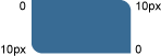 |
| div | Первое значение задаёт радиус левого верхнего уголка, второе — одновременно правого верхнего и левого нижнего, а третье значение — правого нижнего. | 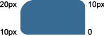 |
| div | Последовательно устанавливает радиус левого верхнего уголка, правого верхнего, правого нижнего и левого нижнего. | 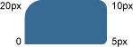 |
В примере 1 показано создание блока со скруглёнными уголками.
HTML5 CSS3 IE 9+ Cr Op Sa Fx
Меня — супплетивная форма винительного падежа от я. Результат данного примера показан на рис. 1.
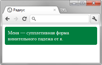
Рис. 1. Блок со скруглёнными уголками
Интересный эффект можно получить, если задать радиус скругления больше половины высоты и ширины элемента. В таком случае получится круг. В примере 2 показано создание круглой кнопки с рисунком.
HTML5 CSS3 IE 9+ Cr Op Sa Fx
Результат данного примера показан на рис. 2.
В браузере Opera скругление к применяется некорректно, если не задана граница через свойство border .
Свойство border-radius можно сочетать и с другими свойствами, например, добавить к элементу тень. В примере 3 сделан набор кружков, из которых один подсвечивается с помощью box-shadow . Такой набор можно использовать для навигации по страницам или по фотографиям.
HTML5 CSS3 IE 9+ Cr Op Sa Fx
Результат данного примера показан на рис. 3.
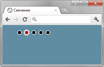
Рис. 3. Свечение вокруг кружка
С помощью border-radius можно сделать не только кружок, но и эллипс, а также эллиптическое скругление у блока. Для этого надо написать не одно значение, а два через слэш. Запись 20px/10px означает, что по горизонтали радиус скругления будет 20 пикселов, а по вертикали 10 пикселов. В примере 4 показано создание эллиптических уголков для добавления к фотографии надписи оформленной как в комиксах.
HTML5 CSS3 IE 9+ Cr Op Sa Fx

Результат данного примера показан на рис. 4.
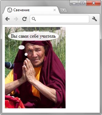
Рис. 4. Использование эллиптических уголков
Вид уголков можно изменить и у изображений, добавляя к селектору img свойство border-radius , как показано в примере 5.
HTML5 CSS3 IE 9+ Cr Op Sa Fx
body < background: #4b5457; >img 

