PyQt — QPushButton Widget
In any GUI design, the command button is the most important and most often used control. Buttons with Save, Open, OK, Yes, No and Cancel etc. as caption are familiar to any computer user. In PyQt API, the QPushButton class object presents a button which when clicked can be programmed to invoke a certain function.
QPushButton class inherits its core functionality from QAbstractButton class. It is rectangular in shape and a text caption or icon can be displayed on its face.
Following are some of the most commonly used methods of QPushButton class −
Recognizes pressed and released states of button if set to true
Toggles between checkable states
Shows an icon formed out of pixmap of an image file
When set to false, the button becomes disabled, hence clicking it doesn’t emit a signal
Returns Boolean state of button
Sets the button as default
Programmatically sets buttons’ caption
Retrieves buttons’ caption
Example
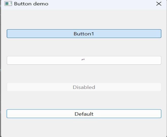
Four QPushButton objects are set with some of the above attributes. The example is written in object oriented form, because the source of the event is needed to be passed as an argument to slot function.
Four QPushButton objects are defined as instance variables in the class. First button b1 is converted into toggle button by the statements −
self.b1.setCheckable(True) self.b1.toggle()
Clicked signal of this button is connected to a member method btnstate() which identifies whether button is pressed or released by checking isChecked() property.
def btnstate(self): if self.b1.isChecked(): print "button pressed" else: print "button released"
Second button b2 displays an icon on the face. setIcon() method takes a pixmap object of any image file as argument.
b2.setIcon(QIcon(QPixmap("python.gif"))) Button b3 is set to be disabled by using setEnabled() method −
PushButton b4 is set to default button by setDefault() method. Shortcut to its caption is created by prefixing & to the caption (&Default). As a result, by using the keyboard combination Alt+D, connected slot method will be called.
Buttons b1 and b4 are connected to whichbtn() slot method. Since the function is intended to retrieve caption of the clicked button, the button object should be passed as an argument. This is achieved by the use of lambda function.
b4.clicked.connect(lambda:self.whichbtn(self.b4))
The complete code is given below −
import sys from PyQt4.QtCore import * from PyQt4.QtGui import * class Form(QDialog): def __init__(self, parent=None): super(Form, self).__init__(parent) layout = QVBoxLayout() self.b1 = QPushButton("Button1") self.b1.setCheckable(True) self.b1.toggle() self.b1.clicked.connect(lambda:self.whichbtn(self.b1)) self.b1.clicked.connect(self.btnstate) layout.addWidget(self.b1) self.b2 = QPushButton() self.b2.setIcon(QIcon(QPixmap("python.gif"))) self.b2.clicked.connect(lambda:self.whichbtn(self.b2)) layout.addWidget(self.b2) self.setLayout(layout) self.b3 = QPushButton("Disabled") self.b3.setEnabled(False) layout.addWidget(self.b3) self.b4 = QPushButton("&Default") self.b4.setDefault(True) self.b4.clicked.connect(lambda:self.whichbtn(self.b4)) layout.addWidget(self.b4) self.setWindowTitle("Button demo") def btnstate(self): if self.b1.isChecked(): print "button pressed" else: print "button released" def whichbtn(self,b): print "clicked button is "+b.text() def main(): app = QApplication(sys.argv) ex = Form() ex.show() sys.exit(app.exec_()) if __name__ == '__main__': main() The above code produces the following output.
clicked button is Button1 button released clicked button is Button1 button pressed clicked button is &Default
QPushButton
The push button, or command button, is perhaps the most commonly used widget in any graphical user interface. Push (click) a button to command the computer to perform some action, or to answer a question. Typical buttons are OK, Apply, Cancel, Close, Yes, No and Help.
A command button is rectangular and typically displays a text label describing its action. A shortcut key can be specified by preceding the preferred character with an ampersand in the text. For example:
button = QPushButton("&Download", self)
- Available or not (grayed out, disabled).
- Standard push button, toggling push button or menu button.
- On or off (only for toggling push buttons).
- Default or normal. The default button in a dialog can generally be “clicked” using the Enter or Return key.
- Auto-repeat or not.
- Pressed down or not.
Note
On macOS when a push button’s width becomes smaller than 50 or its height becomes smaller than 30, the button’s corners are changed from round to square. Use the setMinimumSize() function to prevent this behavior.
A variation of a command button is a menu button. These provide not just one command, but several, since when they are clicked they pop up a menu of options. Use the method setMenu() to associate a popup menu with a push button.
Other classes of buttons are option buttons (see QRadioButton ) and check boxes (see QCheckBox ).
In Qt, the QAbstractButton base class provides most of the modes and other API, and QPushButton provides GUI logic. See QAbstractButton for more information about the API.
PySide2.QtWidgets.QPushButton(icon, text[, parent=None])
PySide2.QtWidgets.QPushButton(text[, parent=None])
Constructs a push button with no text and a parent .
Constructs a push button with an icon and a text , and a parent .
Note that you can also pass a QPixmap object as an icon (thanks to the implicit type conversion provided by C++).
PySide2.QtWidgets.QPushButton. autoDefault ( ) ¶ Return type :
This property holds whether the push button is an auto default button.
If this property is set to true then the push button is an auto default button.
In some GUI styles a default button is drawn with an extra frame around it, up to 3 pixels or more. Qt automatically keeps this space free around auto-default buttons, i.e., auto-default buttons may have a slightly larger size hint.
This property’s default is true for buttons that have a QDialog parent; otherwise it defaults to false.
See the default property for details of how default and auto-default interact.
PySide2.QtWidgets.QPushButton. initStyleOption ( option ) ¶ Parameters :
Initialize option with the values from this QPushButton . This method is useful for subclasses when they need a QStyleOptionButton , but don’t want to fill in all the information themselves.
This property holds whether the push button is the default button.
Default and autodefault buttons decide what happens when the user presses enter in a dialog.
A button with this property set to true (i.e., the dialog’s default button,) will automatically be pressed when the user presses enter, with one exception: if an autoDefault button currently has focus, the autoDefault button is pressed. When the dialog has autoDefault buttons but no default button, pressing enter will press either the autoDefault button that currently has focus, or if no button has focus, the next autoDefault button in the focus chain.
In a dialog, only one push button at a time can be the default button. This button is then displayed with an additional frame (depending on the GUI style).
The default button behavior is provided only in dialogs. Buttons can always be clicked from the keyboard by pressing Spacebar when the button has focus.
If the default property is set to false on the current default button while the dialog is visible, a new default will automatically be assigned the next time a push button in the dialog receives focus.
This property’s default is false.
PySide2.QtWidgets.QPushButton. isFlat ( ) ¶ Return type :
This property holds whether the button border is raised.
This property’s default is false. If this property is set, most styles will not paint the button background unless the button is being pressed. setAutoFillBackground() can be used to ensure that the background is filled using the Button brush.
PySide2.QtWidgets.QPushButton. menu ( ) ¶ Return type :
Returns the button’s associated popup menu or None if no popup menu has been set.
arg__1 – bool
This property holds whether the push button is an auto default button.
If this property is set to true then the push button is an auto default button.
In some GUI styles a default button is drawn with an extra frame around it, up to 3 pixels or more. Qt automatically keeps this space free around auto-default buttons, i.e., auto-default buttons may have a slightly larger size hint.
This property’s default is true for buttons that have a QDialog parent; otherwise it defaults to false.
See the default property for details of how default and auto-default interact.
PySide2.QtWidgets.QPushButton. setDefault ( arg__1 ) ¶ Parameters :
arg__1 – bool
This property holds whether the push button is the default button.
Default and autodefault buttons decide what happens when the user presses enter in a dialog.
A button with this property set to true (i.e., the dialog’s default button,) will automatically be pressed when the user presses enter, with one exception: if an autoDefault button currently has focus, the autoDefault button is pressed. When the dialog has autoDefault buttons but no default button, pressing enter will press either the autoDefault button that currently has focus, or if no button has focus, the next autoDefault button in the focus chain.
In a dialog, only one push button at a time can be the default button. This button is then displayed with an additional frame (depending on the GUI style).
The default button behavior is provided only in dialogs. Buttons can always be clicked from the keyboard by pressing Spacebar when the button has focus.
If the default property is set to false on the current default button while the dialog is visible, a new default will automatically be assigned the next time a push button in the dialog receives focus.
This property’s default is false.
PySide2.QtWidgets.QPushButton. setFlat ( arg__1 ) ¶ Parameters :
arg__1 – bool
This property holds whether the button border is raised.
This property’s default is false. If this property is set, most styles will not paint the button background unless the button is being pressed. setAutoFillBackground() can be used to ensure that the background is filled using the Button brush.
PySide2.QtWidgets.QPushButton. setMenu ( menu ) ¶ Parameters :
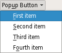
Associates the popup menu menu with this push button. This turns the button into a menu button, which in some styles will produce a small triangle to the right of the button’s text.
Ownership of the menu is not transferred to the push button.
A push button with popup menus shown in the Fusion widget style .
Shows (pops up) the associated popup menu. If there is no such menu, this function does nothing. This function does not return until the popup menu has been closed by the user.
© 2022 The Qt Company Ltd. Documentation contributions included herein are the copyrights of their respective owners. The documentation provided herein is licensed under the terms of the GNU Free Documentation License version 1.3 as published by the Free Software Foundation. Qt and respective logos are trademarks of The Qt Company Ltd. in Finland and/or other countries worldwide. All other trademarks are property of their respective owners.


