Set Matplotlib Grid Interval

This tutorial will introduce how we can set grid spacing and apply different styles to major and minor grids in the Matplotlib plot.
We must use the matplotlib.pyplot.grid() function to show the grids.
import matplotlib.pyplot as plt plt.figure(figsize=(8,6)) plt.xlim(0,10) plt.ylim(0,10) plt.grid() plt.title("Plot with Grids") plt.show() 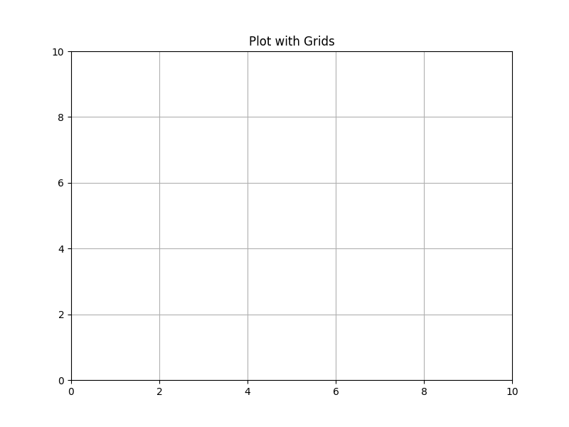
It displays a plot with grids in which grids are spaced as per the spacing of the ticks. We can change the grid interval by changing the spacing of ticks .
Change Matplotlib Plot Grid Spacing by Changing the Spacing of the Ticks
import matplotlib.pyplot as plt fig,axes=plt.subplots(nrows=2,ncols=1,figsize=(8,6)) axes[0].set_xlim(0,10) axes[0].set_ylim(0,10) axes[0].set_title("Subplot 1") axes[0].grid() axes[1].set_xlim(0,8) axes[1].set_ylim(0,8) axes[1].set_title("Subplot 2") axes[1].grid() plt.show() 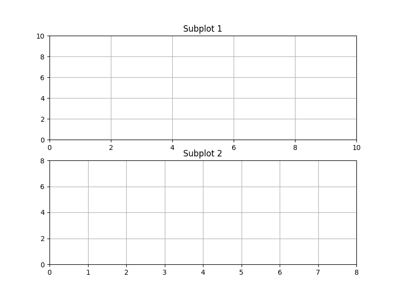
It creates a figure with two subplots. We have set the different spacing of ticks for both subplots. From the figure, it is clear that grids’ spacing is maintained as per ticks are spaced.
import numpy as np import matplotlib.pyplot as plt fig,axes=plt.subplots(nrows=2,ncols=1,figsize=(8,6)) major_ticks_top=np.linspace(0,20,6) minor_ticks_top=np.linspace(0,20,21) major_ticks_bottom=np.linspace(0,15,6) axes[0].set_xticks(major_ticks_top) axes[0].set_yticks(major_ticks_top) axes[0].set_xticks(minor_ticks_top,minor=True) axes[0].set_yticks(minor_ticks_top,minor=True) axes[0].set_title("Subplot 1") axes[0].grid(which="major",alpha=0.6) axes[0].grid(which="minor",alpha=0.3) axes[1].set_xticks(major_ticks_bottom) axes[1].set_yticks(major_ticks_bottom) axes[1].set_title("Subplot 2") axes[1].grid() plt.tight_layout() plt.show() 
It displays a Matplotlib figure with two subplots in it. Subplot 1 has both minor and major grids. The minor grids are located with a spacing of 1 unit and represented with a darker line. Similarly, the major grids are placed with the spacing of 5 units and represented by a lighter line.
We use minor=True to denote minor ticks in set_yticks() or set_xticks() functions. We use which=»major» to select grid corresponding to major ticks, and which=»major» to select grid corresponding to minor ticks.
The alpha parameter in the grid() method is used to set the grid lines’ intensity. The higher the value of alpha , the darker the grid lines are.
Suraj Joshi is a backend software engineer at Matrice.ai.
Grid lines in matplotlib
Adding grid lines in matplotlib with the grid function
How to add a grid onto a matplotlib chart?
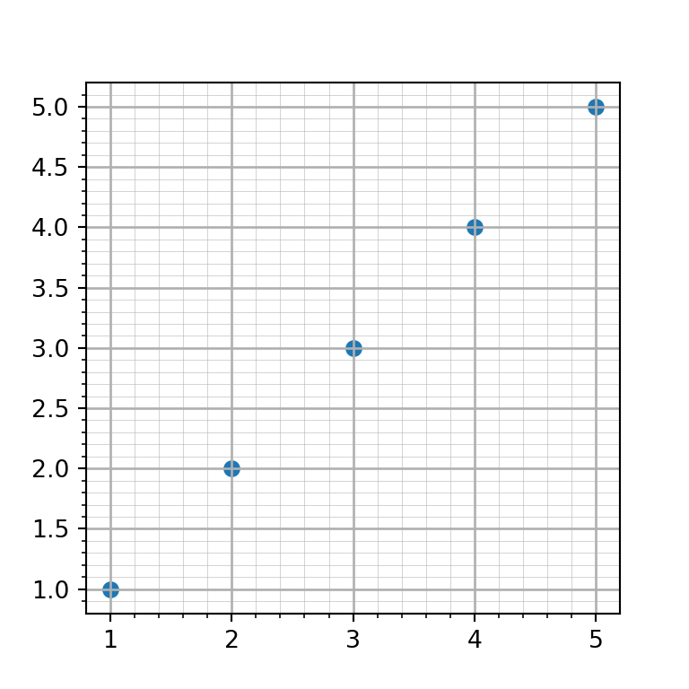
If you want to display grid lines in your plot you will need to call the grid function from matplotlib after creating a plot.
import numpy as np import matplotlib.pyplot as plt # Sample data and plot x = [1, 2, 3, 4, 5] y = [1, 2, 3, 4, 5] fig, ax = plt.subplots() ax.scatter(x, y) # Enabling grid lines: ax.grid() # plt.show()
Grid for the X-axis
The grid lines are added by default both for the X and Y axes, but it is possible to set the grid only for one of them. On the one hand, if you want to add the grid lines for the X axis you can set the axis argument to «x» .
import numpy as np import matplotlib.pyplot as plt # Sample data and plot x = [1, 2, 3, 4, 5] y = [1, 2, 3, 4, 5] fig, ax = plt.subplots() ax.scatter(x, y) # Enabling X-axis grid lines: ax.grid(axis = "x") # plt.show()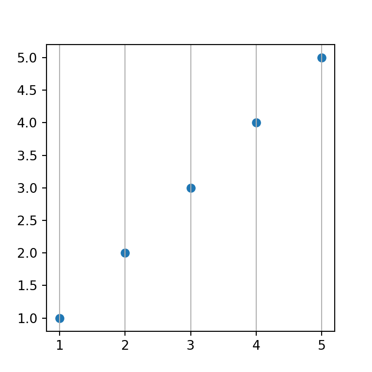
Grid for the Y-axis
On the other hand, if you want to display the grid lines for the Y-axis just set the axis argument to «y» .
import numpy as np import matplotlib.pyplot as plt # Sample data and plot x = [1, 2, 3, 4, 5] y = [1, 2, 3, 4, 5] fig, ax = plt.subplots() ax.scatter(x, y) # Enabling Y-axis grid lines: ax.grid(axis = "y") # plt.show()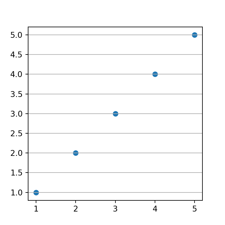
Grid lines below points
In the previous examples the grid lines were added over the points. However, it is possible to add the lines behind the points just setting set_axisbelow to True .
import numpy as np import matplotlib.pyplot as plt # Sample data and plot x = [1, 2, 3, 4, 5] y = [1, 2, 3, 4, 5] fig, ax = plt.subplots() ax.scatter(x, y) # Enabling grid lines: ax.grid() ax.set_axisbelow(True) # plt.show()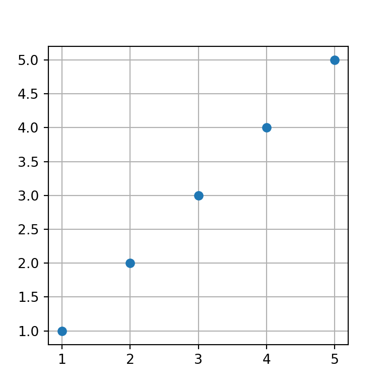
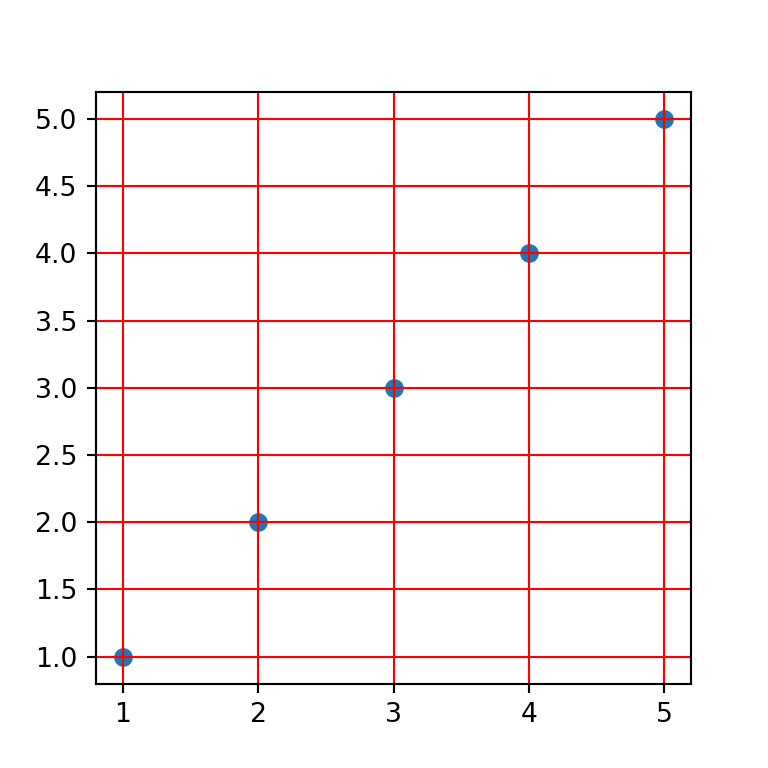
The grid function provides an argument named which . By setting this argument to «major» all the styling will be applied only to the major grid.
import numpy as np import matplotlib.pyplot as plt # Sample data and plot x = [1, 2, 3, 4, 5] y = [1, 2, 3, 4, 5] fig, ax = plt.subplots() ax.scatter(x, y) # Enabling grid lines: ax.grid(which = "major") # plt.show()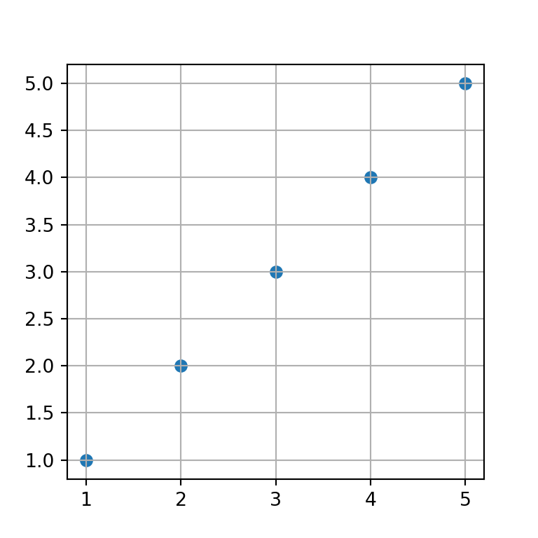
If you set the which argument to «minor» you will be able to customize the settings of the minor grid. Nonetheless, unless you call minorticks_on the minor grid won’t show up.
import numpy as np import matplotlib.pyplot as plt # Sample data and plot x = [1, 2, 3, 4, 5] y = [1, 2, 3, 4, 5] fig, ax = plt.subplots() ax.scatter(x, y) # Enabling minor grid lines: ax.grid(which = "minor") ax.minorticks_on() # plt.show()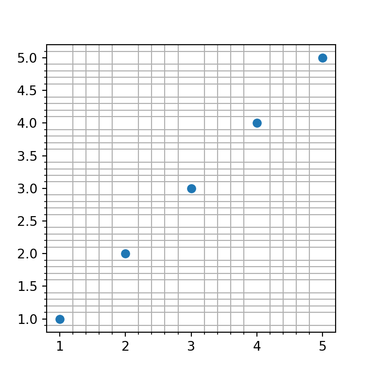
Minor grid without minor ticks
In the previous example, when using the minorticks_on function, the minor ticks will be displayed along the axes. If you prefer not to show those ticks you can remove them with the following line of code:
import numpy as np import matplotlib.pyplot as plt # Sample data and plot x = [1, 2, 3, 4, 5] y = [1, 2, 3, 4, 5] fig, ax = plt.subplots() ax.scatter(x, y) # Enabling minor grid lines: ax.grid(which = "minor") ax.minorticks_on() ax.tick_params(which = "minor", bottom = False, left = False) # plt.show()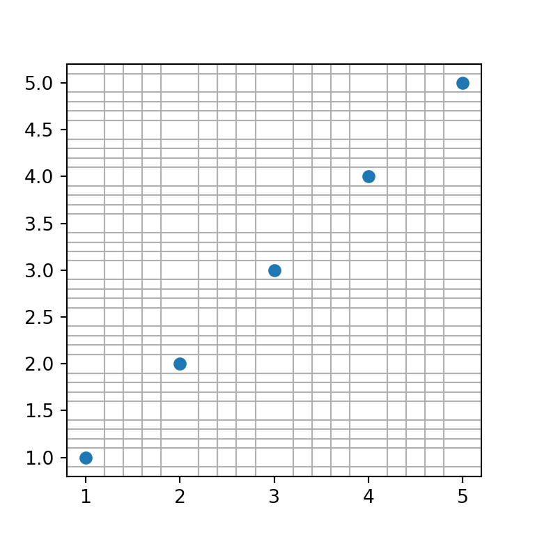
Minor and major grid at the same time
Setting which to both will display both the minor and major grid as long as you also call the minorticks_on function. An alternative is to add each grid individually, which will allow you to set different settings for each grid.
import numpy as np import matplotlib.pyplot as plt # Sample data and plot x = [1, 2, 3, 4, 5] y = [1, 2, 3, 4, 5] fig, ax = plt.subplots() ax.scatter(x, y) # Enabling both grid lines: ax.grid(which = "both") ax.minorticks_on() ax.tick_params(which = "minor", bottom = False, left = False) # Alternative: # ax.grid(which = "major") # ax.grid(which = "minor") # ax.minorticks_on() # plt.show()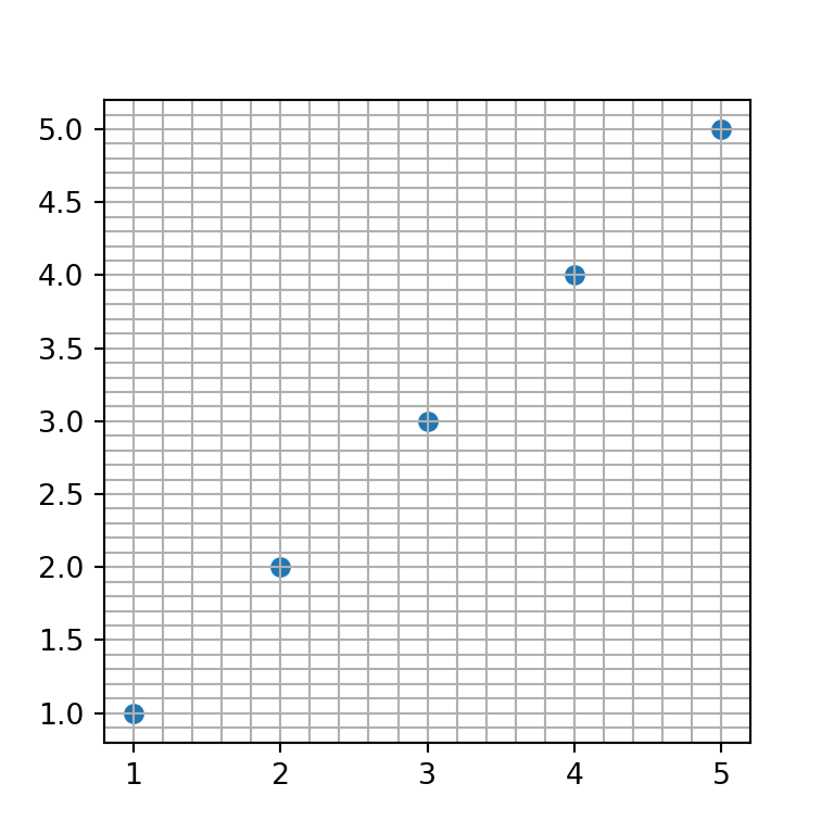
Grid style customization
The properties of the grid can be customized through several parameters. Note that you can apply these styling for the whole grid or create several grids (with axis or which ) and apply the desired customizations for each grid.
Grid lines color
The default color of the grid lines can be overriden by setting a new color to the color argument
import numpy as np import matplotlib.pyplot as plt # Sample data and plot x = [1, 2, 3, 4, 5] y = [1, 2, 3, 4, 5] fig, ax = plt.subplots() ax.scatter(x, y) # Red grid ax.grid(color = "red") # plt.show()Grid lines style
The style or type of line used to create the grid can be customized with the linestyle or ls argument. In the following example we are setting a dashed line.

import numpy as np import matplotlib.pyplot as plt # Sample data and plot x = [1, 2, 3, 4, 5] y = [1, 2, 3, 4, 5] fig, ax = plt.subplots() ax.scatter(x, y) # Grid line style ax.grid(linestyle = "dashed") # plt.show()Grid lines width
The width of the grid lines can be customized both for major and minor grid lines. If you use both grids, the most common practice is to set the major grid wider than the minor grid. The linewidth or lw argument can be used for this purpose.
import numpy as np import matplotlib.pyplot as plt # Sample data and plot x = [1, 2, 3, 4, 5] y = [1, 2, 3, 4, 5] fig, ax = plt.subplots() ax.scatter(x, y) # Grid line width ax.grid(which = "major", linewidth = 1) ax.grid(which = "minor", linewidth = 0.2) ax.minorticks_on() # plt.show()Lines transparency
The alpha argument controls the transparency of the grid lines. This argument is very interesting if you want faded grid lines.
import numpy as np import matplotlib.pyplot as plt # Sample data and plot x = [1, 2, 3, 4, 5] y = [1, 2, 3, 4, 5] fig, ax = plt.subplots() ax.scatter(x, y) # Grid with transparency ax.grid(linewidth = 1.5, alpha = 0.25) # plt.show()Custom grid lines position
Sometimes, when you create a chart with a grid you want to customize the position of the grid lines. You can accomplish this with FixedLocator and AutoMinorLocator from matplotlib.ticker and with the set_[major|minor]_locator functions.
Consider, for instance, that you want to set the X-axis major grid only for X = [1, 3, 5] . In this scenario, you will need to use the FixedLocator and xaxis.set_major_locator . The same can be applied to the Y-axis and the minor grid. However, you could also use the AutoMinorLocator function to create N-1 ticks equally spaced between the major ticks. See the example below for clarification.
import numpy as np import matplotlib.pyplot as plt from matplotlib.ticker import AutoMinorLocator, FixedLocator # Sample data and plot x = [1, 2, 3, 4, 5] y = [1, 2, 3, 4, 5] fig, ax = plt.subplots() ax.scatter(x, y) # Enabling both grids: ax.grid(which = "major") ax.grid(which = "minor", alpha = 0.2) # Locations for the X-axis, major grid ax.xaxis.set_major_locator(FixedLocator([1, 3, 5])) # Locations for the Y-axis, major grid ax.yaxis.set_major_locator(FixedLocator([2, 4])) # Minor X-axis divided into 10 parts between each X-axis major grid ax.xaxis.set_minor_locator(AutoMinorLocator(10)) # plt.show()Настроить шаг меток по оси Y
Как в Qcustomplot настроить шаг оси. Не работает QCPAxisTickerFixed
Здравствуйте. Нужно на графике настроить шаг оси с интервалов в 1(единицу). Нашел такой код: .
Засечки на оси TopAxis (Шаг сетки по Оси)
Всем Доброго времени суток. Я вывожу в Tchart график по оси Х (BottomAxis) — время. Так же мне.
Шаг основных меток в ZedGraph: Куда его перенесли в последней версии?
В шпаргалке по ZedGraph есть такой свойство // Установим шаг основных меток, равным 5 .
Регулировка меток оси chart
при построении нескольких графиков(Series) в компоненте chart, метки на оси x подписываются не так.

Сообщение было отмечено DmFat как решение
Решение
1 2 3 4 5 6 7 8 9 10 11 12 13 14 15 16 17 18
import numpy as np import pandas as pd from matplotlib import pyplot as plt from matplotlib.dates import WeekdayLocator, DateFormatter, MonthLocator np.random.seed(12) s = pd.Series(np.random.randn(365), index=pd.date_range('2021-01-01', '2021-12-31')) g = s.cumsum() y = g.values x = g.index fig, ax = plt.subplots() ax.xaxis.set_major_formatter(DateFormatter('%m')) ax.yaxis.grid(True, "major") # линии сетки для основных делений оси Y ax.plot(x, y) plt.yticks([0, -20, -40, -50], color="r", size=7) # шаг меток по оси Y, цвет и размер plt.show()
QWT расположение меток на шкале по оси Х
Добрый день. Строю график с использованием данной библиотеки. Хочу чтобы деления шкалы.
шаг оси х
добрый день! ни как не могу понять как задать шаг по оси х. График строится при помощи ows. Чтоб.
Настройка отображения меток времени на оси TChart
Добрый день. На форме есть TChart, строю график, ось Х(BottomAxis) формата DateTime В общем.
Кривое размещение меток оси x в XtraCharts (DevExpress)
У меня на диаграмме XtraCharts значения оси х разместились как-то "треугольно". Как это.
Форматирование числовых меток по левой оси TChart
Всем здравствуйте. Где найти расшифровку правой части выражений: .