- Как создать несколько графиков Matplotlib на одном рисунке
- Пример 1: сложите графики вертикально
- Пример 2: сложить графики по горизонтали
- Пример 3: создание сетки графиков
- Пример 4: Совместное использование осей между участками
- Creating multiple subplots using plt.subplots #
- A figure with just one subplot#
- Stacking subplots in one direction#
- Stacking subplots in two directions#
- Sharing axes#
- Polar axes#
- Использование библиотеки Matplotlib. Как нарисовать несколько графиков в одном окне
Как создать несколько графиков Matplotlib на одном рисунке
Вы можете использовать следующий синтаксис для создания нескольких графиков Matplotlib на одном рисунке:
import matplotlib.pyplot as plt #define grid of plots fig, axs = plt.subplots(nrows= 2 , ncols= 1 ) #add data to plots axs[0].plot(variable1, variable2) axs[1].plot(variable3, variable4) В следующих примерах показано, как использовать эту функцию на практике.
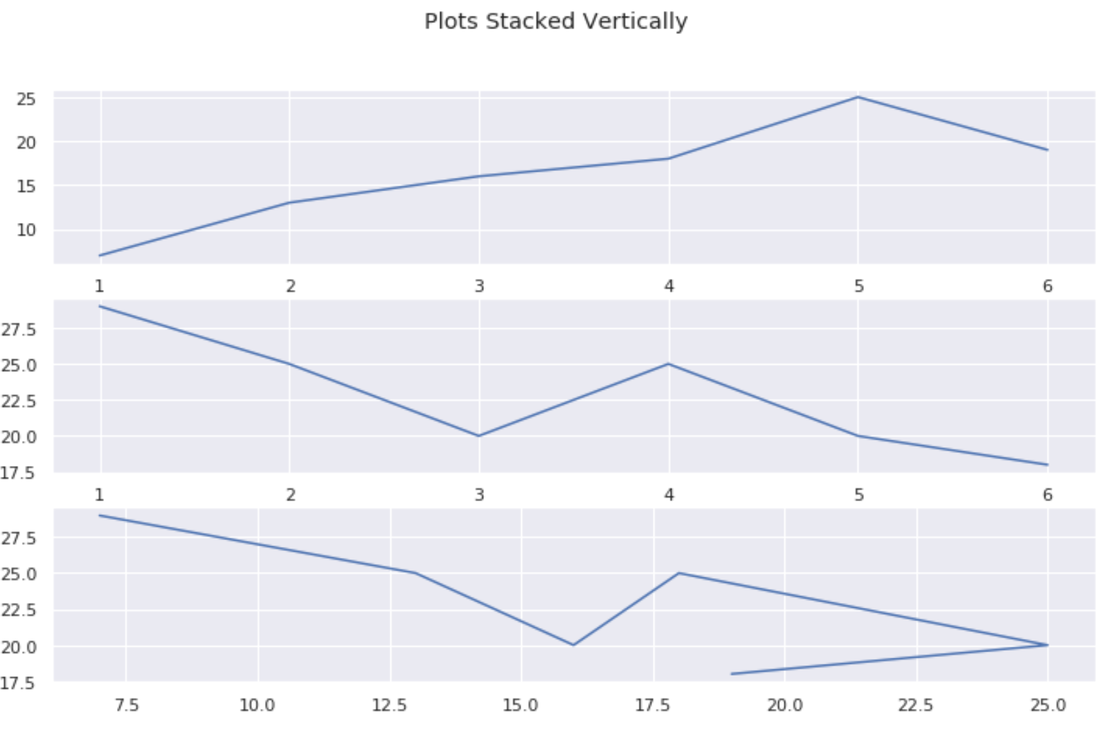
Пример 1: сложите графики вертикально
В следующем коде показано, как создать три графика Matplotlib, расположенные вертикально:
#create some data var1 = [1, 2, 3, 4, 5, 6] var2 = [7, 13, 16, 18, 25, 19] var3 = [29, 25, 20, 25, 20, 18] #define grid of plots fig, axs = plt.subplots(nrows= 3 , ncols= 1 ) #add title fig. suptitle('Plots Stacked Vertically') #add data to plots axs[0].plot(var1, var2) axs[1].plot(var1, var3) axs[2].plot(var2, var3) 
Пример 2: сложить графики по горизонтали
В следующем коде показано, как создать три графика Matplotlib, расположенные горизонтально:
#create some data var1 = [1, 2, 3, 4, 5, 6] var2 = [7, 13, 16, 18, 25, 19] var3 = [29, 25, 20, 25, 20, 18] #define grid of plots fig, axs = plt.subplots(nrows= 1 , ncols= 3 ) #add title fig. suptitle('Plots Stacked Horizontally') #add data to plots axs[0].plot(var1, var2) axs[1].plot(var1, var3) axs[2].plot(var2, var3) 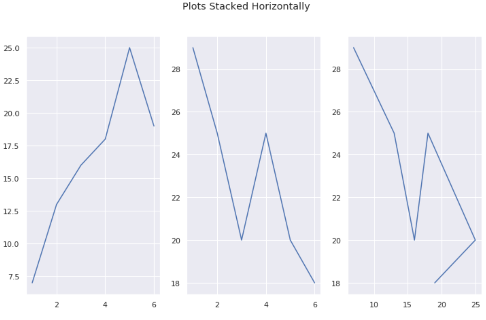
Пример 3: создание сетки графиков
Следующий код показывает, как создать сетку графиков Matplotlib:
#create some data var1 = [1, 2, 3, 4, 5, 6] var2 = [7, 13, 16, 18, 25, 19] var3 = [29, 25, 20, 25, 20, 18] var4 = [4, 4, 6, 4, 7, 11] #define grid of plots fig, axs = plt.subplots(nrows= 2 , ncols= 2 ) #add title fig. suptitle('Grid of Plots') #add data to plots axs[0, 0].plot(var1, var2) axs[0, 1].plot(var1, var3) axs[1, 0].plot(var1, var4) axs[1, 1].plot(var3, var1) 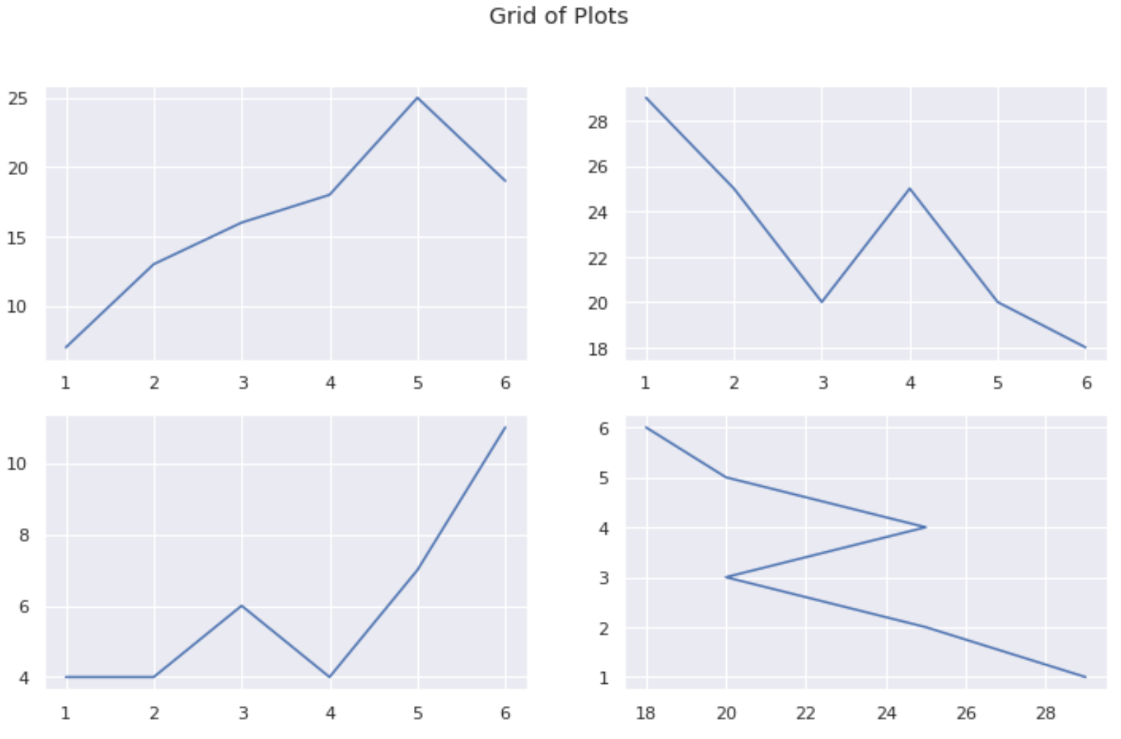
Пример 4: Совместное использование осей между участками
Вы можете использовать аргументы sharex и sharey , чтобы убедиться, что несколько графиков используют одну и ту же ось X:
#create some data var1 = [1, 2, 3, 4, 5, 6] var2 = [7, 13, 16, 18, 25, 19] var3 = [29, 25, 20, 25, 20, 18] var4 = [4, 4, 6, 4, 7, 11] #define grid of plots fig, axs = plt.subplots(nrows= 2 , ncols= 2 , sharex= True , sharey= True ) #add title fig. suptitle('Grid of Plots with Same Axes') #add data to plots axs[0, 0].plot(var1, var2) axs[0, 1].plot(var1, var3) axs[1, 0].plot(var1, var4) axs[1, 1].plot(var3, var1) Creating multiple subplots using plt.subplots #
pyplot.subplots creates a figure and a grid of subplots with a single call, while providing reasonable control over how the individual plots are created. For more advanced use cases you can use GridSpec for a more general subplot layout or Figure.add_subplot for adding subplots at arbitrary locations within the figure.
import matplotlib.pyplot as plt import numpy as np # Some example data to display x = np.linspace(0, 2 * np.pi, 400) y = np.sin(x ** 2)
A figure with just one subplot#
subplots() without arguments returns a Figure and a single Axes .
This is actually the simplest and recommended way of creating a single Figure and Axes.
fig, ax = plt.subplots() ax.plot(x, y) ax.set_title('A single plot')

Stacking subplots in one direction#
The first two optional arguments of pyplot.subplots define the number of rows and columns of the subplot grid.
When stacking in one direction only, the returned axs is a 1D numpy array containing the list of created Axes.
fig, axs = plt.subplots(2) fig.suptitle('Vertically stacked subplots') axs[0].plot(x, y) axs[1].plot(x, -y)

If you are creating just a few Axes, it’s handy to unpack them immediately to dedicated variables for each Axes. That way, we can use ax1 instead of the more verbose axs[0] .
fig, (ax1, ax2) = plt.subplots(2) fig.suptitle('Vertically stacked subplots') ax1.plot(x, y) ax2.plot(x, -y)

To obtain side-by-side subplots, pass parameters 1, 2 for one row and two columns.
fig, (ax1, ax2) = plt.subplots(1, 2) fig.suptitle('Horizontally stacked subplots') ax1.plot(x, y) ax2.plot(x, -y)

Stacking subplots in two directions#
When stacking in two directions, the returned axs is a 2D NumPy array.
If you have to set parameters for each subplot it’s handy to iterate over all subplots in a 2D grid using for ax in axs.flat: .
fig, axs = plt.subplots(2, 2) axs[0, 0].plot(x, y) axs[0, 0].set_title('Axis [0, 0]') axs[0, 1].plot(x, y, 'tab:orange') axs[0, 1].set_title('Axis [0, 1]') axs[1, 0].plot(x, -y, 'tab:green') axs[1, 0].set_title('Axis [1, 0]') axs[1, 1].plot(x, -y, 'tab:red') axs[1, 1].set_title('Axis [1, 1]') for ax in axs.flat: ax.set(xlabel='x-label', ylabel='y-label') # Hide x labels and tick labels for top plots and y ticks for right plots. for ax in axs.flat: ax.label_outer()
![Axis [0, 0], Axis [0, 1], Axis [1, 0], Axis [1, 1]](https://matplotlib.org/stable/_images/sphx_glr_subplots_demo_005.png,)
You can use tuple-unpacking also in 2D to assign all subplots to dedicated variables:
fig, ((ax1, ax2), (ax3, ax4)) = plt.subplots(2, 2) fig.suptitle('Sharing x per column, y per row') ax1.plot(x, y) ax2.plot(x, y**2, 'tab:orange') ax3.plot(x, -y, 'tab:green') ax4.plot(x, -y**2, 'tab:red') for ax in fig.get_axes(): ax.label_outer()

Sharing axes#
By default, each Axes is scaled individually. Thus, if the ranges are different the tick values of the subplots do not align.
fig, (ax1, ax2) = plt.subplots(2) fig.suptitle('Axes values are scaled individually by default') ax1.plot(x, y) ax2.plot(x + 1, -y)

You can use sharex or sharey to align the horizontal or vertical axis.
fig, (ax1, ax2) = plt.subplots(2, sharex=True) fig.suptitle('Aligning x-axis using sharex') ax1.plot(x, y) ax2.plot(x + 1, -y)

Setting sharex or sharey to True enables global sharing across the whole grid, i.e. also the y-axes of vertically stacked subplots have the same scale when using sharey=True .
fig, axs = plt.subplots(3, sharex=True, sharey=True) fig.suptitle('Sharing both axes') axs[0].plot(x, y ** 2) axs[1].plot(x, 0.3 * y, 'o') axs[2].plot(x, y, '+')

For subplots that are sharing axes one set of tick labels is enough. Tick labels of inner Axes are automatically removed by sharex and sharey. Still there remains an unused empty space between the subplots.
To precisely control the positioning of the subplots, one can explicitly create a GridSpec with Figure.add_gridspec , and then call its subplots method. For example, we can reduce the height between vertical subplots using add_gridspec(hspace=0) .
label_outer is a handy method to remove labels and ticks from subplots that are not at the edge of the grid.
fig = plt.figure() gs = fig.add_gridspec(3, hspace=0) axs = gs.subplots(sharex=True, sharey=True) fig.suptitle('Sharing both axes') axs[0].plot(x, y ** 2) axs[1].plot(x, 0.3 * y, 'o') axs[2].plot(x, y, '+') # Hide x labels and tick labels for all but bottom plot. for ax in axs: ax.label_outer()

Apart from True and False , both sharex and sharey accept the values ‘row’ and ‘col’ to share the values only per row or column.
fig = plt.figure() gs = fig.add_gridspec(2, 2, hspace=0, wspace=0) (ax1, ax2), (ax3, ax4) = gs.subplots(sharex='col', sharey='row') fig.suptitle('Sharing x per column, y per row') ax1.plot(x, y) ax2.plot(x, y**2, 'tab:orange') ax3.plot(x + 1, -y, 'tab:green') ax4.plot(x + 2, -y**2, 'tab:red') for ax in fig.get_axes(): ax.label_outer()

If you want a more complex sharing structure, you can first create the grid of axes with no sharing, and then call axes.Axes.sharex or axes.Axes.sharey to add sharing info a posteriori.
fig, axs = plt.subplots(2, 2) axs[0, 0].plot(x, y) axs[0, 0].set_title("main") axs[1, 0].plot(x, y**2) axs[1, 0].set_title("shares x with main") axs[1, 0].sharex(axs[0, 0]) axs[0, 1].plot(x + 1, y + 1) axs[0, 1].set_title("unrelated") axs[1, 1].plot(x + 2, y + 2) axs[1, 1].set_title("also unrelated") fig.tight_layout()

Polar axes#
The parameter subplot_kw of pyplot.subplots controls the subplot properties (see also Figure.add_subplot ). In particular, this can be used to create a grid of polar Axes.
fig, (ax1, ax2) = plt.subplots(1, 2, subplot_kw=dict(projection='polar')) ax1.plot(x, y) ax2.plot(x, y ** 2) plt.show()

Total running time of the script: ( 0 minutes 8.036 seconds)
Использование библиотеки Matplotlib. Как нарисовать несколько графиков в одном окне
Часто бывает удобно отобразить несколько независимых графиков в одном окне. Для этого предназначена функция subplot() из пакета matplotlib.pyplot.
У этой функции есть несколько вариантов ее использования. В этой статье мы рассмотрим два из них.
Функция subplot() ожидает три параметра:
- количество строк в графике;
- количество столбцов в графике;
- номер ячейки, куда будут выводиться графики, после вызова этой функции. Ячейки нумеруются построчно, начиная с 1.
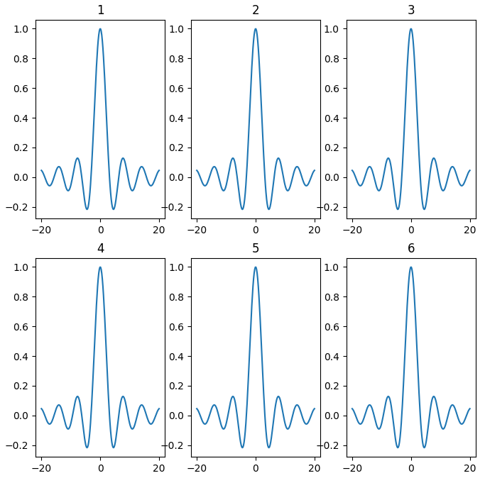
Проще всего сразу рассмотреть пример. В этом примере для простоты будут выводиться одинаковые графики в разные ячейки. Чтобы было более наглядно, в заголовок каждого графика будет добавлена цифра, обозначающая порядковый номер ячейки.
import matplotlib. pyplot as plt
if __name__ == ‘__main__’ :
# Интервал изменения переменной по оси X
xmin = — 20.0
xmax = 20.0
count = 200
# Создадим список координат по оиси X на отрезке [xmin; xmax]
x = np. linspace ( xmin , xmax , count )
# Вычислим значение функции в заданных точках
y = np. sinc ( x / np. pi )
plt. figure ( figsize = ( 8 , 8 ) )
# . Две строки, три столбца.
# . Текущая ячейка — 1
plt. subplot ( 2 , 3 , 1 )
plt. plot ( x , y )
plt. title ( «1» )
# . Текущая ячейка — 2
plt. subplot ( 2 , 3 , 2 )
plt. plot ( x , y )
plt. title ( «2» )
# . Текущая ячейка — 3
plt. subplot ( 2 , 3 , 3 )
plt. plot ( x , y )
plt. title ( «3» )
# . Текущая ячейка — 4
plt. subplot ( 2 , 3 , 4 )
plt. plot ( x , y )
plt. title ( «4» )
# . Текущая ячейка — 5
plt. subplot ( 2 , 3 , 5 )
plt. plot ( x , y )
plt. title ( «5» )
# . Текущая ячейка — 6
plt. subplot ( 2 , 3 , 6 )
plt. plot ( x , y )
plt. title ( «6» )
# Покажем окно с нарисованным графиком
plt. show ( )
Все эти ячейки чисто условные, поэтому для каждого вызова subplot() разбиение главного окна может быть свое, что позволяет сделать, например, следующее расположение графиков (обратите внимание на нумерацию ячеек):
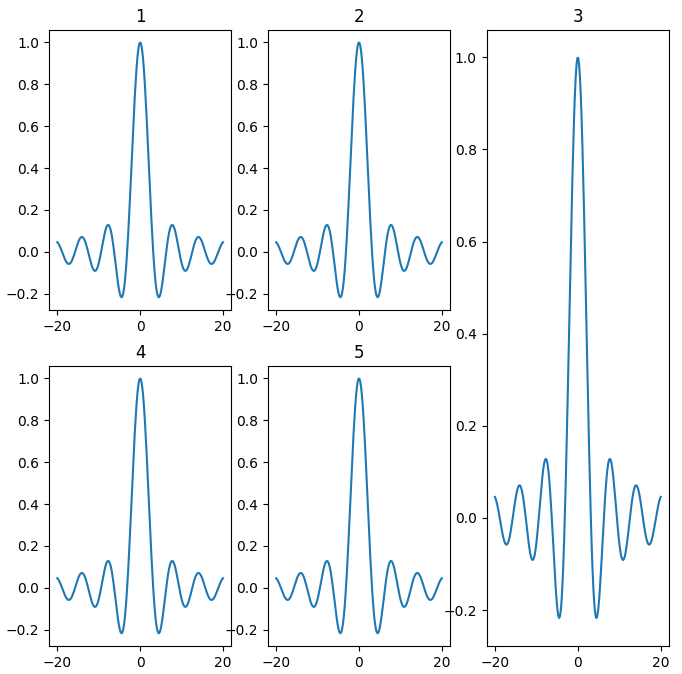
import matplotlib. pyplot as plt
if __name__ == ‘__main__’ :
# Интервал изменения переменной по оси X
xmin = — 20.0
xmax = 20.0
count = 200
# Создадим список координат по оиси X на отрезке [xmin; xmax]
x = np. linspace ( xmin , xmax , count )
# Вычислим значение функции в заданных точках
y = np. sinc ( x / np. pi )
plt. figure ( figsize = ( 8 , 8 ) )
# . Две строки, три столбца.
# . Текущая ячейка — 1
plt. subplot ( 2 , 3 , 1 )
plt. plot ( x , y )
plt. title ( «1» )
# . Две строки, три столбца.
# . Текущая ячейка — 2
plt. subplot ( 2 , 3 , 2 )
plt. plot ( x , y )
plt. title ( «2» )
# . Две строки, три столбца.
# . Текущая ячейка — 4
plt. subplot ( 2 , 3 , 4 )
plt. plot ( x , y )
plt. title ( «4» )
# . Две строки, три столбца.
# . Текущая ячейка — 5
plt. subplot ( 2 , 3 , 5 )
plt. plot ( x , y )
plt. title ( «5» )
# . Одна строка, три столбца.
# . Текущая ячейка — 3
plt. subplot ( 1 , 3 , 3 )
plt. plot ( x , y )
plt. title ( «3» )
# Покажем окно с нарисованным графиком
plt. show ( )
У функции есть еще несколько необычный способ задания разбиения окна. В случае, если количество графиков не превышает 9, вместо перечисления трех чисел мы можем писать одно трехзначное целое число. То есть, вместо plt.subplot(1, 3, 3) мы можем написать plt.subplot(133). Поэтому предыдущий пример мы можем переписать в следующем виде, при этом внешний вид графика не изменится:
import matplotlib. pyplot as plt
if __name__ == ‘__main__’ :
# Интервал изменения переменной по оси X
xmin = — 20.0
xmax = 20.0
count = 200
# Создадим список координат по оиси X на отрезке [xmin; xmax]
x = np. linspace ( xmin , xmax , count )
# Вычислим значение функции в заданных точках
y = np. sinc ( x / np. pi )
plt. figure ( figsize = ( 8 , 8 ) )
# . Две строки, три столбца.
# . Текущая ячейка — 1
plt. subplot ( 231 )
plt. plot ( x , y )
plt. title ( «1» )
# . Две строки, три столбца.
# . Текущая ячейка — 2
plt. subplot ( 232 )
plt. plot ( x , y )
plt. title ( «2» )
# . Две строки, три столбца.
# . Текущая ячейка — 4
plt. subplot ( 234 )
plt. plot ( x , y )
plt. title ( «4» )
# . Две строки, три столбца.
# . Текущая ячейка — 5
plt. subplot ( 235 )
plt. plot ( x , y )
plt. title ( «5» )
# . Одна строка, три столбца.
# . Текущая ячейка — 3
plt. subplot ( 133 )
plt. plot ( x , y )
plt. title ( «3» )
# Покажем окно с нарисованным графиком
plt. show ( )
У функции subplot() есть еще другие способы использования, которые описаны в статье Использование класса GridSpec для расположения графиков.
Вы можете подписаться на новости сайта через RSS, Группу Вконтакте или Канал в Telegram.