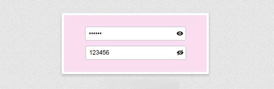
Password input with label and hide/show toggle eye svg — A simple tutorial
For HTML we need a container that will wrap everything. We’ll set «password_input_container» class to this element. Then we’ll need an input of type password. Type will be toggled later to text and back to password using javascript. We’ll also set placeholder of input to space (» «), which will allow us to detect with CSS when input has some value, so we can style it differently, because we want the label element to be both label and placeholder. Also, we need a label for password. And the button. Click on this element will fire the function called «toggle()». We’ll create it later in javascript section. Inside the button, we’ll place an eye svg.
class="password_input_container"> placeholder=" " name="password_input" type="password" id="password_input"> for="password_input">Password id="toggle_button" onclick="toggle()"> xmlns="http://www.w3.org/2000/svg" fill="none" viewBox="0 0 24 24" stroke-width="1.5" stroke="currentColor" width="15" height="15"> stroke-linecap="round" stroke-linejoin="round" d="M2.036 12.322a1.012 1.012 0 010-.639C3.423 7.51 7.36 4.5 12 4.5c4.638 0 8.573 3.007 9.963 7.178.07.207.07.431 0 .639C20.577 16.49 16.64 19.5 12 19.5c-4.638 0-8.573-3.007-9.963-7.178z" /> stroke-linecap="round" stroke-linejoin="round" d="M15 12a3 3 0 11-6 0 3 3 0 016 0z" /> Javascript
For javascript, we’ll create a function called «toggle». This function will change input’s type and button’s svg. First, we’ll select button and input by id. Then we’ll check input’s type. If it’s of type ‘password’, we’ll change it to ‘text’ (which means that input’s value will now be visible) and set button’s innerHTML to a crossed eye svg, to indicate that clicking on this button means hiding the input’s value. And if input’s type is ‘text’, we need to hide the password by setting type to ‘password’, and we also need to change button’s svg to an eye.
function toggle() let input_toggle = document.getElementById('toggle_button') let password_input = document.getElementById('password_input') if (password_input.type === 'password') password_input.type = 'text' toggle_button.innerHTML = ` ` > else password_input.type = 'password' toggle_button.innerHTML = ` ` > > CSS
Now the CSS. First, we’ll style the button. We’ll set cursor to pointer and position to absolute with top and right set to 0 with height of 100%, which means that this element will be placed at the end (near the right border, inside of our div element that wraps everything). Using flexbox, we’ll alight svg in the center and set button’s background to transparent. We’ll remove the default border and set color to grey.
.password_input_container button cursor: pointer; position: absolute; height: 100%; display: flex; justify-content: center; align-items: center; top: 0; right: 0; background-color: transparent; border: none; color: #777; > Now we’ll style the input. We’ll remove the outline and set font size to 9 pixels. We’ll add a little paddings and set width to 130 pixels. Also, we’ll set background color to transparent and border to soli grey (same as svg) 1 pixel wide with 4 pixels radius.
We’ll set text color to slightly darker color that the border.
.password_input_container input outline: none; font-size: 9px; padding: 8px; width: 130px; background-color: transparent; border: #777 solid 1px; border-radius: 4px; color: #555; > Now we’ll style the label. This element will also be a placeholder. We’ll add some margins and paddings, set position to absolute, left to 0 and top to 50% with translate Y to -50%, this will place the label in the center of the input. Now we’ll set z index to -1, because we want the input to be on top of this element so the user can click on it. I’ll set a background color to white, because I have white background (you simply set the same color as your background).
We’re doing this because this element will appear as label if input is in focus or has some value and will be moved on top of the input’s top border. Without background color, the input’s border would be seen behind the label. We’ll set color to light grey and font size to 12 pixels and a little transition.
.password_input_container label position: absolute; margin: 0 5px; left: 0; top: 50%; transform: translateY(-50%); z-index: -1; /* Put the same color as background here */ background-color: #fff; padding: 0 2px; color: #aaa; font-size: 12px; transition: .3s; > Now we’ll style the label when input is in focus or when it has some value (when placeholder » » isn’t shown). That’s why we needed an empty placeholder. We’ll set top to 0, to move this element on top of input’s top border, and we’ll set z index to 1, to place this element on top of input. Otherwise the input’s border would be on top of the label. And we’ll decrease a font size a bit.
/* Focus or containing value (placeholder not shown) */ .password_input_container input:focus + label, .password_input_container input:not(:placeholder-shown) + label top: 0; font-size: 8px; z-index: 1; > Lastly, we’ll style the label whe input is in focus. We’ll just set label’s text color and input’s border to green.
/* Only when focused */ .password_input_container input:focus + label color: rgb(15, 156, 116); font-size: 8px; > .password_input_container input:focus border-color: rgb(15, 156, 116); > Показать и скрыть пароль в html-формe с помощью JavaScript и CSS.

В этом руководстве вы узнаете, как скрывать и отображать пароли в поле ввода формы.
Для этого нам потребуется использовать следующие языки и фреймворки:
- HTML5, чтобы создать форму.
- CSS, чтобы указать местоположение иконки, которая будет показывать и скрывать пароль.
- Bootstrap 4, фреймворк, который поможет нам сверстать форму.
- FontAwesome 5, фреймворк, отображающий иконку, с помощью которых можно взаимодействовать с элементами формы.
- JavaScript, который содержит слушающие события, позволяющие взаимодействовать с элементами формы.
Подключение bootstrap, fontawesom и код HTML
Для начала нам нужно подключить фреймворки, которые мы будем использовать. Напоминаем, что нам понадобятся и Bootstrap 4, и Fontawesome 5. Поместим их в верхнюю часть нашей веб-страницы.
Code language: HTML, XML (xml)link type="text/css" rel="stylesheet" href="https://stackpath.bootstrapcdn.com/bootstrap/4.3.1/css/bootstrap.min.css"/> link rel="stylesheet" href="https://cdnjs.cloudflare.com/ajax/libs/font-awesome/5.13.0/css/all.min.css" integrity="sha256-h20CPZ0QyXlBuAw7A+KluUYx/3pK+c7lYEpqLTlxjYQ hljs-attr">crossorigin="anonymous" />
Следующим шагом будет добавление элементов формы, которые мы хотим показать пользователю.
Code language: HTML, XML (xml)div class="container"> form name="contact" id="contact" action="" method="post"> div class="form-group"> label for="department"> Введите пароль: input type="password" name="password" class="form-control password1" value="pass" placeholder="" /> span class="fa fa-fw fa-eye password-icon show-password"> span> label> div> div class="form-group"> label for="department"> Повторите пароль: input type="password" name="password2" class="form-control password2" value="pass" placeholder="" /> small id="emailHelp" class="form-text text-muted"> Пароли должны совпадать small> label> div> form> div>
Разметка CSS
Добавим CSS-класс для размещения иконки, позволяющей пользователю взаимодействовать с элементом формы INPUT.
Code language: CSS (css).password-icon < float: right; position: relative; margin: -25px 10px 0 0; cursor: pointer; >
События на Javascript
Затем добавим код JavaScript, который содержит событие click, контролирующее каждое взаимодействие пользователя с иконкой клавиши show и hide.
Code language: JavaScript (javascript)window.addEventListener("load", function( ) < // иконка для отображения пароля showPassword = document.querySelector('.show-password'); showPassword.addEventListener('click', () => < // элементы ввода типа пароля password1 = document.querySelector('.password1'); password2 = document.querySelector('.password2'); if ( password1.type === "text" ) < password1.type = "password" password2.type = "password" showPassword.classList.remove('fa-eye-slash'); > else < password1.type = "text" password2.type = "text" showPassword.classList.toggle("fa-eye-slash"); > >) >);
Результат работы примера можно посмотреть по ниже.
Показать и скрыть пароль в поле ввода
Безусловно, что конфиденциальность на интернет ресурсе или блоге идет как самая или одна из самых важных аспектов, особенно в том случай, когда пользователь защищает персональные данные, которые требуются при регистрации на сайтах. Вот как раз в этом небольшом мануале вы узнаете немного больше про безопасность и функций. А точнее, это как правильно все выставить, включая кнопку, что будет показывать скрывающий, что производился при вводе.
В большинстве такой трюк необходим на сайтах, в тот случай, это когда у пользователя не получается зайти под своим логином, где просто он не правильно вписывает пароль, а здесь вы написали и автоматически проверили, где при нажатии вместо точек появятся знаки.
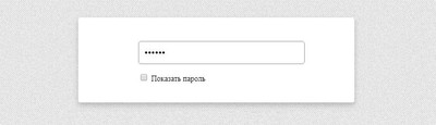
Показать или скрыть пароль при помощи JQuery
Произвести показа пароля с помощью чекбоксу
Здесь идет стандартная форма, только функция находится за рамкой.
.konid-nusial <
width: 295px;
margin: 0 auto;
padding: 14px;
>
#vekodnaya-prokhodna <
width: 100%;
padding: 6px 0;
height: 28px;
line-height: 40px;
text-indent: 5px;
margin: 0 0 12px 0;
border-radius: 3px;
border: 1px solid #888383;
font-size: 18px;
>
$(‘body’).on(‘click’, ‘.apavolku-galocksed’, function() <
if ($(this).is(‘:checked’)) <
$(‘#vekodnaya-prokhodna’).attr(‘type’, ‘text’);
> else <
$(‘#vekodnaya-prokhodna’).attr(‘type’, ‘password’);
>
>);
Это касается только того пользователя, который регистрируется на сайте или уже был ранее зарегистрирован и хочет зайти под своим логином, где прописывает пароль, и автоматически проверяет его, это правильно он написал или нет. Так как некоторые изначально не правильно напишут, что их перекидывает, где они снова все заполняют.
Произвести показ пароля по клику иконке

.kedsanud <
width: 298px;
margin: 15px auto;
position: relative;
>
#kapavolsu-salockedun <
width: 100%;
padding: 5px 0;
height: 30px;
line-height: 40px;
text-indent: 10px;
margin: 0 0 15px 0;
border-radius: 5px;
border: 1px solid #999;
font-size: 18px;
>
.kodnaya-prokhod <
position: absolute;
top: 11px;
right: 6px;
display: inline-block;
width: 20px;
height: 20px;
background: url(http://zornet.ru/ZORNET-RU/ZR/Alinuversa/amipsakilad/pekugedsan.svg) 0 0 no-repeat;
>
.password-control.view <
background: url(http://zornet.ru/ZORNET-RU/ZR/Alinuversa/amipsakilad/dsamudulas.svg) 0 0 no-repeat;
>
$(‘body’).on(‘click’, ‘.kodnaya-prokhod’, function() <
if ($(‘#kapavolsu-salockedun’).attr(‘type’) == ‘password’) <
$(this).addClass(‘view’);
$(‘#kapavolsu-salockedun’).attr(‘type’, ‘text’);
> else <
$(this).removeClass(‘view’);
$(‘#kapavolsu-salockedun’).attr(‘type’, ‘password’);
>
return false;
>);
Здесь также нужно выставить библиотеку, которую можно взять в начале статьи, ведь она идет и на этот вариант.
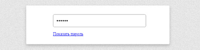
Показать пароль по ссылке
.amilopad <
width: 297px;
margin: 0 auto;
padding: 15px;
>
#pesacu-gdsaned <
width: 100%;
padding: 6px 0;
height: 28px;
line-height: 40px;
text-indent: 5px;
margin: 0 0 12px 0;
border-radius: 3px;
border: 1px solid #888383;
font-size: 18px;
>
$(‘body’).on(‘click’, ‘.ksadevu-kilasuda’, function() <
if ($(‘#pesacu-gdsaned’).attr(‘type’) == ‘password’) <
$(this).html(‘Скрыть пароль’);
$(‘#pesacu-gdsaned’).attr(‘type’, ‘text’);
> else <
$(this).html(‘Показать пароль’);
$(‘#pesacu-gdsaned’).attr(‘type’, ‘password’);
>
return false;
>);
Где уже сам веб разработчик уже самостоятельно может выставить шрифт под функцию открытия. Где аналогично в начале статьй указана библиотека, она также участвует при установке, а вот следующий вариант идет без библиотек.
Показать пароль без jQuery

.udasamnelab <
width: 320px;
margin: 15px auto;
position: relative;
>
#usedabun-kasdenum <
width: 100%;
padding: 6px 0;
height: 28px;
line-height: 40px;
text-indent: 5px;
margin: 0 0 12px 0;
border-radius: 3px;
border: 1px solid #888383;
font-size: 18px;
>
.podsanu-gesamilod <
position: absolute;
top: 11px;
right: 6px;
display: inline-block;
width: 20px;
height: 20px;
background: url(http://zornet.ru/ZORNET-RU/ZR/Alinuversa/amipsakilad/dsareqab.svg) 0 0 no-repeat;
>
.podsanu-gesamilod.view <
background: url(http://zornet.ru/ZORNET-RU/ZR/Alinuversa/amipsakilad/loxanetased.svg) 0 0 no-repeat;
>
function show_hide_password(target) <
var input = document.getElementById(‘usedabun-kasdenum’);
if (input.getAttribute(‘type’) == ‘password’) <
target.classList.add(‘view’);
input.setAttribute(‘type’, ‘text’);
> else <
target.classList.remove(‘view’);
input.setAttribute(‘type’, ‘password’);
>
return false;
>
Это один из всех вариантов, где не нужно подключать библиотеку, так как все корректно работает без нее, Но и по дизайну несколько слов, что здесь он по сути не нужен, так как такие формы в основной своей стилистике всегда представлены в стандартном виде.