Making Charts with CSS
There are many ways to make visual representations of data: bar charts, line graphs, scatter diagrams, sparklines… not to mention the many ways in which you can implement them on the web. In this post I’ll be looking at plain CSS methods for styling data. But before we take a look at some examples, I think it’s worth briefly going over our design goals first.
Guidelines for Chart Making
- Accessibility: everyone should be able to view some format of the data we present, even if it’s a boring table (boring is better than nothing).
- Ease of development: graph-making shouldn’t be unnecessarily complex, and we’ll certainly want to avoid technical debt for the future.
- Performance: we need to make sure that users don’t spend a lot of time waiting for assets to download or for elements to be painted to the screen.
These goals are likely to change depending on the type of chart that make, as performance is going to be less of a concern for a static bar chart than a crazy interactive map. With these guidelines in mind, let’s look at a few examples.
There are a couple of ways to make a simple bar chart in CSS. For starters we’ll use a definition list for our data:
- A title of the graph
- Data 1: 20%
- Data 2: 50%
- Data 3: 30%
We’ll absolutely position the text content of each dd to the left with that span.
To make the “bars” that visually represent the data, we’ll use pseudo elements. To do that we could update the markup with classes like .percentage-20 , and set a width on its pseudo element:
.percentage:after < content: ""; display: block; background-color: #3d9970; >.percentage-20:after < width: 20%; >.percentage-30:after
But we don’t want to have to write out every single one of these classes by hand because the data is likely to change in the future. We could write a Sass loop to make all those classes for us:
@for $i from 1 through 100 < .percentage-#:after < $value: ($i * 1%); width: $value; >>That’s a little icky as it’ll create a whole bunch of classes that we probably won’t be using in the final implementation, but there are lots of tools to tidy this up for us in production.
Next, we can add those classes we’ve automatically generated to each .percentage element, like so:
- A title of the graph
- IE 11: 7%
- Chrome: 20%
- Android 4.4: 2%
Finally we can add rules to the background of each .percentage element to aid legibility in comparing these values with a repeating-linear-gradient :
This technique is relatively simple, but I can’t help but think that this information should always be set in a table by default. Although I’m a little wary of styling tables in this way, that certainly doesn’t mean it’s impossible. For instance, Eric Meyer wrote about this technique and described how to position finicky table elements to behave like a bar chart. This is his original markup for the table:
Quarterly Results Invoiced Collected Q1 $18,450.00
$16,500.00
Q2 $34,340.72
$32,340.72
Q3 $43,145.52
$32,225.52
Q4 $18,415.96
$32,425.00
Unlike the example I used earlier, where I implemented a number of automatically generated helper classes in Sass to define the width of the bar charts, Eric used inline styles on the td element with those values being calculated server side or with JavaScript, rather than added by hand.
The example below is my copy of Eric’s original example where I’ve updated the styling a little bit:
I really like that each row in the table has a header such as Q1, Q2, etc. — that feels really neat and tidy rather than depending on a definition list to describe the content. They’re easy to position and will fall back nicely to a standard table if the CSS fails to load for whatever reason.
However, one of the problems with this approach is that it requires absolutely positioning each table row side by side, which means that if we want to add more data then we’ll need to do a lot more work than simply updating the markup. This means it could be a pain to work with in the future.
We don’t always have to use table s when representing information like this. That’s probably the case when we make a series of sparklines, tiny graphs that sit next to a line of text and help readers get a quick overview of the information. Wilson Miner outlined this method and made sure to focus on the accessibility of the information beforehand:
I’ve updated the original markup from what Wilson used since to me this feels like it should fit into a figure , as the docs on MDN state that:
Usually [a figure]… is an image, an illustration, a diagram, a code snippet, or a schema that is referenced in the main text, but that can be moved to another page or to an appendix without affecting the main flow.
That makes a lot more sense to me than a plain ul element. But anyway, here’s what that looks like without any CSS:
Very accessible! Next up we can add styles to that sparkline element and position it to the right of the link with inline-block. And again, we could use that Sass class generator we used earlier to set the height of each bar. But, let’s keep those styles inline just for now:
Make sure to hover over each entry in the list to see an expanded version of the diagram that I’ve added. Although it’s not particularly helpful in terms of breaking down the data, it shows that we aren’t stuck with charts in one single representation; manipulating these visualisations with such ease is a great advantage when using simple markup and CSS.
Lea Verou recently wrote a great piece about making pie charts. One possibility she suggests is using pseudo elements that cover a circle and nudging them around with transform: rotate() .
Another possibility is SVG, which has a number of advantages, some of which we’ll list in the next section.
If browsers supported conic-gradient() , that would be a very compelling way to create them. They don’t quite yet, but Lea has a polyfill for it that works wonderfully. Here’s a pie chart demo using it that we made for one of the last polls we did here on CSS-Tricks:
Problems with making charts with CSS
- If you’re using background to style an element then it (probably) won’t be visible if the web page is printed. The only exception is if you use -webkit-print-color-adjust: exact; in a WebKit browser.
- Finicky control over design: absolutely positioning table rows, for instance, is likely to be pain for developers at some point in the future.
- Browser support is a laborious process in some instances, and ensuring that all devices support every CSS property might be difficult to test.
- It’s not possible to use inline styles on pseudo elements, so if you want to style a pseudo element with JavaScript then this makes things a bit more complicated.
- It’s possible to do anything with CSS, but when we’re making pure CSS line graphs we should probably take a little while to reconsider the implications that this might have on the rest of the codebase.
Plain CSS and markup solutions for charts and graphs work to a certain extent, and in many situations they’re probably the safest bet. But I think it’s worth exploring alternative solutions to representing data.
In the next post in this series I’ll be looking at SVG and JavaScript solutions to making charts.
How to Create a Pie Chart Using Only CSS

Temani Afif
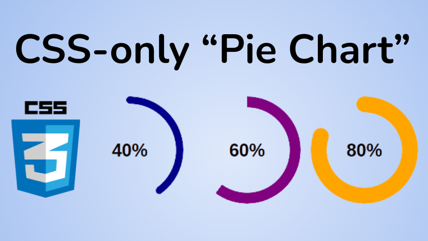
Pie charts are common components that let you show portions of a whole, and you can use them for many different purposes.
You will find a lot of articles around building such a component, but they typically either rely on SVG or a lot of HTML elements.
In this post, I will show you how to create a pie chart using CSS and only one element.
Below is an overview of what we are building:
Click to see the full code
@property --p< syntax: ''; inherits: true; initial-value: 1; > .pie < --p:20; --b:22px; --c:darkred; --w:150px; width: var(--w); aspect-ratio: 1; position: relative; display: inline-grid; margin: 5px; place-content: center; font-size: 25px; font-weight: bold; font-family: sans-serif; >.pie:before, .pie:after < content: ""; position: absolute; border-radius: 50%; >.pie:before < inset: 0; background: radial-gradient(farthest-side,var(--c) 98%,#0000) top/var(--b) var(--b) no-repeat, conic-gradient(var(--c) calc(var(--p)*1%),#0000 0); -webkit-mask: radial-gradient(farthest-side,#0000 calc(99% - var(--b)),#000 calc(100% - var(--b))); mask: radial-gradient(farthest-side,#0000 calc(99% - var(--b)),#000 calc(100% - var(--b))); >.pie:after < inset: calc(50% - var(--b)/2); background: var(--c); transform: rotate(calc(var(--p)*3.6deg)) translateY(calc(50% - var(--w)/2)); >.animate < animation: p 1s .5s both; >.no-round:before < background-size: 0 0, auto; >.no-round:after < content: none; >@keyframes p < from> 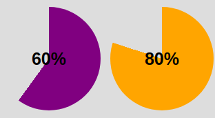
We are getting closer! The conic-gradient() is giving us a two-color gradient. From 0% to p% the main color and the remaining part is a transparent color (defined with the hexadecimal value #0000 ).
To keep only the border part we will use a mask to hide the middle part. We will use a radial-gradient() this time:
radial-gradient(farthest-side,red calc(99% - var(--b)),blue calc(100% - var(--b)))The above applied as a background will give us the following:
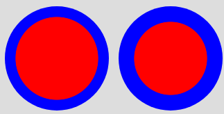
Note the use of the variable —b that defines the thickness of the border (shown as blue in the above).
Now imagine the red part being the invisible part and the blue part the visible one. This is what we will get if we use the same gradient with the mask property:

We have our pie chart with one element and a few lines of CSS code.
How to add the the rounded edges
For this I will add an extra gradient layer to round the top edge and a pseudo element to round the other edge. Here is an illustration to understand the trick:
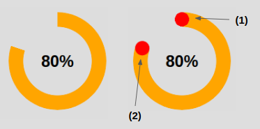
The code for (1) to round the top edge:
In addition to the conic-gradient() we add a radial-gradient() placed at the top that has a size equal to the border thickness defined by —b .
The code for (2) to round the other edge:
The inset property is setting the size of the pseudo-element to be equal to —b . Remember that it’s the shorthand for top , right , bottom and left . If we have
this means that from each side we are moving to the center minus an offset equal to b/2 – so we end up having a width equal to 2*b/2 = b . Same logic for the height.
Now we need to correctly place our element, which is why we use the transform property. Our element is initially placed at the center so we need to first rotate it. Having the percentage we use the «Rule of three» to get the angle:
angle = percentage*360deg/100Then we do a translation, and here we will need the width because we have to perform a translation by half the width ( w/2 ).
Ok, ok – you might be a bit lost within all these formulas. Find below an illustration to understand the logic behind the transform property

After that, we color the pseudo-element with the main color —c and we are done. We have our pie chart with rounded edges.
How to Animate the Pie Chart
A static pie chart is good but an animated one is better! To do this we will animate the percentage value —p from 0 to the defined value. By default, we cannot animate CSS variables, but thanks to the new @property feature it’s now possible.
@property --p< syntax: ''; inherits: true; initial-value: 0; >Note that we only need to specify the from . Doing this, the browser will make the to equal, by default, to the value we defined (
).
And finally, we call the animation. You can define the duration/delay as you want.
Unfortunately, this technique is not widely supported. You can test it on Chromium-based browsers (Chrome and Edge) but it will fail on Firefox and Safari. You can check out Can I Use to keep track of the support.
Before we end, here again is the full code and a demo of the final working product. You can see that I am using two classes to control the rounded edges and the animation so we can easily add/remove them as needed.
Click to see the full code
@property --p< syntax: ''; inherits: true; initial-value: 1; > .pie < --p:20; --b:22px; --c:darkred; --w:150px; width: var(--w); aspect-ratio: 1; position: relative; display: inline-grid; margin: 5px; place-content: center; font-size: 25px; font-weight: bold; font-family: sans-serif; >.pie:before, .pie:after < content: ""; position: absolute; border-radius: 50%; >.pie:before < inset: 0; background: radial-gradient(farthest-side,var(--c) 98%,#0000) top/var(--b) var(--b) no-repeat, conic-gradient(var(--c) calc(var(--p)*1%),#0000 0); -webkit-mask: radial-gradient(farthest-side,#0000 calc(99% - var(--b)),#000 calc(100% - var(--b))); mask: radial-gradient(farthest-side,#0000 calc(99% - var(--b)),#000 calc(100% - var(--b))); >.pie:after < inset: calc(50% - var(--b)/2); background: var(--c); transform: rotate(calc(var(--p)*3.6deg)) translateY(calc(50% - var(--w)/2)); >.animate < animation: p 1s .5s both; >.no-round:before < background-size: 0 0, auto; >.no-round:after < content: none; >@keyframes p < from> For more CSS tips, follow me on Twitter.
Want to support me? You can buy me a coffee