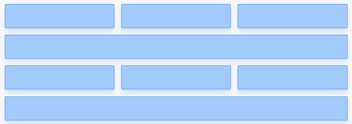
Here’s the challenge: if you want to create a flexbox layout with several rows of items, how do you control which item ends up in which row? Presume you want to create a layout that looks something like this, with three stacked items and alternating full-width items:
A common way of controlling the positioning and size of flex items is to use width or flex-basis ; if we set the fourth item to have a width of 100% it’ll be positioned on its own row. But what if we don’t want to or can’t set the width of individual items, do we really need to? Or is there a way of just telling flexbox to line break at certain points?
There’s no property that we can set on a flex item to make it break to a new row, but we can insert a collapsed row (you can think of it as a ) between two flex items two achieve something similar. In a gist:
/* Inserting this collapsed row between two flex items will make * the flex item that comes after it break to a new row */.breakflex-basis:100%;height:0;>
class="container">class="item">
class="break">
class="item">
Let’s walk through some scenarios when you might want to use this, and look at some interesting layout techniques that it enables us to use.
Note that all of the code examples below requires and assumes that you have a flex container with display: flex and flex-wrap: wrap and that the flex items are added to that container:
.containerdisplay:flex;flex-wrap:wrap;>
class="container">class="item">
class="item">
class="item"> .
Inserting a line-breaking flex item
Using an element to break to a new flex row comes with an interesting effect: we can skip specifying the width of any item in our flex layout and rely completely on the line breaks to define the flow of our grid.
Let’s start with a simple example. Say that we have two items shown side by side (these are set to grow with flex-grow: 1 , and they have no defined width or flex-basis ):
We can insert a line breaking element between the items to make them both take up 100% of the available space:
class="item">.class="break">class="item">.
This produces a layout with two vertically stacked full-width items (I’ve added a border to the .break element to illustrate its position and behavior):
How does this work? Since we’ve said that .break should take up 100% of the width of the container (because we set flex-basis: 100% ), the breaking flex item needs to sit on its own row to accomplish that. It can’t share a row with the first item so it will break to a new row, which will leave the first item alone on one row. The first item will then grow to fill the remaining space (since we set flex-grow: 1 ). The same logic applies to the second item.
We can use this technique to compose the layout at the top of the post by breaking before and after every fourth item:
This will produce the layout at the top of the blog post. Essentially an item won’t break to a new row unless we insert the line-breaking element:
Again, we didn’t need to specify the width on any of those items. The same technique will work for columns if we have a flex container with flex-direction: column , and set the width (rather than height ) to 0 for our breaking element:
/* Use a collapsed column to break to a new column */.break-columnflex-basis:100%;width:0;>
This approach of using line breaking elements to define a layout definitely adds some bloat and noise to our HTML, but it can be a powerful tool when used in the right way. We can, for example, use it to build a masonry layout with CSS only, and position the breaks dynamically with the order property. We can also break to a new row without having to modify the width of any content item, and we can rely solely on flex-grow to distribute space in a grid layout.
Suppose that we’re looking to create this layout:
And assume that we want to do so by setting different values of flex-grow to distribute the space (rather than using flex-basis or width , which you’d have to recalculate as soon as you added or removed items):
.itemflex-grow:1;>.item-wideflex-grow:3;>
class="item">class="item-wide">class="item">
If we then want to add another row of items below that row:
We wouldn’t be able to do so without resorting to setting flex-basis or width on at least some of the items (or creating a nested flexbox layout with one flex item for every row). If all of the items just have different values of flex-grow nothing would make them break to a new row, they’d all just squeeze in on one row together:
Cozy, but not what we’re after. If we insert a breaking element, however, we can construct this layout by distributing all space with flex-grow :
Yielding the desired layout, with all sizes defined proportionally through flex-grow :
And if there’s a scenario when we need five items in the first row we don’t have to change any of the CSS to make that work, we can just add those items before the line break:
All that you need to add to your CSS to use line-breaking elements are these two classes (the only difference between the two classes is that width (and not height ) needs to be set to 0 for the element to collapse when used in a column layout):
/* Inserting a collapsed row between two flex items will make * the flex item that comes after it break to a new row */.breakflex-basis:100%;height:0;>/* Use a collapsed column to break to a new column */.break-columnflex-basis:100%;width:0;>
You could certainly achieve the same effect or similar effects by nesting flexboxes and having one flex item for every row, and in many cases just utilizing flex-basis , width , or the content within the flex items is probably the preferred way of controlling the flow of items in a flexbox layout. But inserting line-breaking flex items is approachable and easy to grok, it works, and the technique comes with some unique characteristics that may come in handy.
Предположим, вы хотите создать макет, который выглядит примерно так, с чередующимися строками из трех элементов и одним элементом на всю ширину:
Распространенным способом управления позиционированием и размером flex-элементов является использование width или flex-basic; если мы установим для четвертого элемента width 100%, он будет расположен в отдельной строке. Но что, если мы не хотим или не можем установить ширину отдельных элементов? Или есть ли способ просто указать flexbox разрыв строки в определенных точках?
Нет никакого свойства, которое мы могли бы установить для flex, чтобы оно переносило элементы на новую строку, но мы можем вставить перенос строки (вы можете представить это, как br) между двумя flex-элементами для достижения чего-то похожего:
Курс «Frontend-разработчик»
— Научитесь верстать сайты для всех типов устройств.
— Сможете использовать JavaScript для работы в браузере.
— 77 часов теории, 346 часов практики.
— Выполните 5 масштабных проектов для портфолио.
— Помощь с поиском работы или стажировки.
Курс «веб-разработчик с нуля»
— Научитесь программировать на JavaScript и PHP.
— Сможете создавать сайты и веб-приложения.
— Сможете уверенно работать и с фронтендом, и с бэкендом веб-сервисов.
— Выполните 9 масштабных проектов для портфолио
— Помощь с поиском работы или стажировки.
Курс «PHP-разработчик с нуля»
— Научитесь создавать сайты и веб-приложения на языке PHP.
— Изучите актуальные фреймворки Laravel, Simfony и Yii2.
— 78 часов теории и 361 час практики.
— Вы создадите 5 масштабных проектов для портфолио.
Позволяем флекс-элементам переноситься на новые строки.
Время чтения: меньше 5 мин
Кратко
Скопировать ссылку «Кратко» Скопировано
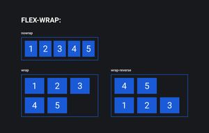
Флекс-элементы по умолчанию стараются уместиться в один ряд, даже если размер им не позволяет.
Чтобы изменить это поведение, свойству flex — wrap нужно задать значение, отличное от nowrap .
Пример
Скопировать ссылку «Пример» Скопировано
Флекс-элементы, вложенные во флекс-контейнер с классом .container , не будут переноситься в новый ряд ни при каких обстоятельствах. Всегда будут стоять в один.
Внутри флекс-контейнера элементы располагаются вдоль основной оси. Стандартным поведением считается расположение элементов в один ряд.
Если вы позволяете элементам переноситься на новый ряд, изменив значение свойства flex — wrap , то для каждой строки будут созданы дополнительные основные оси. Каждый ряд будет вести себя как отдельный флекс-контейнер, но с общим управлением.
Как пишется
Скопировать ссылку «Как пишется» Скопировано
По умолчанию значение у свойства flex — wrap — nowrap . При этом флекс-элементы помещаются (или пытаются уместиться) в один ряд и не переносятся на новую строку, даже если не влезают в размеры родителя.
Установив значение wrap , мы можем изменить это поведение, и флекс-элементы будут иметь возможность перенестись в новый ряд, если не влезают в одну линию в рамках родителя.
Ещё одно возможное значение — wrap — reverse . В этом случае элементы будут располагаться снизу вверх, заполнив собой сперва нижний ряд, а те, что не влезли, перепрыгнут в ряд выше.
Подсказки
Скопировать ссылку «Подсказки» Скопировано
💡 Ситуация, когда сумма размеров элементов превышает размер родителя, называется переполнение контейнера. Именно это произойдёт, если вы не разрешите флекс-элементам переноситься на новый ряд.
Полный список свойств флексбоксов можно посмотреть в гайде по flexbox.