- Maintaining an alternating pattern across a responsive grid
- :nth-child()
- Grid-column
- Grid-auto-flow
- Putting it all together
- The finished pattern
- Example for alternating pattern
- Example for cycle of 3
- CSS + Media queries
- Is it accessible?
- Conclusion.
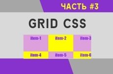
- CSS Grid. Практические примеры #3
- Фокусы с grid-row
- Выравнивание элементов по горизонтали
- Элементы выровнены по центру
- Элементы выровнены по левому краю
- Элементы выровнены по правому краю
- Выравнивание элементов по вертикали
- Комментарии ( 0 ):
Maintaining an alternating pattern across a responsive grid
I get dangerously intrigued by problems that seem potentially impossible where CSS is concerned, but completely reasonable from a visual design point of view. Here’s one that cropped up yesterday: a responsive gallery where the pictures alternate dark-themed and light-themed (could also be B&W/color, red-themed/green-themed, photo/drawing or any alternating stylistic property). In the markup the images alternate. It even looks totally great on its own when there are an odd number of pictures per row. But when there are an even number of itemsPerRow , we get vertical bands because each row starts with a ‘light’ picture. What we want, though, is for the diagonal tiling effect to be maintained across every breakpoint. Something like (3 mb gif alert 🚨):
In a nutshell 🥜: The last item in row 1 needs to stylistically match the first item in row 2, but only when there are an even number of items per row.
TLDR for the designers: If your front-end dev said this is impossible, they were wrong 😱! (if you don’t need to support IE 😉)
I’ll explain each of these and then illustrate how to apply them to our situation. Or just jump to the ‘solution’ and read the code directly.
:nth-child()
The nth-child selector is an important one. It’s very powerful, but sometimes a bit difficult to figure out when using it beyond its basic functionality of odd / even / 4
:nth-child() also accepts an equation, which will be very useful for manipulating a series of data of an unknown length, which is exactly what we need to do here. If you already know how this one works, feel free to skip this section!
That would result in selecting the following children:
In case your linear algebra is rusty, there’s a pretty straightforward way to apply this.
Given our specific problem, we need to select every x th item, starting with the y th. More englishy, we want to select «the first item of alternating rows of 4». Diving a little deeper, we want to ignore the first row, and start with the 5th item overall ( y / firstItem ). After that we want to select every 8th item after that (to continue selecting the first column of every other row—( x / itemsPerRow * 2 ) ). That looks like:
// This is not real javascript! 😉 let y=5 let x=8 equation = (x*n)+y selector = `8n + 5` // or let itemsPerRow = 4 let firstItem = itemsPerRow + 1 // 5 equation = (itemsPerRow * 2)n + firstItem selector = `8n + 5` That wasn’t real javascript, just an attempt to illustrate the maths going on here. That same equation will allow us to modify any grid, as we’ll see later.
Grid-column
Grid-column is a property that can be assigned to a specific grid-item in order to move it to a different place than where it normally would fall. So if I have something like grid-template-columns: repeat(4, auto) (which places my grid items in rows of 4), I can use grid-column to move a particular item (chosen by nth-child) to a different position.
.grid-item /* put the item in the second column */ grid-column: 2; /* put the item in the last column */ grid-column: -1; /* make the item span between column 2 and column 4 */ grid-column: 2/4; > Grid-auto-flow
This is the one that makes this even possible. Without it all would be lost (at least until grid-auto-flow: 🐍 is supported 😉).
Normally, when you reposition a grid item, it repositions every following item with it, leaving a gap. If you want to change the order of just the one particular item when using grid-column , the dense keyword takes the other items and moves them up to fill the spaces. It’s a little like position: absolute or a float, except the targeted items still take up space. Whoa.
Grid-auto-flow does other stuff, too, but dense is what we came here for.
Putting it all together
So putting these rules together you get something that looks like this:
.grid grid-template-columns: repeat(4, auto); grid-auto-flow: dense; > /* 4 itemsPerRow, every other row(4*2), starting with the 5th: 8n+5 */ img:nth-child(8n+5) grid-column: 4; > 
The finished pattern
To apply this in the real world, we have to set up the correct repositioning rules for just the breakpoints where they’re necessary. Here’s some example codepens that use a data attribute instead of a media query to make playing with the results a little nicer.
Example for alternating pattern
Example for cycle of 3
You can also use the same strategy to make a repeating pattern of 3 style types always look aesthetically pleasing no matter the number of items per row.
It gets a little more complicated, but it also provides an example of needing to reposition 2 items per row (row of 6 and a cycle of 3 styles).
CSS + Media queries
For it to work like we actually want it to, via media queries, you would need something like this (example below is for a cycle of 2 and a grid up to 4 per row:
.photo-grid display: grid; grid-auto-flow: dense; > .photo-grid img width: 100%; > /* I don't like min AND max queries (mobile first!), but it makes perfect sense here because we're doing some specific things to the image that we don't want to apply to the 900px breakpoint. */ @media screen and (min-width: 600px) and (max-width: 899px) .photo-grid grid-template-columns: repeat(2, auto); > .photo-grid img:nth-child(4n + 3) grid-column: 2; > > @media screen and (min-width: 900px) .photo-grid grid-template-columns: repeat(3, auto); > > @media screen and (min-width: 1200px) .photo-grid grid-template-columns: repeat(4, auto); > .photo-grid img:nth-child(8n + 5) grid-column: 4; > > Is it accessible?
This is a question you should always be asking when stumbling across a wacky CSS or JS technique on the internet, and I am thrilled if you’re looking at all this thinking «While this is theoretically useful in very specific and uncommon situations, I worry that it isn’t fully accessible!»
Indeed! It’s important for screen-readers to be able to make sense of a site, and messing with the order of elements visually vs in source can be problematic — 2.4.3: focus order and 1.3.2: meaningful sequence.
If you are ordering your content visually, the order probably isn’t inherently important to reading the content of the page, so this should not be an issue! But do keep in mind, if source order is important (i.e. you are explicitly sorting content in a specific order (alphabetically, new→old), or intentionally presenting it in a narrative order) then the visual order and the mark-up order need to be maintained.
Conclusion.
I would love to be able to do this in a breakpoint-free way using, say, repeat(auto-fill, minmax(300px, 1fr) ) and a mythical grid-auto-flow: snake/alternating-rows to essentially eliminate all the weird math. But in the meantime this was the best I could come up with 😅!
Let me know in the comments if you have a cleaner approach to this or a similar problem!
CSS Grid. Практические примеры #3
В CSS Grid предусмотрена возможность изменять позицию каждого элемента на линии, обращаясь к нему через CSS свойства. Чтобы обратится к первому элементу в сетке, обратимся к нему через псевдокласс nth-child(1).
.container display: grid;
grid-template-columns: repeat(4, 1fr);
grid-template-rows: repeat(3, 100px);
grid-gap: 10px;
>
Зададим первому элементу вторую позицию. В результате первый элемент занял место второго элемента, а последний элемент перескочил на новый ряд.
.item:nth-child(1) grid-column-start: 2;
>

Если мы хотим, чтобы первый элемент занял весь ряд, то добавим еще одно свойство grid-column-end. Важно понимать, что значения 1 и 5, не номера ячеек. Это номера линий (Grid Line). У данной сетки 2 горизонтальные линии и 5 вертикальных.
.item:nth-child(1) grid-column-start: 1;
grid-column-end: 5;
>
//сокращенный вариант: номера стартовой и конечной позиций
grid-column: 1 / 5;
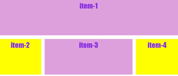
Далее определим позицию третьего элемента не только по колонкам, но и по рядам.
.item:nth-child(3) grid-column: 2 / 4;
grid-row: 2; >
Третий элемент стал занимать две фракции по горизонтали со второй по четвертую позиции и закрепился во втором ряду.
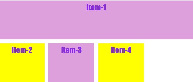
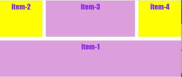
Фокусы с grid-row
Представьте себе первый элемент — это баннер на всю ширину браузера и вы хотите баннер (item-1) поменять местами с соседними элементами (item-2, item-3, item-4). Сделать это невероятно легко, указав первому элементу второй ряд, а второму и третьему элементам, наоборот первый ряд.
.item:nth-child(1) grid-column: 1 / -1;
grid-row: 2;
>
.item:nth-child(2) grid-column: 1;
grid-row: 1;
>
.item:nth-child(3) grid-column: 2 / 4;
grid-row: 1;
>
Теперь баннер поменялся местами с соседними элементами, без вмешательства в HTML-разметку. Ничего подобного до появления Grid CSS, было сделать невозможно.
Выравнивание элементов по горизонтали
Выравнивание элементову у гридов происходит с таким же набором свойств, как и у флексбоксов. Для выравнивания сразу всех элементов, свойства задаются контейнеру.
justify-items: start; — элементы прижимаются к левому краю
justify-items: center; — элементы выравниваются по центру
justify-items: end; — элементы прижимаются к правому краю
justify-items: stretch; — элементы растягиваются на всю ширину экрана
Все элементы в контейнере по умолчанию растягиваются на всю ширину экрана (stretch), но если мы хотим изменить такой порядок вещей, то в нашем распоряжении есть три значения у свойства justify-items.
Элементы выровнены по центру
.container <
display: grid;
grid-template-columns: 1fr 2fr 1fr;
grid-template-rows: minmax(120px, auto);
grid-gap: 10px;
justify-items: center;
>
Элементы выровнены по левому краю
Элементы выровнены по правому краю

Выравнивание элементов по вертикали
Свойство align-items выравнивает элементы в контейнере по вертикали и обладает тем же набором значений, как и у предыдущего свойства.
align-items: start; — элементы прижимаются к верхнему краю
align-items: center; — элементы выравниваются по центру
align-items: end; — элементы прижимаются к нижнему краю
align-items: stretch; — элементы растягиваются
.container .
align-items: center;
>

Создано 05.03.2021 10:20:23
Копирование материалов разрешается только с указанием автора (Михаил Русаков) и индексируемой прямой ссылкой на сайт (http://myrusakov.ru)!
Добавляйтесь ко мне в друзья ВКонтакте: http://vk.com/myrusakov.
Если Вы хотите дать оценку мне и моей работе, то напишите её в моей группе: http://vk.com/rusakovmy.
Если Вы не хотите пропустить новые материалы на сайте,
то Вы можете подписаться на обновления: Подписаться на обновления
Если у Вас остались какие-либо вопросы, либо у Вас есть желание высказаться по поводу этой статьи, то Вы можете оставить свой комментарий внизу страницы.
Порекомендуйте эту статью друзьям:
Если Вам понравился сайт, то разместите ссылку на него (у себя на сайте, на форуме, в контакте):
- Кнопка:
Она выглядит вот так: - Текстовая ссылка:
Она выглядит вот так: Как создать свой сайт - BB-код ссылки для форумов (например, можете поставить её в подписи):
Комментарии ( 0 ):
Для добавления комментариев надо войти в систему.
Если Вы ещё не зарегистрированы на сайте, то сначала зарегистрируйтесь.
Copyright © 2010-2023 Русаков Михаил Юрьевич. Все права защищены.