line-break
The CSS line-break property defines how strictly to enforce rules for wrapping text wrapping on new lines, particularly when working with symbols and punctuations in Chinese, Japanese or Korean (CJK) writing systems. It is included in the CSS Text Module Level 3 specification, which is currently in Editor’s Draft.
line-break: auto | loose | normal | strict | anywhere;/* Keyword values */ line-break: auto; line-break: loose; line-break: normal; line-break: strict; line-break: anywhere; /* Global values */ line-break: inherit; line-break: initial; line-break: unset;- auto : This lets the browser decide how it implements line breaks. Each browser may differ on its criteria based on factors, including line length.
- loose : This is the lightest enforcement of line breaking rules. The spec cites short lines of text, like ones we might see in a newspaper, as an example where this value might be used.
- normal : This breaks lines of text based on the “most common” set of rules. (Note that there is no definition provided about what the most common set of rules is or what it might contain.)
- strict : This enforces the strictest set of rules for line breaks.
- anywhere : This value enables soft wrap opportunities, which allow text to break at spaces or punctuation instead of the word boundary alone. It’s ideal for languages that might not use spaces or punctuation to separate words. The spec says that CSS does not define soft wrap opportunities, and this value recognizes and leverages them to apply line breaking rules. The spec describes the text wrapping behavior like what we typically see in a terminal.
The spec also notes that the anywhere value allows preserved white spaces at the end of a line to wrap to the next line when used with the white-space property set to break-spaces .
Value behavior across different languages
As you might imagine, different languages have different preferences when it comes to how text is broken onto new lines. There is no standardized convention used by all languages. That leaves it up to browsers to figure out and follow the “correct” rules for a particular language. But the specification does outline several requirements for determining whether line breaking is allowed at the different levels of line-break strictness in certain situations. We’ll present those here.
| Situation | normal | loose | strict |
|---|---|---|---|
| Breaks before Japanese small kana or the Katakana-Hiragana prolonged sound mark, i.e. character from the Unicode line breaking class CJ | ❌ | ✅ | ✅ |
| Breaks before certain CJK hyphen-like characters: 〜 U+301C, ゠ U+30A0 | ❌ | ✅ if the writing system is Chinese or Japanese | Allowed, if the writing system is Chinese or Japanese |
| Breaks before certain CJK hyphen-like characters: 〜 U+301C, ゠ U+30A0 | ❌ | ✅ if the preceding character belongs to the Unicode line breaking class ID (including when the preceding character is treated as ID due to word-break: break-all) | ❌ |
| Breaks before iteration marks: 々 U+3005, 〻 U+303B, ゝ U+309D, ゞ U+309E, ヽ U+30FD, ヾ U+30FE | ❌ | ✅ | ❌ |
| Breaks between inseparable characters (such as ‥ U+2025, … U+2026) i.e. characters from the Unicode line breaking class IN | ❌ | ✅ | ❌ |
| Breaks before certain centered punctuation marks: ・ U+30FB, : U+FF1A, ; U+FF1B, ・ U+FF65, ‼ U+203C, ⁇ U+2047, ⁈ U+2048, ⁉ U+2049, ! U+FF01, ? U+FF1F | ❌ | ✅ | ❌ |
| Breaks before suffixes: Characters with the Unicode line breaking class PO and the East Asian Width property Ambiguous , Fullwidth , or Wide . | ❌ | ✅ | ❌ |
| Breaks after prefixes: Characters with the Unicode line breaking class PR and the East Asian Width property Ambiguous , Fullwidth , or Wide . | ❌ | ✅ | ❌ |
| IE | Edge | Firefox | Chrome | Safari | Opera |
|---|---|---|---|---|---|
| 6+ | 14+ | 69+ | All | All | 15+ |
| Android Chrome | Android Firefox | Android Browser | iOS Safari | Opera Mobile |
|---|---|---|---|---|
| 85+ | No | 81+ | All | 59+ |
Source: caniuse
CSS No Line Break
A Cascading Style Sheet (CSS) offers a property to display all the HTML items without any break, or you can say that all the HTML contents are displayed on a single line. HTML and CSS both contribute to accomplishing this phenomenon on the web page. The basic advantage of doing this is that the HTML contents will take less space when they are displayed. It also makes the contents aligned.
There is no any built-in feature in CSS like the other effects, for example the text decoration, list style type, etc. But we need to apply this no-line break effect by using a display property that’s valued as an inline-block property.
To implement the CSS no-line break property effect, you need to know the basics of HTML and CSS. We will use a text editor for the code and a browser to implement the code in the editor. Let us elaborate on the CSS property of inline-block and its effects on the “no line break” phenomenon.
CSS Inline-Block Property
This property is used to display an item in the inline-block container. In this approach, the block of elements is converted into the inline element. By doing this, there is the prevention of the line break. The syntax of the inline-block property is displayed in the following:
We will implement this property in two ways: through the list and the div.
Example 1: No Line Break in Lists
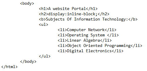
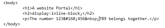
In the first example, we will apply the no-line break concept on the list. A list is an HTML content where the text is represented vertically along with the bullets, either the list is ordered or unordered. When we talk about lists, we always come up with the view of having each item of the list in a separate line with a line break. But sometimes, according to the scenario, we want to display the list items without bullets in a single line. This is done by displaying the list items using the CSS with the “no line break” property. Let us start the HTML code with the body section.
We used two headings of the text through the heading tags – and . After that, the unordered list is created with 5 items in each row.
The same syntax is followed for the 5 items to be entered in each row.
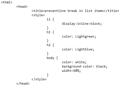
We use the “li” tag directly in the CSS to apply the inline-block effect on all the list items and prevent them from displaying on a separate line. Furthermore, we apply the font color to both headings. This is an additional style and is not mandatory to use.
For the body style, we use the background color and the font color collectively to add a style to the web page to make it aesthetic to the users. Another important feature that is used to apply the display property is to mention the HTML body width to display all the HTML contents in a single line.
Save the code in the text editor file with the html extension to make it an icon of the browser that depicts that it is a web page. Execute it in the browser. The expected web page has a list of all the items in a vertical notation if there is no inline-block property.
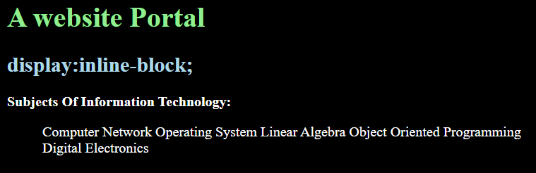
But as a result of this display CSS property, we see that all the items on the list are displayed in a single horizontal line without bullets. It no longer looks like a list. But it looks like a simple paragraph with the default spaces between the words.
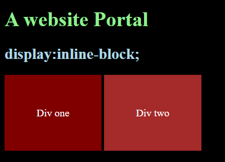
Example 2: No Line Breaks in Div
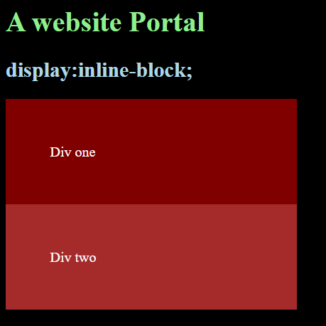
Just like lists, when the list is converted into a paragraph, we are capable of applying the display effect on any other HTML content. So, we have chosen a div. A div is the container that contains the other HTML contents within it. First, consider a simple div tag in which we have not applied any CSS effect of “no line break “. But the div is supplied with its basic stylings like padding and color to display the existence of both divs on the web page.
The same goes for the div two.

Save the code and execute it in the browser. You will see that two divs are displayed vertically with the specifications that we applied as an inline CSS inside the tags. These divs are displayed without any break between them. As seen in the output, both divs are attached.
Whenever a div or a table is used in the HTML, they both lay one after the other in a vertical direction as we represented. This is because HTML generates the auto spacing by following the padding value applied by the user to keep them in a single line. Using the “no line break” phenomenon, we undergo some changes in the code.
First, we apply the display property with the inline-block property to both divs in CSS.

Moreover, we need to reduce the body width of the HTML so that both the divs can adjust to the given size of the body.
Upon execution, you will see that the two divs that we declared used the “no line break” CSS property of display.
Additional Ways:
Some additional information regarding the property of the “no line break” is accompanied through the HTML tags without the use of the CSS tags separately.
One way is to use the string . Using this string in between two strings causes a space by making them stay on the same line instead of using a
tag that leads towards the following line. The and(&) operator is used for binding purposes.
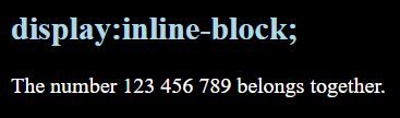
Another way of a gap between two strings is that HTML uses a built-in feature “nbsp” or the “Non-breaking space”. We use the nbsp between two numbers. The results will have a space.
Now, upon execution, you will see the space between these three numbers without using the line break.
Conclusion
The CSS “no line break” article explains the use of the properties of CSS and HTML other than the break effect that is applied through the HTML break tag
. At the start, we gave a simple introduction about HTML and CSS. The property that is responsible mainly for the “no line break” effect is explained as the inline-block display property. We explained the inline-block display usage in the HTML lists and the div containers through examples. Moreover, some additional information regarding this topic is also added.
About the author
Aqsa Yasin
I am a self-motivated information technology professional with a passion for writing. I am a technical writer and love to write for all Linux flavors and Windows.
white-space
The CSS white-space property controls how text is handled on the element it is applied to. Let’s say you have HTML exactly like this:
You’ve styled the div to have a set width of 100px. At a reasonable font size, that’s too much text to fit in 100px . Without doing anything, the default white-space value is normal , and the text will wrap. See the example below or follow along at home with the demo.
 If you want to prevent the text from wrapping, you can apply white-space: nowrap;
  Notice in HTML code example at the top of this article, there are actually two line breaks, one before the line of text and one after, which allow the text to be on its own line (in the code). When the text renders in the browser, those line breaks appear as if they are stripped out. Also stripped out are the extra spaces on the line before the first letter. If we want to force the browser to display those line breaks and extra white space characters we can use white-space: pre;
  It’s called pre because the behavior is that as if you had wrapped the text in tags (which by default handle white space and line breaks that way). White space is honored exactly as it is in the HTML and the text does not wrap until a line break is present in the code. This is particularly useful when literally displaying code, which benefits aesthetically from some formatting (and sometimes is absolutely crucial, as in white-space-dependent languages!) Perhaps you like how pre honors white space and breaks, but you need the text to wrap instead of potentially break out of its parent container. That’s what white-space: pre-wrap; is for:
  Finally, white-space: pre-line; will break lines where they break in code, but extra white space is still stripped.
  Interestingly, the final line break is not honored. As per the CSS 2.1 spec: “Lines are broken at preserved newline characters, and as necessary to fill line boxes.” so perhaps that makes sense. Here is a table to understand the behaviors of all the different values:
| New lines | Spaces and tabs | Text wrapping | |
|---|---|---|---|
| normal | Collapse | Collapse | Wrap |
| pre | Preserve | Preserve | No wrap |
| nowrap | Collapse | Collapse | No wrap |
| pre-wrap | Preserve | Preserve | Wrap |
| pre-line | Preserve | Collapse | Wrap |
In CSS3, the white-space property is literally going to follow that chart and map the properties to text-space-collapse and text-wrap accordingly.
| IE | Edge | Firefox | Chrome | Safari | Opera |
|---|---|---|---|---|---|
| 8+ | All | All | All | All | All |
| Android Chrome | Android Firefox | Android Browser | iOS Safari | Opera Mobile |
|---|---|---|---|---|
| All | All | All | All | All |
Source: caniuse