Flexbox Navbar Creating a Navigation Bar with Flexbox
Creating a navigation bar for a site used to be challenging, especially when you want a horizontal navigation bar on large screens. You’d need to do the math to split up your elements, account for padding and margin width, and then hope nobody wanted changes later. With Flexbox widely available in browsers, creating your navigation bar involves much less code. In this tutorial you’ll build a navigation bar with elements evenly-spaced on large screens, and vertically stacked on small screens, and you’ll build it all with minimal HTML and CSS.
Creating the HTML
lang="en-US"> charset="utf-8"> name="viewport" content="width=device-width, initial-scale=1"> My Navbar Example This template defines the document’s language, the character encoding, the viewport size, so mobile devices will zoom and scale the page appropriately, and the page’s title. In the
of the page, add a element that contains a few links: href="#">Home href="#">About href="#">Products href="#">Support Styling the Menu
Start by defining the placement. The goal for this menu is that it displays vertically on small screens and horizontally on large screens. You’ll end up writing less code if you build your CSS «mobile first»; in other words, style everything for the small screen first, and then add media queries for the larger screens.
In your nav.html file, add a element to the section.
In a larger project, you’d use an external stylesheet with a element, but for this example, keep everything in one file so you can reference it later when you’re working on your own projects.
Within the section of the page, add a new definition for the nav element that defines it as a flex container, ensures its child elements are spaced apart evenly, and that the elements are stacked vertically:
nav display: flex; justify-content: space-between; flex-direction: column; > The justify-content option ensures there’s even spacing between child elements, while flex-direction determines whether child elements are displayed vertically stacked ( column ), or horizontally placed ( row ). Stacking elements vertically by default follows the «mobile first» philosophy.
Next, add a media query that targets larger displays and defines flex-direction again, but this time using the row value:
@media only screen and (min-width: 768px) nav flex-direction: row; > > This media query looks for screens with a minimum width of 768 pixels. In your own projects, use your browser’s developer tools to simulate mobile devices and adjust the width and identify a width that works for you.
The flex container is defined, so the next step is to style the individual elements. The flex container settings you specified in the nav element’s style definition apply to direct child elements only. That’s one reason this code doesn’t use additional markup like bulleted lists. If you did that, you’d have to make the list the flex container instead.
Add the following style definition to evenly space your elements:
nav a flex: 1; text-align: center; margin: 0.25em; padding: 0.25em; > text-align: center centers the text inside of each element. The margin and padding ensure there’s even spacing inside and outside of each element.
This defines the placement of the elements. Now define the appearance. Add a border around each navigation item, change the color, and remove the underline:
nav a flex: 1; text-align: center; margin: 0.25em; padding: 0.25em; border: 1px solid #ddd; text-decoration: none; color: #555; > Your menu is complete. Your entire file should look like this:
lang="en-US"> charset="utf-8"> name="viewport" content="width=device-width, initial-scale=1"> My Navbar Example nav display: flex; justify-content: space-between; flex-direction: column; > @media only screen and (min-width: 768px) nav flex-direction: row; > > nav a flex: 1; text-align: center; margin: 0.25em; padding: 0.25em; border: 1px solid #ddd; text-decoration: none; color: #555; > href="#">Home href="#">About href="#">Products href="#">Support Verify that it does, and save the file. Open the file in your browser and you’ll see your horizontal navbar:
Shrink the browser window below 768 pixels and you’ll see the vertical menu:

Conclusion
In this tutorial you explored the Flexbox feature of CSS. Flexbox lets you build a navigation element with much less code than you could in the past, but you can also use it for things like image galleries, user interface panes, or other elements you need to align horizontally or vertically. You could even use it for entire layouts. Explore Flexbox and see how you can fit it in to your next project.
Адаптивное меню на CSS flexbox

Всем привет! На начало 2018 года, по данным сайта Can I Use, верстка на flexbox-ах, поддерживается браузерами на 97.8%. Это отличные показатели для этой уже далеко не новой технологии по верстки сайтов. Теперь уже нет причин, почему не пользоваться этим удобным способом верстки. Чем мы сейчас и займемся.
Сверстав несколько макетов на CSS flexbox-ах, уже не хочется возвращаться к устаревшим float-ам и даже к такому любимому среди верстальщиков фреймворку, как Bootstrap. Хотя, Bootstrap ещё рано списывать со счетов, ведь используя его знаменитую сетку, можно «не париться» по поводу медиа запросов.
На этом уроке мы сверстаем шапку сайта с типичным адаптивным меню с применением flexbox CSS метода.

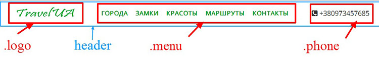
Шапка состоит из трех логичных блоков:
- Блок с логотипом
- Блок с меню, сделанное на списках
- Блок с иконкой и номером телефона
Эти три блока будут помещены в общий внешний блок-обертку header, который внутри себя будет делать display: flex; для трех блоков.
Внутри блока nav, еще раз пропишем display: flex; для пунктов меню. Таким образом мы добьёмся гибкости, при уменьшении размеров экрана, пункты меню могут выстраиваться друг под другом.
Для наглядной демонстрации сделаем всю HTML разметку для шапки сайта.
+380973457685
Так будет выглядеть шапка без применения стилей, так и должно быть.

А сейчас внимание! Достаточно указать двум блокам display: flex; и всё содержимое шапки вытянется в строчку.
.header .menu ul display: flex;
>
Вот так работает flexbox.

Добавим стили и шапка готова. Дальше нам нужно будет её адаптировать под разные размеры экранов. Обратите внимание, как мало написано кода.
body background-color: #fff;
font-family: «Open Sans», sans serif;
line-height: 1.5;
>
.header border: 2px solid #ccc;
display: flex;
flex-wrap: wrap; /*перенос строки */
justify-content: space-between; /*прижимает содержимое к краям */
align-items: center; /*выравнивает элементы по центру на вертикальной */
>
.header .logo padding-left: 30px;
>
.header .menu ul display: flex;
list-style: none;
>
.header .menu ul li margin: 20px 10px;
>
.header .menu ul a text-transform: uppercase;
text-decoration: none;
font-weight: bold;
color: #06a327;
>
.phone font-size: 110%;
color: #333;
padding-right: 40px;
>
Работаем над адаптивностью шапки
Суть процесса по адаптивности сайта заключается в поиске контрольных точек, при которых элементы сайта будут не видны или выглядеть небрежно. Наша задача при сжатии браузера по ширине, увидеть проблему и исправить, дописав соответствующий код (медиа запрос) в файл стилей.
Например, на ширине экрана 900 пикселей, блок с телефон прижался к левому краю шапки.
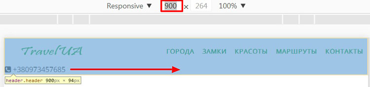
Решение проблемы, вы видите ниже. Выравниваем блок .phone по центру.
@media screen and (max-width: 900px) .phone margin: auto;
>
>
На ширине экрана 500 пикселей начинает срезаться меню, так как не помещается в строчку.
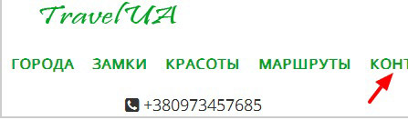
Легким движением руки для ul, прописываем свойство flex-direction: column; которое возвращает списки в естественное блочное состояние.
@media screen and (max-width: 500px) .header flex-direction: column;
>
.header .menu ul flex-direction: column;
align-self: center;
>
.header .menu ul li margin: 5px;
>
>

Разобраться с адаптивной версткой на flexbox-ах, Вам поможет этот видеокурс «Вёрстка сайта с нуля»

Создано 08.03.2018 10:18:00
Копирование материалов разрешается только с указанием автора (Михаил Русаков) и индексируемой прямой ссылкой на сайт (http://myrusakov.ru)!
Добавляйтесь ко мне в друзья ВКонтакте: http://vk.com/myrusakov.
Если Вы хотите дать оценку мне и моей работе, то напишите её в моей группе: http://vk.com/rusakovmy.
Если Вы не хотите пропустить новые материалы на сайте,
то Вы можете подписаться на обновления: Подписаться на обновления
Если у Вас остались какие-либо вопросы, либо у Вас есть желание высказаться по поводу этой статьи, то Вы можете оставить свой комментарий внизу страницы.
Порекомендуйте эту статью друзьям:
Если Вам понравился сайт, то разместите ссылку на него (у себя на сайте, на форуме, в контакте):
- Кнопка:
Она выглядит вот так: - Текстовая ссылка:
Она выглядит вот так: Как создать свой сайт - BB-код ссылки для форумов (например, можете поставить её в подписи):
Комментарии ( 2 ):
Доброго времени суток Михаил! От себя хочу предложить маленькую поправочку в стили, а именно: в коде CSS с указанием размеров отступов margin: 0; padding: 0; Указывать не просто ноль (0), а дописывать 0px, так как просто ноль не срабатывает.
уверяю Вас, что работают оба варианта.
Для добавления комментариев надо войти в систему.
Если Вы ещё не зарегистрированы на сайте, то сначала зарегистрируйтесь.
Copyright © 2010-2023 Русаков Михаил Юрьевич. Все права защищены.