- CSS Media Queries
- CSS3 Introduced Media Queries
- Browser Support
- Media Query Syntax
- CSS3 Media Types
- Media Queries Simple Examples
- Example
- Example
- More Media Query Examples
- CSS @media Reference
- CSS Media Queries — Examples
- Example
- Media Queries For Menus
- Example
- Media Queries For Columns
- Example
- Example
- Hide Elements With Media Queries
- Example
- Change Font Size With Media Queries
- Variable Font Size.
- Example
- Flexible Image Gallery
- Example
- Flexible Website
- Example
- Orientation: Portrait / Landscape
- Example
- Min Width to Max Width
- Example
- Example
- CSS @media Reference
CSS Media Queries
The @media rule, introduced in CSS2, made it possible to define different style rules for different media types.
Examples: You could have one set of style rules for computer screens, one for printers, one for handheld devices, one for television-type devices, and so on.
Unfortunately these media types never got a lot of support by devices, other than the print media type.
CSS3 Introduced Media Queries
Media queries in CSS3 extended the CSS2 media types idea: Instead of looking for a type of device, they look at the capability of the device.
Media queries can be used to check many things, such as:
- width and height of the viewport
- width and height of the device
- orientation (is the tablet/phone in landscape or portrait mode?)
- resolution
Using media queries are a popular technique for delivering a tailored style sheet to desktops, laptops, tablets, and mobile phones (such as iPhone and Android phones).
Browser Support
The numbers in the table specifies the first browser version that fully supports the @media rule.
Media Query Syntax
A media query consists of a media type and can contain one or more expressions, which resolve to either true or false.
The result of the query is true if the specified media type matches the type of device the document is being displayed on and all expressions in the media query are true. When a media query is true, the corresponding style sheet or style rules are applied, following the normal cascading rules.
Unless you use the not or only operators, the media type is optional and the all type will be implied.
You can also have different stylesheets for different media:
CSS3 Media Types
| Value | Description |
|---|---|
| all | Used for all media type devices |
| Used for printers | |
| screen | Used for computer screens, tablets, smart-phones etc. |
| speech | Used for screenreaders that «reads» the page out loud |
Media Queries Simple Examples
One way to use media queries is to have an alternate CSS section right inside your style sheet.
The following example changes the background-color to lightgreen if the viewport is 480 pixels wide or wider (if the viewport is less than 480 pixels, the background-color will be pink):
Example
The following example shows a menu that will float to the left of the page if the viewport is 480 pixels wide or wider (if the viewport is less than 480 pixels, the menu will be on top of the content):
Example
More Media Query Examples
For much more examples on media queries, go to the next page: CSS MQ Examples.
CSS @media Reference
For a full overview of all the media types and features/expressions, please look at the @media rule in our CSS reference.
CSS Media Queries — Examples
Let us look at some more examples of using media queries.
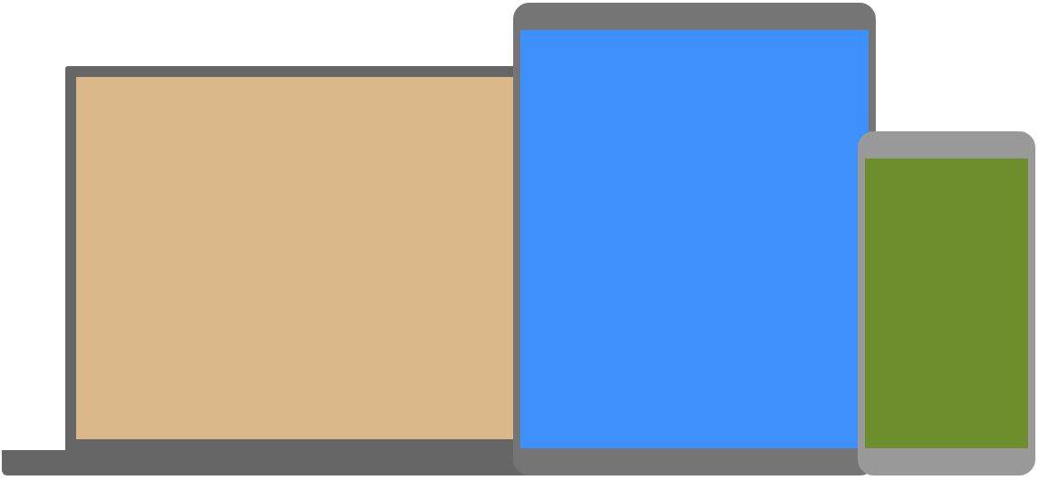
Media queries are a popular technique for delivering a tailored style sheet to different devices. To demonstrate a simple example, we can change the background color for different devices:
Example
/* Set the background color of body to tan */
body background-color: tan;
>
/* On screens that are 992px or less, set the background color to blue */
@media screen and (max-width: 992px) body background-color: blue;
>
>
/* On screens that are 600px or less, set the background color to olive */
@media screen and (max-width: 600px) body background-color: olive;
>
>
Do you wonder why we use exactly 992px and 600px? They are what we call «typical breakpoints» for devices. You can read more about typical breakpoints in our Responsive Web Design Tutorial.
Media Queries For Menus
In this example, we use media queries to create a responsive navigation menu, that varies in design on different screen sizes.
Example
/* The navbar container */
.topnav overflow: hidden;
background-color: #333;
>
/* Navbar links */
.topnav a float: left;
display: block;
color: white;
text-align: center;
padding: 14px 16px;
text-decoration: none;
>
/* On screens that are 600px wide or less, make the menu links stack on top of each other instead of next to each other */
@media screen and (max-width: 600px) .topnav a float: none;
width: 100%;
>
>
Media Queries For Columns
A common use of media queries, is to create a flexible layout. In this example, we create a layout that varies between four, two and full-width columns, depending on different screen sizes:
Example
/* Create four equal columns that floats next to each other */
.column float: left;
width: 25%;
>
/* On screens that are 992px wide or less, go from four columns to two columns */
@media screen and (max-width: 992px) .column width: 50%;
>
>
/* On screens that are 600px wide or less, make the columns stack on top of each other instead of next to each other */
@media screen and (max-width: 600px) .column width: 100%;
>
>
Tip: A more modern way of creating column layouts, is to use CSS Flexbox (see example below). However, it is not supported in Internet Explorer 10 and earlier versions. If you require IE6-10 support, use floats (as shown above).
To learn more about the Flexible Box Layout Module, read our CSS Flexbox chapter.
To learn more about Responsive Web Design, read our Responsive Web Design Tutorial.
Example
/* Container for flexboxes */
.row display: flex;
flex-wrap: wrap;
>
/* Create four equal columns */
.column flex: 25%;
padding: 20px;
>
/* On screens that are 992px wide or less, go from four columns to two columns */
@media screen and (max-width: 992px) .column flex: 50%;
>
>
/* On screens that are 600px wide or less, make the columns stack on top of each other instead of next to each other */
@media screen and (max-width: 600px) .row flex-direction: column;
>
>
Hide Elements With Media Queries
Another common use of media queries, is to hide elements on different screen sizes:
Example
/* If the screen size is 600px wide or less, hide the element */
@media screen and (max-width: 600px) div.example display: none;
>
>
Change Font Size With Media Queries
You can also use media queries to change the font size of an element on different screen sizes:
Variable Font Size.
Example
/* If screen size is more than 600px wide, set the font-size of
@media screen and (min-width: 600px) div.example font-size: 80px;
>
>
/* If screen size is 600px wide, or less, set the font-size of to 30px */
@media screen and (max-width: 600px) div.example font-size: 30px;
>
>
Flexible Image Gallery
In this example, we use media queries together with flexbox to create a responsive image gallery:
Example
Flexible Website
In this example, we use media queries together with flexbox to create a responsive website, containing a flexible navigation bar and flexible content.
Example
Orientation: Portrait / Landscape
Media queries can also be used to change layout of a page depending on the orientation of the browser.
You can have a set of CSS properties that will only apply when the browser window is wider than its height, a so called «Landscape» orientation:
Example
Use a lightblue background color if the orientation is in landscape mode:
Min Width to Max Width
You can also use the (max-width: ..) and (min-width: ..) values to set a minimum width and a maximum width.
For example, when the browser’s width is between 600 and 900px, change the appearance of a element:
Example
@media screen and (max-width: 900px) and (min-width: 600px) <
div.example <
font-size: 50px;
padding: 50px;
border: 8px solid black;
background: yellow;
>
>
Using an additional value: In the example below, we add an additional media query to our already existing one using a comma (this will behave like an OR operator):
Example
/* When the width is between 600px and 900px OR above 1100px — change the appearance of */
@media screen and (max-width: 900px) and (min-width: 600px), (min-width: 1100px) div.example font-size: 50px;
padding: 50px;
border: 8px solid black;
background: yellow;
>
>
CSS @media Reference
For a full overview of all the media types and features/expressions, please look at the @media rule in our CSS reference.
Tip: To learn more about responsive web design (how to target different devices and screens), using media query breakpoints, read our Responsive Web Design Tutorial.