Форма входа и регистрации с помощью HTML5 и CSS3
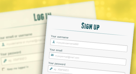
Здравствуй, дорогой хабрадруг! В этом туториале мы научимся создавать две формы HTML5: форма входа и форма регистрации. Эти формы будут меняться друг с другом местами с помощью псевдо-класса CSS3 :target. Мы будем использовать CSS3 и шрифт с иконками. Идея этого демо в том, чтобы показать пользователю форму входа и предоставить ему ссылку “перехода” к форме регистрации.
В этом туториале я подробно расскажу о том, как создавать эффект как в Демо 1.
HTML
Здесь мы использовали несколько приемов HTML5. Например, элемент type=password автоматически скрывает то, что пользователь печатает и заменяет символы точками или звездочками (зависит от браузера). Элемент type=email позволяет браузеру проверить правильность формата email адреса. Кроме того, мы использовали параметр require=required; браузеры, поддерживающие данный параметр не позволят пользователю отправить форму до тех пор, пока поле не заполнено, JavaScript здесь не требуется. Параметр autocomplete=on будет автоматически заполнять некоторые поля. Мы также использовали замещающийся текст, который поможет пользователю при заполнении формы.
Теперь о двух хитрых моментах. Вы наверное заметили две ссылки в начале формы. Этот ловкий прием позволит нашей формы вести себя правильно при работе с якорями (anchors).
Второй момент связан с применением шрифта с иконками. Мы будем использовать data-attribute, чтобы отобразить иконки. Устанавливая параметр data-icon=”icon_character” с соответствующим символов в HTML, мы должны назначить лишь одно правило в CSS для установления стиля всех иконок. Подробнее об этом приеме можно почитать на сайте: 24 Ways: Displaying Icons with Fonts and Data- Attributes.
CSS
Для чистоты кода я пропущу базовые параметры (html, body и т.п.), но вы сможете найти их в исходных файлах. Повторяю, что я использую приемы CSS3, которые не будут работать во всех браузерах. Итак, давайте же приступим!
Стилизуем формы, используя CSS3
Во-первых, давайте назначим нашим формам базовый стиль.
Мы добавили две тени к элементу: одна — с целью создать внутреннее голубое свечение, а вторая — внешняя тень. Чуть позже я объясню вам z-index.
Здесь мы назначим свойства для шапки:
/**** текст ****/ #wrapper h1 < font-size: 48px; color: rgb(6, 106, 117); padding: 2px 0 10px 0; font-family: 'FranchiseRegular','Arial Narrow',Arial,sans-serif; font-weight: bold; text-align: center; padding-bottom: 30px; >/** На донный момент только webkit поддерживает background-clip:text; **/ #wrapper h1 < background: -webkit-repeating-linear-gradient(-45deg, rgb(18, 83, 93) , rgb(18, 83, 93) 20px, rgb(64, 111, 118) 20px, rgb(64, 111, 118) 40px, rgb(18, 83, 93) 40px); -webkit-text-fill-color: transparent; -webkit-background-clip: text; >#wrapper h1:after
Замечу, что сегодня только браузеры с webkit поддерживают background-clip: text, поэтому мы сделаем полосатый фон только для webkit и привяжем его к заголовку H1. Так как параметр background-clip: text работает только в Webkit браузерах, я решил работать только со свойствами webkit. Именно поэтому я разделил CSS на две части и использовал только градиент webkit. Однако вы не должны использовать лишь webkit на своих вебсайтах! Так, например, параметр -webkit-text-fill-color: transparent позволяет нам иметь прозрачный фон, но только для браузеров webkit, все другие браузеры проигнорируют это свойство.
Мы также создали тонкую линию под заголовком с помощью элемента :after pseudo-class. Мы использовали градиент с 2px в высоту и уменьшили прозрачность по краям до нуля.
Теперь давайте позаботимся о полях ввода и придадим им приятный вид.
/**** advanced input styling ****/ /* placeholder */ ::-webkit-input-placeholder < color: rgb(190, 188, 188); font-style: italic; >input:-moz-placeholder, textarea:-moz-placeholder < color: rgb(190, 188, 188); font-style: italic; >input
Во-первых, мы стилизуем поля и уберем обводку. Но будьте осторожны: обводка помогает пользователю понять, на каком поле он находится. Если же вы уберете ее, то нужно применить свойства :active и :focus.
/* все поля исключают submit и checkbox */ #wrapper input:not([type="checkbox"]) < width: 92%; margin-top: 4px; padding: 10px 5px 10px 32px; border: 1px solid rgb(178, 178, 178); box-sizing : content-box; border-radius: 3px; box-shadow: 0px 1px 4px 0px rgba(168, 168, 168, 0.6) inset; transition: all 0.2s linear; >#wrapper input:not([type="checkbox"]):active, #wrapper input:not([type="checkbox"]):focus
Здесь мы использовали псевдо класс :not, чтобы стилизовать все поля, кроме чекбоксов. Кроме того, я решил убрать обводку и добавил свойства :focus и :active.
Теперь время веселиться: шрифт с иконками. Так как мы не можем использовать псевдо-классы :before и :after, мы добавим иконку в параметр label, а затем разместим в поле. Я буду использовать библиотеку fontomas. Вы можете сами сопоставить иконки с соответствующей буквой. Помните атрибут data-icon? Именно в него нужно вставить букву. Я использовал data-icon=’u’ для логина, ‘e’ для email, ‘p’ для пароля. Как только я выбрал буквы, я скачал шрифт и использовал генератор шрифтов fontsquirrel для конвертации в формат, пригодный для @font-face.
@font-face < font-family: 'FontomasCustomRegular'; src: url('fonts/fontomas-webfont.eot'); src: url('fonts/fontomas-webfont.eot?#iefix') format('embedded-opentype'), url('fonts/fontomas-webfont.woff') format('woff'), url('fonts/fontomas-webfont.ttf') format('truetype'), url('fonts/fontomas-webfont.svg#FontomasCustomRegular') format('svg'); font-weight: normal; font-style: normal; >/** магический трюк! **/ [data-icon]:after Вот собственно и все. Вам не требуется иметь отдельный класс для каждой иконки. Мы использовали параметр content: attr(data-icon), чтобы получить букву из атрибута data-icon. Таким образом, нам нужно лишь назначить шрифт, выбрать цвет и разместить иконку.
Теперь назначим правила для кнопки отправки формы.
/*стилизуем обе кнопки*/ #wrapper p.button input < width: 30%; cursor: pointer; background: rgb(61, 157, 179); padding: 8px 5px; font-family: 'BebasNeueRegular','Arial Narrow',Arial,sans-serif; color: #fff; font-size: 24px; border: 1px solid rgb(28, 108, 122); margin-bottom: 10px; text-shadow: 0 1px 1px rgba(0, 0, 0, 0.5); border-radius: 3px; box-shadow: 0px 1px 6px 4px rgba(0, 0, 0, 0.07) inset, 0px 0px 0px 3px rgb(254, 254, 254), 0px 5px 3px 3px rgb(210, 210, 210); transition: all 0.2s linear; >#wrapper p.button input:hover < background: rgb(74, 179, 198); >#wrapper p.button input:active, #wrapper p.button input:focus < background: rgb(40, 137, 154); position: relative; top: 1px; border: 1px solid rgb(12, 76, 87); box-shadow: 0px 1px 6px 4px rgba(0, 0, 0, 0.2) inset; >p.login.button, p.signin.button
Трюк заключается в том, чтобы использовать box-shadow, чтобы создать несколько рамок. Естественно, вы можете использовать лишь одну рамку, но также можно и несколько. Мы будем использовать параметр length для создания “фейковой” второй белой рамки, 3px в ширину, без размытия.
Теперь стилизуем чекбокс, здесь мы ничего необычного не сотворим:
/* стилизуем чекбокс "запомнить меня"*/ .keeplogin < margin-top: -5px; >.keeplogin input, .keeplogin label < display: inline-block; font-size: 12px; font-style: italic; >.keeplogin input#loginkeeping < margin-right: 5px; >.keeplogin label
Стилизуем подвал формы, используя множественные линейные градиенты, чтобы создать полосатый градиент.
p.change_link < position: absolute; color: rgb(127, 124, 124); left: 0px; height: 20px; width: 440px; padding: 17px 30px 20px 30px; font-size: 16px ; text-align: right; border-top: 1px solid rgb(219, 229, 232); border-radius: 0 0 5px 5px; background: rgb(225, 234, 235); background: repeating-linear-gradient(-45deg, rgb(247, 247, 247) , rgb(247, 247, 247) 15px, rgb(225, 234, 235) 15px, rgb(225, 234, 235) 30px, rgb(247, 247, 247) 30px ); >#wrapper p.change_link a < display: inline-block; font-weight: bold; background: rgb(247, 248, 241); padding: 2px 6px; color: rgb(29, 162, 193); margin-left: 10px; text-decoration: none; border-radius: 4px; border: 1px solid rgb(203, 213, 214); transition: all 0.4s linear; >#wrapper p.change_link a:hover < color: rgb(57, 191, 215); background: rgb(247, 247, 247); border: 1px solid rgb(74, 179, 198); >#wrapper p.change_link a:active
Сейчас вы видите, что у нас две приятные формы, но ведь мы хотим, чтобы отображалась только лишь одна из них. Пришло время анимации!
Создаем анимацию
Первое, что мы сделаем, мы спрячем вторую форму, назначив opacity на 0:
Помните, что форма входа имеет параметр z-index: 22? Второй форме мы назначим этот параметр на 21, чтобы поставить его “под” форму входа.
Теперь самое интересное: меняем формы местами, используя псевдо класс :target. Вам нужно понять одну вещь по поводу :target: для перемещения мы будем использовать якоря. Нормальное поведение якоря — прыжок на определенный элемент страницы. Но мы не хотим этого, мы лишь хотим поменять формы местами. И тут приходит на помощь наш трюк с использованием двух ссылок в начале страницы. Вместо того, чтобы направить нас прямо на вторую форму, рискуя испытать эффект “прыжка”, мы придадим ссылкам параметр display: none. Это поможет избежать прыжков. Я обнаружил этот трюк на сайте: CSS3 create (французский язык).
#toregister:target ~ #wrapper #register, #tologin:target ~ #wrapper #login
Вот, что происходит: когда мы кликаем на кнопку Присоединиться, мы направляемся на #toregister. Затем происходит анимация и лишь потом переходим на элемент #register. Мы используем анимацию под названием fadeInLeft. Так как мы “прячем” форму, используя нулевую прозрачность, мы применим анимацию, которая будем постепенно появляться. Мы также изменили z-index, чтобы она появилась поверх другой формы. То же самое происходит для другой формы same happens for the other form.
Вот код для анимации. Мы использовали CSS3 animation framework от Dan Eden и адаптировали этот фреймворк под наш туториал.
.animate < animation-duration: 0.5s; animation-timing-function: ease; animation-fill-mode: both; >@keyframes fadeInLeft < 0% < opacity: 0; transform: translateX(-20px); >100% < opacity: 1; transform: translateX(0); >> Форма, которая “исчезает”, будет иметь анимацию затемнения влево:
#toregister:target ~ #wrapper #login, #tologin:target ~ #wrapper #register < animation-name: fadeOutLeftBig; >@keyframes fadeOutLeft < 0% < opacity: 1; transform: translateX(0); >100% < opacity: 0; transform: translateX(-20px); >> Теперь вы можете использовать другие анимации от Dan Eden’ с помощью файла animate.css: просто измените класс .animate class и названия анимаций. Вы также обнаружите несколько других анимаций в конце файла animate-custom.css file.
Вот и все, друзья. Надеюсь вам понравился этот туториал!
Заметим, что в некоторых браузерах параметр background-clip: text не поддерживается. В Internet Explorer 9 анимации не работают. В Internet Explorer 8 и ниже псевдо-класс :target pseudo-class не поддерживается, поэтому там этот эффект вообще работать не будет.
Демо
P.S. Все замечания по поводу перевода с удовольствием приму в личку. Спасибо!
Login and Registration Form in HTML CSS & JavaScript
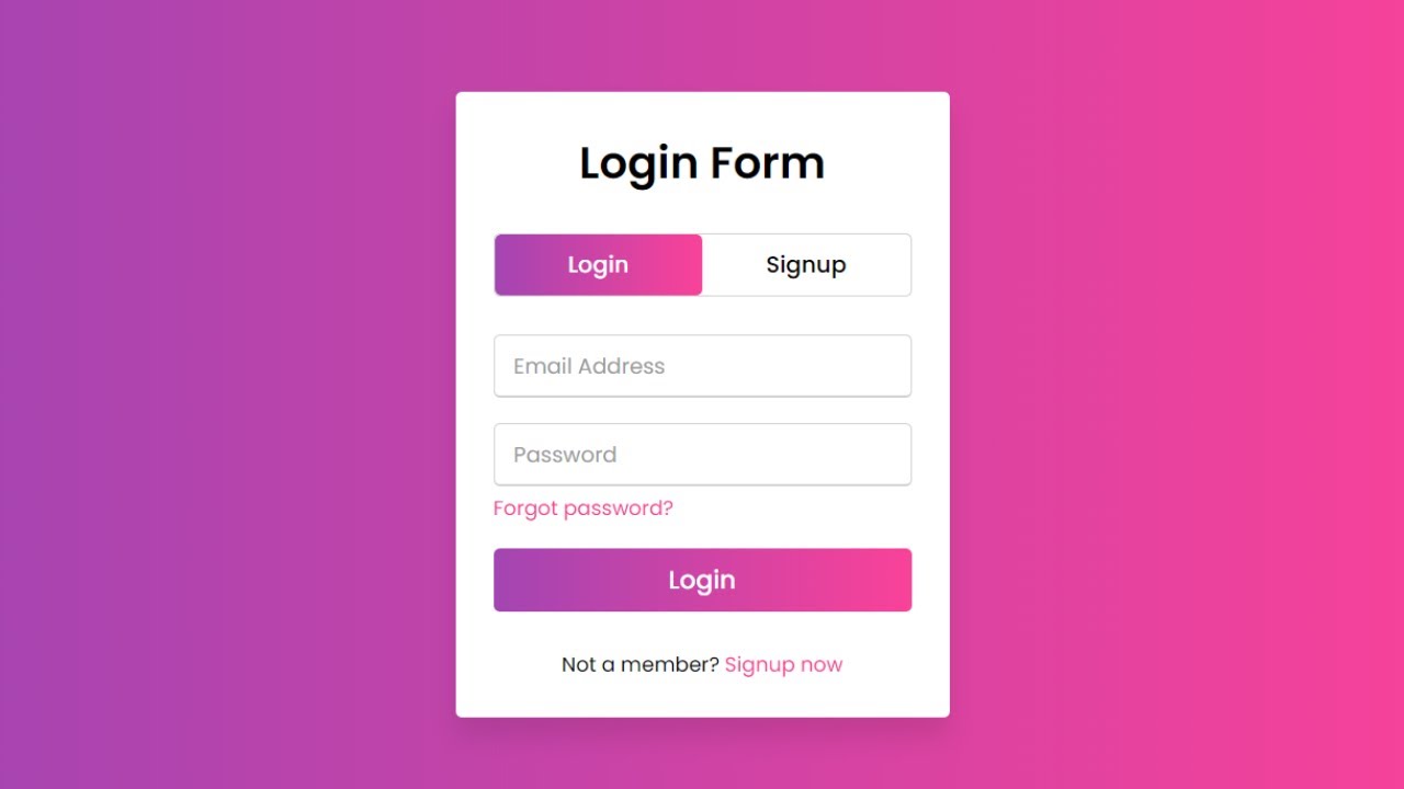
Hey friends, today in this blog, you’ll learn how to create an Animated Login and Registration Form in HTML CSS & JavaScript. Earlier I shared many blogs on How to Create a Login Form using HTML & CSS but, I haven’t shared a particular blog related to Login and Registration Forms in HTML. So, it’s time to create this one.
In this Form (Login and Registration Form in HTML), on the webpage, there is a login form and two toggle buttons at the top of the form labeled Login and Signup as you can see in the preview image above.
When you click on the signup button, the login form smoothly slides from the right to the left side and shows you the signup form.
And again after clicking the login button, the signup form slide from the left to the right side and shows you the login form. In this form, the login and signup forms both are on the same page and it is done with a little bit of JavaScript codes.
If you’re feeling difficult to understand what I am saying, you can watch a full video tutorial of this form (Login and Registration Form in HTML).
Video Tutorial of Login and Registration Form in HTML
In the video, you have seen an animated Login and Registration Form that is created using HTML CSS & JavaScript. I hope you’ve understood the basic codes behind creating this form.
I used just a few lines of JavaScript codes to complete this form, so you can easily create this type of login and registration form in HTML even if you’re a beginner.
JavaScript is used only to slide the form on button click and the toggle tab that slides from login to signup text and signup to login text is wholly based on pure HTML & CSS with the help of HTML tag.
If you liked this login form and want to get source codes or files, you can get them from the bottom of this page.
You might like this:
Login and Registration Form in HTML [Source Codes]
To create this form (Login and Registration Form in HTML). First, you need to create two Files one HTML File and another one is CSS File. After completing these files paste the following codes into your file.
First, create an HTML file with the name index.html and paste the given codes into your HTML file. Remember, you’ve to create a file with a .html extension.
Login FormSignup Form