- Plot Customized Line Graph in Python
- Installation of Packages
- Parameters for Customization of Line Plot
- How to Plot Customize Line Style Graph in Python
- Installation of Packages
- Import libraries
- Prepare dataset
- Draw Line chart using Plot()
- Set Line Chart Title and Labels
- Plot Customized Line Graph
- Python Line Plot Code
- Line Style Graph Output
- Plot Line Style Graph with Parameter in Python
- Installation of Packages
- Import libraries
- Prepare dataset and Plot the graph
- Plot customized line graph
- Set Line Chart Title and Labels
- Show the Line Chart
- Line Chart Python Code
- Line Chart output
- Multi Line Color Graph in Python
- Installation of Packages
- Prepare Dataset
- Plot Multiple Line Chart in Python
- Set Line Graph Title and Labels
- Show Line Chart
- Line Chart Python Code
- Line Chart output
- Conclusion
- Recent Posts
- How to Plot a Line Chart in Python using Matplotlib
- Steps to Plot a Line Chart in Python using Matplotlib
- Step 1: Install the Matplotlib package
- Step 2: Gather the data for the Line chart
- Step 3: Capture the data in Python
- Step 4: Plot a Line chart in Python using Matplotlib
- How to Create a Line Chart in Python with Pandas DataFrame
Plot Customized Line Graph in Python
Line graph is basically a graph of a line joining the data points. Data points are also known as markers. The graph can be of any shape. For ex. straight line, curve, or any other shape. Line plot is a basic type of chart which is commonly used in many fields. To plot customized line graph in python using matplotlib package, use plot() function of matplotlib library.
In this article, I will explain you how to plot customized line graph in python using matplotlib package.
Installation of Packages
We will need numpy and matplotlib packages to create line chart in python. If you don’t have these packages installed on your system, install it using below commands.
pip install matplotlib pip install numpy
Parameters for Customization of Line Plot
plot(x, y) # plot x and y using default line style and color plot(x, y, 'bo') # plot x and y using blue circle markers plot(y) # plot y using x as index array 0..N-1 plot(y, 'r+') # ditto, but with red plusses representation formats for styling **Markers** ============= =============================== character description ============= =============================== ``'.'`` point marker ``','`` pixel marker ``'o'`` circle marker ``'v'`` triangle down marker ``'^'`` triangle up marker ``''`` triangle right marker ``'1'`` tri down marker ``'2'`` tri_up marker ``'3'`` tri_left marker ``'4'`` tri_right marker ``'s'`` square marker ``'p'`` pentagon marker ``'*'`` star marker ``'h'`` hexagon1 marker ``'H'`` hexagon2 marker ``'+'`` plus marker ``'x'`` x marker ``'D'`` diamond marker ``'d'`` thin_diamond marker ``'|'`` vline marker ``'_'`` hline marker ============= =============================== **Line Styles** ============= =============================== character description ============= =============================== ``'-'`` solid line style ``'--'`` dashed line style ``'-.'`` dash-dot line style ``':'`` dotted line style ============= =============================== Example format strings:: 'b' # blue markers with default shape 'or' # red circles '-g' # green solid line '--' # dashed line with default color '^k:' # black triangle_up markers connected by a dotted line **Colors** The supported color abbreviations are the single letter codes ============= =============================== character color ============= =============================== ``'b'`` blue ``'g'`` green ``'r'`` red ``'c'`` cyan ``'m'`` magenta ``'y'`` yellow ``'k'`` black ``'w'`` white ============= =============================== We can use any combination of color, markers and styling to the graph. And make the graph customized the way we want.
How to Plot Customize Line Style Graph in Python
Let’s see an example to plot line style graph using matplotlib library
Installation of Packages
We will need numpy and matplotlib packages to show line graph. Install packages using below command.
pip install matplotlib pip install numpy
Import libraries
Import numpy and matplotlib libraries in our python line graph code to get started with plotting line chart.
# Import library import matplotlib.pyplot as plt import numpy as np
Prepare dataset
# Create x_axis dataset x=np.arange(1,5) # Create y_axis dataset y=x**5
Draw Line chart using Plot()
- The first argument in plot function defines x axis
- The second argument in plot function defines y axis
- The third argument kp: in plot function defines color code and marker. k represents black color, p represents marker style ‘pentagon’ and : represents dotted line style
# Plot the graph plt.plot(x,y,'kp:')
Set Line Chart Title and Labels
Use matplotlib title and label function to assign title and label for x axis and y axis.
# Set the title and Labels plt.title('Line Style Graph in Python') plt.xlabel('x axis') plt.ylabel('y axis') Plot Customized Line Graph
Use show() function of matplotlib.pyplot module to plot line graph
Python Line Plot Code
Use below entire Line plot in python code using matplotlib library
# Import library import matplotlib.pyplot as plt import numpy as np # Create x_axis dataset x=np.arange(1,5) # Create y_axis dataset y=x**5 # Plot the line graph plt.plot(x,y,'kp:') # Set the title and Labels plt.title('Line Style Graph in Python') plt.xlabel('x axis') plt.ylabel('y axis') # Show the Line Graph plt.show() Line Style Graph Output
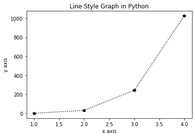
Line Style Graph in Python
Cool Tip: Learn How to plot bubble chart in python !
Plot Line Style Graph with Parameter in Python
Let’s see an example to style line graph in Python using matplotlib parameters. In this example, I will explain you how to use dashed line, use marker and custom color for line.
Installation of Packages
We will require matplotlib.pyplot packages installed on our system to draw line plot. If we don’t have packages installed, we can install packages with the command below.
Import libraries
We will import matplotlib.pyplot libraries to plot line chart.
import matplotlib.pyplot as plt
Prepare dataset and Plot the graph
- The first argument defines list for x axis
- The second argument defines list for y axis
# Create a dataset of air quality forecast to plot line graph # Create dataset of days for x-axis x=['Saturday','Sunday','Monday','Tuesday','Wednesday','Thursday','Friday'] # Create dataset of temperature for y axis y=[30,31,31,32,33,29,31]
Plot customized line graph
- The first argument in plot function defines x axis
- The second argument in plot function defines y axis
- The third argument color defines line color as green
- The fourth argument marker defines marker as round
- The fifth argument linestyle defines line style as dashed
plt.plot(x,y,color='green', marker='o', linestyle='dashed')
Set Line Chart Title and Labels
Use matplotlib title and label function to assign title and label for x axis and y axis.
# Set the title and Labels for 7 days Forecast plt.title('Line plot for 7 days forecast') plt.xlabel('Days') plt.ylabel('Day time Temperature') Show the Line Chart
Use show() function of matplotlib.pyplot module to plot line graph
Line Chart Python Code
Use below Line chart in python matplotlib source code
# Import library import matplotlib.pyplot as plt # Create a dataset of air quality forecast to plot line graph # Create dataset of days for x-axis x=['Saturday','Sunday','Monday','Tuesday','Wednesday','Thursday','Friday'] # Create dataset of temperature for y axis y=[30,31,31,32,33,29,31] # Plot the line graph plt.plot(x,y,color='green', marker='o', linestyle='dashed') # Set the title and Labels for 7 days Forecast plt.title('Line plot for 7 days forecast') plt.xlabel('Days') plt.ylabel('Day time Temperature') # Show the line graph plt.show() Line Chart output
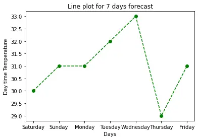
Dashed Line style graph in Python
Multi Line Color Graph in Python
In this matplotlib multiple line chart with python example, I will explain you to plot multiline chart in python and style with different colors.
Installation of Packages
Follow above givens steps to install required packages and import libraries to get started with plotting multiline chart in python.
# Import libraries import matplotlib.pyplot as plt
Prepare Dataset
- Create dataset for days variable to use for x axis dataset
- Create dataset for day_temp and night_temp variable to use for y axis
# Create dataset of days for x-axis days=['Monday','Tuesday','Wednesday','Thursday','Friday'] # Create dataset of temperature for y axis day_temp=[31,32,32,32,33] night_temp=[16,15,14,11,12]
Cool Tip: Learn How to plot basic area plot in python !
Plot Multiple Line Chart in Python
- The first argument define x axis dataset
- The second argument define y axis dataset for days temperature
- The third argument s defines color and style for days temperature
- The fourth argument defines x axis dataset
- The fifth argument defines y axis dataset for night temperature
- The sixth argument defines color and style for night temperature
# Plot the graph plt.plot(days,day_temp,'yo-',days,night_temp,'bo-')
Set Line Graph Title and Labels
Use matplotlib title and label function to assign title and label for x axis and y axis.
# Set the title and line graph labels plt.title('Line Graph for 5 day forecast') plt.xlabel('Days') plt.ylabel('Temperature') Show Line Chart
Using Matplotlib show() function to show the graphical view of Line chart.
Line Chart Python Code
Use below python line plot with dots source code
# Import library import matplotlib.pyplot as plt # Create dataset of days for x-axis days=['Monday','Tuesday','Wednesday','Thursday','Friday'] # Create dataset of temperature for y axis day_temp=[31,32,32,32,33] night_temp=[16,15,14,11,12] # Plot the graph plt.plot(days,day_temp,'yo-',days,night_temp,'bo-') # Set the title and line graph labels plt.title('Line Graph for 5 day forecast') plt.xlabel('Days') plt.ylabel('Temperature') #show graphics plt.show() Line Chart output
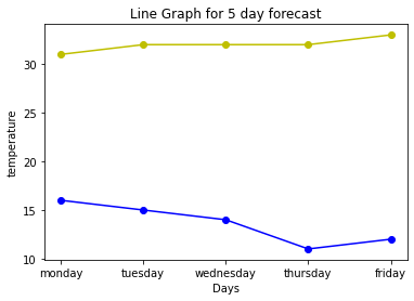
Multiple Line Graph with colors in Python
Cool Tip: Learn How to plot stacked area plot in python !
Conclusion
I hope you found above article on how to plot customize Line style graph in python using matplotlib and numpy package informative and educational.
Use plt.plot() function of matplotlib module to create line graph.
Use linestyle and color argument in plot() function of matplotlib library to plot line chart with dots, color dotted line or dashed line.
Recent Posts
How to Plot a Line Chart in Python using Matplotlib

To start, here is a template that you may use to plot your Line chart:
import matplotlib.pyplot as plt x_axis = ['value_1', 'value_2', 'value_3', . ] y_axis = ['value_1', 'value_2', 'value_3', . ] plt.plot(x_axis, y_axis) plt.title('title name') plt.xlabel('x_axis name') plt.ylabel('y_axis name') plt.show() Next, you’ll see how to apply the above template using a practical example.
Steps to Plot a Line Chart in Python using Matplotlib
Step 1: Install the Matplotlib package
If you haven’t already done so, install the Matplotlib package in Python using this command (under Windows):
You may check the following guide for the instructions to install a package in Python using PIP.
Step 2: Gather the data for the Line chart
Next, gather the data for your Line chart.
For example, let’s use the following data about two variables:
Here is the complete data:
| year | unemployment_rate |
| 1920 | 9.8 |
| 1930 | 12 |
| 1940 | 8 |
| 1950 | 7.2 |
| 1960 | 6.9 |
| 1970 | 7 |
| 1980 | 6.5 |
| 1990 | 6.2 |
| 2000 | 5.5 |
| 2010 | 6.3 |
The ultimate goal is to depict the above data using a Line chart.
Step 3: Capture the data in Python
You can capture the above data in Python using the following two Lists:
year = [1920, 1930, 1940, 1950, 1960, 1970, 1980, 1990, 2000, 2010] unemployment_rate = [9.8, 12, 8, 7.2, 6.9, 7, 6.5, 6.2, 5.5, 6.3]
Step 4: Plot a Line chart in Python using Matplotlib
For the final step, you may use the template below in order to plot the Line chart in Python:
import matplotlib.pyplot as plt x_axis = ['value_1', 'value_2', 'value_3', . ] y_axis = ['value_1', 'value_2', 'value_3', . ] plt.plot(x_axis, y_axis) plt.title('title name') plt.xlabel('x_axis name') plt.ylabel('y_axis name') plt.show() Here is the code for our example:
import matplotlib.pyplot as plt year = [1920, 1930, 1940, 1950, 1960, 1970, 1980, 1990, 2000, 2010] unemployment_rate = [9.8, 12, 8, 7.2, 6.9, 7, 6.5, 6.2, 5.5, 6.3] plt.plot(year, unemployment_rate) plt.title('unemployment rate vs year') plt.xlabel('year') plt.ylabel('unemployment rate') plt.show() Run the code in Python and you’ll get the Line chart.
You can further style the Line chart using this code:
import matplotlib.pyplot as plt year = [1920, 1930, 1940, 1950, 1960, 1970, 1980, 1990, 2000, 2010] unemployment_rate = [9.8, 12, 8, 7.2, 6.9, 7, 6.5, 6.2, 5.5, 6.3] plt.plot(year, unemployment_rate, color='red', marker='o') plt.title('unemployment rate vs year', fontsize=14) plt.xlabel('year', fontsize=14) plt.ylabel('unemployment rate', fontsize=14) plt.grid(True) plt.show() How to Create a Line Chart in Python with Pandas DataFrame
So far, you have seen how to create your Line chart using lists.
Alternatively, you may capture the dataset in Python using Pandas DataFrame, and then plot your chart.
In that case, the complete code would look as follows:
import pandas as pd import matplotlib.pyplot as plt data = df = pd.DataFrame(data) plt.plot(df['year'], df['unemployment_rate'], color='red', marker='o') plt.title('unemployment rate vs year', fontsize=14) plt.xlabel('year', fontsize=14) plt.ylabel('unemployment rate', fontsize=14) plt.grid(True) plt.show() You’ll then get the exact same Line chart with Pandas DataFrame.