Layout Modes
So far I have explained how the web browser (or more precisely its rendering engine) determines values of different CSS properties. When this is done, the rendering engine may start actually drawing the HTML elements on the screen. The first step in drawing the elements is determining their sizes and positions. This is done using a layout engine, which can operate in several layout modes:
- block layout – by default used for block elements ( p , table , ul , ol , div , …),
- float layout – a flavour of block layout in which elements are stacked into lines,
- column layout – a flavour of block layout in which elements are stacked into columns,
The flex layout and grid layout are the newest additions to CSS layouts. Grid layout is not very well supported among browsers yet, but there are already some guides on using it. Keep in mind that layout mode is specified per element (not per document), which means that all the layout modes can be mixed in a single document. Let’s have a quick look on the basic properties and usage of different layout modes.
CSS Box Model
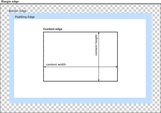
Before we get to the layout modes, it is important how CSS handles HTML elements. Each element on a page is represented as a rectangular box (even if it has round corners) with four edges:

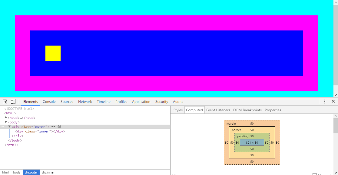
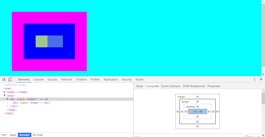
The edges are computed from the element content. In the following example, the inner div size is 50 × 50 pixels. So that is the size of content of the outer div (yellow box is the content edge). To that, the element padding is added (another 50 pixels). Padding is spacing between the element content and element border, therefore it has the background color of the parent element (it acts as if it were part of the content). The blue rectangle defines the padding edge. The last part of the element is the magenta border (another 50 pixels). Border is placed outside the element content. The magenta rectangle shows the border edge.
Outside of the element is the margin (another 50 pixels). Margin is spacing outside of the element – between the element border and its parent content edge. The cyan rectangle shows the margin edge. The margin edge determines the total space occupied by the HTML element on screen.
The ::after selector is a pseudo-element. Pseudo-elements represent special places in document content (remember what pseudo-classes are?). The distinction between pseudo-element and pseudo-class is that pseudo-element use two semicolons :: (but they are also accepted with one semicolon, so :after ). The rule works so that it virtually creates another element after the list child of .outer element. That virtual element has no content content: «» and stops the floating clear: both and switches layout mode to block layout. The same could be (and for older browser was) achieved by a special element in HTML code, which would stop floating. It is not that important to know how Clearfix works, but it is a nice illustration of immense CSS capabilities. The important thing is that it ensures that the container grows with the floats.
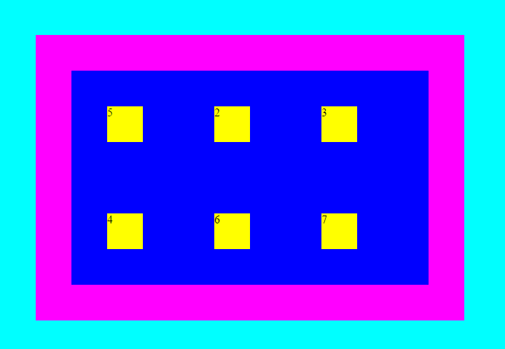
Floating blocks are mainly useful for textual documents (as shown in the above example), but it has other uses too – e.g. if you replace the yellow boxes in the above example with photos, you’ll get a nice photo gallery. For more complicated layouts, the flex layout is a better solution.
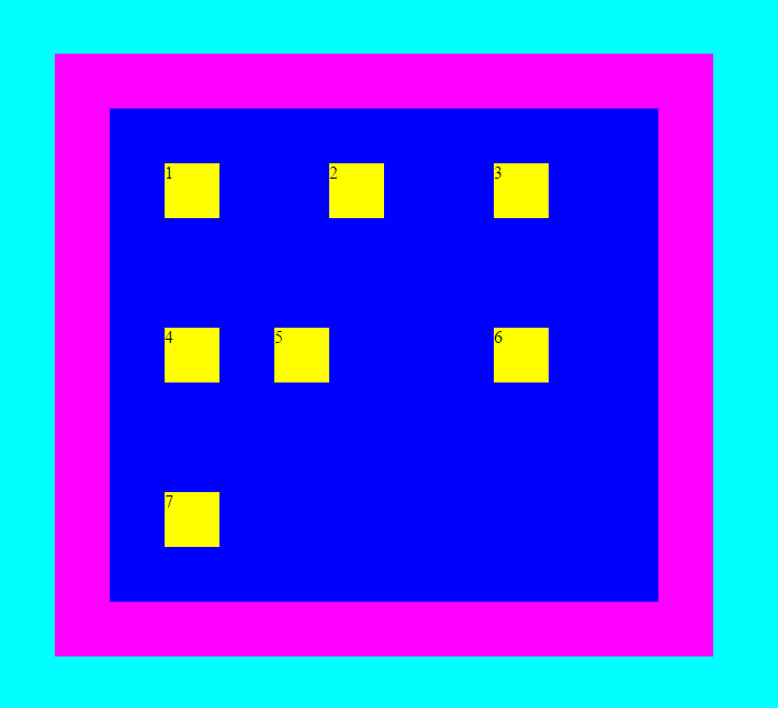
Column layout
Similarly to float layout, the column layout is an extension to block layout and is designed mainly for text layouts. In the below example, the text is split into three columns:
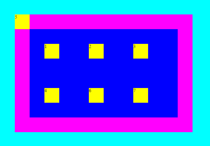
Absolute position
If you modify the #special element to:
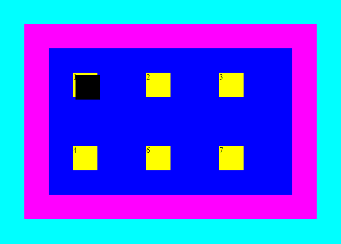
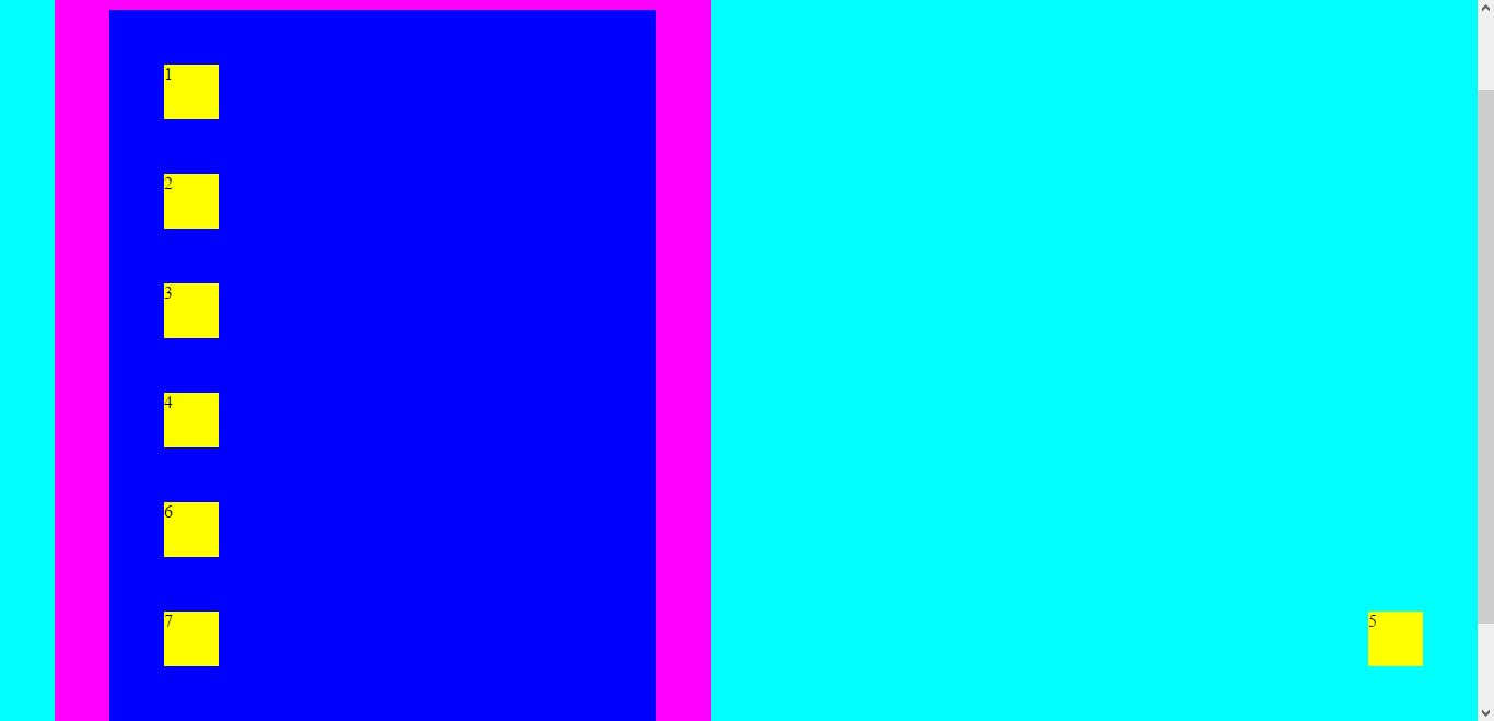
The #special element now overlaps the first yellow box (notice there is number 5 instead of 1). This is because it is positioned at coordinates 0, 0 relative to the content of the .outer element (because that is the closest parent of #special which has position: absolute ). This is pretty important, because it means that the absolute positioning mode is not really absolute. Also it means that if you have a absolutely positioned elements inside a page and you add position: absolute to some of their parents, the entire layout will break to pieces.
Stacking
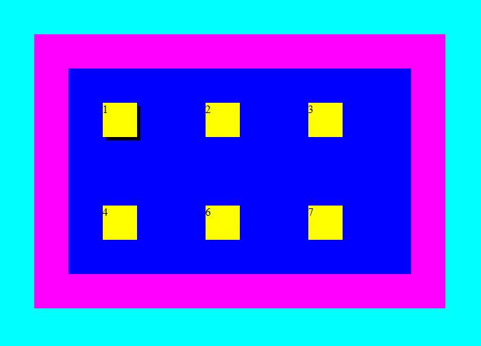
When working with positioned elements (positioned otherwise than static ) it becomes to take notice of element stacking. So far, I told you that child elements are drawn over their parents with transparent background (unless specified otherwise) so that the parents can be seen through. This describes the default static positioning a default Stacking order. Stacking order can be modified by seting the z-index property, but only if the element position is not static .
Let’s change the #special element color and offset it a bit so that you can see the overlap more clearly:
body, html margin: 0; background-color: cyan; > .inner background-color: yellow; width: 50px; height: 50px; margin: 50px; > .outer background-color: blue; border: 50px solid magenta; margin: 50px; width: 500px; display: flex; flex-flow: row wrap; >The display: flex; property switches the layout mode of .outer div to flexible container. All children of that element become flexible boxes. The property flex-flow: row wrap; defines that the flexible boxes will be arranged in wrapping rows.
The flex layout is a great tool that can be used for a wide range of layouts, you can see:
Summary
In this article I tried to describe the various systems used to actually draw HTML elements on a computer screen. Mastering CSS layouts is no easy task and describing all the possibilities would fill many books. You should start with already created page and layout templates, there is no shame in that. However it is good to have a general idea how they work.
New Concepts and Terms
- box model
- content edge
- margin edge
- layout mode
- block layout
- inline layout
- positioned layout
- table layout
- flex layout
- float
- relative positioning
- absolute positioning
- stacking
- stacking order ( z-index )
- fixed position
- viewport
CSS Layout
There are a number of methods that you can use to lay out your web pages and applications. MDN contains a number of in-depth guides to the different methods, and this page provides an overview of them all.
Normal flow, block, and inline layout
If you are not using a flex or grid layout, then your content is laid out using normal flow, or block and inline layout. These guides will help you to understand the way this layout method works.
An introduction to normal flow.
How to take an item out of flow, and what that does to the layout of your document.
An introduction to creating a new formatting context.
How flow layout works if you use a different writing mode, such as vertical text.
Understanding and managing overflow.
Understanding the box model is a CSS fundamental; this guide explains how it works.
Find out why you sometimes end up with less margin than you expect, due to margin collapsing in normal flow.
Absolute positioning, flexbox, and grid all result in the stack (elements’ relative position on the z-axis) to be manipulable via the z-index property. This article explains how to manage it.
Multi-column layout
Multi-column layout, often referred to as multicol, takes content in normal flow, and breaks it into columns. Find out how to use this layout method in the following guides.
An overview of the basic functionality of multicol.
There is a limited amount of styling opportunities for columns; this guide explains what you can do.
Spanning elements across columns, and balancing the content of columns.
What happens when there is more content than available column space?
Dealing with content breaks as the content is split into columns.
Flexbox
CSS Flexible Box Layout, commonly known as flexbox, is a layout model optimized for user interface design, and the layout of items in one dimension. In the flex layout model, the children of a flex container can be laid out in any direction, and can «flex» their sizes, either growing to fill unused space or shrinking to avoid overflowing the parent.
An overview of the features of Flexbox.
How Flexbox relates to other layout methods, and other CSS specifications.
How the Box Alignment properties work with Flexbox.
Explaining the different ways to change the order and direction of items, and covering the potential issues in doing so.
Explaining the flex-grow , flex-shrink , and flex-basis properties.
How to create flex containers with multiple lines and control the display of the items along those lines.
Common design patterns that are typical Flexbox use cases.
Grid layout
CSS Grid Layout introduces a two-dimensional grid system to CSS. Grids can be used to lay out major page areas or small user interface elements.
An overview of the features of grid layout.
How grid relates to other methods such as alignment, sizing, and flexbox.
How to place items by numbered lines.
How to place items using the grid-template syntax.
How to name lines, and place items by line name rather than number.
How to manage the auto-placement algorithm, and understand how the browser places items.
How to align items, and distribute space on both axes in grid.
How to use flow relative, rather than physical, properties and values with grid.
Some accessibility considerations when working with grid layout.
How to ensure your site still works well in browsers that don’t support grid.
Using grid to build some common layouts.
An explanation of the subgrid value, part of Grid Level 2.
An explanation of the masonry layout feature in Grid Level 3.
Alignment
The alignment properties are specified for block and inline layout, though there is no browser support as yet.
The alignment properties first appeared with flexbox; this guide explains how they work.
How to align items in grid layout.
How alignment will work in multicol.
Found a content problem with this page?
This page was last modified on Jul 17, 2023 by MDN contributors.
Your blueprint for a better internet.