# Label — метка
Библиотека tkinter содержит набор компонентов или виджетов, одним из которых является метка — Label() . Метки (или надписи) — это достаточно простые виджеты, содержащие строку (или несколько строк) текста и служащие в основном для информирования пользователя.
from tkinter import * root = Tk() label = Label(root, text="This text wrote in the first label!") label.pack() root.mainloop() Для создания метки используется конструктор Label() . В этом конструкторе с помощью параметра text можно установить текст виджета. Чтобы сделать элемент видимым, у него вызывается метод pack() . В итоге вверху окна будет красоваться метка с текстом:
Для создания двух и более виджетов достаточно просто создать метку и добавить её в окно:
from tkinter import * root = Tk() label_1 = Label(root, text="This text wrote in the first label!") label_1.pack() label_2 = Label(root, text="This text wrote in the second label!") label_2.pack() root.mainloop() Каждый виджет, имеет ряд атрибутов, которые влияют на ее визуализацию и которые мы можем настроить через конструктор:
from tkinter import * root = Tk() label = Label(root, text="Hello", font=("Arial Bold", 50), bg="lightgreen") label.pack() root.mainloop() # Параметры виджета
Всего же виджет Label может принимать следующие параметры:
- anchor : управляет положением текста (или изображения) внутри метки. Допустимые значения: N, NE, E, SE, S, SW, W, NW или CENTER. По умолчанию это CENTER. (Заглавные сокращения букв, берутся от именования направлений North — север, South — юг, East — восток, West — запад)
- background/bg : устанавливает цвет фона виджета, по умолчанию зависит от платформы.
- bitmap : растровое изображение, отображаемое на виджете. Если указан параметр изображения, этот параметр игнорируется в автоматическом режиме.
- borderwidth/bd : ширина границы метки. Значение по умолчанию зависит от системы, но обычно составляет от 1 до 2 пикселей.
- compound : контролирует, как текст и изображения в пределах метки объединяются. По умолчанию, если задано изображение или растровое изображение, оно будет отображено вместо текста. Когда для этой опции установлено значение CENTER, на изображении отображается текст. Допустимые значения: BOTTOM, LEFT, RIGHT или TOP.
- cursor : курсор, отображаемый, когда мышь перемещается над меткой. По умолчанию используется стандартный курсор.
- disabledforeground : цвет переднего плана для использования, когда метка отключена или недействительна. Значение по умолчанию зависит от системы.
- font : шрифт, используемый для надписей. Метки могут содержать только один текст шрифта. Значение по умолчанию зависит от системы.
- foreground/fg : цвет метки, используемой для цвета текста и растровой метки. По умолчанию используется цвет заданный системой.
- height : высота метки. Если текст отображается на метке, размер указывается в текстовых единицах. Если изображение отображается в метке, размер указывается в пикселях (или единицах экрана). Если вы установите размер 0 или пропустите его, он рассчитывается на основе содержимого метки.
- image : изображение для отображения на виджете. Значением должно быть PhotoImage , BitmapImage или совместимый объект. Если указано, это переопределяет параметры текста и растрового изображения.
- padx : горизонтальные отступы для добавления текста. По умолчанию используется 1 пиксель.
- pady : вертикальный отступ, чтобы добавить вокруг текста. По умолчанию используется 1 пиксель.
# Упражнения
- Создайте окно с текстом в метке: «It is my first label».
- Создайте окно с тремя метками и текстов в них: «1-st label», «2-nd label», «3-rd label» соответственно.
- Для переноса строки в одном виджете можно использовать \n . Создайте окно c одной меткой, с текстом на две строки: «It is the first string\nand the second string».
- Создайте окно с выводом текста: «Письмо Деду Морозу». Вывод должен реализовываться при помощи одного Label и с использованием строки с переменными, в которых хранятся имя, город, год, подарок и т.п. Укажите выравнивание текста по центру.
Tkinter Label
Summary: in this tutorial, you’ll learn about Tkinter Label widget and how to use it to display a text or image on the screen.
Introduction to Tkinter Label widget
Tkinter Label widget is used to display a text or image on the screen. To use a Label widget, you use the following general syntax:
label = ttk.Label(container, **options)Code language: Python (python)The Label widget has many options that allow you to customize its appearance:
| Options | Meaning |
|---|---|
| anchor | When the text and/or image are smaller than the width, the anchor option determines where to position them tk.W , tk.CENTER or tk.E for left, center, and right alignment respectively. |
| background | Set the background color for the label |
| borderwidth | Add a border around the label. |
| class_ | Specify a custom widget class name for changing the label’s appearance. |
| compound | Specify how to display both text and image on the Label. |
| cursor | Specify the mouse cursor’s appearance when the mouse is over the widget. |
| font | Specify the font style for displaying text |
| foreground | Specify the color of the text |
| image | Specify an image or images to show in addition to text or instead of text. |
| justify | If the text contains newline characters, the justify option specifies how each line is positioned horizontally. The valid values are tk.LEFT (left-justify), tk.CENTER (center), and tk.RIGHT (right-justify). |
| padding | Add more space around the label. |
| relief | Use this option to create an effect for the Label .e.g, flat, raised, sunken, groove, and ridge. |
| style | Specify the custom widget style. |
| takefocus | is a boolean value that specifies whether the label is visited during focus traversal. It defaults to False which doesn’t get focus. |
| text | Specify a string of text to show in the widget |
| textvariable | A StringVar instance that holds the text value of the widget. It overrides the text option if both textvariable and text are available. |
| underline | Specify the position of the letter that should be underlined e.g, underline = 0 would underline the letter E in the text=’Exit’ |
| width | Specify the number of characters to show |
| wraplength | Chop the text into the lines which less than the length specified by the wraplength option. |
The following shows a skeleton program that we’ll use to illustrate various options of the Label widget:
import tkinter as tk from tkinter import ttk root = tk.Tk() root.geometry('300x200') root.resizable(False, False) root.title('Label Widget Demo') # show the label here root.mainloop()Code language: Python (python)Displaying a regular label
The following program shows how to display a regular label on the root window:
import tkinter as tk from tkinter.ttk import Label root = tk.Tk() root.geometry('300x200') root.resizable(False, False) root.title('Label Widget Demo') # show a label label = Label(root, text='This is a label') label.pack(ipadx=10, ipady=10) root.mainloop()Code language: Python (python)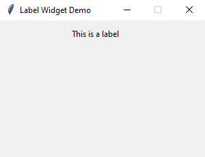
- First, import Label class from the tkinter.ttk module.
- Second, create the root window and set its properties including size, resizeable, and title.
- Third, create a new instance of the Label widget, set its container to the root window, and assign a literal string to its text property.
Setting a specific font for the Label
To set a particular font for a label, you pass the font keyword argument to the Label constructor like this:
font = ('font name', font_size)Code language: Python (python)The font keyword argument is a tuple that contains font name and size. For example:
font=("Helvetica", 14)Code language: Python (python)The following example shows a label with the Helvetica font:
import tkinter as tk from tkinter import ttk root = tk.Tk() root.geometry('300x200') root.resizable(False, False) root.title('Label Widget Demo') # label with a specific font label = ttk.Label( root, text='A Label with the Helvetica font', font=("Helvetica", 14)) label.pack(ipadx=10, ipady=10) root.mainloop() Code language: Python (python)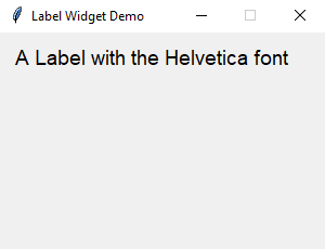
Displaying an image
To use a Label widget to display an image, you follow these steps:
First, create a PhotoImage widget by passing the path to the photo to the PhotoImage constructor:
photo = tk.PhotoImage(file='./assets/python.png')Code language: Python (python)Second, assign the PhotoImage object to the image option of the Label widget:
Label(. image=photo)Code language: Python (python)The following example shows how to use a Label widget to display an image:
import tkinter as tk from tkinter import ttk # create the root window root = tk.Tk() root.geometry('300x200') root.resizable(False, False) root.title('Label Widget Image') # display an image label photo = tk.PhotoImage(file='./assets/python.png') image_label = ttk.Label( root, image=photo, padding=5 ) image_label.pack() root.mainloop() Code language: Python (python)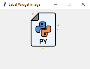
Note that the image file is located at the /assets/ folder.
To display both text and image, you’ll use the text attribute and compound option.
The compound option specifies the position of the image relative to the text. Its valid values are:
| Compound | Effect |
|---|---|
| ‘top’ | Display the image above the text. |
| ‘bottom’ | Display the image below the text. |
| ‘left’ | Display the image to the left of the text. |
| ‘right’ | Display the image to the right of the text. |
| ‘none’ | Display the image if there’s one, otherwise display the text. The compound option defaults to ‘none’ . |
| ‘text’ | Display the text, not the image |
| ‘image’ | Display the image, not the text. |
The following program shows how to display both text and image on a label:
import tkinter as tk from tkinter import ttk # create the root window root = tk.Tk() root.geometry('300x200') root.resizable(False, False) root.title('Label Widget Image') # display an image label photo = tk.PhotoImage(file='./assets/python.png') image_label = ttk.Label( root, image=photo, text='Python', compound='top' ) image_label.pack() root.mainloop() Code language: PHP (php)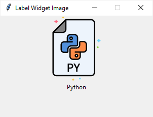
Summary
Python 3 — Tkinter Label
This widget implements a display box where you can place text or images. The text displayed by this widget can be updated at any time you want.
It is also possible to underline part of the text (like to identify a keyboard shortcut) and span the text across multiple lines.
Syntax
Here is the simple syntax to create this widget −
Parameters
- master − This represents the parent window.
- options − Here is the list of most commonly used options for this widget. These options can be used as key-value pairs separated by commas.
This options controls where the text is positioned if the widget has more space than the text needs. The default is anchor = CENTER, which centers the text in the available space.
The normal background color displayed behind the label and indicator.
Set this option equal to a bitmap or image object and the label will display that graphic.
The size of the border around the indicator. Default is 2 pixels.
If you set this option to a cursor name (arrow, dot etc.), the mouse cursor will change to that pattern when it is over the checkbutton.
If you are displaying text in this label (with the text or textvariable option, the font option specifies in what font that text will be displayed.
If you are displaying text or a bitmap in this label, this option specifies the color of the text. If you are displaying a bitmap, this is the color that will appear at the position of the 1-bits in the bitmap.
The vertical dimension of the new frame.
To display a static image in the label widget, set this option to an image object.
Specifies how multiple lines of text will be aligned with respect to each other: LEFT for flush left, CENTER for centered (the default), or RIGHT for right-justified.
Extra space added to the left and right of the text within the widget. Default is 1.
Extra space added above and below the text within the widget. Default is 1.
Specifies the appearance of a decorative border around the label. The default is FLAT; for other values.
To display one or more lines of text in a label widget, set this option to a string containing the text. Internal newlines («\n») will force a line break.
To slave the text displayed in a label widget to a control variable of class StringVar, set this option to that variable.
You can display an underline (_) below the nth letter of the text, counting from 0, by setting this option to n. The default is underline = -1, which means no underlining.
Width of the label in characters (not pixels!). If this option is not set, the label will be sized to fit its contents.
You can limit the number of characters in each line by setting this option to the desired number. The default value, 0, means that lines will be broken only at newlines.
Example
Try the following example yourself −
# !/usr/bin/python3 from tkinter import * root = Tk() var = StringVar() label = Label( root, textvariable = var, relief = RAISED ) var.set("Hey!? How are you doing?") label.pack() root.mainloop() Result
When the above code is executed, it produces the following result −