- Меняющееся гамбургер меню на CSS
- Разметка
- Начальные стили SCSS
- Работа переключателя
- Создание закрытого состояния
- Создание открытого меню
- Магия в мелочах
- Вывод
- How To Make a Responsive Hamburger Menu [CSS]
- Advantages of a Responsive CSS Hamburger Menu
- Structure of a Responsive Hamburger Menu (HTML)
- Styling the Responsive Hamburger Menu (CSS)
- Adding Functionality to the Hamburger Menu with CSS
- Using Transition to Slide the Menu into View
- Add the Main Navbar
- Making the Hamburger Menu Responsive with CSS
- Final Result
- Related Posts:
Меняющееся гамбургер меню на CSS
Недавно я обнаружил эту потрясающую картинку на dribbble.com от Виталия Рубцова и не мог удержаться от желания её реализовать.
В этом уроке я расскажу, как сделать такое с помощью одного CSS, без какого-либо использования JavaScript. Итак, мы увидим некоторые трюки CSS (и SCSS), которые позволят нам добиться почти такой же плавной анимации, как и этот анимированный gif.
Вот пример того, что мы будем делать:
Разметка
Начнём со структуры HTML, которую мы будем использовать. Смотри комментарии для лучшего понимания.
Начальные стили SCSS
Теперь добавим некоторые базовые стили, чтобы получить желаемый внешний вид. Код довольно простой.
/* Базовые стили */ * < box-sizing: border-box; >html, body < margin: 0; >body < font-family: sans-serif; background-color: #F6C390; >a < text-decoration: none; >.container
Работа переключателя
Прежде чем приступать к созданию остальной части интерфейса, добавим работу переключателя, чтобы легко переходить от одного состояния к другому.
Нужный нам HTML уже на месте. А стиль, который заставляет его работать, примерно такой:
// Прячем чекбокс #toggle < display: none; >// Стили для «открытого» состояния, когда чекбокс выбран #toggle:checked < // Любой элемент, стиль которого вам нужно изменить при открытии меню, идёт здесь с селектором ~ // Стили для открытия навигационного меню, к примеру & ~ .nav < >>Создание закрытого состояния
Чтобы сделать закрытое состояние, нам нужно преобразовать пункты меню в линии, чтобы получить иконку гамбургера. Есть несколько путей для получения такой трансформации. Мы решили сделать это следующим образом:
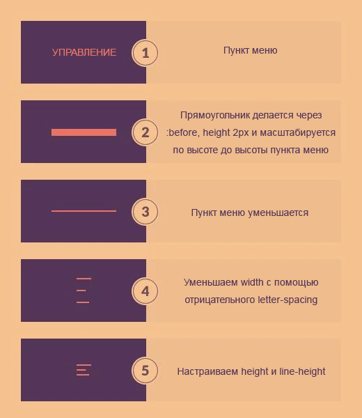
И вот код, который это реализует.
$transition-duration: 0.5s; // Отображение пунктов навигации в виде линий, составляющих иконку гамбургера .nav-item < position: relative; display: inline-block; float: left; clear: both; color: transparent; font-size: 14px; letter-spacing: -6.2px; height: 7px; line-height: 7px; text-transform: uppercase; white-space: nowrap; transform: scaleY(0.2); transition: $transition-duration, opacity 1s; // Добавление ширины для первой линии &:nth-child(1) < letter-spacing: -8px; >// Добавление ширины для второй линии &:nth-child(2) < letter-spacing: -7px; >// Настройки для элементов, начиная с четвёртого &:nth-child(n + 4) < letter-spacing: -8px; margin-top: -7px; opacity: 0; >// Получение линий для иконки гамбургера &:before < position: absolute; content: ''; top: 50%; left: 0; width: 100%; height: 2px; background-color: #EC7263; transform: translateY(-50%) scaleY(5); transition: $transition-duration; >>Обратите внимание, что здесь мы разместили только основные стили для пунктов навигации, который наиболее важны. Вы можете найти полный код на Github.
Создание открытого меню
Чтобы создать открытое меню, нам необходимо восстановить пункты навигации из линий в обычные текстовые ссылки, а также проделать ряд мелких изменений. Давайте посмотрим, как это сделать:
$transition-duration: 0.5s; #toggle:checked < // Открываем & ~ .nav < // Восстанавливаем пункты навигации из «линий» в иконке меню .nav-item < color: #EC7263; letter-spacing: 0; height: 40px; line-height: 40px; margin-top: 0; opacity: 1; transform: scaleY(1); transition: $transition-duration, opacity 0.1s; // Скрываем линии &:before < opacity: 0; >> > >Магия в мелочах
Если мы посмотрим ближе на gif, то увидим, что все пункты меню перемещаются не одновременно, а в шахматном порядке. Мы можем сделать такое и в CSS! В принципе нам нужно выбрать каждый элемент (с помощью :nth-child ) и задать постепенное повышение значения transition-delay . Это, безусловно, повторяющаяся работа. А что если у нас будет больше элементов? Не волнуйтесь, мы можем сделать всё лучше, используя немного магии SCSS:
$items: 4; $transition-delay: 0.05s; .nav-item < // Задаём задержку для пунктов навигации при закрытии @for $i from 1 through $items < &:nth-child(#) < $delay: ($i - 1) * $transition-delay; transition-delay: $delay; &:before < transition-delay: $delay; >> > >Здесь мы используем цикл, переменную и некоторые базовые арифметические операции. Вы можете больше узнать об этих и других интересных функциях на сайте документации SASS.
Обратите внимание, что с помощью этого кода мы получим желаемое пошаговое поведение для анимации закрытия. Нам нужно вычислить $delay , немного отличающийся для анимации открытия, чтобы получить обратно ступенчатый переход. Вроде этого:
$delay: ($items - $i) * $transition-delay;Вывод
Вот мы и закончили с нашим причудливым меню! Мы также включили некоторые фиктивные элементы как в анимированном gif, и вы можете увидеть финальную демонстрацию здесь.
Итак, мы создали простое и функциональное меню только на CSS. Однако, если вы не хотите использовать систему переключения CSS, она может быть идеально заменена с помощью нескольких строк JavaScript без особых усилий.
Надеемся, этот урок оказался вам по душе и вы сочли его полезным!
How To Make a Responsive Hamburger Menu [CSS]
A CSS hamburger menu (responsive) is one of those cool slide-out navigation menus that appears when you click those three-line menu icons.
(It’s also a convenient way to buy fast food — but that’s not important right now)
Looking for ready-to-use hamburger menus examples? Check these 10 CodePens of CSS Hamburger Menus.
In this post, you’ll learn how to create a responsive hamburger menu (CSS only — no JS needed!). But you might be wondering, why bother? Why hide your beautiful navigation behind a hamburger icon?
Advantages of a Responsive CSS Hamburger Menu
- According to Oberlo, over 56% of web traffic comes through mobile devices.
- Full-width navigation menus are often unusable on small screens.
- Positioning menu items vertically solves this problem — but then the user has to scroll past the menu to get to the content — not ideal.
- By using fixed positioning on the hamburger icon, your visitors can access the nav no matter where they are on your page.
OK enough talk, let’s make one! First, we’ll start with the structure.
Structure of a Responsive Hamburger Menu (HTML)
If we were using JavaScript to do this, we’d set up an event listener to detect when the user clicks on the icon, then trigger the menu to appear.
Since we’re making this responsive hamburger menu CSS-style, we have to use a different approach.
We need two elements, a button for the icon, and a nav for the menu itself. The nav element needs to be nested inside the button:
button id="hamburger-menu">
nav id="sidebar-menu">
nav>
button>
You can fill your nav menu with anything you want. We’ll just use some common top-level pages for this example (don’t forget to replace # with your actual page urls!):
label id="hamburger-menu">
nav id="sidebar-menu">
h3>Menuh3>
ul>
li>a href="#">Homea>li>
li>a href="#">Storea>li>
li>a href="#">Bloga>li>
li>a href="#">Abouta>li>
li>a href="#">Contacta>li>
ul>
nav>
label>

div class="overlay">div>
OK, we have the structure sorted. but it doesn’t look how we want, and it doesn’t do anything. Let’s solve that with some CSS.
Styling the Responsive Hamburger Menu (CSS)
There are many ways to get the three lines of the hamburger icon itself — we’ll use a linear gradient as Chris Coyier over at CSS tricks explains:
#hamburger-menu
width: 50px;
height: 50px;
display: block;
border: none;
background: linear-gradient(
to bottom,
#3D0E61, #3D0E61 20%,
white 20%, white 40%,
#3D0E61 40%, #3D0E61 60%,
white 60%, white 80%,
#3D0E61 80%, #3D0E61 100%
);
>
Now, because the menu is nested inside the hamburger icon, we need to set its position to absolute . This takes it out of the flow and enables us to position it manually.
We’ll set the responsive hamburger menu’s top to 0, left to -250px, and width to 200px. This will position it off-screen.
Technically we only need to set left to -200px, since that’s how wide the element is. But I like to add a bit more, just for insurance. We’ll also set visibility to hidden for good measure.
#hamburger-menu #sidebar-menu
visibilty: hidden;
position: fixed;
top: 0;
left: -250px;
width: 200px;
height: 100%;
transition: 0.3s;
>
Now we have a hamburger menu icon, and we can’t see the menu — yet. So far so good:
Adding Functionality to the Hamburger Menu with CSS
So, how do you make the responsive hamburger menu actually work, without using JavaScript? How do we get a real Hamburger Menu CSS-styled?
We will use a hidden checkbox together with the :checked pseudo-class. It’s a small hack to make sure our checkbox not only works on desktop computers but also on touch screen devices, where focusing elements is not a thing.
But. how do make a checkbox change its :checked status whene it’s not visible? By using a label element for that checkbox and showing that label element instead.
input type="checkbox" id="hamburger-input" class="burger-shower" />

 We use a `label` element with the `for` attribute
with the same value as our label `id` attribute
-->
label id="hamburger-menu" for="hamburger-input">
nav id="sidebar-menu">
h3>Menuh3>
ul>
li>a href="#">Homea>li>
li>a href="#">Storea>li>
li>a href="#">Bloga>li>
li>a href="#">Abouta>li>
li>a href="#">Contacta>li>
ul>
nav>
label>

 Adding an overlay to show a dark
background when the menu appears
-->
div class="overlay">div>
We will style the label in a way that it looks like a burger menu, so when someone clicks on it, the hidden checkbox status will also change.
This way, we are able to conditioanlly trigger CSS changes in other elements by using the :checked pseudo-class.
#hamburger-input:checked + #hamburger-menu #sidebar-menu
visibility: visible;
left: 0;
>
#hamburger-input:checked ~ .overlay
visibility: visible;
opacity: 0.4;
>- Notice how we are using the combinator + symbol in our CSS. This is a combinator symbol that allows us to select inmediate siblings to the first element.
- We are also using the ~ symbol. This allows us to select non inmediate siblings. And we need to use it because .overlay is not inmediately after #hamburger-input .
- Notice the styles we’ve applied. We set visibility to visible (always a good idea if you want people to see things!), and set the left property to 0 — this will bring it into view (remember it was -250px previously).
Using Transition to Slide the Menu into View
As it stands, this would make the CSS Hamburger menu appear instantly on the screen. But it’s much cooler to have it slide in from the left. To do that, we apply a transition to the #sidebar-menu element:
This means it’ll take 0.3 seconds to slide in — you can change this to fit your preferences.
OK, now let’s see how it looks! I’ve added a little extra styling to the menu too:
If the user wants to close the menu, they just need to click or tap on anything outside the menu itself — a common and intuitive way to do it.
Add the Main Navbar
If the CSS hamburger menu is all you need, you’re good to go — enjoy!
But if you’re also interested in setting up a responsive CSS hamburger menu, then stick around!
- If the visitor has a wide enough screen, we’ll show them a full-width nav bar.
- If they have a smaller screen, we’ll show them the CSS hamburger menu.
So first, let’s set up horizontal nav bar. The HTML:
nav id="main-menu">
ul>
li>a href="#">Homea>li>
li>a href="#">Storea>li>
li>a href="#">Bloga>li>
li>a href="#">Abouta>li>
li>a href="#">Contacta>li>
ul>
nav>
#main-menu
display: block;
height: 100px;
width: 100%;
background: #3D0E61;
margin: 0px;
>
#main-menu ul
max-width: 800px;
width: 100%;
height: 100%;
margin: 0px auto;
display: flex;
justify-content: space-evenly;
align-items: center;
>
#main-menu li
list-style-type: none;
font-size: 2rem;
>
#main-menu a
color: #B9FAF8;
font-size: 1.5rem;
text-decoration: none;
>
#main-menu a:hover
text-decoration: underline;
>Because the hamburger icon is a block element, this navbar will push it out of position — so let’s make sure it stays in the top left of the screen by adding the following code to #hamburger-menu :
position: fixed;
top: 20px;
left: 20px;
Now for the ‘responsive’ part.
Making the Hamburger Menu Responsive with CSS
We’ll use a media query for this.
We need to choose a breakpoint — a screen width that will cause the display to switch between the full-width menu and the responsive CSS hamburger menu.
The width you choose will be unique to you — if you have lots of menu items, it’ll need to be wider. For this example, I’ll go with 750px:
@media screen and (max-width: 750px)
#main-menu
display: none;
>
#hamburger-menu
display: inline;
>
>
When the screen is smaller than 750px, these styles will be applied.
And we also need to hide the responsive hamburger menu (CSS) when the screen is wider than 750px. To do that, we just change display: block; to display: none in #hamburger-menu`. So it will be hidden by default.
Final Result
That’s it! Here’s the final CSS Hamburger menu (responsive):
Hope that was useful to you! You can take this as a template, and change the colors and styles to suit your needs.
Personally, I love how a CSS Hamburger Menu looks on full-screen websites. If you do not believe me, just check it for yourself:
Cool, right? If you like this fancy style, I recommend that you check out fullPage.js. It’s a JS library that enables you to create professional-looking responsive full-page websites really easily. Then you just have to add your CSS Responsive Hamburger Menu and. voilá! Your website is ready!
FullPage.js also offers some cool navigation options you might like, whether you want a scroll bar, navigation dots, anchor links, or continuous scrolling, you’re covered. And there are some great animations to take people from page to page — the drop effect is one of my favorites.
Related Posts:
Warren Davies is a front end developer based in the UK.
You can find more from him at https://warrendavies.net
Join 2,000+ readers and learn something new every month!