- How to Change the Selected Option Color using CSS?
- Apply Styles to the Default Selected Option of the Dropdown
- Live Demo
- Example:
- Conclusion
- Related posts:
- Giving Style to Select Option Values
- Стилизация Select с помощью css, как будто это 2020
- Примечания по CSS
- Как это выглядит в разных браузерах
- Стилизация пунктов option
How to Change the Selected Option Color using CSS?
In Html, a select dropdown is generally used in forms to collect input from the user. The dropdown can have one to many options as a dropdown list and the user can select any option according to his preference.
By default, the styles applied to the selected option such as color, background color, etc are same as the styles applied to un-selected options of the dropdown.
But, in some cases, we want to style the selected option differently so that the user could distinguish between the selected and un-selected options.
In CSS, if you want to change the selected option’s color or any other style, you can use the :checked pseudo-class selector. The :checked selector targets only the selected(checked) option of the dropdown.
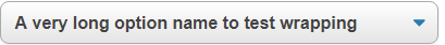
Let’s say we have the following dropdown in our HTML document. By default, we have kept the Bootstrap option selected by adding the selected=»true» attribute.
Now, if we want to apply CSS styles only to the selected option of the dropdown, we have to use the :checked selector on the element i.e. option:checked
/*Apply styles to selected option*/ option:checked
Below is the outcome of the above code:
Apply Styles to the Default Selected Option of the Dropdown
A select dropdown can also have a default selected option. If the user does not select any option from the dropdown, the default selected option is used by the form.
To make a dropdown option selected by default, we add the selected=»true» attribute in that option. Here, true means that the option will be selected by default.
If you want to apply CSS styles to this default selected option, you can use the :default pseudo-class selector. The :default selector allows you to apply styles to those inputs which are selected by default.
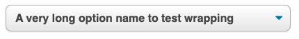
Let’s say we have the following dropdown in our HTML file. We have made the «CSS» option of the dropdown selected by default. This is done by adding the selected=»true» attribute to it.
Now, we want to apply yellow background color and italic font style to this default selected option so that the user could distinguish between the default selected option and normal options.
To do that we have to use the :default selector with the select option:
/*Apply styles to default selected option*/ option:default
This will give you the following output:
Live Demo
You can use the following try it now example to run the code in our online html editor.
Example:
Conclusion
In this article, we learned how we can change the selected option color of a select dropdown using CSS. We also learned to apply styles to the default selected option of a dropdown with CSS.
To change the selected option color of a dropdown, we use the :checked selector with the select option. The :checked selector only targets the currently selected option of the dropdown.
Also, to change the default selected option color, we use the :default selector with the select option. The :default selector targets only that option which is selected by default using the selected=»true» attribute.
Related posts:
Giving Style to Select Option Values
tldr; inputs and their corresponding elements exclusively allow text. Emoji is text. Therefore, in some cases, you can use emoji to style select inputs without reinventing the wheel of dropdown inputs. But it would be cool if browsers and OS makers allowed more in the future.
I have a small project where I want the user to be able to choose from an enumerated set of colors.
Right now I have a menu with elements to represent each color choice:
select> option value="blue">Blue option> option value="red">Red option> option value="orange">Orange option> . select> While I could use with a predefined list of values, those ultimately remain suggestions for input while any color can still be chosen.
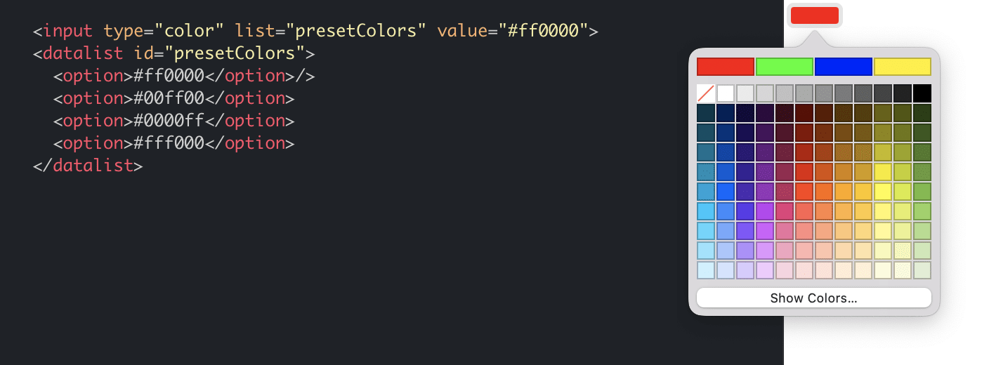
For my case, the makes sense because its a limited set of options.
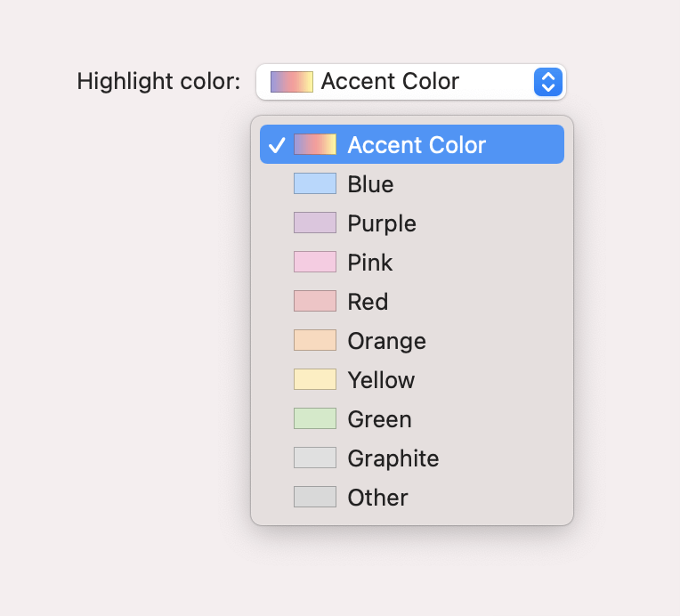
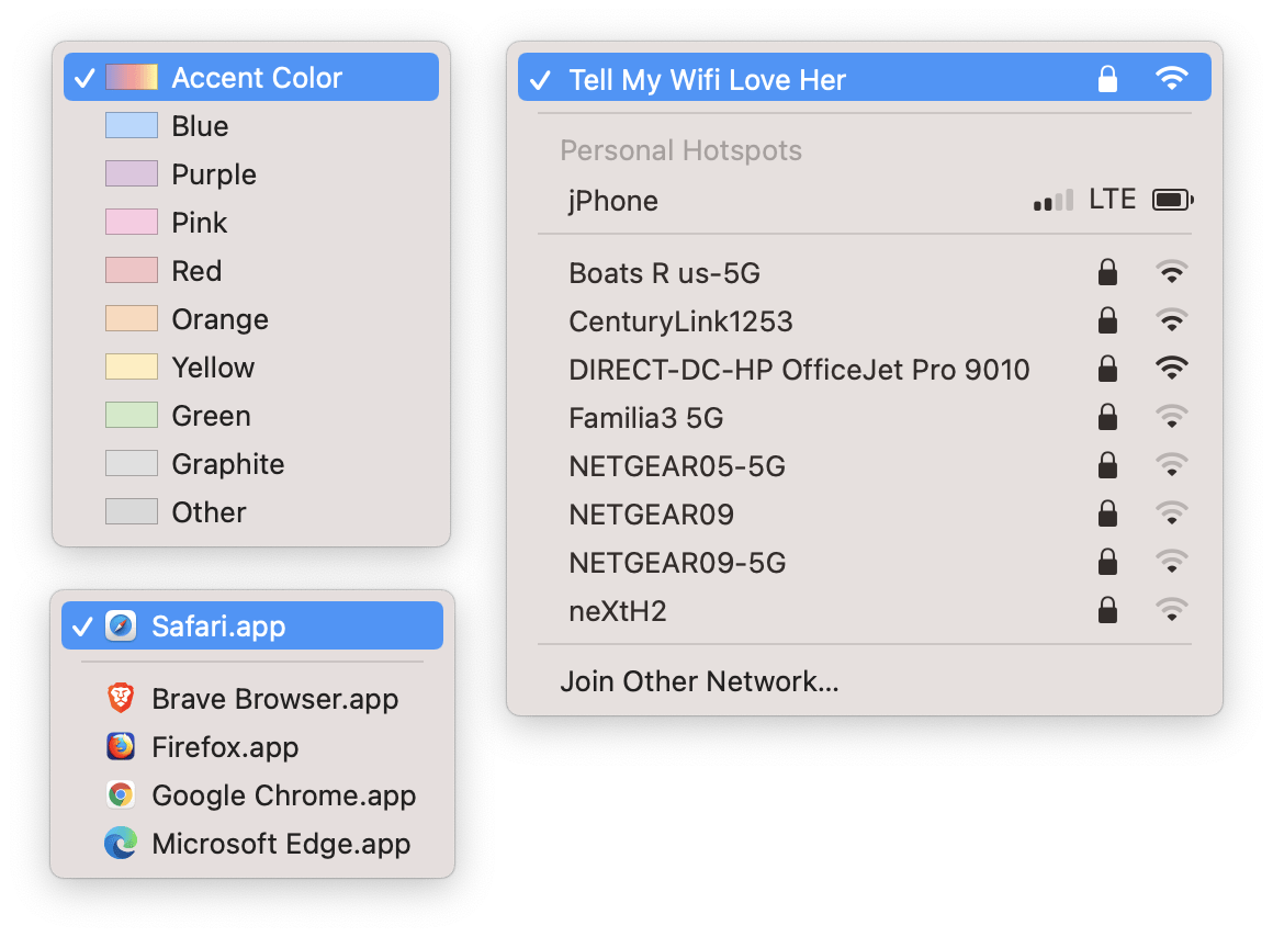
However, it would be nice if I could make the options more visual. For example: prefix every color’s textual value with a visual representation of the corresponding color, like what you see in the macOS settings for “Highlight color”:
Wouldn’t it be nice if the option in HTML allowed this kind of flexibility? Say, the ability to provide an image or icon?
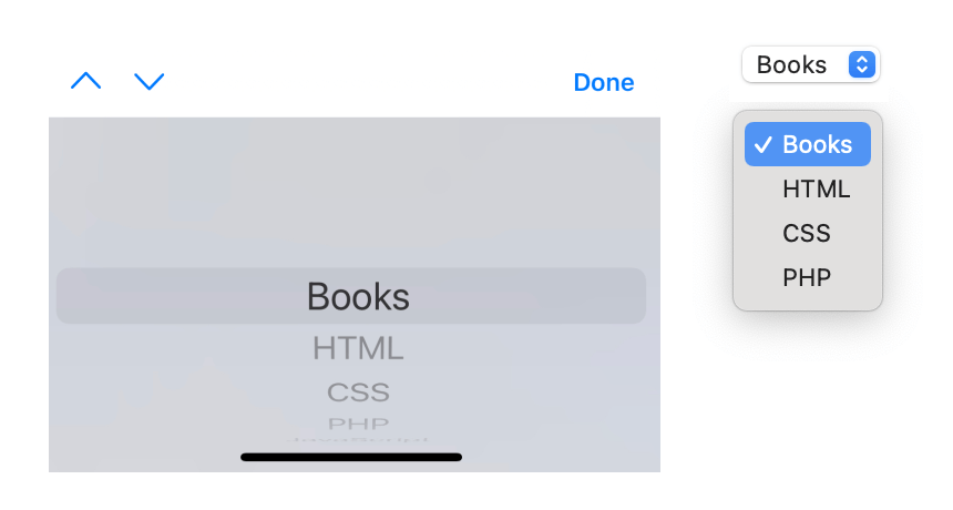
Of course, you have to remember that the native dropdown is not a “dropdown” in all scenarios. Different devices and operating systems handle this input differently. On macOS, for example, you see a dropdown when triggering a . However, on iOS, you don’t see a dropdown appear on screen below the but rather a kind of virtual keyboard tailored for handling this type of input:
Granted, you can re-engineer the menu as a customizable on-screen dropdown across all devices and inputs by using a third-party JavaScript implementation like react-select. This would allow the kind of flexibility one might be looking for in a “select dropdown”.
It’s worth remembering, however, that these implementations aren’t equivalent, one merely being more customizable than the other. And once you opt to “roll your own” HTML element, you lose all hard-won considerations learned over decades that’ve been baked into HTML to deal with accessibility, usability, resiliency, etc.
So, back to my original problem. Is there an easy win where I can A) leverage existing HTML semantics and native input controls, while B) still getting an enhanced visual cue of some sort, without C) using a library or rebuilding a input from scratch?
The biggest constraint is how limited theis technically invalid. Even option::before is invalid. It’s characters only.
While searching for how to add some flare to the elements, I stumbled on this Stack Overflow which points out the ability to leverage code points in combination with custom fonts to get custom glyphs.
And that’s when the light bulb went on in my head: emojis are characters! Why not use emojis as my color cues? For my particular case, surely there must be emojis of the basic color enumerations I’m working with?
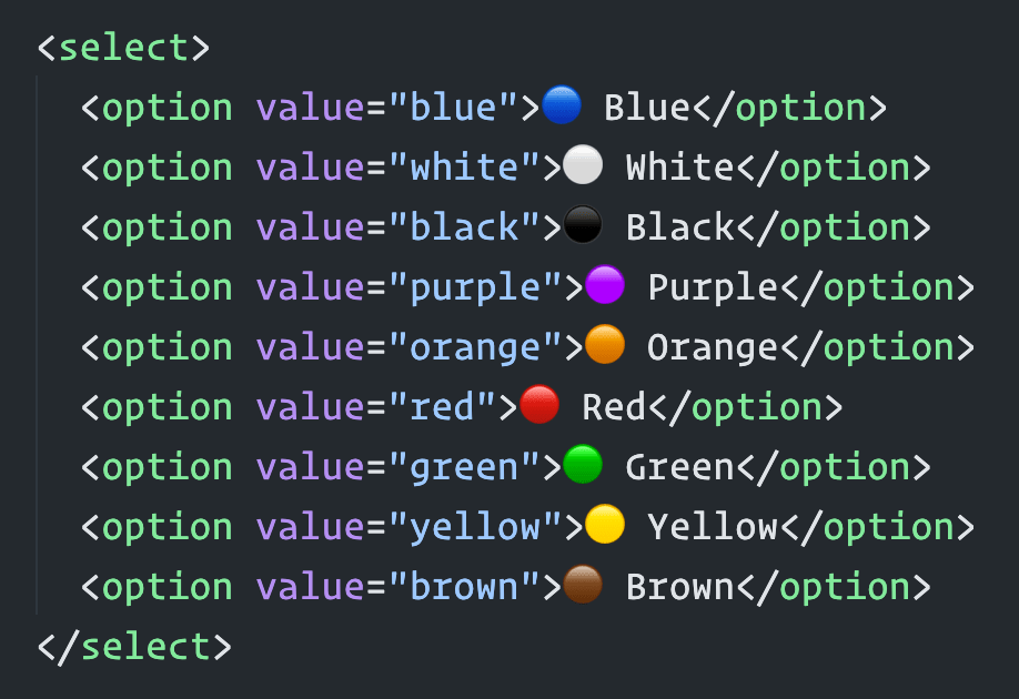
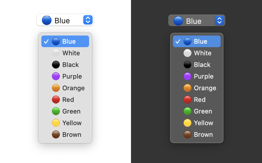
A quick search on emojipedia reveals there’s an emoji for each color I need. If I put all these ingredients together, I get a native with color values as options and small visual representations of each color in tandem with the text.
At first, since the emojis were intended to be purely stylistic, I thought I’d implement them with CSS. For example:
style> option[value="red"]::before < content: "🔴"; > style> select> option value="red">Red option> select> The problem, as I mentioned earlier, is that this isn’t considered valid and doesn’t actually work. The only way to see the emojis is to put them directly into the markup:
select> option value="blue">🔵 Blue option> option value="white">⚪ White option> option value="black">⚫ Black option> option value="purple">🟣 Purple option> option value="orange">🟠 Orange option> option value="red">🔴 Red option> option value="green">🟢 Green option> option value="yellow">🟡 Yellow option> option value="brown">🟤 Brown option> select> Because of how emojis work across different systems and applications, the code sample above might render different than what you see in the screenshots I posted earlier. It also might look different than what you see in VSCode:
Anyway, this solution works decent, although putting the emoji first sort of breaks quick keyboard navigation, i.e. hitting “Y” on the keyboard when the dropdown menu is open doesn’t jump you down to “Yellow” as the selected option because the first character of that isn’t “Y”. It’s the yellow emoji. If you wanted to support that functionality, you’d have to put the emojis last.
It’s a shame I couldn’t get the pseudo element solution to work in CSS! That would’ve been the best of both worlds.
Anyhow, now I’ve got some nice inputs with color-coded emojis as visual cues for the textual values. Even works in dark mode!
What would be neat is if browsers and OS makers could extend the HTML element so that web developers could take advantage of the same kind of UI controls native OS users have:
Стилизация Select с помощью css, как будто это 2020
Select – этот элемент трудно стилизовать для всех браузеров. Чтобы избегать его недостатки раньше, мы использовали обходные пути, такие как стилизация родительского элемента, добавление псевдоэлементов и даже использование JavaScript для создания подобного элемента управления из различных элементов, которые легче стилизовать. Но обходные пути сложно поддерживать и использовать, не говоря уже о проблемах доступности, которые создают пользовательские элементы.
Как выясняется, разумный набор стилей для select можно создать согласованно и привлекательно для новых браузеров, не меняясь при этом и в старых.
Быстрый Пример
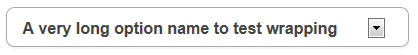
Вот элемент select без стиля . Он будет выглядеть немного иначе, в зависимости от браузера, который вы используете.
Ниже представлен тот же элемент select, стилизованный непосредственно с помощью CSS. Никаких дополнительных элементов обертки или псевдоэлементов не требуется (за исключением одного, который необходим для IE10 +):
HTML-код для приведенного select приведен ниже. Обратите внимание, что CSS применяется к любому select с классом select-css.
А вот CSS, управляющий select:
.select-css < display: block; font-size: 16px; font-family: sans-serif; font-weight: 700; color: #444; line-height: 1.3; padding: .6em 1.4em .5em .8em; width: 100%; max-width: 100%; box-sizing: border-box; margin: 0; border: 1px solid #aaa; box-shadow: 0 1px 0 1px rgba(0,0,0,.04); border-radius: .5em; -moz-appearance: none; -webkit-appearance: none; appearance: none; background-color: #fff; background-image: url('data:image/svg+xml;charset=US-ASCII,%3Csvg%20xmlns%3D%22http%3A%2F%2Fwww.w3.org%2F2000%2Fsvg%22%20width%3D%22292.4%22%20height%3D%22292.4%22%3E%3Cpath%20fill%3D%22%23007CB2%22%20d%3D%22M287%2069.4a17.6%2017.6%200%200%200-13-5.4H18.4c-5%200-9.3%201.8-12.9%205.4A17.6%2017.6%200%200%200%200%2082.2c0%205%201.8%209.3%205.4%2012.9l128%20127.9c3.6%203.6%207.8%205.4%2012.8%205.4s9.2-1.8%2012.8-5.4L287%2095c3.5-3.5%205.4-7.8%205.4-12.8%200-5-1.9-9.2-5.5-12.8z%22%2F%3E%3C%2Fsvg%3E'), linear-gradient(to bottom, #ffffff 0%,#e5e5e5 100%); background-repeat: no-repeat, repeat; background-position: right .7em top 50%, 0 0; background-size: .65em auto, 100%; >.select-css::-ms-expand < display: none; >.select-css:hover < border-color: #888; >.select-css:focus < border-color: #aaa; box-shadow: 0 0 1px 3px rgba(59, 153, 252, .7); box-shadow: 0 0 0 3px -moz-mac-focusring; color: #222; outline: none; >.select-css option < font-weight:normal; >*[dir="rtl"] .select-css, :root:lang(ar) .select-css, :root:lang(iw) .select-css Примечания по CSS
CSS для этого прекрасно использовать как есть, но если вы хотите его редактировать, вам может понадобиться знать о нескольких числах и значениях, которые помогают ему выглядеть правильно.
- Select Устанавливается на display: block; по умолчанию, но вы можете поменять его, display: inline-block; width: auto; если хотите, чтобы он сидел рядом с label.
- Фон select создается с использованием двух фоновых изображений: первое — это значок стрелки svg (выраженный в виде URI данных), а второе — повторяющийся линейный градиент. Любой URL может быть внешним изображением, если хотите. Если вы меняете изображение значка, имейте в виду, что его размер установлен в первом разделе последующего background-size: .65em auto, 100%; свойства. И его положение задается через background-position: right .7em top 50%, 0 0;(который находится .7em с правой стороны, соответственно). Кроме того, если размер изменяется, вы можете захотеть сделать более правый отступ для кнопки, чтобы она не перекрывала select текст, но имейте в виду, что в IE9 и более ранних версиях пользовательская стрелка не появится и браузер по умолчанию Стрелка будет отображаться слева от отступа, поэтому не добавляйте слишком много, иначе стрелка IE9 будет вставлена очень далеко.
- Важно сохранить линейный градиентный фон, потому что его наличие на самом деле мешает IE9 и старше распознавать свойство background, и в результате он не будет показывать пользовательский значок рядом со своим невидимым собственным. Если вы хотите плоский цвет, используйте линейный градиент между двумя одинаковыми значениями цвета.
- Appearance Правило и его и приставочные версии имеют важное значение, чтобы сбросить стили некоторых браузеров по умолчанию.
- font-size: 16px; Правило важно , потому что IOS Safari будет увеличивать его в макете сайта , если select текст меньше 16px. Обычно такое поведение раздражает, поэтому мы стараемся избегать его с размером шрифта 16 пикселей на select.
- .select-css::-ms-expand Правило предписывает IE11 и IE10 , чтобы скрыть псевдоэлемент меню значка, поэтому может появиться пользовательский значок позади него.
Как это выглядит в разных браузерах
Вот несколько скриншотов select в различных браузерах. В некоторых браузерах, таких как IE9 и старше, дизайн иконок не полностью поддерживается, но элемент управления можно использовать и выглядит достаточно хорошо для наших обычных целей.

Наслаждайтесь!
Обновление статьи 3.06.20
Стилизация пунктов option
В интернете есть много решений как стилизовать пункты выбора. Ниже приведены три популярных способа.
2. С помощью стилизации label со скрытыми input
3. С помощью списка li и скрытого input
Стилизация — это конечно хорошо, но доступность нужна не меньше.
Заменяя стандартные элементы управления самодельными, придется реализовывать штатные возможности самостоятельно.
В последних двух приведенных примерах без мыши/тачскрина (с помощью клавиатуры/скринридера) сделать ничего нельзя. Скринридер в режиме чтения тоже ограничен. После долгих изысканий в дизайне и функционале я пришел к выводу, что лучше просто оставить select как есть.
И это все. Спасибо за прочтение.