- How to Position HTML Elements Side by Side with CSS
- 1. Display: Inline-Block
- Inline or Block?
- 2. Using Floats
- Should I Use Floats?
- Usage
- Advanced Techniques: Flexbox or Grid
- 3. Flexbox
- 4. Grid
- 3 ways to display two divs side by side (float, flexbox, CSS grid)
- Float Method
- Add space between columns by nesting each column in an outer div
- Flexbox Method
- Add space between divs by using a margin, and it will still fit!
- CSS Grid Method
- Adding space between grid items with the grid-gap property
- Related posts
How to Position HTML Elements Side by Side with CSS
Aligning HTML elements is one of the most common issues in CSS that developers deal with. There are a couple of ways that CSS provides for positioning elements and you need to decide for yourself which one to use, depending on your project.
In this post, I’m going to explore four different ways that CSS provides for positioning elements side by side.
1. Display: Inline-Block
The first way you can use is the display: inline-block method. This method is a simple and classic CSS technique for positioning elements side by side.
Inline or Block?
The important thing to understand before using this method is to see whether the element is a block-level element (like ,
) or an inline one (, ).
First of all, you can use inline HTML elements and they will be automatically positioned side by side, but the restriction of inline elements is that width & height properties cannot be applied to them. On the other hand, we can apply width and height properties to block-level elements but the problem is that they cannot be placed side by side. That’s why, there is a third way that can be applied, which leads to changing the display behavior of an element to inline-block:
div, span  display: inline-block;
>
What inline-block does is place elements side by side (like inline elements) We can also assign width and height properties as we can do for block-level elements.
2. Using Floats
Another way to align elements side by side is by using floats. This is an older technique and there are many discussions on the web about whether using floats is still useful or not.
Should I Use Floats?
Honestly, it depends on your project. If all you want to do is to place elements side by side, using floats will do the trick. However, if your project is using a modern technique (like Flexbox, Grid, or maybe a framework like Bootstrap, etc.) then using floats may not be a good idea.
Usage
By using floats, you can either position elements on the left or on the right side of the page. Centering elements is not possible directly by using floats only because there is no “center” value for floats, but this can be done with other CSS properties.
In addition, the float property will take the elements out of the normal document flow. This can cause a mess on your page and shift the rest of the elements under the floated elements so they will be partially visible or won’t be visible at all.
To prevent this, you should use the clear property right after the floated elements.
You can also watch the tutorial video of this post below:
Advanced Techniques: Flexbox or Grid
So far we’ve talked about the classic methods to solve this issue. Now let’s move on to more advanced techniques.
CSS provides two newer methods to solve the alignment problem as flexbox and grid. The advantage of using flexbox or grid is that they bring a wider, more flexible, and easy to use solution for the positioning problem. However, both of these techniques require more understanding because they have a lot of various features for alignment, so before using flexbox or grid in your project you need to either have some understanding about them or your project should be suitable for using one of these methods.
3. Flexbox
If you decide to use flexbox, firstly the elements must be wrapped by a parent element.
class="container">
 1
 2
 3
Then, when we assign the parent element (the container) a display: flex behavior, it will automatically position all of its child elements side by side:
.container  display: flex;
>
Besides, if you add child elements to a flex property and give a number (number 1, for example), all of the space will be divided equally:
Flexbox makes it a lot easier to position elements with CSS if you have some understanding of how to use it.
4. Grid
CSS Grid is another alternative way of aligning elements side by side. It has similarities to Flexbox but has different rules and implementation.
First of all, as we did in the flexbox method, the elements should be inside a parent container:
class="container">
 1
 2
 3
After that, we change the display property of the parent element (container) to the grid:
.container display: grid;
>
Next, we need to determine what the layout will look like. We can decide how many columns and rows there will be in our layout. Let’s say we want three columns for three elements, each positioned in one column and in the same row. To place the elements side by side, we define the grid-template-columns property and divide the empty field equally by giving a value of 1fr for each column:
.container display: grid;
grid-template-columns: 1fr 1fr 1fr;
>
Note: fr means fractional unit of space and is similar to the “flex“ property of flexbox.
Liked the article? Medium is a great platform that hosts thousands of great articles without showing any ads. Since Medium is ad-free, readers who love this platform can support it by becoming a member.
You can become a Medium member here and have unlimited access to every story on Medium. If you use the link right above, it will also support me as a writer, because I’ll earn a small commission from Medium. Thank you 🙂
3 ways to display two divs side by side (float, flexbox, CSS grid)
Here are 3 ways you can use CSS to place HTML div elements side by side.
(Click to jump to each section)
Float Method
In the float method, we will be using the following HTML markup:
Float Column 1 Float Column 2 The .float-container is simply the parent element that contains both .float-child elements.
To get the divs side by side, we will use the following CSS rules:
.float-container < border: 3px solid #fff; padding: 20px; >.float-child
The resulting code will look like this:
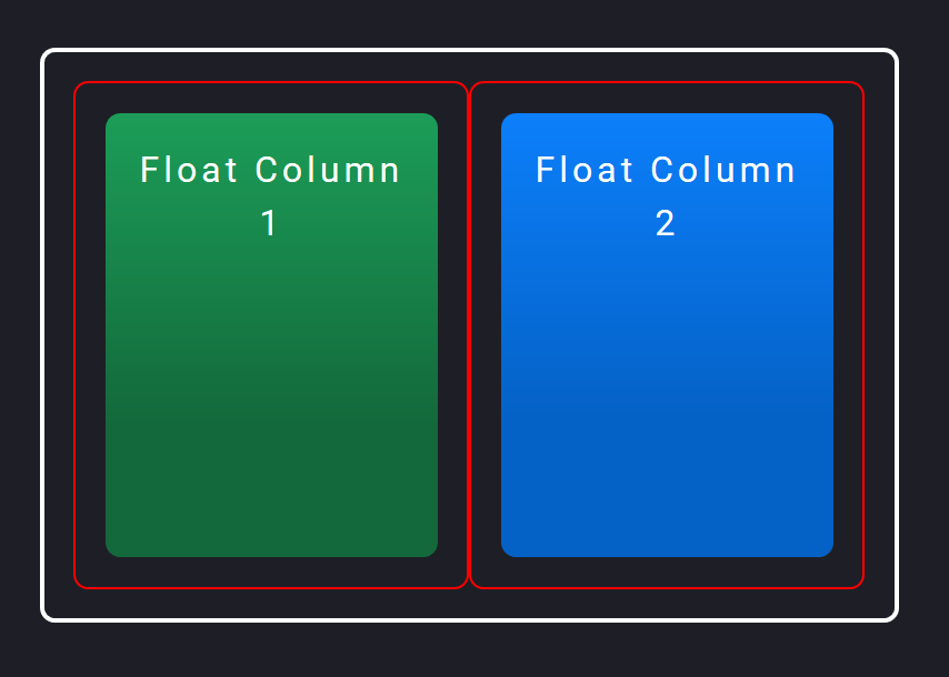
I’ve added borders and padding to the divs so you can more easily see exactly what’s going on. The thicker solid white border on the outside is the .float-container div, which has 20px of padding.
Then each .float-child element has a thinner red border and some more padding. Then the actual color blocks are child elements of the .float-child elements. (You’ll see why in a bit.)
To position the divs side by side, we are using the float property to float each .float-child element to the left.
Since they are both floating to the left, they will display side by side if there’s enough space for both to fit. They do fit because we have two .float-child divs, each at 50% width.
And the space between the divs is created by adding padding in each .float-child div, which then contains the color blocks.
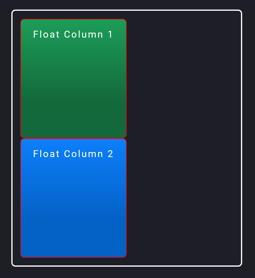
Add space between columns by nesting each column in an outer div
It’s necessary for the color blocks to have an outer div ( .float-child ) in order to add space and also have both blocks fit side by side.
Well, what if we only had the .float-child divs without padding, and instead tried to add space by putting a margin-right value on the first block like this?
Float Column 1 Float Column 2 In this case, both .float-child elements would take up 50% of the total width. But the first green element would also have a margin of 20px.
This would mean that both blocks would take up 50% + 20px + 50% width. This would be 20px more than 100% width, meaning there’s not enough room for both to be side by side.
The second blue block would then wrap to the next row underneath the first block, and float to the left there:
You can try to tweak the widths so they are 48% or some other number less than 50% to fit them. But it won’t be exact.
That’s why I personally like wrapping the blocks in an outer div set at 50% width, with padding to add the space between the divs.
Nowadays, it’s easier to use other, newer methods in CSS to place divs side by side rather than with float.
Let’s take a look at one of these: the flexbox method!
Flexbox Method
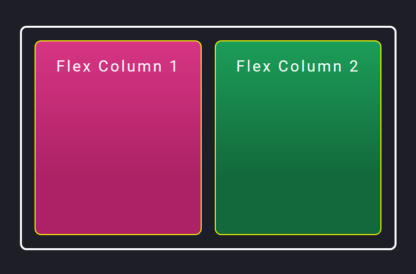
With flexbox, we can use a more intuitive way of aligning our two div elements.
Flex Column 1 Flex Column 2 .flex-container < display: flex; >.flex-child < flex: 1; border: 2px solid yellow; >.flex-child:first-child
With flexbox, we have set display: flex on the parent .flex-container element. This turns on flexbox.
Then in each .flex-child element, we are setting flex: 1 . This number is like a ratio comparing the widths of each child in the parent flex element.
Since they are the same, the available space will be divided up equally. And since we have two child elements, they will each take up 50%.
Here’s what the resulting code will look like:
Add space between divs by using a margin, and it will still fit!
Notice that we’ve added space by adding margin-right: 20px to just the first .flex-child element. However, flexbox is intelligent enough to take that extra 20px into consideration when dividing up the rest of the available width.
This means you can add space with margin without having to calculate the exact pixels. Flexbox will fit the content for you!
This is one big reason that I love flexbox.
However, if you have multiple elements that you want to layout in a responsive grid, you don’t always know where you need to add that space between elements.
In our case, if we wanted to stack the two divs one under the other for mobile, we would have to take out that margin-right property for mobile widths.
Or you could add an additional outer element plus padding for each .flex-child element, similar to what we did with the float method.
It’s not 100% intuitive, but it will still work. If you need to create more complex responsive layouts with flexbox, you will need to keep this in mind.
Let’s now take a look at the newest method you can use to place divs side by side: CSS grid.
CSS Grid Method
And here’s how you can place the two divs side by side, using CSS grid:
Grid Column 1 Grid Column 2 And here’s what the code will look like:
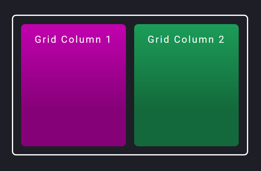
One big change with grid is that you first determine what the grid template will look like. Meaning how many columns and/or rows you want in your layout.
In our case, we want two columns of equal width. So in the parent .grid-container element, we turn grid on with display: grid . Then we add in how many columns we want in our layout with the grid-template-columns property.
We want two columns of equal width, so we set it to 1fr 1fr . This tells the browser to create a two-column layout, and each column takes up 1fr (fr = fractional unit) of space.
The fr unit is a ratio of each column to another, similar to the flex: 1 rule we used in the flexbox method. Having the columns set to 1fr 1fr means that each column will take up the same amount of space.
Adding space between grid items with the grid-gap property
One big benefit to using CSS grid is that you don’t need to use padding or margin to add space between grid items.
You can use the grid-gap (or gap in newer browsers) to automatically add space in your grid template.
We’ve set grid-gap to 20px, so the browser will know to add 20px of space between all items, whether they are side by side or stacked.
And you may have noticed that all the CSS properties for grid were set on the parent .grid-container element. We didn’t actually have to write any CSS for the child .grid-child elements!
I’m making a course that will teach you how to build a real-world responsive website from scratch!
Related posts
Sign up to get emails about new posts and other info. Unsubscribe anytime.
Affiliate Disclaimer
I participate in various affiliate programs and my content contains affiliate links. If you purchase through those links, I may receive a commission from the seller, at no cost to yourself. It’s one way you can support this site!
As an Amazon Associate I earn from qualifying purchases. I only recommend products that I personally know and believe are helpful to my readers.