Make Take Up 100% of the Browser Height

Ok, so here is the setup! A short while ago, I was trying to listen for mouse events on the body of a mostly empty page. What I wanted to do was make the body element take up the full height of the page so that I have a giant hit target that I can do all sorts of event-related shenanigans on. Knowing what I had to do, I specified the body element in the HTML and wrote some CSS that looked as follows:
When I previewed this page in the browser, this is what I saw:
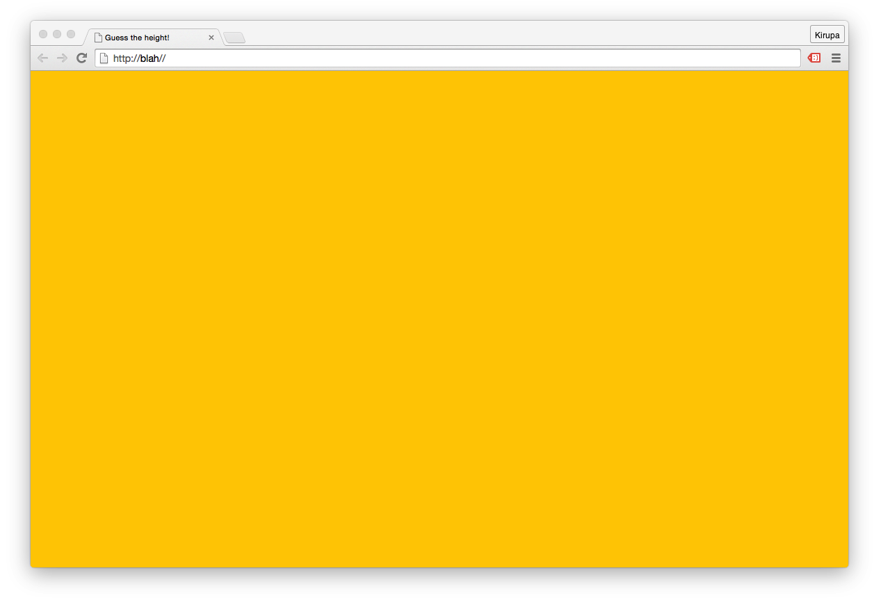
From what you and I can see, the body element seems to take up the full size of the page. The yellow background color we specified in the CSS fills up everything. Life seems good. Right? Despite what you see, this is one of the many cases involving HTML and CSS where looks can be deceiving. Your body element literally has a height of 0. Let’s pause for a moment and let that sink in. Take a measured walk around the room if needed.
Once you are ready, read on to learn both why you have such a bizarre height and how to fix it so that our body element truly takes up 100% of the available space.
How Percentage Sizes are Calculated
In HTML and CSS, some of the greatest mysteries revolve around two things:
To follow along and help explain the confusion around this topic, take a look at the following markup:
This is the full markup for the example you saw earlier, and if you preview all of this in your browser, you’ll see an empty page with a yellow background. Our goal is to have our body element take up the full height of the page, and despite overwhelming evidence to the contrary, that isn’t happening right now. You can verify that this isn’t happening when you inspect the height of the body element using an in-browser development tool such as what you get with Chrome:
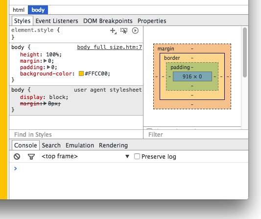
Notice that the reported height of the body element in the box model visualization is in fact 0 pixels. This means that your body element might as well not exist from a visual point of view. What is going on here?
To fully understand what is going on here, let’s learn a bit about how the html and body elements are sized along with some general height calculation trivia. By default, both the html element and body element have their height CSS property set to auto. This means they don’t have an explicit height out of the box. They’ll either take up whatever height they are told to be, or they will take up whatever height of the content that is inside them.
Doesn’t the highlighted line satisfy the «they’ll take up whatever height they are told to be» part of what I wrote earlier? The answer is “No” and the reason has to do with what a percentage value for height actually means. Allow me to bore you with the relevant information from the spec:
The percentage is calculated with respect to the height of the generated box’s containing block. If the height of the containing block is not specified explicitly (i.e., it depends on content height), and this element is not absolutely positioned, the value computes to ‘auto’. A percentage height on the root element is relative to the initial containing block.
The emphasized part holds the key. See, our body element’s height is set to be 100% of the height of the containing block. The containing block is the html element, and we never specified a height on it. Because there isn’t any content on the page, the height of the html element. wait for it. is also 0. The solution to our problem then would be to specify a height value of 100% on the html element as well:
Once you do this, the height of our body element naturally becomes the 100% height that we had always wanted it to be:
There is just one more thing we need to do. Your body element will often contain more content than can be displayed in one screen of your browser. In such cases, you will want a scrollbar to appear and not have your body element’s size fixed to whatever initial size your browser was. There is an easy fix to address this valid concern — replace the height property on the body element with min-height instead:
This will ensure your body element’s size grows along with the content inside it. If you have no content in your body element, the body will take up all the space available to it anyway.
Conclusion
The twisted path to writing this article started with something completely unrelated — making the body element a click/hit area as big as the browser window. Figuring all of this out was 80% fun and 20% frustrating, but the result is that I learned a lot about how sizing in HTML/CSS works. I hope my rambling writing here helped you to learn more about it as well.
Just a final word before we wrap up. If you have a question and/or want to be part of a friendly, collaborative community of over 220k other developers like yourself, post on the forums for a quick response!


- Arrays From Noob to Ninja
- BUY
- JavaScript Absolute Beginner’s Guide
- BUY
- Learning React:
A Hands-on Guide- BUY
- Creating Web Animations
- BUY
The KIRUPA Newsletter
Thought provoking content that lives at the intersection of design 🎨, development 🤖, and business 💰 — delivered weekly to over a bazillion subscribers!
Serving you freshly baked content since 1998!
Killer hosting by GoDaddy
Stretching body to full viewport height: the missing way
Suppose you’re making a sticky footer or centering some content relative to the viewport. You want to stretch the body element to the full height of the browser viewport while also letting it grow even further to match its content. This task was surely solved a bazillion times, and it should be as easy as pie. Right? Right?
The state-of-the-art way

Sure! Applying min-height: 100vh to the body element should do the trick. Here, 100vh means that the initial body height will take 100% of the viewport height, whereas the use of min-height instead of height will let the body element grow even more if necessary. Isn’t it exactly what we need? Well. Almost. If we open such a page in a typical mobile browser (such as iOS Safari or Android Chrome), it will be scrollable regardless of the size of its content. Even if the page has no content at all, its bottom will still disappear beneath the bottom UI panel of the browser! The reason for this is fairly simple. UI elements in these browsers shrink after the scroll, providing additional space for the actual content. A height of 100vh corresponds to the maximum possible viewport height. Since the initial viewport height is smaller, the body element with a min-height of 100vh initially exceeds the viewport height regardless of its content. The known fix for this issue looks like this:
html height: -webkit-fill-available; /* We have to fix html height */ > body min-height: 100vh; min-height: -webkit-fill-available; > This solution has a minor glitch in Chrome: when the browser height increases, the body height stays the same, getting out of sync with the viewport height. Aside from that, this approach solves the issue. However, we now have to fix the html height. If that’s the case, shouldn’t we use an older, more robust solution?
The old-school way
Since we couldn’t avoid fixing the html height, let’s try the good old way that involves passing a height of 100% from the html element. Let’s apply min-height: 100% to the body element, where 100% is the full height of its parent (namely, html ). A percentage height on a child requires its parent to have a fixed height, so we have to apply height: 100% to the html element, thereby fixing its height to the full viewport height. Since the percentage height of the html element in mobile browsers is calculated relative to the minimal viewport height, the above-mentioned scroll issue doesn’t bug us anymore!
html height: 100%; /* We still have to fix html height */ > body min-height: 100%; > 
This solution is not as pretty as the 100vh one, but it’s been used since time immemorial, and it will work, that’s for sure! Well. Not quite. Apparently, the gradient applied to such a body element will be cut at the html height (in other words, at the viewport height, or, to be more precise, at the minimal viewport height). It happens because of the fixed html height, and it doesn’t matter whether it’s height: 100% or height: -webkit-fill-available . Of course, this can be «fixed» by applying the gradient to the body content, but that’s just not right. The page background should be applied to the body element, and the html element should stretch to its content. Can we achieve that?
The missing way
I suggest another way of stretching the body element to the full viewport height without the above-mentioned issues. The core idea is to use flexbox, which enables a child element to stretch even to a parent with non-fixed dimensions while retaining the ability to grow further. First, we apply min-height: 100% to the html element to stretch it to the full minimal viewport height. Then we use display: flex and flex-direction: column to turn it into a flex-container with a vertical main axis. Finally, we apply flex-grow: 1 to the body element, thereby stretching it to the html height. The align-self property of the body element implicitly has the stretch value, so the body width already matches the html width.
html min-height: 100%; /* Look, it's not fixed anymore! */ display: flex; flex-direction: column; > body flex-grow: 1; > Now both html and body can stretch to their content, and, since we’re using the percentage height, there are no issues with mobile browsers whatsoever. Neat!
Notes
- It should be obvious that the flexbox-based solution works for any depth. It can easily be used in cases where the content is being rendered to an element inside the body , and not the body element itself. It’s a typical scenario with React or Vue, for example.
- As you might’ve noticed, the direction of the main axis of the flex-container shouldn’t matter. I just think that the vertical axis is more elegant in this case, and I didn’t really test the other variant. I don’t see how it can possibly break, but who knows.
- The flexbox-based solution doesn’t work in IE. Not at all. But you don’t support it anyway, do you?