- Hover — эффекты при наведении
- Горизонтальная заполнение
- Вертикальное заполнение
- Инвертирование цвета
- Пунктирная граница
- Появление значка
- Эффект подпрыгивания
- Искажение
- 3D-поворот
- 40 CSS Button Hover Effects
- Related Articles
- Author
- Links
- Made with
- About the code
- Directionally Aware Pure CSS Button Hover
- Author
- Links
- Made with
- About the code
- Circle Button
- Author
- Links
- Made with
- About the code
- Button Hover Effect
- Author
- Links
- Made with
- About the code
- Epic Button
- Author
- Links
- Made with
- About the code
- CSS Button Hover Effect
- Author
- Links
- Made with
- About the code
- Bubble Coloring Button
- Author
- Links
- Made with
- About the code
- Animated Buttons
- Author
- Links
- Made with
- About the code
- «Click Me» Button
- Author
- Links
- Made with
- About the code
- Buttons + SVG Trianglify
- Author
- Links
- Made with
- About the code
- Stylized Buttons
- Author
- Links
- Made with
- About the code
- Hover Buttons
- Author
- Links
- Made with
- About the code
- Button Hover Effect
- Author
- Links
- Made with
- About the code
- Border Button
- Author
- Links
- Made with
- About the code
- Button Hover Effect
- Author
- Links
- Made with
- About the code
- Gooey Button
- Author
- Links
- Made with
- About the code
- Stripped Buttons
- Author
- Links
- Made with
- About the code
- Button Hover Effects With Box-Shadow
- Author
- Links
- Made with
- About the code
- CSS-Mask Button Hover Animation
- Author
- Links
- Made with
- About the code
- Button Hover Effects
- Author
- Links
- Made with
- About the code
- Sass Button Border Hover Effect Mixin
- Author
- Links
- Made with
- About the code
- Flip Button
- Author
- Links
- Made with
- About the code
- Button Hover
- Author
- Links
- Made with
- About the code
- Cool Beans Button 60fps
- Author
- Links
- Made with
- About the code
- Animation Button #3
- Author
- Links
- Made with
- About the code
- Button Explore
- Author
- Links
- Made with
- About the code
- Animation Button 2
- Author
- Links
- Made with
- About the code
- Gradient Hover Animated Button
- Author
- Links
- Made with
- About the code
- Animated SVG Hover Buttons
- Author
- Links
- Made with
- About a code
- Button Hover Animations
- Author
- Links
- Made with
- About a code
- Blobs Buttons
- Author
- Links
- Made with
- About a code
- Simple Button Hover
- Author
- Links
- Made with
- About a code
- Amy Winehouse Doc Button
- Author
- Links
- Made with
- About a code
- Half Fuller Buttons
- Author
- Links
- Made with
- About a code
- Collection of Button Hover Effects
- Author
- Links
- Made with
- About a code
- Button Hover States
- Author
- Links
- Made with
- About a code
- Animated CSS3 Buttons
- Author
- Links
- Made with
- About the code
- Star Trek LCARS-Style Ghost Buttons
- Author
- Links
- Made with
- About a code
- Button Outline Animation On Hover
- Author
- Links
- Made with
- About a code
- Box/Button Hovers
- Author
- CSS Buttons
- Example
- Button Sizes
- Example
- Example
- Rounded Buttons
- Example
- Colored Button Borders
- Example
- Hoverable Buttons
- Example
- Shadow Buttons
- Example
- Disabled Buttons
- Example
- Button Width
- Example
- Button Groups
- Example
- Bordered Button Group
- Example
- Vertical Button Group
- Example
- Button on Image
- Animated Buttons
- Example
- Example
- Example
- Example
Hover — эффекты при наведении
Мы задали цвет фона и текста, радиусы закругления, размер шрифта, отступы. Для анимации используем transition: all 500ms ease, которое означает, что в нужный момент будут анимированы все свойства в течение 500 миллисекунд.
Горизонтальная заполнение
Полупрозрачный фоновый цвет постепенно заполняет кнопку при наведении. Обычно заполнение происходит с какой-то одной стороны и переход длится до тех пор, пока вся кнопка не будет заполнена.
Чтобы достичь такого результата, нужно использовать псевдо-элемент :before:
Данный контент абсолютно спозиционирован и расположен в верхнем левом углу кнопки. Зададим ширину равную 0px, потому что именно этот параметр мы будем анимировать. Чтобы анимировать его, мы просто изменим его ширину:
Вертикальное заполнение
Если анимировать высоту, то заполнение произойдёт сверху.
button:before < content:''; position: absolute; top: 0; left: 0; width: 100%; height: 0; background: rgba(255,255,255,0.3); border-radius: 5px; transition: all 2s ease; >button:hover:before
Инвертирование цвета
Инвертируем цвет внутри кнопки и добавляем границу:
Пунктирная граница
Добавим границу у кнопки и инвертируем цвета:
Появление значка
При наведении значок плавно появиться слева от текста.
Подключим шрифт со значками Font Awesome.
Увеличим внутренний отступ, чтобы для значка было место, и добавим свойство overflow со значением hidden:
Далее добавляем значок из шрифта Font Awesome в псевдо-элемент before и размещаем его за пределами кнопки:
Осталось установить свойство left:
Эффект подпрыгивания
Для данной анимации установим несколько ключевых кадров (keyframes):
Подключаем созданную анимацию:
Искажение
В CSS3 появилась возможность использовать искажения:
3D-поворот
Самый сложный эффект. Используем поворот кнопки для отображения другого сообщения, которое мы добавим в псевдо-элемент after у нашей кнопки.
Зададим для свойства transform-style значение preserve-3d, чтобы все дочерние элементы кнопки находились в 3D-пространстве:
Установим правила для псевдо-элемента after:
Правила добавлены сверху, перед кнопкой, и выставлены такие же параметры width и border-radius, как и у самой кнопки. Что касается свойств трансформации, то в качестве опорной точки, относительно которой будет происходить трансформация, установлен нижний левый угол элемента и указано вращение по оси X со значением 90 градусов, чтобы элемент казался плоским. Сейчас осталось только создать анимацию при наведении:
Чтобы активировать данный эффект, переместим опорную точку трансформации в центр, а также повернём сам элемент, чтобы реализовать трансформацию.
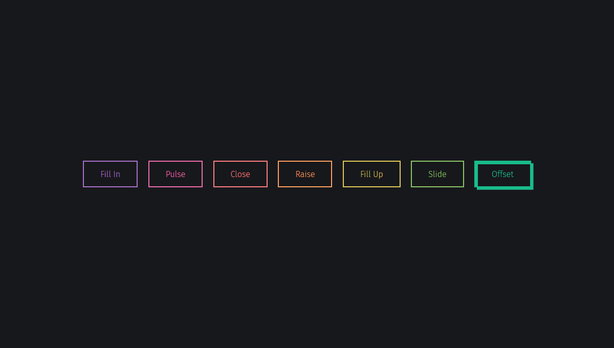
40 CSS Button Hover Effects
Collection of hand-picked free HTML and CSS button hover effect code examples from Codepen, GitHub and other resources. Update of November 2021 collection. 5 new items.
Related Articles
Author
Links
Made with
About the code
Directionally Aware Pure CSS Button Hover
Directionally aware hover button with just CSS using segments and hover state checks.
Compatible browsers: Chrome, Edge, Firefox, Opera, Safari
Author
Links
Made with
About the code
Circle Button
HTML and CSS circle button with hover effect.
Compatible browsers: Chrome, Edge, Firefox, Opera, Safari
Author
Links
Made with
About the code
Button Hover Effect
Pure CSS button hover effect.
Compatible browsers: Chrome, Edge, Firefox, Opera, Safari
Author
Links
Made with
About the code
Epic Button
Fluid hover effect for button in HTML and CSS.
Compatible browsers: Chrome, Edge, Firefox, Opera, Safari
Author
Links
Made with
About the code
CSS Button Hover Effect
CSS button hover effect with chevron arrows.
Compatible browsers: Chrome, Edge, Firefox, Opera, Safari
Author
Links
Made with
About the code
Bubble Coloring Button
Pure CSS bubble coloring buttons.
Compatible browsers: Chrome, Edge, Firefox, Opera, Safari

Author
Links
Made with
About the code
Animated Buttons
Animated buttons with rainbow hover.
Compatible browsers: Chrome, Edge, Firefox, Opera, Safari

Author
Links
Made with
About the code
«Click Me» Button
«Click Me» button with pure CSS hover/click effect.
Compatible browsers: Chrome, Edge, Firefox, Opera, Safari

Author
Links
Made with
About the code
Buttons + SVG Trianglify
Buttons with SVG patterns that move on hover.
Compatible browsers: Chrome, Edge, Firefox, Opera, Safari

Author
Links
Made with
About the code
Stylized Buttons
Elegant buttons with direction hover effects.
Compatible browsers: Chrome, Edge, Firefox, Opera, Safari

Author
Links
Made with
About the code
Hover Buttons
Experimenting with the CSS mix-blend-mode property.
Compatible browsers: Chrome, Edge, Firefox, Opera, Safari

Author
Links
Made with
About the code
Button Hover Effect
Hover effect using pseudo elements.
Compatible browsers: Chrome, Edge, Firefox, Opera, Safari
Author
Links
Made with
About the code
Border Button
Button with fancy border hover effect.
Compatible browsers: Chrome, Edge, Firefox, Opera, Safari

Author
Links
Made with
About the code
Button Hover Effect
Pretty hover effect for button.
Compatible browsers: Chrome, Edge, Firefox, Opera, Safari

Author
Links
Made with
About the code
Gooey Button
Gooey button hover effect with SVG filters & CSS.
Compatible browsers: Chrome, Firefox, Opera, Safari

Author
Links
Made with
About the code
Stripped Buttons
Button with animated diagonal single border on hover.
Compatible browsers: Chrome, Edge, Firefox, Opera, Safari
Author
Links
Made with
About the code
Button Hover Effects With Box-Shadow
Making some basic animations with box-shadow s. No extra elements or even pseudo elements required.
Compatible browsers: Chrome, Edge, Firefox, Opera, Safari

Author
Links
Made with
About the code
CSS-Mask Button Hover Animation
Made this sprite animation on button with hover effect for triggering the frame’s.
Compatible browsers: Chrome, Firefox, Opera, Safari

Author
Links
Made with
About the code
Button Hover Effects
Three buttons with hover effects.
Compatible browsers: Chrome, Edge, Firefox, Opera, Safari
Author
Links
Made with
About the code
Sass Button Border Hover Effect Mixin
CSS button with drawing effect on hover.
Compatible browsers: Chrome, Edge, Firefox, Opera, Safari
Author
Links
Made with
About the code
Flip Button
Compatible browsers: Chrome, Edge, Firefox, Opera, Safari

Author
Links
Made with
About the code
Button Hover
Compatible browsers: Chrome, Edge, Firefox, Opera, Safari

Author
Links
Made with
About the code
Cool Beans Button 60fps
We can easily make our animated buttons more performant. Use transform s and opacity for animations only. Then use will-change: transform; to let the browser know what animations lie ahead.
Compatible browsers: Chrome, Edge, Firefox, Opera, Safari

Author
Links
Made with
About the code
Animation Button #3
Practice for button hover style!
Compatible browsers: Chrome, Edge, Firefox, Opera, Safari

Author
Links
Made with
About the code
Button Explore
Just a kind of experimental button transition.
Compatible browsers: Chrome, Edge, Firefox, Opera, Safari

Author
Links
Made with
About the code
Animation Button 2
Button animation practice.
Compatible browsers: Chrome, Edge, Firefox, Opera, Safari

Author
Links
Made with
About the code
Gradient Hover Animated Button
HTML and CSS gradient hover animated button.
Compatible browsers: Chrome, Firefox, Opera, Safari

Author
Links
Made with
About the code
Animated SVG Hover Buttons
This is pure HTML/CSS implementation of some SVG buttons with a cool hover effect. The colors and shapes can be customized to fit your needs.
Compatible browsers: Chrome, Edge, Firefox, Opera, Safari

Author
Links
Made with
About a code
Button Hover Animations
A set of button hover animations.
Compatible browsers: Chrome, Edge, Firefox, Opera, Safari

Author
Links
Made with
About a code
Blobs Buttons
Compatible browsers: Chrome, Edge, Firefox, Opera, Safari

Author
Links
Made with
About a code
Simple Button Hover
Simple multi layer box shadow hover effect.
Compatible browsers: Chrome, Edge, Firefox, Opera, Safari
Author
Links
Made with
About a code
Amy Winehouse Doc Button
Compatible browsers: Chrome, Edge, Firefox, Opera, Safari

Author
Links
Made with
About a code
Half Fuller Buttons
Compatible browsers: Chrome, Edge, Firefox, Opera, Safari

Author
Links
Made with
About a code
Collection of Button Hover Effects
A few examples of flashy hover effects.
Compatible browsers: Chrome, Edge, Firefox, Opera, Safari

Author
Links
Made with
About a code
Button Hover States
Snazzy CSS hover states for a buttons.
Compatible browsers: Chrome, Edge, Firefox, Opera, Safari

Author
Links
Made with
About a code
Animated CSS3 Buttons
Compatible browsers: Chrome, Edge, Firefox, Opera, Safari

Author
Links
Made with
About the code
Star Trek LCARS-Style Ghost Buttons
These buttons are inspired by the computer interface seen in Star Trek with a bit of added transition effects on hover. The left and right values define the numerator and denominator of the border radius for the transition effects.
Compatible browsers: Chrome, Edge, Firefox, Opera, Safari

Author
Links
Made with
About a code
Button Outline Animation On Hover
Compatible browsers: Chrome, Edge, Firefox, Opera, Safari

Author
Links
Made with
About a code
Box/Button Hovers
Compatible browsers: Chrome, Edge, Firefox, Opera, Safari

Author
CSS Buttons
Use the background-color property to change the background color of a button:
Example
Button Sizes
Use the font-size property to change the font size of a button:
Example
Use the padding property to change the padding of a button:
10px 24px 12px 28px 14px 40px 32px 16px 16px
Example
.button1
.button2
.button3
.button4
.button5
Rounded Buttons
Use the border-radius property to add rounded corners to a button:
Example
Colored Button Borders
Use the border property to add a colored border to a button:
Example
Hoverable Buttons
Use the :hover selector to change the style of a button when you move the mouse over it.
Tip: Use the transition-duration property to determine the speed of the «hover» effect:
Example
.button <
transition-duration: 0.4s;
>
.button:hover background-color: #4CAF50; /* Green */
color: white;
>
.
Shadow Buttons
Use the box-shadow property to add shadows to a button:
Example
.button1 <
box-shadow: 0 8px 16px 0 rgba(0,0,0,0.2), 0 6px 20px 0 rgba(0,0,0,0.19);
>
.button2:hover box-shadow: 0 12px 16px 0 rgba(0,0,0,0.24), 0 17px 50px 0 rgba(0,0,0,0.19);
>
Disabled Buttons
Use the opacity property to add transparency to a button (creates a «disabled» look).
Tip: You can also add the cursor property with a value of «not-allowed», which will display a «no parking sign» when you mouse over the button:
Example
Button Width
By default, the size of the button is determined by its text content (as wide as its content). Use the width property to change the width of a button:
Example
Button Groups
Remove margins and add float:left to each button to create a button group:
Example
Bordered Button Group
Use the border property to create a bordered button group:
Example
Vertical Button Group
Use display:block instead of float:left to group the buttons below each other, instead of side by side:
Example
Button on Image

Button
Animated Buttons
Example
Example
Add a «pressed» effect on click:
Example
Example
Add a «ripple» effect on click: