20 Most Common CSS Issues and their Solutions
A CSS (Cascading Style Sheet) is a web page stimulated from diversified sources, where the definition of any style element conflict. With CSS, you can create rules and apply them to many elements in a website. It provides multiple advantages when the site-wide alters are demanded by a client. Along with the advantages, it also offers critical issues or bugs.
In this blog, we will discuss on 20 most common Cascading Style Sheet issues and also try to find out their respective solutions. We have listed down these issues based on our own experiences while working on HTML to WordPress conversion projects.
IE Bug Fixes
1) IE Double Margin Float Bug: It has become one of the serious problems in IE5. It is the Internet Explorer, which is a bug wherein an element is floated and given a margin in the equivalent direction, as the float ends up with twice the particular margin size.
Fortunately, this problem has a simple solution as you have to apply a display: inline rule to the floated element.
#content <
float: left;
width: 400px;
padding: 12px 18px;
margin-left: 18px; >
Apply this to rectify the issue:
#content <
float: left;
width: 400px;
padding: 12px 18 px;
margin-left: 18px;
display:inline;
>
2) Overcoming the Box Model Hack: if you are supposed to fix a width to any div, then you don’t need to fix padding or margins. All you need to do is to craft an inner div without any width set, instead of fixing padding and margins. Instead of this:
#main-div <
width: 140px;
border: 10px;
padding: 25px;
>
#main-div <
width: 140px;
>
#main-div div <
border: 10px;
padding: 25px;
>
3) Min-height attribute ignored in IE: This attribute immediately ignored in IE, but can work properly in Firefox. It means IEs height act as Firefox’s min-height. However, this problem can be fixed in IE7.
/* for understanding browsers */
.container <
width:15em;
padding:0.4em;
border:1px solid #000;
min-height:10em;
height:auto;
>
/* for Internet Explorer */
/*\*/
* html .container <
height: 10em;
>
/**/
4) Min-Width for IE: It sets the minimum width of a particular element. The mid-width always overrules the width whether applied before or after in your attestation.
Centering a Block Element
5) Centering Block Element: You can center a block element by offering it margin-left or margin-right of auto. However, there are various methods that can help in centering the block element in more dictatorial values. You can easily put entire’s page content in center like this:
body <
text-align: center;
>
#container
<
text-align: left;
width: 950px;
margin: 0 auto;
>
6) Vertical Alignment with CSS: You can simply create vertical alignment in the legitimate way that can specify the line-height for the text of the container’s same height.
#wrapper <
width:550px;
height:20px;
background:url(container.gif) no-repeat left top;
padding:0px 10px;
>
#wrapper p <
line-height:20px;
>
Column Problems
7) Major reason that your CSS columns are disorganized: With the help of CSS box model, you will be able to understand this issue quickly. The following is the diagram and code snippets:-
8) The Expanding Box Bug: IE will develop a “float drop”, as when you create a two-column float layout. It is persisted due to the over-sized content in a fixed-width floated div that should fit into a specific place in the layout.
Positioning of CSS
9) Significance of CSS positioning part 1: The most difficult task in CSS is its positioning and layout. It is because the CSS has many of positioning an element. In fact, the series of articles will boost to clarify the possibilities that you have in positioning. It doesn’t only envelope positioning, but also cover the layout that include float, display and a preview of the new Cascading Style Sheet 3 layout modules.
10) Difference among relative and absolute positioning: You might get confuse between choosing the relative and absolute positioning. Working with the relative positioning means the way an object is question is placed is relative to page margins of the document. On the other side, in the absolute positioning, all elements are placed in relation to the browser or parent element.
Your code may look like this:
#redSquare
<
position: relative;
bottom: 50px;
right: 50px;
>
11) Hang Tab: You can craft a Sticky Tab directly from the Edge of the browser window. In fact, you can also check their website for their Software coda.
#hang_tab <
position: absolute;
top: 7px;
left: 0px;
width: 157px;
height: 93px;
>
Understanding the Concept of CSS Float
12) Important things about CSS Float Theory: You can browse SmashingMagazine through multiple of relates articles and elect the most imperative things that you should keep in mind while creating CSS based layouts with floats.
13) Floatutorial: It takes you through the fundamentals of floating elements that includes drop caps, images, inline lists, next and back button, image galleries and multi-column layouts.
14) Clear the Floats: Use EasyCleaning on your website to clear the floats because it can be one of the irritating tasks of CSS development.
/* Hides from IE-mac \*/
* html #container
#container
/* End hide from IE-mac */
Solutions: Easier Rounded Corner
15) CSS issue can be solved through rounded corner: “Simplest way is to use a giant gif, then I’ll markup my box.”
beautifully-encapsulated paragraph
“And give it the background”
.roundBox <
background:transparent url(roundBox.gif) no-repeat top left;
width:350px;
padding:30px;
>
.roundBox .boxBottom <
background:white url(roundBox.gif) no-repeat bottom left;
font-size:1px;
line-height:1px;
height:14px;
margin:0 -30px -30px -30px;
>
16) 3 Easy steps in coding a rounded corners layout: You can code a fixed width and rounded corners layout in simple and effective three steps:
Step 1 => Header
To abridge the things, you can crop the entire header as a single background image. Always remember that the size of the image should not exceed 50kb. You can also crop the top corners of the content area to make it more visually appealing.
Step 2 => Content
Content area can be expandable in height. For that you can use 1 px high gif that echo vertically.
Step 3=> Footer
You can close the content area with footer background image. In that way, the footer’s background can be used for ceasing of the content and creation of the footer.
Issues Related to CSS Form
17) Handy tips for Creating effective Web forms: You can choose the simple and easy contact forms from the millions of options.
label <
float: left;
text-align: right;
margin-right: 15px;
width: 120px;
>
18) Clean and authentic CSS FORM design: With the help of the tutorial, you will be able to understand the concept of designing an authentic CSS form without the use of HTML tables.
19) Enable the JavaScript: Most of the times, user’s needs guidance about what they are going to enter into the text input fields. However, you can easily find out the solution by enabling the JavaScript. With this you can hide the label element can copy the value of the input element’s title attribute to the value attribute.
20) Cross browser Horizontal Rule with Background Image: You can craft a cross-browser horizontal to use a custom image as the separator of the content.
div.hr <
background: #fff url(myhrimg.gif) no-repeat scroll center;
height: 10px
>
div.hr hr <
display: none
>
Hopefully, this blog has helped you by giving appropriate answers related to the CSS issues and their solutions. It becomes necessary to understand each of the problems and then find out the most suitable solutions. With this, you will be able to create the hassle-free CSS layouts quickly and effectively.
CSS Common Problems and Solutions
In the process of development, front-end engineers encounter the most headache is the compatibility of browsers, often in order to achieve a compatible browser effect rack their brains. When we usually write front-end code, we also encounter various compatibility problems when typesetting, especially when the boss asks for compatibility with IE5, IE6 and IE7. Next, I will summarize several compatibility problems and solutions that I have encountered, which will be updated slowly in the future.
1. H5 Label Compatibility IE5, IE6 Incompatibility
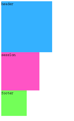
H5 tags are not compatible with IE5 and IE6. To illustrate this problem, I will first write a small example, the code is as follows:
header < width:200px; height:200px; display: block; background-color: #34b1ff; >section < width:150px; height:150px; background-color: #ff54c5; >footerheader session
Because I don’t have IE6 on my computer, I use IETester to test and display the results under IE6:
To solve this problem, we can create H5 tags manually, but if all H5 tags need to be created one by one, the process is troublesome, but here’s how to create it. The Js code is as follows:
Why is it that these three elements are not displayed according to the width and height I defined? This is because the elements created through js are considered as custom tags, the default is inline elements, and if you want to display them according to a fixed width and height, you must be block elements, so in order to achieve this effect, we can add display:block to the style of each element. The effect is achieved. The style code is modified as follows:
The problem here is that if we need a lot of tags, it’s very difficult to create each element one by one, then we can do it by introducing an H5 JS plug-in. Here I use HTML 5shiv. js, because it can not upload, you can find me in private if you need. The implementation code is as follows:
header < width:200px; height:200px; background-color: #34b1ff; >section < width:150px; height:150px; background-color: #ff54c5; >footerheader session
2. After the element floats, set the width for the element if it can set the width; if it needs the width to be content-stretched, add floating to the block elements inside it.
What does this mean? Let’s give an example to illustrate that I first write an html structure and the desired effect. Now we write the following structure. The effect we want to achieve is that two div s are displayed on the left and right sides respectively.
But I am foolish to see the effect of IE6. Didn’t I set the left and right floats? Why is the result so?
Next, let’s talk about the solution.
Modify the code of h2 as follows:
2) If you want the width to be content-spanned, float the block elements inside it.
Now the problem arises. Sometimes I don’t know how wide the h2 inside is. I need to expand it according to the content, so I can’t set a uniform width. At this time, I can add floating to the h2 block element.
The modification code is as follows:
3. The first element floats, and the second element plus margin value equals the width of the first element. There will be gaps under IE6.
First of all, let me give you an example:
Why is there an extra gap between the two divs? Everyone will be curious about why, but I don’t know the reason, because I have added a margin:0 in the front. But there will still be such a gap. Because the first div is floating, out of the document stream, and the second div is still in the document stream, so two in the same line, it is really an unexpected problem, generally do not recommend to write this, if we really want to do so, then we will add floating to the second element.
By contrast, I wanted to set up margin-left to move the second div to the right automatically. Now I’m going to remove this code and add floating directly. The effect is as follows (the gap is perfectly removed):
4. IE6’s lower child elements exceed the width and height of the parent, which will stretch the width and height of the parent.
The effect under IE6:
The div of the child element actually extends the width and height of the parent element, so we must pay attention to not letting the width and height of the child element exceed the width and height of the parent element in the process of coding.
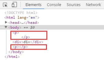
5. P contains nesting rules for block elements
First of all, let me give you an example:
There is no problem with the effect display, but when we look at the review elements, we find that the problem is solved automatically. The P tag ends automatically and adds a P tag. So in the process of writing code, we usually have a nested relationship in the tag. In addition to the problem of the P tag, there are two tags that will also have this problem: td, h:
Posted by mallard on Mon, 25 Mar 2019 00:51:29 -0700
Hot Keywords
- Java — 6961
- Database — 2683
- Python — 2616
- Programming — 2419
- Attribute — 2418
- Javascript — 2383
- Spring — 2111
- Android — 2077
- xml — 1972
- Linux — 1818
- JSON — 1764
- network — 1748
- github — 1720
- less — 1676
- MySQL — 1538
- SQL — 1332
- PHP — 1318
- encoding — 1179
- Mobile — 1029
- Apache — 925
