- How to select text input fields using CSS selector?
- Structure of a text input field
- Example 1: Selecting text input fields using type attribute
- Selecting text input fields using type attribute
- Using the ID selector to select a specific text input field
- Example 2: Selecting text input fields using ID attribute.
- Selecting text input fields using ID attribute
- Using the class selector to select multiple text input fields
- Example 3: Selecting text input fields using class attribute
- Selecting text input fields using ID attribute
- Conclusion
- CSS Selectors Related to Form Control
- Agenda
- Form Related CSS Selectors
- :require & :placeholder-shown
- :out-of-range
- :invalid
- :default
- :read-only
- Browser Support
- Conclusion
- Reference
How to select text input fields using CSS selector?
Selecting text input fields using CSS selectors is a powerful and crucial tool for styling and targeting the specific elements on the webpage. Text input fields are an essential part of any web form that requires users to provide input. As a web developer or designer, we may need to select text input fields using CSS selectors to apply styling to them. If we want to change the font color, background color, or add custom styles to the input fields, it is important to understand how to select them using CSS selectors.
Structure of a text input field
Before we select a text input field using CSS selectors, it is important to understand its structure. A text input field is usually represented by an HTML element with the type attribute set to «text». For example, the following HTML code creates a text input field.
This selector targets all input fields with a «type» attribute set to «text», «email», or «password». The comma between the selectors means that all the selectors will receive the same styles.
Example 1: Selecting text input fields using type attribute
In this example, we use the type attribute selector to select all text input fields in the form. The CSS styles are applied to all text input fields with the attributes type=»text», type=»email», and type=»password». The border, padding, font-size, and margin-bottom styles are applied to these input fields.
body < text-align: center; >input[type="text"], input[type="email"], input[type="password"]Selecting text input fields using type attribute
Using the ID selector to select a specific text input field
We can use the ID selector to target a specific text input field. The ID selector is represented by the «#» character followed by the value of the ID attribute of the HTML element. For example, if we have an HTML element with the ID attribute set to «username», we can select it using the following CSS selector −
Example 2: Selecting text input fields using ID attribute.
In this example, we use the ID attribute selector to select three text input fields with IDs name, email and password. The CSS styles are applied to these three input fields. The border-radius, and background-color styles are applied to these input fields.
body < text-align: center; >input[type="text"], input[type="email"],input[type="password"] < border: 2px solid lightgray; padding: 12px; font-size: 18px; margin-bottom: 15px; >#name, #emailSelecting text input fields using ID attribute
Using the class selector to select multiple text input fields
If we have multiple text input fields with similar styling or functionality, we can use the class selector to target them. The class selector is represented by the «.» character followed by the value of the class attribute of the HTML element. For example, if we have multiple HTML elements with the class attribute set to «input-field», we can select them using the following CSS selector −
This selector targets all HTML elements with the class attribute set to «input-field».
Example 3: Selecting text input fields using class attribute
In this example, we use the Class attribute selector to select three text input fields with the class name, email, and password. The CSS styles are applied to these three input fields. The border-radius, and background-color styles are applied to these input fields.
body < text-align: center; >input[type="text"], input[type="email"], input[type="password"] < border: 2px solid lightgray; padding: 12px; font-size: 18px; margin-bottom: 15px; >.password, .searchSelecting text input fields using ID attribute
Conclusion
Selecting text input fields using CSS selectors is a simple process once we understand the structure of a text input field and the different CSS selectors available. By using the appropriate CSS selector, we can easily target and style text input fields to enhance the user experience of the web forms.
CSS Selectors Related to Form Control
Nowadays, we tend to use JavaScript to validate the form. Then adding some classes to help us style the input elements. In some cases, we probably no need to create extra classes because there are already some CSS selectors that can help us do the job. In this article, I will introduce some CSS selectors related to form control which you might not know before.
Agenda
Form Related CSS Selectors
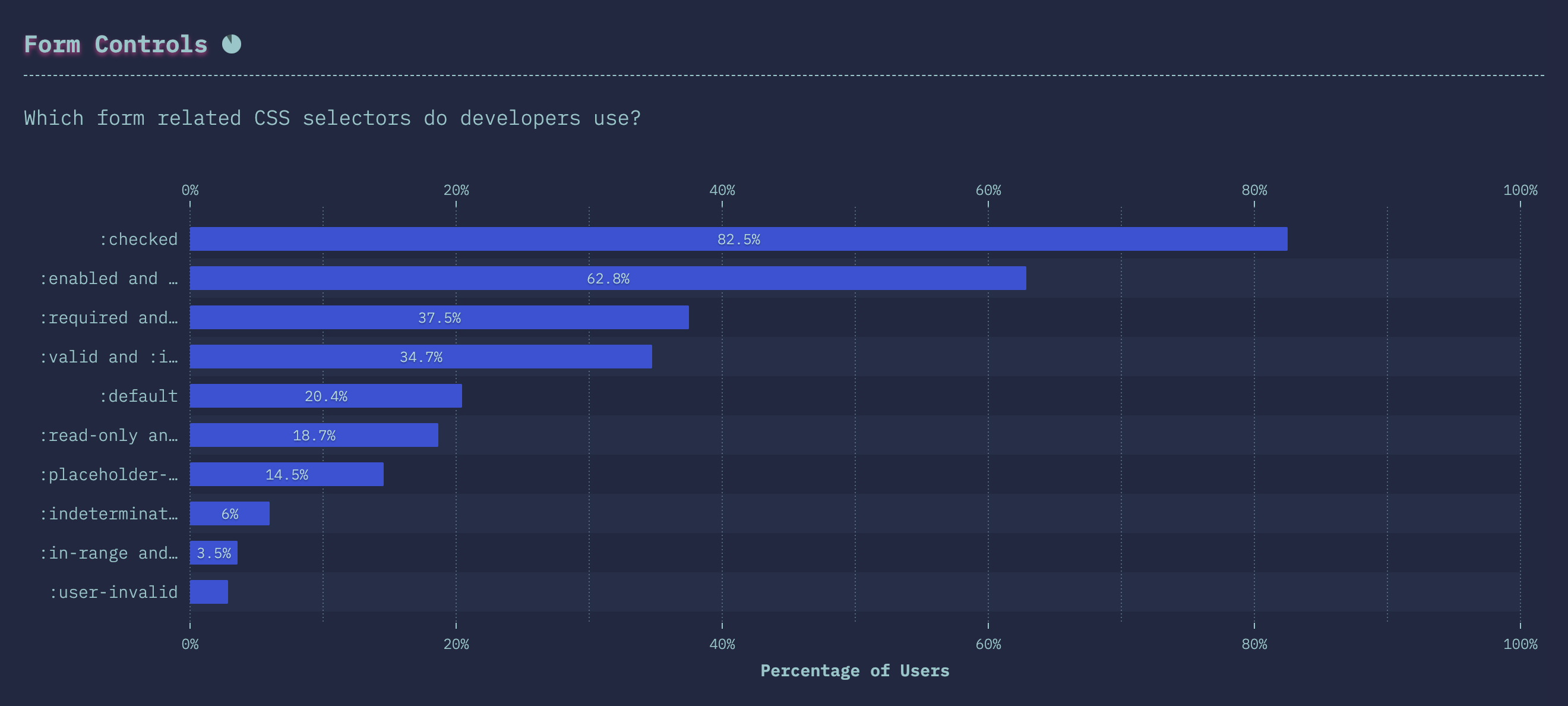
This image is coming from the State of CSS 2019. Some of the CSS selectors related to form control had not used by many developers.
:require & :placeholder-shown
The first example is :required . Because we can’t use Pseudo-elements for the input element, Therefore I add an extra div after the input element to display the message.
Name type="text" name="name" placeholder="your name" required /> Then we can use :required to add some style for the input which is must fill up.
input:required + div::before content: "(required)"; color: red; > If we want to hide the warning message after the user fills up the input, we can use :placeholder-shown to do the trick.
input:required + div::before display: none; > input:placeholder-shown + div::before display: block; > :out-of-range
If we have set a range for the input, then we can use :out-of-range to alert the user when the input value is not within the limit.
Years of Experience type="number" min="0" max="100" /> input:out-of-range + div::before content: "(out-of-range)"; color: red; > :invalid
If there was some error on the content that the user provides, we might want to notify the user that the form is not completed yet. Here we can apply :invalid to display the result.
Name type="text" name="name" placeholder="your name" required /> type="submit"> button:before content: "Ready to Submit"; > form:invalid > button background: darkgray; > form:invalid > button:before content: "Not Ready"; > :default

Sometimes we will set a default option for the checkbox or radio. It’s good to let the user know this option is checked by default. We can use :default to add extra style for that.
Fields type="checkbox" value="fe" checked /> Front-End Developer type="checkbox" value="be" /> Back-End Developer input:default + div::before content: "(default)"; color: red; > :read-only

When the user is editing the form, we might not allow them to edit certain columns (ex. user id). So we can use :read-only display a different style to identity that.
Referred by type="text" value="oahehc@gamil.com" readonly /> input:read-only + div::before content: "(read-only)"; color: red; > Here is an example to display all the above scenarios.
Browser Support
Here is the status of the browser support for all those Pseudo-classes . (2020-03-22)


Conclusion
Frankly, handling form validation through JavaScript can provide maximum flexibility, and we can easily create extra classes for style the input elements base.
If the use case is simple and we can implement the form validation by using HTML attributes. Then using CSS selectors to style the input elements will be a good solution.
The code will be easier to read because we have standard syntax. And HTML now already have enough attributes to help us validate the input for most of the use case.

The downside of using HTML attributes to do the form validation is the style will be inconsistent in different browsers.
