- Matplotlib Axes Class
- What is Matplotlib Axes Class?
- Adding Axes Using add_axes() Function
- Legend
- Plot() with marker codes
- What is add_axes matplotlib
- add_axes matplotlib
- add_axes rect matplotlib
- add_axes on each other matplotlib
- add_axes polar matplotlib
- add_axes projection matplotlib
- add_axes scatter matplotlib
- add_axes facecolor matplotlib
- add_axes multiple bars matplotlib
- add_axes plot inside plot matplotlib
Matplotlib Axes Class
Data analysts often need to use multiple subplots within the same image to accumulate different data extracted from various sources or results. In such situations, we need to leverage the power of the Axis class to create sub-plots. This tutorial will give you a quick walkthrough of creating sub-plots and working with them.
What is Matplotlib Axes Class?
Axes is a flexible and easy-to-use class of the Matplotlib that helps produce multiple sub-plots under a single set of axes. With the help of Axes class, data analysts and data science professionals can put the plots at any point or location in the figure. A generated figure can have multiple axes. The position of the origin can be changed through axis square methods. Depending on the graph generating type, the axis can contain 2D or three-axis objects. The figure is the entire space where we can accommodate multiple axes.
axes([left, bottom, width, height])Let us take a closer look at some essential functions of the Axes class.

In the axes() function, the axes parameter 0.1 refers to the distance from the distance of the left axis or the bottom from the border of the image. In the example figure, we have not plotted any graph; therefore, it is empty.
Adding Axes Using add_axes() Function
Another alternate way of adding axes to the figure is by using the add_axes() method of Matplotlib. It also takes the same parameter format, adding axes at position [left, bottom, width, height]. Here all the parametric quantities remain in the fractional figures. We can also use the add_axes() function to create multiple subplots in the same figure.
add_axes([left, bottom, width, height])Let us take a practical look at it.

Legend
Often, you have seen a box or a collection of colors representing what is mentioned in the graph or chart. They are called legends and are a part of the axes class. Adding legend to your plotted figure is possible by calling the legend() function. It takes three arguments.
ax.legend(handles, labels, loc)Here, «handles» are a sequence of patch instances or 2D lines, «labels» define the name as a sequence of strings, and «loc» can be a string or an integer that determines the position or location of the legend within that figure. Here is a program explaining the legend() function:
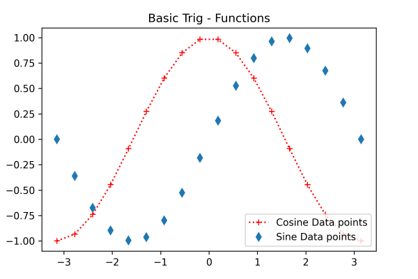
Here the box in the lower right corner is the legend representing the cosine and sine data points.
Plot() with marker codes
Plot() is the most basic axes class method that helps plot the collection of values as lines or markers. Its syntax looks something like this:
In the «line» parameter, you can provide different styles such as dotted line (‘:’), solid line (‘-‘), dashed line (‘—’), hexagon marker (H), and dash-dot line (-.) You can specify the marker using certain letters and symbols:
What is add_axes matplotlib
In this Python Matplotlib tutorial, we’ll discuss the add_axes matplotlib. Here we will cover different examples related to add_axes using matplotlib in Python. And we’ll also cover the following topics:
- add_axes matplotlib
- add_axes rect matplotlib
- add_axes on each other matplotlib
- add_axes polar matplotlib
- add_axes projection matplotlib
- add_axes scatter matplotlib
- add_axes facecolor matplotlib
- add_axes multiple bars matplotlib
- add_axes plot inside plot matplotlib
add_axes matplotlib
Matplotlib is a library used for data visualization in Python. The figure module provides the figure, which has all the elements of the plot. To add the axes to the figure we use the figure module of the matplotlib library.
The function of the figure module used to add axes to the figure is add_axes().
The following is the syntax:
matplotlib.Figure.figure.add_axes(*args, *kwargs)The parameters are as follow:
| Parameter | Value | Description |
|---|---|---|
| rect | [left, bottom, width, height] | The parameter is used to set new dimensions of the figure. It takes values in float also. |
| projection | None, ‘aitoff’, ‘hammer’, ‘lambert’, ‘mollweide’, ‘polar’, ‘rectilinear’ | The parameter is used to set a new projection of axes. By default, the project is None which results in ‘rectilinear’ projection. |
| polar | bool | By default, polar is set to False. If we set it to True, axes results in ‘polar’ projection. |
| sharex or sharey | axes | The parameter is used to share the x-axis and y-axis. |
add_axes rect matplotlib
Here we’ll see an example of the add_axes function with rect parameter in Matplotlib. In this example, we only add single axes.
The following is the syntax:
matplotlib.figure.figure.add_axes(rect=[])# Import library import matplotlib # Create figure() objects fig = matplotlib.pyplot.figure() # Creating axis axes = fig.add_axes([0.75, 1, 0.5, 1]) # Display plt.show()- First, import matplotlib.pyplot library.
- Next, create figure() module.
- To add axes to the figure,use the add_axes() function.
- Here we set xmin, ymin, width, and height to 0.75, 1, 0.5, 1 respectively.
- To display the plot, use the show() function.

add_axes on each other matplotlib
Here we’ll see an example where we add a plot above each other by using the add_axes matplotlib function.
# Import libraries import matplotlib import numpy as np # Create figure() objects fig = matplotlib.pyplot.figure() # Generate line graph x = np.arange(0, 20, 0.2) y1 = np.sin(x) y2 = np.sqrt(x) # Creating two axes axes1 = fig.add_axes([0, 0, 1, 1]) axes1.plot(x, y1) axes2 = fig.add_axes([0, 1, 1, 1]) axes2.plot(x, y2) # Show plot plt.show()- Import matplotlib.pyplot and numpy libraries.
- Next, we create figure() object.
- After this, we define data coordinates using arange(), sin(), and sqrt() functions of numpy.
- Then we create two axes, using add_axes() function.

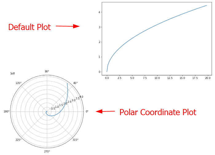
add_axes polar matplotlib
By using the add_axes() function of the figure module, we can plot the curves in polar coordinates. For this, we pass polar as a parameter and set its value to True.
The following is the syntax:
matplotlib.figure.figure.add_axes(rect,polar)Let’s see an example:
# Import libraries import matplotlib import numpy as np # Create figure() objects fig = matplotlib.pyplot.figure() # Generate graph x = np.arange(0, 20, 0.2) y1 = np.exp(x) y2 = np.sqrt(x) # Creating two axes axes1 = fig.add_axes([0, 0, 1, 1],polar=True) axes1.plot(x, y1) axes2 = fig.add_axes([1, 1, 1, 1]) axes2.plot(x, y2) # Show plot plt.show()- First, we import important libraries such as matplotlib.pyplot and numpy.
- Next, we create figure object by using figure() function.
- We define data coordinates using arange(), exp() and sqrt() functions.
- Next, we create first axes using add_axes() function and to create plot In polar curves we pass polar as parameter and set its value to True.
- To create second axes, we again use add_axes() function and we also set its position by passing rect parameter.
add_axes projection matplotlib
To set a new projection on the axes, we pass the projection argument to the add_axes() function in matplotlib.
The syntax is as below:
matplotlib.figure.figure.add_axes(rect, projection)# Import libraries import matplotlib import numpy as np # Create figure() objects fig = matplotlib.pyplot.figure() # Generate graph x = np.arange(0, 5, 0.1) y1 = np.trunc(x) y2 = np.arctan(x) # Creating two axes axes1 = fig.add_axes([0, 1, 1, 1],projection='hammer') axes1.plot(x, y1) axes2 = fig.add_axes([1, 1, 1, 1],projection='polar') axes2.plot(x, y2) # Show plot plt.show()- Import libraries matplotlib.pyplot and numpy.
- Next, we create figure object using figure() function.
- To define data points, we use arange(), trunc() and arctan() functions of numpy.
- To generate plot, use plot() function.
- To add axes to the figure, use add_axes() function.
- To set the new projection to the axes, we pass projection argument to method and set their value to hammer and polar respectively.

add_axes scatter matplotlib
Here we learn to add axes by using add_axes to the scatter plot. To generate a scatter graph, use the scatter() function in Matplotlib.
# Import libraries import matplotlib import numpy as np # Create figure() objects fig = matplotlib.pyplot.figure() # Generate line graph x = np.arange(0, 20, 0.2) y1 = np.sin(x) y2 = np.arctan(x) # Creating two axes axes1 = fig.add_axes([0, 1, 1, 1]) axes1.scatter(x, y1) axes2 = fig.add_axes([1, 0, 1, 1]) axes2.scatter(x, y2) # Show plot plt.show()
add_axes facecolor matplotlib
Here we’ll see an example where we add axes to the figure by using the add_axes method and we also set the background color of the figure by using the set_facecolor method in Matplotlib.
# Import libraries import matplotlib import numpy as np # Create figure() objects fig = matplotlib.pyplot.figure() # Generate line graph x = np.linspace(20, 10, 100) y1 = np.sin(x) y2 = np.cos(x) # Set facecolor fig.set_facecolor('mistyrose') # Creating two axes axes1 = fig.add_axes([0, 0, 1, 1]) axes1.plot(x, y1) axes2 = fig.add_axes([1, 1, 1, 1]) axes2.plot(x, y2) # Show plot plt.show()- Here we define data coordinates using linspace(), sin() and cos() function of numpy.
- To set the facecolor we use set_facecolor() function and set it to mistyrose.

add_axes multiple bars matplotlib
Here we’ll see an example where we’ll add_axes to multiple bars figure using Matplotlib.
# Import libraries import matplotlib import numpy as np # Create figure() objects fig = matplotlib.pyplot.figure() # Generate graph x = [2, 4, 6, 8, 10] y1 = [3, 5.5, 7, 12, 3] y2 = [2.3, 5, 6, 10, 15] # Creating two axes axes1 = fig.add_axes([1, 1, 1, 1]) axes1.bar(x, y1) axes2 = fig.add_axes([1, 0, 1, 1]) axes2.bar(x,y2) # Show plot plt.show()- To plot a bar chart, use bar() method.
- To add axes to the figure, use add_axes() method.

add_axes plot inside plot matplotlib
Here we’ll see an example, where we add a plot inside a plot using the add_axes() method.
# Import libraries import matplotlib import numpy as np # Create figure() objects fig = matplotlib.pyplot.figure() # Define Data x = [3, 6, 9, 12, 15] y = [5.5, 8, 10.5, 23, 12] # Plot plt.plot(x,y) # add plot inside a plot axes=fig.add_axes([0.20, 0.48, 0.28, 0.28]) axes.plot([1,5]) # display plt.show()- Firstly, we import matplotlib.pyplot, and numpy library.
- To create a figure object, use the figure() method.
- To define data points x and y.
- To plot a graph, use the plot() method of pyplot module.
- To add a plot inside an already generated plot, use the add_axes() method.
- After generating a plot, use the plot() method to plot a graph.
- To visualize the graphs, use the show() method.

You may also like to read the following matplotlib tutorials.
So, in this Python tutorial, we have discussed the “add_axes matplotlib” and we have also covered some examples related to using add_axes matplotlib. These are the following topics that we have discussed in this tutorial.
- add_axes matplotlib
- add_axes rect matplotlib
- add_axes on each other matplotlib
- add_axes polar matplotlib
- add_axes projection matplotlib
- add_axes scatter matplotlib
- add_axes facecolor matplotlib
- add_axes multiple bars matplotlib
- add_axes plot inside plot matplotlib
I am Bijay Kumar, a Microsoft MVP in SharePoint. Apart from SharePoint, I started working on Python, Machine learning, and artificial intelligence for the last 5 years. During this time I got expertise in various Python libraries also like Tkinter, Pandas, NumPy, Turtle, Django, Matplotlib, Tensorflow, Scipy, Scikit-Learn, etc… for various clients in the United States, Canada, the United Kingdom, Australia, New Zealand, etc. Check out my profile.