- Dynamic Color Manipulation with CSS Relative Colors
- Dynamic Colors in CSS via Transparency
- Dynamic Colors in CSS via calc()
- Conclusion
- Calculating Color: Dynamic Color Theming with Pure CSS
- The Demo
- What CSS *-Processors Give Us
- Setting it Up
- Adjusting Values with HSL
- Getting the Complement and Triads
- Recreating Mix()
- Creating a Color Contrast Function
- The Future of CSS Color Functions
Dynamic Color Manipulation with CSS Relative Colors
I was reading Dave’s post “Alpha Painlet” when I first learned about CSS relative colors.
CSS relative colors enable the dynamic color manipulation I’ve always wanted in vanilla CSS since Sass’ color functions first came on the scene ( darken() , lighten() , etc.).
Allow me to explain a bit more about why I’m so excited.
Dynamic Colors in CSS via Transparency
I’ve written about generating shades of color using CSS variables, which details how you can create dynamic colors using custom properties and the alpha channel of a supporting color function. For example:
:root < --color: 255 0 0; > .selector < background-color: rgb(var(--color) / 0.5); > However, there are limitations to this approach.
First, all your custom property color values must be defined in a color space whose notation supports the alpha channel in its color function, like rgb() , rgba() , hsl() , and hsla() . For example:
:root < --color-rgb: 251 0 0; --color-hsl: 5 10% 50%; > .selector < background-color: rgb(var(--color-rgb) / 0.5); background-color: hsl(var(--color-hsl) / 0.5); > You can’t “coerce” a custom property’s color value from one type to another:
:root < --color: #fb0000; > .selector < /* Coercing a HEX color to an RGB one doesn't work */ background-color: rgb(var(--color) / 0.5); > Dynamic colors in CSS using HEX color values is impossible. While you can specify the alpha channel for a HEX color, you can only do so declaratively (i.e. #ff000080 ). CSS has no notion of concatenating strings.
:root < --color: #ff0000; > .selector < /* You can’t dynamically specify the alpha channel. */ background-color: var(--color) + "80"; > And if you’re using named colors in CSS, well, you’re flat out of luck trying to do anything dynamic.
:root < --color: green; > .selector < /* how would you even. */ background-color: var(--color) + "opacity: .5"; > However, with relative colors in CSS this all changes!
You can declare a custom property’s value using any color type you want (hex, rgb, hsl, lch, even a keyword like green ) and convert it on the fly to any other color type you want.
:root < --color: #fb0000; > .selector < /* can’t do this */ background-color: rgb(var(--color) / 0.5); /* can do this */ background-color: rgb(from var(--color) r g b / .5); > It even works with color keywords!
:root < --color: red; > .selector < background-color: rgb(from var(--color) r g b / .5); > The easiest way for me to describe what’s happening here is to borrow terminology from JavaScript. With relative colors in CSS, you can declaratively perform a kind of type coercion from one color type to another and then destructure the values you want.
I don’t know if that blows your mind as much as it blew mine, but take a minute to let that soak in. Imagine the possibilities that begin to open up with this syntax.
Dynamic Colors in CSS via calc()
Dynamically changing colors using the alpha channel has its drawbacks. Transparent colors blend into the colors upon which they sit (you’re not always blending into white). You can take a color and get a “slightly lighter” version by changing its opacity, but that color won’t be the same everywhere. It is dependent upon which color(s) it sits on top of.
Sometimes you need a “slightly lighter” color without transparency. One that is opaque.
Or sometimes you need a “slightly darker” color, in which case you can’t set the alpha channel to 1.2 hoping it’ll get slightly darker.
Previously, you could achieve this flexibility in CSS by becoming incredibly verbose in your custom property definitions and defining each channel individually.
:root < /* Define individual channels of a color */ --color-h: 0; --color-s: 100%; --color-l: 50%; > .selector < /* Dynamically change individual channels */ color: hsl( var(--color-h), calc(var(--color-s) - 10%), var(--color-l) ); > This could get really verbose really fast. And color values like hexadecimal colors are not supported.
With CSS relative colors, this is now dead simple in combination with calc() .
:root < --color: #ff0000; > .selector < color: hsl(from var(--color) h calc(s - 10%) l); > Wild! A few more examples, for completeness:
:root < --color: #ff0000; > .selector < /* syntax: hsl(from var() h s l / alpha) */ /* change the transparency */ color: hsl(from var(--color) h s l / .5); /* change the hue */ color: hsl(from var(--color) calc(h + 180deg) s l); /* change the saturation */ color: hsl(from var(--color) h calc(s + 5%) l); /* change all of them */ color: hsl( from var(--color) calc(h + 10deg) calc(s + 5%) calc(l - 10%) / calc(alpha - 15%) ); > Amazing! Sass color functions, let me show you the door.
Conclusion
Destructuring? Type coercion? Do those words belong in a post about CSS? Is CSS a programming language?
The only thing we need now is the ability to have user defined custom functions in CSS—then you could create your own reusable lighten() and darken() functions.
Support for this syntax shipped in Safari Technology Preview 122 (check out some of the tests to see examples of the syntax). At the time of this writing, it’s still an experimental feature so you have to enable it via the menubar “Develop > Experimental Features”.
Calculating Color: Dynamic Color Theming with Pure CSS

Did you know that you can build custom dynamic color themes without the use of JavaScript or a CSS preprocessor!? With the magic of CSS Custom Properties, HSL colors, and some calc() fun, you too can create custom theming with no dependencies. That means we can support any framework or web technology without adding cruft to a codebase! Hooray for CSS!
The Demo
In the above demo, you can select a primary and secondary color and create entire color systems with vanilla CSS alone. The only JavaScript used in that demo is to change the colors dynamically.
What CSS *-Processors Give Us
When it comes to color systems, there are several Sass color functions that authors find useful. Jackie Balzar has a great visual post about this. Some of the most common are:
Some of these transformations can actually be re-created with CSS filters. For example, lighten and darken are essentially just the lightness value from HSL (the L). A hue transform is also just the H from HSL. Complementary colors can be calculated by taking the inverse of the hue (i.e. adding or subtracting 180 , which would transform the hue to the other side of the 360 degree color wheel. Using calc() in our CSS, along with custom properties, lets us apply these transformations based on a single value.
In this blog post (like in the demo above), I’ll show you how to recreate lighten() , darken() , complement() , and even triadic colors, all using CSS custom properties with the calc() function. I’ll also show a hacky technique for color-contrast() . This will work in all modern browsers, but you still need to use a preprocessor to support older browsers like Internet Explorer 11.
Setting it Up
To get started, we’ll need to break up our colors into hue, saturation, and lightness values (and if you want to take this a step further, you can also break out the alpha value). This means that a variable for the color red , or hsl(0, 100%, 50%) would look like this:
Initial custom property declaration:
Custom property declaration with HSL values broken out:
--colorPrimary-h: 0; --colorPrimary-s: 100%; --colorPrimary-l: 50%;
—colorPrimary: var(—colorPrimary-h), var(—colorPrimary-s), —colorPrimary-l);
Adjusting Values with HSL
Awesome! So now we can use these values to make adjustments. Should we start with recreating the lighten and darken functions? Why not!
To start, we’ll need to identify how much we want to lighten and darken, so let’s go ahead and save those as additional custom properties.
--lighten-percentage: 20%; --darken-precentage: 15%; Once we’ve identified our transformations, now we can write the new value. We’ll want to adjust the lightness with a calculation like so: calc(var(—colorPrimary-l) + var(—lighten-percentage)) .
All together it looks like this:
--colorPrimary--light: var(--colorPrimary-h), var(--colorPrimary-s), calc(var(--colorPrimary-l) + var(--lighten-percentage)));While this seems a bit verbose, essentially all we are doing is using the base hue and saturation value, and adjusting the lightness value by adding the new lightness percentage to the original value.
For a darken function, we can subtract the lightness (or add it if you set the darken percentage to a negative value) in the same way:
--colorPrimary--dark: var(--colorPrimary-h), var(--colorPrimary-s), calc(var(--colorPrimary-l) - var(--darken-percentage)));Getting the Complement and Triads
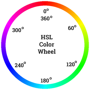
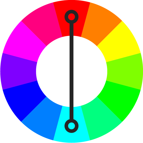
To get the complimentary or triadic shades, we’ll need to adjust the hue of the primary color instead of the lightness. We could set up individual variables, but can also take a shorcut and remember that the color wheel in HSL goes from 0 to 360. That means adding or subtracting 180 will give us the complementary shade.
--colorPrimary--complement: calc(var(--colorPrimary-h) + 180), var(--colorPrimary-s), var(--colorPrimary-l));For triadic colors, we cut 360 into old-thirds, meaning we can get the first and second triad by adding or subtracting 120 and 240 respectively.
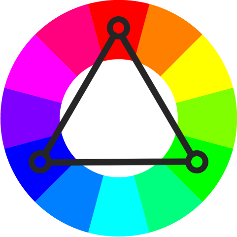
--colorPrimary--triad1: calc(var(--colorPrimary-h) + 120), var(--colorPrimary-s), var(--colorPrimary-l));
—colorPrimary—triad2: calc(var(—colorPrimary-h) + 240), var(—colorPrimary-s), var(—colorPrimary-l));
For analogous shades, we can determine the hue adjustment per shade, and get a nice analogous scheme of colors based on our preferences.
Recreating Mix()
The mix() blend mode is a little bit trickier than something like lighten() or darken() but it can totally be done with HSL calculations!
In order to mix colors, we need two colors to mix, so let’s break them down:
--color-1-h: 0; --color-1-s: 100%; --color-1-l: 50%; —color-2-h: 50; —color-2-s: 80%; —color-2-l: 50%;
Then, we can get the averages between those two colors:
--avg-1-2-h: calc((var(--color-1-h) + var(--color-2-h)) / 2); --avg-1-2-s: calc((var(--color-1-s) + var(--color-2-s)) / 2); --avg-1-2-l: calc((var(--color-1-l) + var(--color-2-l)) / 2); finally, we can write our mixed color:
--mixed-color: hsl(var(--avg-1-2-h), var(--avg-1-2-s), var(--avg-1-2-l));Creating a Color Contrast Function
Another key functionality that CSS processors provide are logical values, which allow for us to calculate accessible colors based on their background is the contrast-color() function. This function takes a series of values: the base color to contrast against, a light value, and a dark value, and will return whichever of the provided values contrasts more with the base. While we can’t currently model this directly in pure CSS, we can hack around it.
I’m using this technique from Facundo Corradini, so please don’t give me the credit! 😄
First, we set a contrast threshold:
Then, as we update the color value in each box from the demo at the top of the page, we test the lightness value to determine if it meets the contrast threshold for «light» or not. If the threshold is higher than the lightness of the base color, the color returns light because we multiply the lightness result by -100. For example, if our lightness was 40 and the contrastThreshold is 60, 40 — 60 = -20, so when we multiply that lightness by -100, it becomes 2000, resulting in white, since white shows when the lightness is 100 or higher.
The opposite happens when the lightness is higher than the contrastThreshold . If our lightness is 90, and the contrastThreshold is 60, the result is 30, so when we multiply this positive value by -100, we get a lightness of -3000, meaning the result is black, since the lightness is lower than 0.
We then return this lightness as the «L» in the HSL of the color value that lives on top of this background color. It looks like this:
If you want to see this in action, check out the demo at the top of the page
Keep in mind, since HSL is how the computerunderstands lightness and not how the *user* understands lightness, this technique is not perfect, and it clearly shows us where custom properties and the calc function still fall short.
The Future of CSS Color Functions
. which is exactly why we need color modification functions on the web! Wouldn’t it be nice if this stuff actually worked natively? If we didn’t have to break everything up into individual HSLA values and hack around color contrast?
So many design systems and websites rely on color modification, and the CSS Working Group is listening, working on identifying how we can bring color adjustment and modification functions to web browsers.
I hope you enjoyed this post or learned something new! If you use color modification in your design systems or user interfaces, I would love to hear about it! Please tweet at me @una or leave a comment below!