- Drop-Shadow: The Underrated CSS Filter
- Why is drop-shadow useful?
- Non-rectangular shapes
- Clipped elements
- Grouped elements
- Multiple drop shadows
- Limitations
- Gotchas
- Browser support
- Conclusion
- How to add a Drop Shadow to an Image with CSS?
- Drop Shadow CSS Syntax
- Parameters of drop-shadow()
- Basic Example
- How to Add a Drop Shadow to an Image With CSS?
- Example: Adding Drop Shadow to an Image
- Explaining the Drop Shadow Code
- How to Remove White Space Under images
- Example:
- Output:
- How to Add a Drop Shadow to a Text box
- Example: Adding a drop shadow to a text Box
- Output:
- More Examples:
- Example: How to Add Drop Shadow to the Text
- Example: Adding Drop Shadow to a Text Box
- Output:
- Limitations and Differences of Drop Shadow
- Limitations:
- Differences Between drop-shadow and box-shadow in CSS?
- Conclusion
- Drop Shadow
Drop-Shadow: The Underrated CSS Filter
If you’re familiar with CSS, you probably know all about the box-shadow property. But did you know there is a CSS filter, drop-shadow , that does something similar? Like box-shadow , we can pass in values for x-offset, y-offset, blur radius and colour:
.my-element
filter: drop-shadow(0 0.2rem 0.25rem rgba(0, 0, 0, 0.2));
>
Unlike box-shadow , it doesn’t take a spread parameter (more on that later).
Why is drop-shadow useful?
If we have box-shadow , why do we need drop-shadow at all?
Non-rectangular shapes
Using drop-shadow allows us to add a shadow to an element that doesn’t correspond to its bounding box, but instead uses the element’s alpha mask. We could add a drop shadow to a transparent PNG or SVG logo, for instance.
img
filter: drop-shadow(0.35rem 0.35rem 0.4rem rgba(0, 0, 0, 0.5));
>
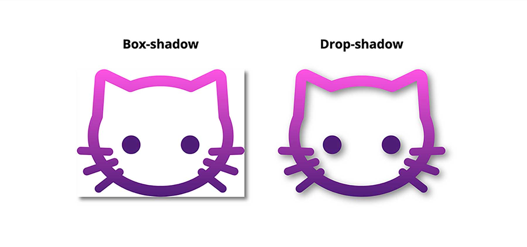
We can compare the effect of box-shadow versus drop-shadow :
Using box-shadow gives us a rectangular shadow, even though the element has no background, while drop-shadow creates a shadow of the non-transparent parts of the image.
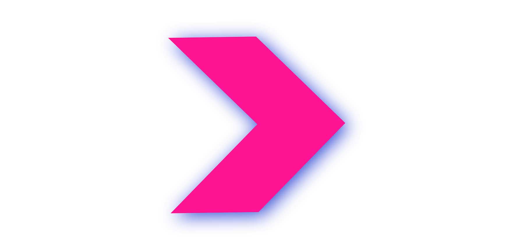
This will work whether the image is inline in the HTML (either as an inline SVG, or in tag), or a CSS background image. That means we could also add a shadow to a gradient background. These shapes are created with background gradients, with the drop-shadow filter applied:
Clipped elements
If we clip or mask an element using clip-path or mask-image , any box-shadow we add will be clipped too — so it will be invisible if it’s outside of the clipped area.
But we can create a drop shadow on the clipped element by applying the drop-shadow filter on the element’s parent. Pretty cool!
.parent-element
filter: drop-shadow(0.35rem 0.35rem 0.4rem rgba(0, 0, 0, 0.5));
>

.clipped-element
clip-path: polygon(0 0, 50% 0, 100% 50%, 50% 100%, 0 100%, , 50% 50%))
>
Grouped elements
On occasion I’ve needed to build components made up of overlapping elements, which itself needs to cast a shadow.
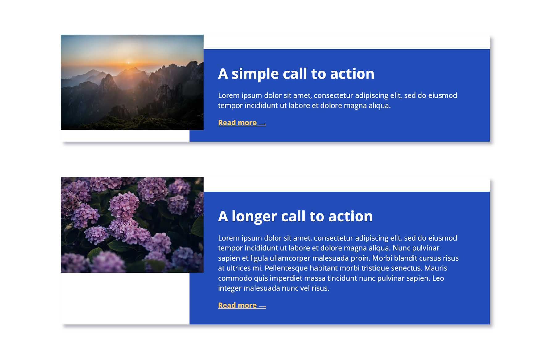
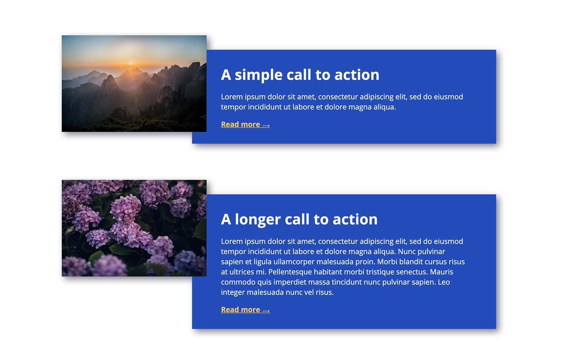
If we add a box-shadow to the whole component, we’ll be left with strange empty spaces:
If we add a box-shadow to each element individually, then each one will cast its own shadow, which might not be the desired effect. We’d need to employ some clever CSS to hide those shadows where elements overlap.
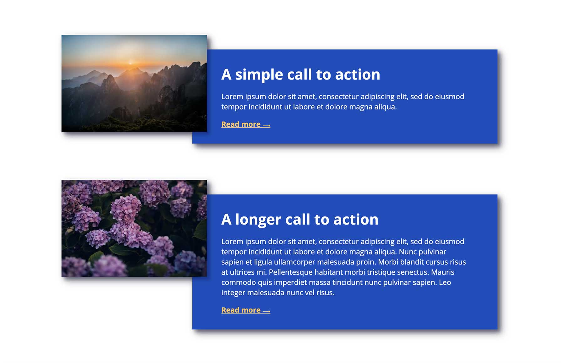
But by using drop-shadow on the whole component, we get the shadow exactly where we want it, without resorting to hacks:
Multiple drop shadows
Here’s a fun thing: You can use multiple drop shadows for some pretty cool effects! Check out the following demo.
(Side note: transitioning and animating CSS filters isn’t particularly performant, and it’s probably best to avoid animating this many filters at once in real projects. This one’s just for fun though!)
Limitations
As mentioned above, drop-shadow doesn’t include the spread parameter. This means we can’t currently use it to create an outline effect, which I think would be really useful. For example, if it was supported, we could use drop-shadow to create an outline on a gradient background, in the way we can with box-shadow on other elements.
Gotchas
drop-shadow doesn’t render the exact same shadow effect as box-shadow , even when given the same parameters. box-shadow tends to give a darker, heavier shadow than drop-shadow when the same values are used. I suspect this is something to do with CSS filters being based on SVG filter primitives. Whatever the case, you’ll likely need to compensate for the difference by adjusting your drop-shadow values somewhat.
If you’re interested in further reading, Ana Tudor pointed me to this article on how blur radius is calculated.
Browser support
CSS filters (including drop-shadow ) are supported in all modern browsers. I tend to use it as progressive enhancement, without the need for a workaround for older browsers, as it isn’t normally something that would affect the user experience in any significant way. But if you do need to provide alternative styling for older browsers, you could do so using a feature query, with a box-shadow fallback:
.my-element > *
box-shadow: 0 0.2rem 0.25rem rgba(0, 0, 0, 0.2);
>

@supports (filter: drop-shadow(0 0.2rem 0.25rem rgba(0, 0, 0, 0.2)))
.my-element
filter: drop-shadow(0 0.2rem 0.25rem rgba(0, 0, 0, 0.2));
>

.my-element > *
box-shadow: none;
>
>
Conclusion
Despite having excellent support, the drop-shadow filter is highly under-utilised. I hope this article highlights some cases where it could save you hacking around with box-shadow – maybe you could use it in your next project!
How to add a Drop Shadow to an Image with CSS?
Drop Shadow in CSS is used to add a drop shadow effect to the input image. It produces a nice 3-D effect on the image or the other objects. It adds a cool effect to the objects and increases the website’s aesthetics.
In this article, we will learn how to add a drop shadow to images and other objects.
Drop Shadow CSS Syntax
Let’s understand the syntax of drop-shadow() in CSS. The drop-shadow() in CSS uses the parameter of type shadow having values like offset-x, offset-y, blur-radius, color.
Parameters of drop-shadow()
Let’s understand the parameters of drop-shadow() in CSS. drop-shadow() takes the following parameters.
- offset-x: It is the horizontal distance that determines the length of the shadow from the object. Shadow depends on the following values:
- Positive value: positive value places the shadow to the right of the object by the given length.
- Negative value: negative value places the shadow to the left of the object by the given length.
- 0: Shadow is placed directly behind the object.
- Positive value: positive value places the shadow below the object by the given length.
- Negative value: negative value places the shadow above the object by the given length.
- 0: Shadow is placed directly behind the object.
- The larger the value passed, the more the shadow will be blurred.
- The default value is 0, which results in unblurred edges of the shadow.
Basic Example
Let us take a look at a basic example of how the drop-shadow() functions in CSS.
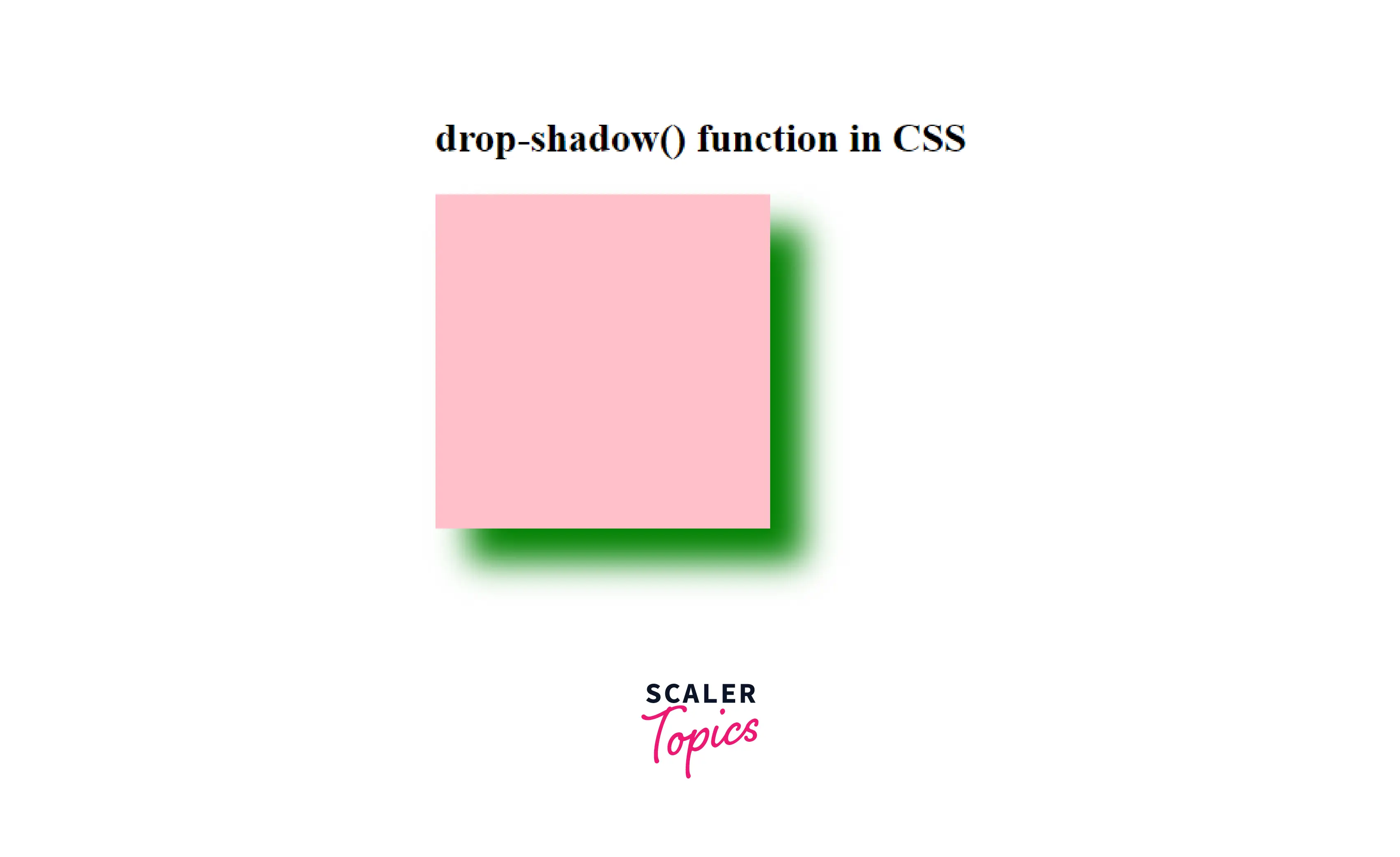
In this example, we are simply adding a drop shadow to a div using this function.
Here in this example, we have simply added the drop shadow to an HTML div element using this function.
How to Add a Drop Shadow to an Image With CSS?
We can simply use the drop-shadow() function to add a drop shadow to an image. Let us take a look at how we can do it.
Example: Adding Drop Shadow to an Image
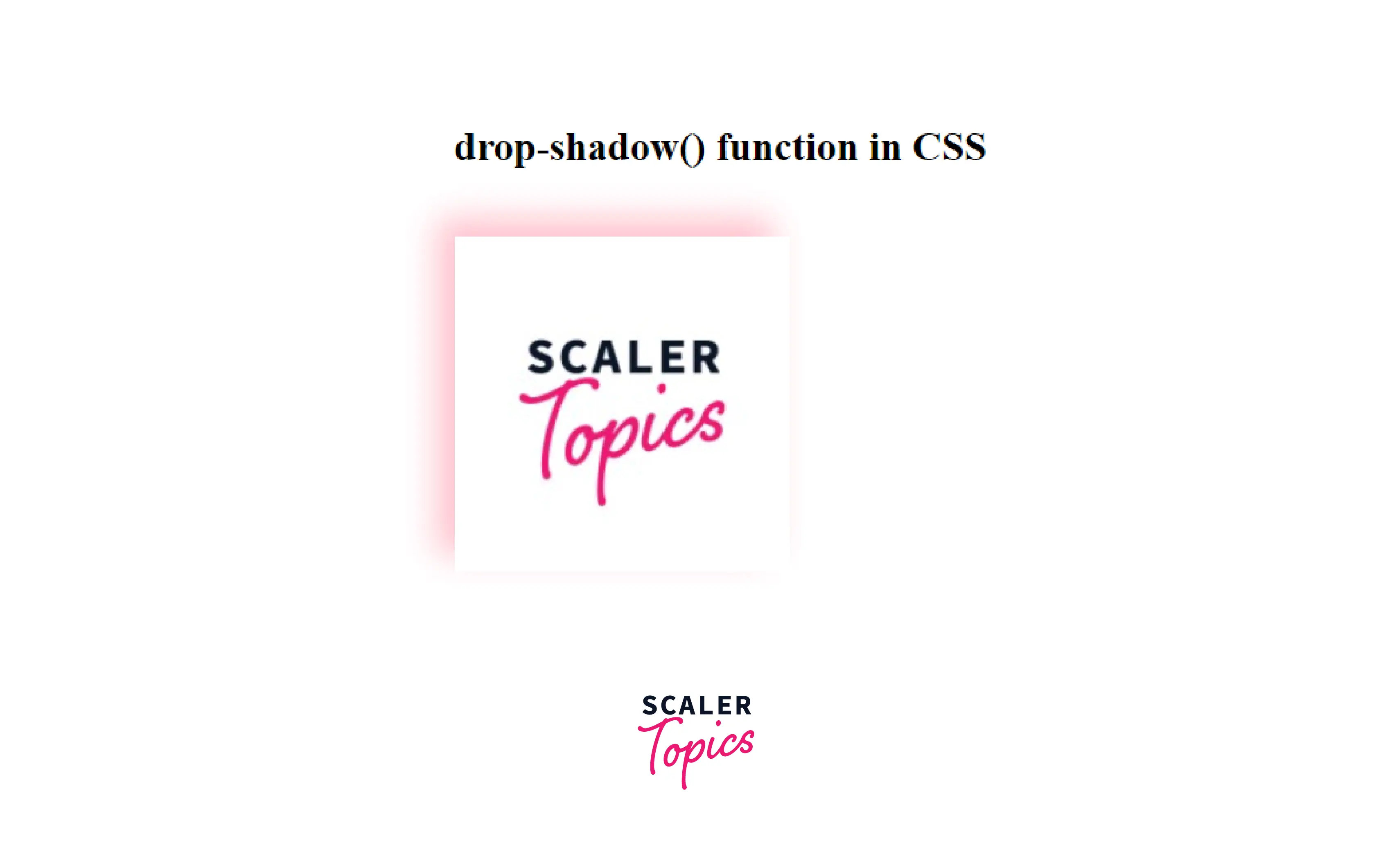
In this example, we are simply adding a drop shadow to an image using this function.
Here, we have added a drop shadow to the image using the drop-shadow() function
Explaining the Drop Shadow Code
In the above-used code, we have passed the following values to the drop-shadow() function:
- First value of -10px is the horizontal distance that determines the length of the shadow from the object. It is a negative value that places the shadow to the left of the object by the given length.
- Second value of -10px is the vertical distance that determines the length of the shadow from the object. It is a negative value that places the shadow above the object by the given length.
- Third value of 10px specifies the shadow’s blur radius.
- Fourth parameter sets the color of the shadow.
How to Remove White Space Under images
If the image has a white space between the image and the drop shadow, then it can be because the images are inline element and it should be corrected by treating them as block element .
So, we need to change the display of the image as a block from inline:
Example:
Output:
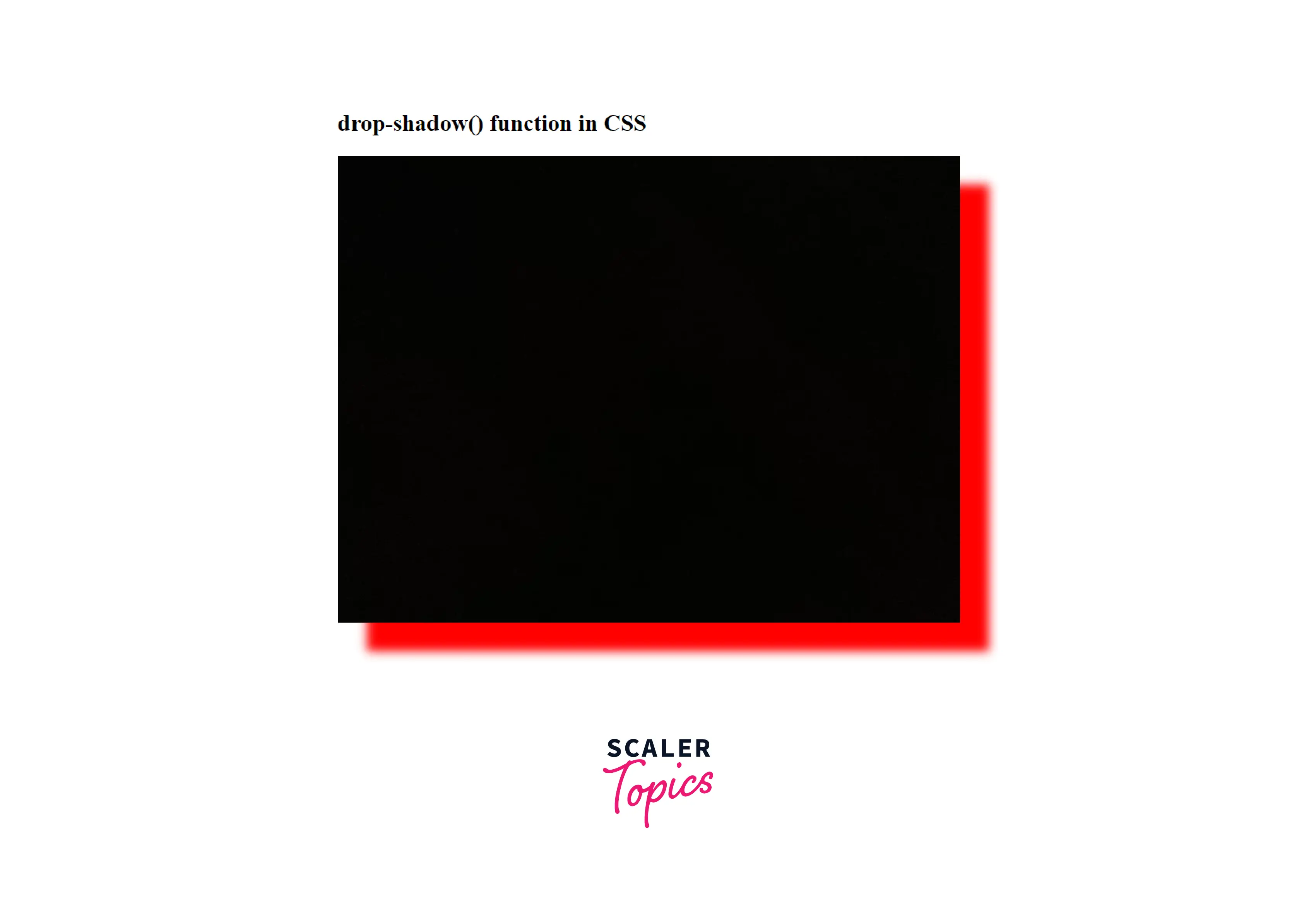
We got the red-colored drop-shadow to the image.
How to Add a Drop Shadow to a Text box
We can also add a drop shadow to a text box. For that, we will be using the box-shadow property for adding the shadow to the border of the text box.
Example: Adding a drop shadow to a text Box
Output:
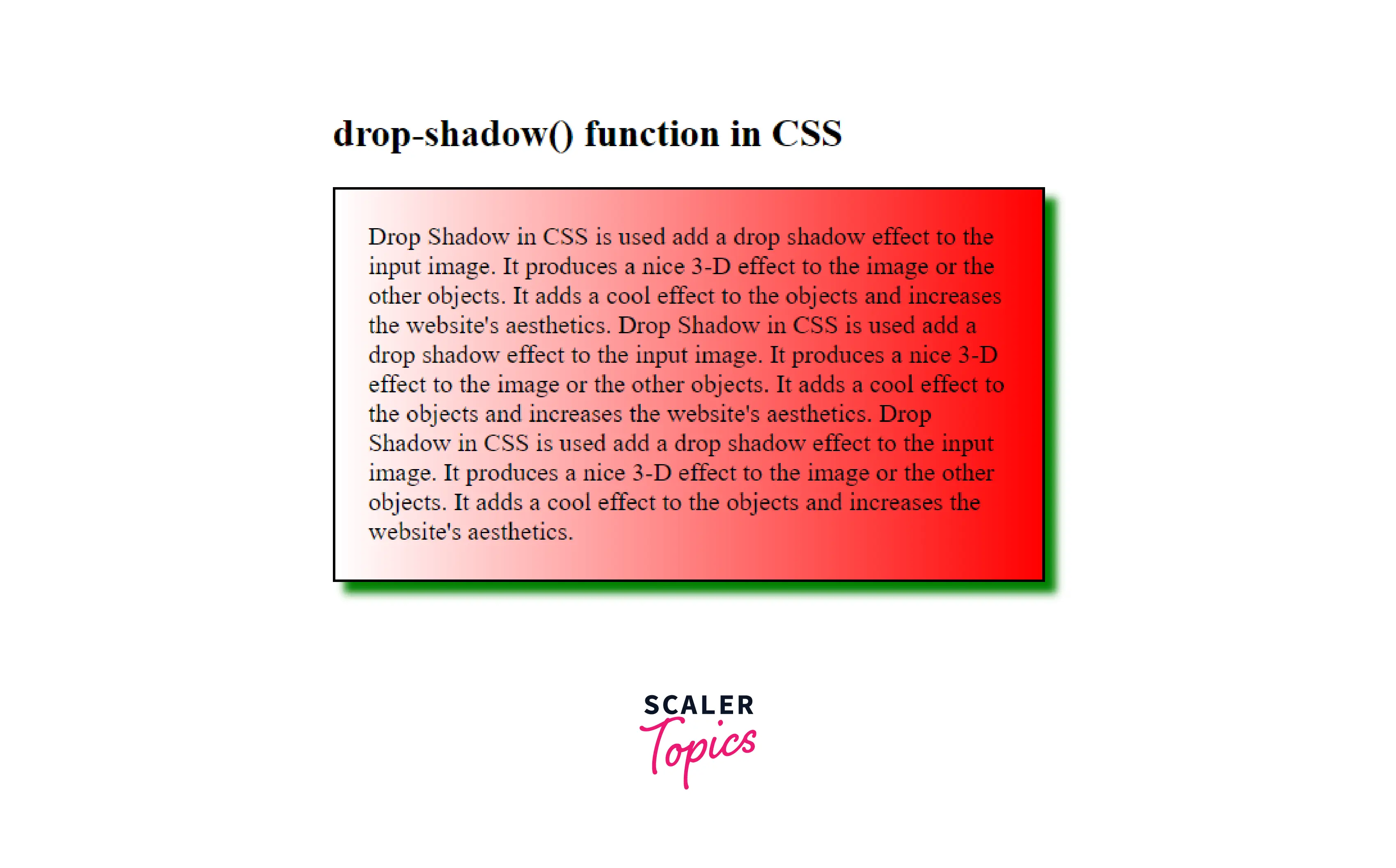
Here, we got the green coloured drop-shadow to the text-box.
More Examples:
Example: How to Add Drop Shadow to the Text
We can add a drop shadow to some text so as to get a cool shadow effect on the text. For that, simply add the text in a div and give some class to that div and use the drop-shadow() function to give the shadow effect to that text.
Example: Adding Drop Shadow to a Text Box
Output:
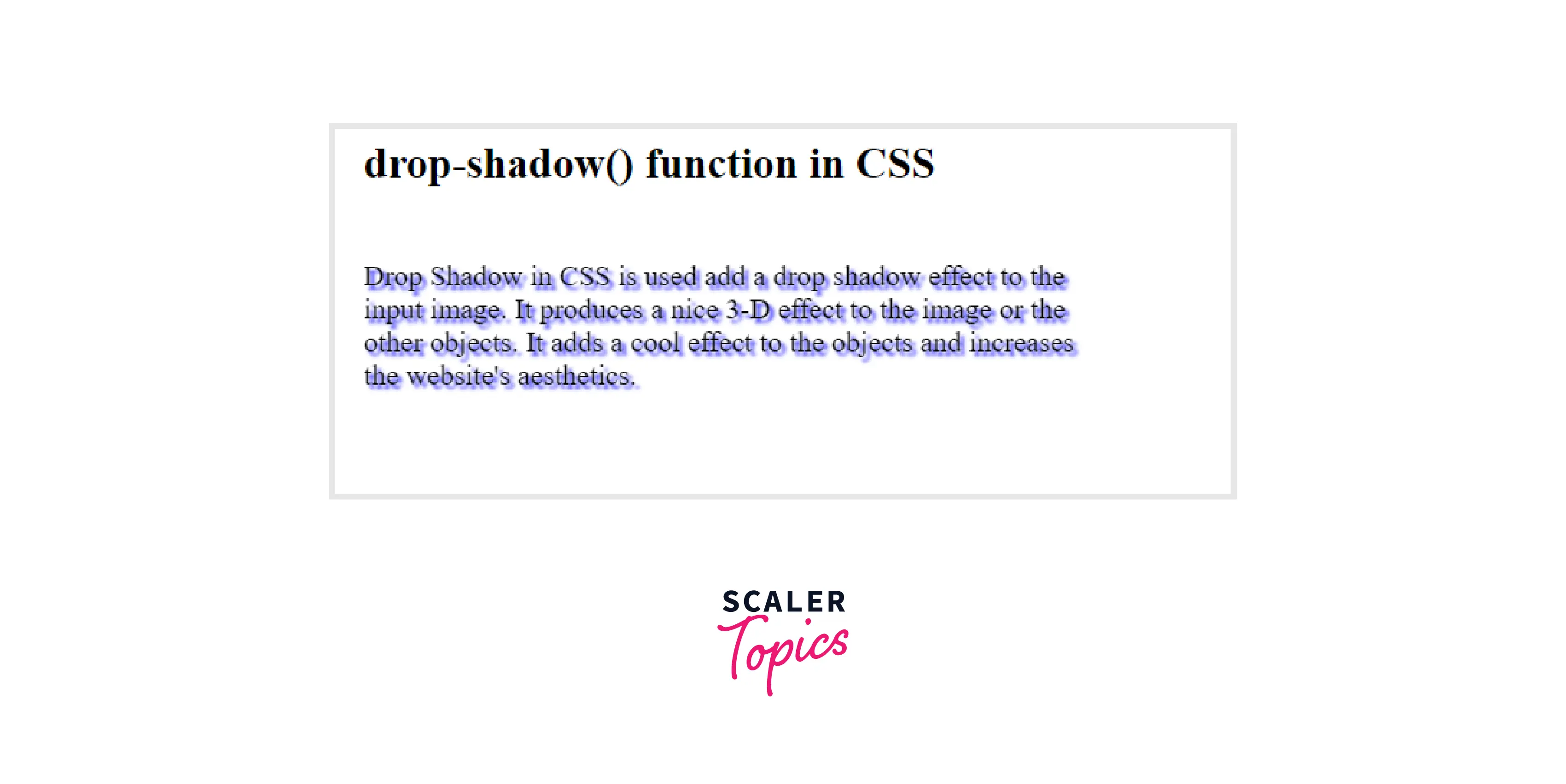
We got a cool shadow effect on some text using the drop-shadow() function.
Limitations and Differences of Drop Shadow
Limitations:
- Drop-shadow() is not compatible with the spread parameter; hence it does not swell the shadow as the box-shadow does.
- You cannot create an outline effect using this function.
- Drop-shadow() doesn’t support the inset shadows
- drop-shadow() doesn’t work well with some web browsers, so it can be limited to some browsers.
Differences Between drop-shadow and box-shadow in CSS?
We have seen that drop-shadow and box-shadow are almost of the same use, but there are certain differences between both them, whether it be browser support or the parameter values.
Both can be used in certain situations according to the advantages of each one. Let’s see the major differences between the both:
Parameters drop-shadow box-shadow Spread Parameter Support No Yes Browser Support Doesn’t support old browsers Supports all the Browsers inset shadows Doesn’t support Supports Performance Hardware accleration increases the performance Not Hardware accelerated Blur Radius Support Yes Yes Conclusion
- Drop Shadow in CSS is used add a drop shadow effect to the input image.
- It produces a nice 3-D effect to the image or the other objects and adds a cool effect to the objects, and increases the website’s aesthetics.
- Syntax of drop-shadow() is:
- drop-shadow(offset-x offset-y blur-radius color)
- offset-x
- offset-y
- blur-radius
- color
- Add a Drop Shadow to an Image
- Remove White Space Under images
- Add a drop shadow to a text box
- Add drop shadow to the text
Drop Shadow
Utilities for applying drop-shadow filters to an element.
Use the drop-shadow- utilities to add a drop shadow to an element.
div class="drop-shadow-md . "> div> div class="drop-shadow-lg . "> div> div class="drop-shadow-xl . "> div> div class="drop-shadow-2xl . "> div>This is useful for applying shadows to irregular shapes, like text and SVG elements. For applying shadows to regular elements, you probably want to use box shadow instead.
To remove all of the filters on an element at once, use the filter-none utility:
div class="blur-md invert drop-shadow-xl md:filter-none"> div>This can be useful when you want to remove filters conditionally, such as on hover or at a particular breakpoint.
Tailwind lets you conditionally apply utility classes in different states using variant modifiers. For example, use hover : drop-shadow-xl to only apply the drop-shadow-xl utility on hover .
div class="drop-shadow-md hover:drop-shadow-xl"> div>For a complete list of all available state modifiers, check out the Hover, Focus, & Other States documentation.
You can also use variant modifiers to target media queries like responsive breakpoints, dark mode, prefers-reduced-motion, and more. For example, use md: drop-shadow-xl to apply the drop-shadow-xl utility at only medium screen sizes and above.
div class="drop-shadow-md md:drop-shadow-xl"> div>To learn more, check out the documentation on Responsive Design, Dark Mode and other media query modifiers.
By default, Tailwind includes a handful of general purpose dropShadow utilities. You can customize these values by editing theme.dropShadow or theme.extend.dropShadow in your tailwind.config.js file.
module.exports = theme: extend: dropShadow: '3xl': '0 35px 35px rgba(0, 0, 0, 0.25)', '4xl': [ '0 35px 35px rgba(0, 0, 0, 0.25)', '0 45px 65px rgba(0, 0, 0, 0.15)' ] > > > >Learn more about customizing the default theme in the theme customization documentation.
If you need to use a one-off drop-shadow value that doesn’t make sense to include in your theme, use square brackets to generate a property on the fly using any arbitrary value.
div class="drop-shadow-[0_35px_35px_rgba(0,0,0,0.25)]"> div>Learn more about arbitrary value support in the arbitrary values documentation.
Copyright © 2023 Tailwind Labs Inc.
