- Custom double range slider
- HTML
- CSS
- JavaScript
- О input[type=range], параметре multiple и как сделать, чтобы всё работало
- Инициализация
- Параметры плагина
- Параметры элемента
- События
- Как сделать 2 ползунка в Input=range?
- Double Range Slider | HTML, CSS, Javascript
- Video Tutorial:
- Project Folder Structure:
- HTML:
- CSS:
- Javascript:
Custom double range slider
To create our custom slider we will make use of the native input type range, well, two of them. The idea in a nutshell is to hide the inputs and set / update visually our custom slider based on the values of those inputs.
HTML
- the text labels holding the values
- the inputs
- the custom slider (thumbs, track and the range between)
CSS
The main idea is pretty straight forward, visually hide the inputs and place our custom slider elements on top of the inputs.
JavaScript
We will initialise and hydrate our custom slider with the default input values and then listen for any input change so we can visually update the custom slider and the labels.
In order to achieve this we will write some functions
setLabelValue(label, input) this function takes a label together with an input. It sets the label inner text to the input’s value, and will run every-time the value of the input changes

To visually set the value of our custom slider we will separate the logic into two functions, one for each side, since each calculates its values slightly different.
let’s have a look at the start / left-side function.
setStartValueCustomSlider(inputStart, inputEnd, pseudoEl, range) it includes both inputs because we need to prevent our start value to go past inputEnd’s value.

In code it would look something like:
const maximum = Math.min(parseInt(inputStart.value), parseInt(inputEnd.value) - 1); Next, we proceed to calculate our percentage based on the input’s values so we update our UI.
const percent = ((maximum - inputStart.min) / (inputStart.max - inputStart.min)) * 100; Now that we know the current position, we can go ahead and visually update our thumb and the range aka what is in between both of thumbs.
pseudoEl.style.left = percent + '%'; range.style.left = percent + '%'; Last, we need to run these two functions whenever the inputs value change, we do this by listening to the «input» event on each input.
inputStart.addEventListener('input', () => < setStartValueCustomSlider(inputStart, inputEnd, thumbLeft, rangeBetween); setLabelValue(labelMin, inputStart); >); inputEnd.addEventListener('input', () => < setEndValueCustomSlider(inputEnd, inputStart, thumbRight, rangeBetween); setLabelValue(labelMax, inputEnd); >); (The end / right-side function is quite similar, you can inspect it in the demo below.)
О input[type=range], параметре multiple и как сделать, чтобы всё работало
Обычно, если вам требуется сделать блок с ползунком или даже что покруче — с выбором диапазона, то используем готовый плагин из набора jQuery UI — slider().

На ПК всё отлично работает, мы даже не заморачиваемся, меняем стили и радуемся функционалом.
Затык приходит в том моменте, когда проект — это мобильная версия чего-либо на html и обязательно вместо поля для ввода значений нужно использовать ползунок — ну потому что удобней или же по другим каким-то причинам.
Тут и возникает проблема. На windows phone 8 работает, на android 4.1 версии нет, да и iphone 4 тоже отказался нормально работать.
Первым делом нашел, что есть в сети, это noUiSlider, причем довольно хорошо работает и везде, но у меня только при первом скроллинге ползунка, потом всё лагает, пердит и дрыгается. Пришлось отказаться, причину лагов не выяснил, да и времени разбираться не было.
egorkhmelev.github.io/jslider сразу отказался работать на мобильниках, jqxslider хорошо, но тормоза.
Короче суть поста: это взять нативный слайдер:
И сделать так, чтобы появился выбор диапазона.
В документации что-то мелькает про этот параметр, но по сути нигде ничего не меняется, если его добавить.
С помощью нехитрых манипуляций со стилями и скриптами получается что-то вроде:
Инициализация
$('input[name=three]').nativeMultiple(< stylesheet: "slider", onCreate: function() < console.log(this); >, onChange: function(first_value, second_value) < console.log('onchange', [first_value, second_value]); >, onSlide: function(first_value, second_value) < console.log('onslide', [first_value, second_value]); >>); Параметры плагина
stylesheet — дополнительный класс для слайдера.
Параметры элемента
min — минимальное значение
max — максимальное значение
step — шаг слайдера (по умолчанию 1, этот параметр можно опустить)
value — начальное и конечное значения ползунков через запятую. При отсутствии запятой начальное и конечное равняются данному значению. При отсутствии значения начальное и конечное равны минимальному и максимальному значению соответственно.
События
Событие onCreate возникает при инициализации слайдера.
Событие onSlide возникает при движении одного из ползунков.
Событие onChange возникает при завершении движения одного из ползунков.
Добавлю, что вот эти чудесные белые вертикальные две полосочки на ползунках работают только в webkit движках. Возможно, общее решение — это добавить background ползункам с уже нарисованными полосами.
А вот как изменять стили ползунков — в интернете уже полно статей и данной публикации не касается напрямую. Дерзайте!
Посмотреть пример и скачать плагин вы можете на этой странице: lampaa.github.io/nativemultiple
Как сделать 2 ползунка в Input=range?
Как сделать 2 ползунка в Input=range? и дополнительно выводил минимальное и максимальное значение при изменении ползунков?
Оценить 1 комментарий
.container < display: -webkit-box; display: -ms-flexbox; display: flex; -webkit-box-pack: start; -ms-flex-pack: start; justify-content: flex-start; -webkit-box-align: start; -ms-flex-align: start; align-items: flex-start; -webkit-box-orient: vertical; -webkit-box-direction: normal; -ms-flex-direction: column; flex-direction: column; max-width: 980px; padding: 0 28px; margin: 0 auto; -webkit-box-sizing: border-box; box-sizing: border-box; >.fWrapper < margin-bottom: 48px; >.rangeWrapper < box-sizing: border-box; position: relative; touch-action: none; pointer-events: none; height: 24px; margin: 16px 0; >.bgRange, .activebgRange < position: absolute; top: 50%; height: 2px; transform: translateY(-50%); >.bgRange < left: 0; width: 100%; background-color: #f5c2c2; >.activebgRange < left: 0; width: 100%; background-color: var(--color-font-sale-light); >.rangeWrapper input[type=range] < position: absolute; margin: 0; -webkit-appearance: none; display: block; width: 100%; background: transparent; outline: none; height: 24px; >/*input[type=range]::-webkit-slider-thumb < -webkit-appearance: none; >*/ input[type=range]:focus < outline: none; >input[type="range"]::-webkit-slider-thumb < pointer-events: all; >input[type="range"]::-moz-range-thumb < pointer-events: all; >input[type="range"]::-ms-thumb
document.addEventListener('DOMContentLoaded', function() < const wrapperSliders = document.querySelectorAll('.fWrapper'); wrapperSliders.forEach(function(el) < const textMin = el.querySelector('input[name="textMin"]'); const textMax = el.querySelector('input[name="textMax"]'); const rangeMin = el.querySelector('input[name="rangeMin"]'); const rangeMax = el.querySelector('input[name="rangeMax"]'); function rangeChangeMin() < const dataMin = rangeMin.getAttribute('min'); if (+textMin.value >+textMax.value) < textMin.value = +textMax.value; >if (+textMin.value < +dataMin) < textMin.value = +dataMin; >rangeMin.value = textMin.value; > function rangeChangeMax() < const dataMax = rangeMax.getAttribute('max'); if (+textMax.value < +textMin.value) < textMax.value = +textMin.value; >if (+textMax.value > +dataMax) < textMax.value = +dataMax; >rangeMax.value = textMax.value; > function textChangeMin() < if (+rangeMin.value >+rangeMax.value) < rangeMin.value = +rangeMax.value; >textMin.value = rangeMin.value; > function textChangeMax() < if (+rangeMax.value < +rangeMin.value) < rangeMax.value = +rangeMin.value; >textMax.value = rangeMax.value; > textMin.addEventListener('change', rangeChangeMin); textMax.addEventListener('change', rangeChangeMax); rangeMin.addEventListener('input', textChangeMin); rangeMax.addEventListener('input', textChangeMax); rangeMin.addEventListener('change', textChangeMin); rangeMax.addEventListener('change', textChangeMax); >); >);Double Range Slider | HTML, CSS, Javascript

Hey everyone. Welcome to today’s tutorial. In this tutorial, we will learn how to create a double range slider. To build this slider, we need HTML, CSS and Javascript.
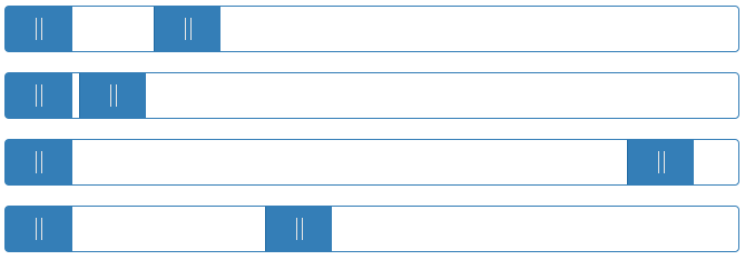
A typical slider consists of a slider track and a movable thumb. The user has to move the thumb horizontally across the slider to set the value. Unlike a typical slider, the double slider consists of two thumbs. In a double-range slider, the user can set two values.
This is an intermediate-level javascript project. If you are looking for more such projects to practice your javascript skills, you can check out this playlist here. This playlist consists of 100+ javascript projects.
The difficulty of these projects varies from simple to quite complex ones. Hence this playlist is suitable for all kinds of javascript learners, including javascript beginners to javascript experts.
Video Tutorial:
If you are interested to learn by watching a video tutorial rather than reading this blog post, you can check out the video below. Also do not forget to subscribe to my youtube channel, where I post new tips, tricks and tutorials regularly.
Project Folder Structure:
Before we start coding, let us take a look at the project folder structure. We create a project folder called- ‘Double Range Slider’. Inside this folder, we have three files. These files are – index.html, style.css and script.js. The first file is index.html which is our HTML document. Next, we have style.css which is the stylesheet. And finally, we have script.js which is the script file.
HTML:
We begin with the HTML code. First, copy the code below and paste it into your HTML document.
Our HTML code consists of two span elements to display the values. Followed by the span elements we have a container that wraps a div with the class name ‘slider-track’ and two range sliders.
0 ‐ 100CSS:
We use CSS to position and style these sliders. For this, copy the code below and paste it into your stylesheet.
*, *:before, *:after < padding: 0; margin: 0; box-sizing: border-box; font-family: "Poppins",sans-serif; >body < height: 100vh; display: -ms-grid; display: grid; background-color: #3264fe; place-items: center; >.wrapper < position: relative; width: 95vmin; background-color: #ffffff; padding: 50px 40px 20px 40px; border-radius: 10px; >.container < position: relative; width: 100%; height: 100px; margin-top: 30px; >input[type=»range»] < -webkit-appearance: none; -moz-appearance: none; appearance: none; width: 100%; outline: none; position: absolute; margin: auto; top: 0; bottom: 0; background-color: transparent; pointer-events: none; >.slider-track < width: 100%; height: 5px; position: absolute; margin: auto; top: 0; bottom: 0; border-radius: 5px; >input[type=»range»]::-webkit-slider-runnable-track < -webkit-appearance: none; height: 5px; >input[type=»range»]::-moz-range-track < -moz-appearance: none; height: 5px; >input[type=»range»]::-ms-track < appearance: none; height: 5px; >input[type=»range»]::-webkit-slider-thumb < -webkit-appearance: none; height: 1.7em; width: 1.7em; background-color: #3264fe; cursor: pointer; margin-top: -9px; pointer-events: auto; border-radius: 50%; >input[type=»range»]::-moz-range-thumb < -webkit-appearance: none; height: 1.7em; width: 1.7em; cursor: pointer; border-radius: 50%; background-color: #3264fe; pointer-events: auto; >input[type=»range»]::-ms-thumb < appearance: none; height: 1.7em; width: 1.7em; cursor: pointer; border-radius: 50%; background-color: #3264fe; pointer-events: auto; >input[type=»range»]:active::-webkit-slider-thumb < background-color: #ffffff; border: 3px solid #3264fe; >.values < background-color: #3264fe; width: 32%; position: relative; margin: auto; padding: 10px 0; border-radius: 5px; text-align: center; font-weight: 500; font-size: 25px; color: #ffffff; >.values:before
Javascript:
We finally implement the functionality for our double range slider with javascript. For this once again copy the code provided to you below and paste it into your script file.
window.onload = function() < slideOne(); slideTwo(); >let sliderOne = document.getElementById("slider-1"); let sliderTwo = document.getElementById("slider-2"); let displayValOne = document.getElementById("range1"); let displayValTwo = document.getElementById("range2"); let minGap = 0; let sliderTrack = document.querySelector(".slider-track"); let sliderMaxValue = document.getElementById("slider-1").max; function slideOne() < if(parseInt(sliderTwo.value) - parseInt(sliderOne.value) displayValOne.textContent = sliderOne.value; fillColor(); > function slideTwo() < if(parseInt(sliderTwo.value) - parseInt(sliderOne.value) displayValTwo.textContent = sliderTwo.value; fillColor(); > function fillColor()< percent1 = (sliderOne.value / sliderMaxValue) * 100; percent2 = (sliderTwo.value / sliderMaxValue) * 100; sliderTrack.style.background = `linear-gradient(to right, #dadae5 $% , #3264fe $% , #3264fe $%, #dadae5 $%)`; >That’s all for this tutorial. If you face any issues while creating this code, you can download the source code by clicking on the ‘Download Code’ button below. Also, I would love to hear from you guys, so if you have any queries, suggestions, or feedback, you can comment below.
Happy Coding!
- Tags
- custom range slider
- double range slider
- double value slider
- dual range slider
- dual thumb slider
- multi range slider
- multi thumb slider
- range slider
- slider with two inputs