How to Add a Date Picker in HTML?
The date picker in HTML is used to create an interactive input (a dropdown) which is used to select a date instead of typing it manually. The date picker in HTML is created using the element of type=”date” , this creates an input field in the HTML document, which allows us to type the date manually and it will validate the input or we can enter using the date picker interface.
What We are Creating?
We can see the demo in the gif below:
- So we can create the interactive dropdown like the above example to select a date from the calendar using the date picker in html.
- The syntax of the date picker is:
- We can select the date month and year using this.
Note 1: Using the will only select a date, month, and year, but if we want to enter the time also then we can use this will allow us to select the time also.
Note 2: The displayed date format in the date picker dropdown depends on the browser of the user, but the value is always formatted like yyyy-mm-dd format.
How to Add a Date Picker in HTML?
To add a date picker in html we have to write with others like id, value, etc as per the requirements.
Generally, a picker is added like this:
This will create a date picker like this:
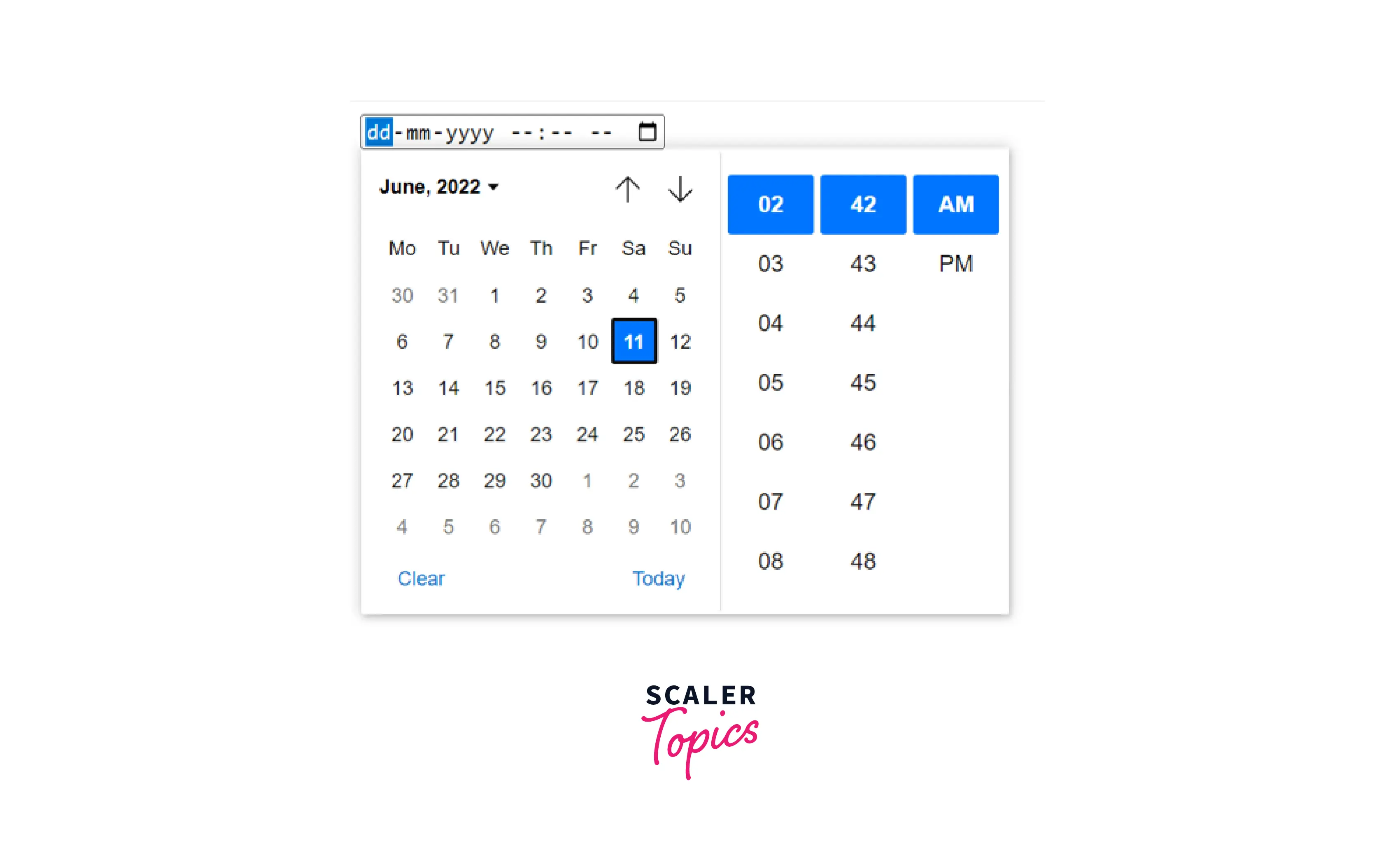
If we want to create a date picker that includes a dropdown to select the time also, we have to use .
This will create a date picker in html like this:
How To Open HTML Date Picker Dialog On Click Anywhere Inside Input?
Usually, a calendar sign appears in the top right of the date input block, clicking on this icon opens the calendar drop down, but if we want to open this date picker by clicking anywhere inside the input we can do using the below code.
We can add this CSS code to our document and now we will be able to open the date picker in html by clicking anywhere inside the input.
Additional Attributes for Date Picker
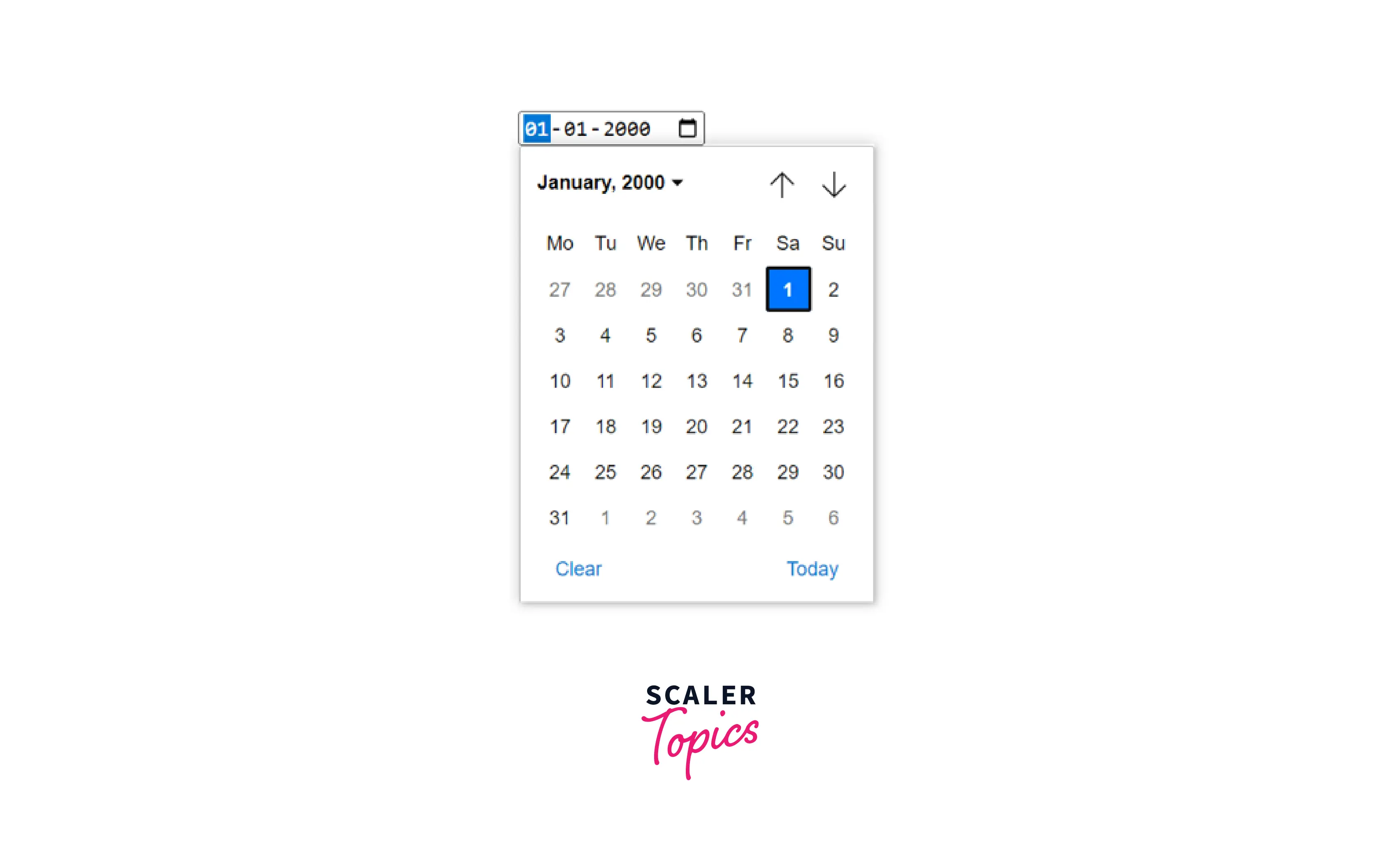
The date picker have all the common attributes that are supported by input element, but it also have some additional attributes min, max, value, etc Value attribute: We can set the default value for the date picker in html using the value attribute like this:
Here we can see the input have the default date, which is set in the value attribute. Clicking on the calendar icon will open a date picker like this.
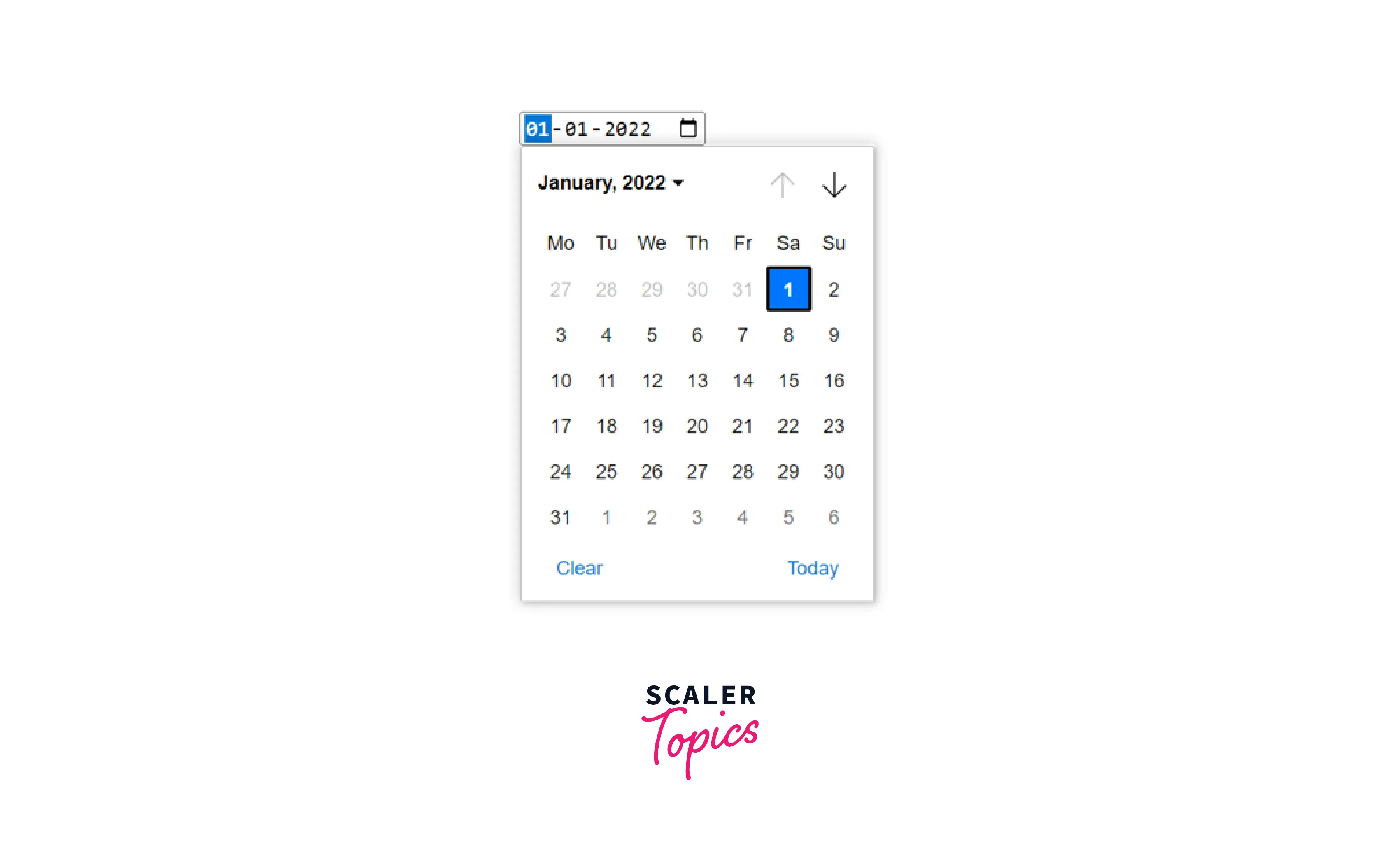
Min attribute: We can set the earliest date in the min attribute, so any date earlier than this specified date will not be accepted. If the date specified in min is not a possible date in yyyy-mm-dd then the element will not have any minimum date value.
Here, we can see that the calendar has disabled the previous button (up arrow) because we have set the minimum date. Therefore we cannot select any date before the specified date.
Max attribute: We can set a maximum date in the max attribute, so any date after the date specified will not be allowed. If the date specified in the max is not a possible date in yyyy-mm-dd then the input element has no maximum date value.
Here, we can see that the calendar has disabled the next button (down arrow) because we have set the maximum date. Therefore we cannot select any date after the specified date.
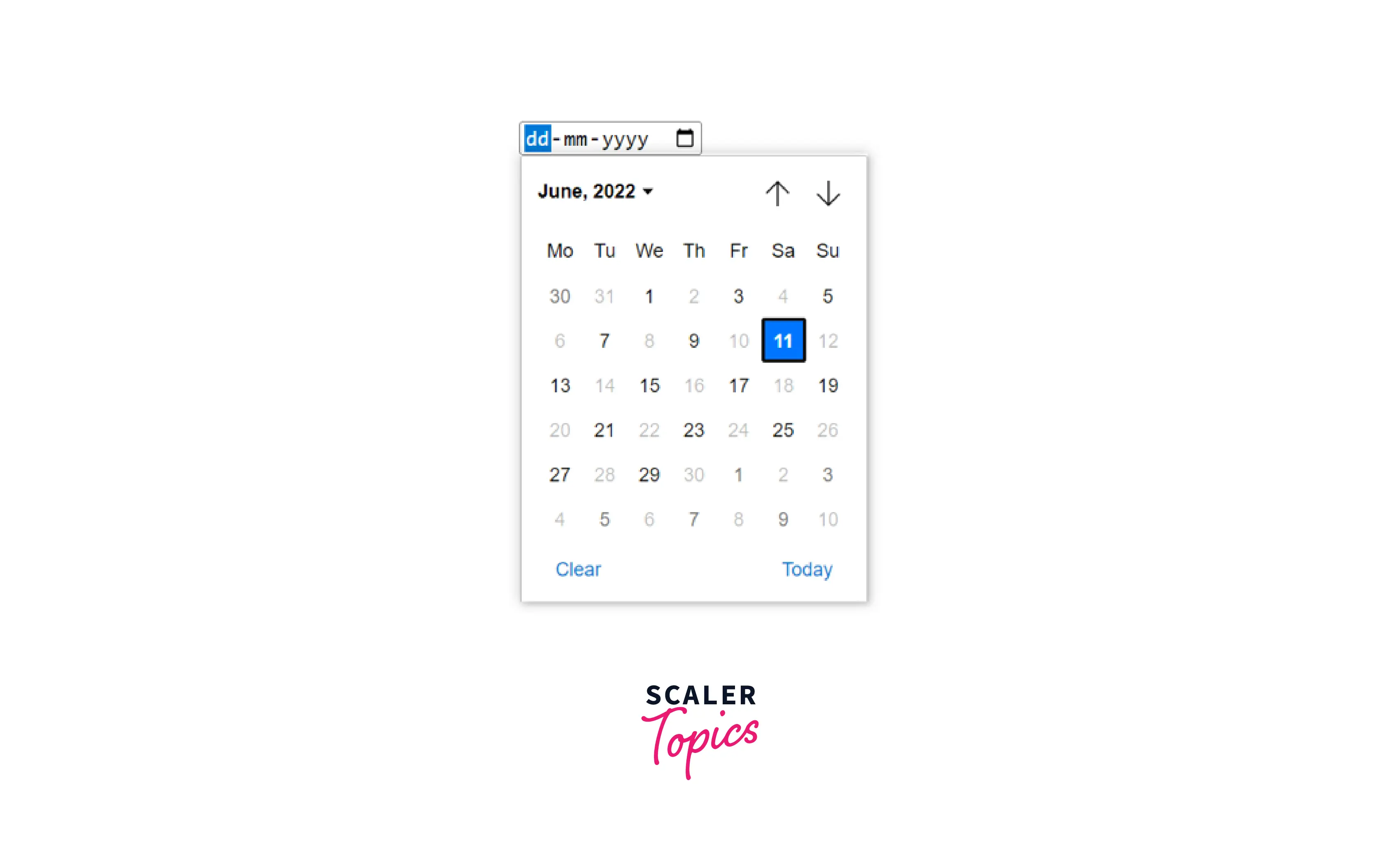
Step attribute: we can use the step attribute to set a step value so that only date that are skipped using the step value are allowed, for example, if we set step=”2” then we will be able to select only alternate days. This can be helpful in case like when we want the user to select date which is on monday.
Here, we can see that all the alternate days are disabled this is because we have specified step=»2″.
Browser Support
The list of browsers that support date picker in html is listed below:
Conclusion
- A date picker in html is used to create an interactive dropdown that allows us to select a date from the calendar.
- We can add a date picker by writing
- If we want to take date as well as time in input we can write datetime-local instead of date like
- We can set a default date using the value attribute like this
- We can set a minimum and maximum date using min and max attribute respectively.
- We can use the step attribute to set a step value for the date picker in html.
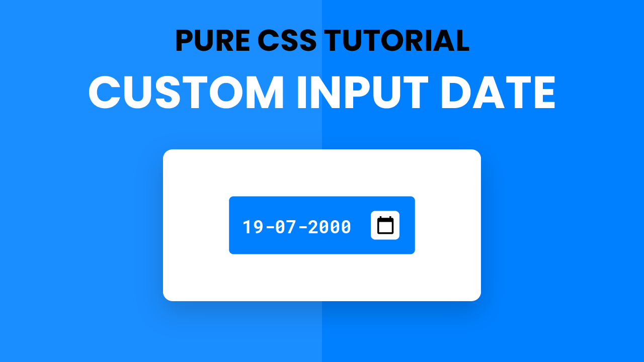
Custom Input Date | CSS Tutorial
Hey everyone. Welcome to today’s tutorial. In this tutorial, we will learn how to create a custom input date field. To build this custom date input, we need HTML and CSS. We do not make use of any external libraries, images or javascript.
If you are looking for javascript projects to improve your javascript skills, you can check out this playlist here. This playlist consists of 100+ tutorials along with the source. The difficulty of these projects varies from simple to quite complex ones. Hence this playlist is suitable for everyone including javascript beginners to javascript experts.
Video Tutorial:
If you are interested to learn by watching a video tutorial rather than reading this blog post check out the video down below. Also, subscribe to my youtube channel where I post new and exciting tutorials every alternate day.
Project Folder Structure:
Before we start coding let us take a look at the project folder structure. We create a project folder called – ‘Styling Input Date’. Inside this folder, we have two files. The first file is index.html which is the HTML document. And the second file is style.css which is the stylesheet.
HTML:
We begin with the HTML code. First, copy the code below and paste it into your HTML document. Our HTML document consists of just the input tag of type ‘date’.
CSS:
We style this date input with CSS. For this copy, the code provided to you below and paste it into your stylesheet. We make use of the ‘::-webkit-calendar-picker-indicator
‘ pseudo-element to style the input field.
*, *:before, *:after < padding: 0; margin: 0; box-sizing: border-box; >input[type=»date»] < background-color: #0080ff; padding: 15px; position: absolute; transform: translate(-50%,-50%); top: 50%; left: 50%; font-family: "Roboto Mono",monospace; color: #ffffff; font-size: 18px; border: none; outline: none; border-radius: 5px; >::-webkit-calendar-picker-indicator
That’s it for this tutorial. Our input field styling is now ready. You can now go ahead and customize it the way you want by changing font size, font family, colours, border radius and much more.
If you face any issues while creating this project you can download the source code by clicking on the ‘Download Code’ button below. A zip file will download automatically. All you have to do is extract the files inside and you are good to go.
Also, I would love to hear from you guys. So if you have any queries, suggestions or feedback comment below.
Happy Coding!


