- Heading Set Styling with CSS
- A few words on vertical rhythm
- What is vertical rhythm?
- Vertical rhythm in CSS
- Example 1
- Example 2
- The CSS
- Example 3
- The CSS
- Why not a border?
- Example 4
- The CSS
- Why not a border, again?
- Example 5
- A word on CSS counters
- The CSS
- Example 6
- The CSS
- What about CSS pre-processors?
- Final words
- CSS Heading Styles |CSS Style h1 h2
- CSS Heading Styles
- Example 1- Style h1 CSS Example
- This is a heading.
- This is an another heading with have CSS Properties.
- Basic CSS Properties Apply On The Heading
- CSS h2 Style Example with more Properties
- Example 2- Advance Properties of CSS which Apply on Heading
- This is the Heading with have advance CSS Properties.
Heading Set Styling with CSS
In this tutorial we will create a couple of heading styles to get your creative juices flowing for your next project. Make heading styles work by applying the right combinations of colors, fonts and decoration.
In this tutorial I’m hoping to give you some ideas and inspiration for your current and future projects!
Today, we are going to talk about headings and titles. When you put some content on the web (or on a paper), you have to set up some kind of structure. And this is where you need headings: to give sense to your content.
We all know how difficult it is to find the appropriate title for the right content, and frankly I’m not good at it so this won’t be the point of the article. Instead, we are going to talk about design.
How to design a good title, or a good arborescence of titles? I didn’t think much about it until then so I thought it could be a nice exercise, so here we are. I tried to create a few sets of headings, each one with its own feeling.
A few notes before we start:
- Every font used in this tutorial is a free font from Google WebFonts.
- You won’t see any vendor prefixes in the CSS snippets, but you will, of course, find them in the files.
- I use the box-model where [width] = [element-width] + [padding] + [borders]. I activate it with the following snippet:
I don’t think there is much need for an explanation about the markup used in the demos: I used 4 titles, from h1 to h4.
Why not h5 and h6 you say? Simply because it’s not very usual to have such a depth for normal websites. But if you have one which requires those levels of headings, please be sure to include some styles for them as well. 😉
A few words on vertical rhythm
What is vertical rhythm?
Vertical rhythm is a very important thing when it comes to web design. It is the concept implying consistent spacing between elements on a page, especially typographic elements.
When you write a blog post which is divided into multiple sections like this one, you may want to have proportional spacing around each element, such as titles, paragraphs, images, lists, etc.
Let me quote Richard Rutter from his great 24 Ways article on vertical rhythm:
On the Web, vertical rhythm – the spacing and arrangement of text as the reader descends the page – is contributed to by three factors: font size, line height and margin or padding. All of these factors must calculated with care in order that the rhythm is maintained.
Since I’m not a vertical rhythm expert, I decided to not reinvent the wheel and go with a few lines of CSS as a default base to write my demos.
Vertical rhythm in CSS
h1 < font-size: 36px; line-height: 40px; >h2 < font-size: 30px; line-height: 40px; >h3 < font-size: 24px; line-height: 40px; >h4 < font-size: 18px; line-height: 20px; >/* Won’t be used here */ h5 < font-size: 14px; line-height: 20px; >h6
I also gave a few styles to paragraphs to make them fit to the headings. But we are going to focus on the headings only here.
Now that we have covered the basics of our exercise, we can create a few sets of headings!
Note that each heading will have its styles defined individually, so you will see a lot of repetition of styles among the headings. When you write your styles, you should of course summarize them to avoid repetition.
Example 1

Let’s start with something pretty simple. Not much involved here, just a few font styles.
Fonts used: Ultra (sans-serif), Orienta (sans-serif).
.demo-1 .main h1 < margin: 1em 0 0.5em 0; color: #343434; font-weight: normal; font-family: 'Ultra', sans-serif; font-size: 36px; line-height: 42px; text-transform: uppercase; text-shadow: 0 2px white, 0 3px #777; >.demo-1 .main h2 < margin: 1em 0 0.5em 0; color: #343434; font-weight: normal; font-size: 30px; line-height: 40px; font-family: 'Orienta', sans-serif; >.demo-1 .main h3 < margin: 1em 0 0.5em 0; color: #343434; font-size: 22px; line-height: 40px; font-weight: normal; text-transform: uppercase; font-family: 'Orienta', sans-serif; letter-spacing: 1px; font-style: italic; >.demo-1 .main h4
Okay, it was pretty straightforward. Let’s try something a little more detailed.
Example 2

This examples shows how to add something to the background of your heading, be it solid color or even an image. The large inset white box shadow for the h1 will ensure that the image does not “collide” with the headline text when we view it on a small screen. The left padding has a percentage value for the same reason: when the viewport becomes very small, we want to keep the padding relative to the width, i.e. keep it fluid.
Fonts used: Titillium Web (sans-serif), Muli (sans-serif).
The CSS
.demo-2 .main h1 < margin: 1em 0 0.5em 0; font-weight: 600; font-family: 'Titillium Web', sans-serif; position: relative; font-size: 36px; line-height: 40px; padding: 15px 15px 15px 15%; color: #355681; box-shadow: inset 0 0 0 1px rgba(53,86,129, 0.4), inset 0 0 5px rgba(53,86,129, 0.5), inset -285px 0 35px white; border-radius: 0 10px 0 10px; background: #fff url(../images/bartoszkosowski.jpg) no-repeat center left; >.demo-2 .main h2 < margin: 1em 0 0.5em 0; font-weight: normal; position: relative; text-shadow: 0 -1px rgba(0,0,0,0.6); font-size: 28px; line-height: 40px; background: #355681; background: rgba(53,86,129, 0.8); border: 1px solid #fff; padding: 5px 15px; color: white; border-radius: 0 10px 0 10px; box-shadow: inset 0 0 5px rgba(53,86,129, 0.5); font-family: 'Muli', sans-serif; >.demo-2 .main h3 < margin: 1em 0 0.5em 0; font-weight: 600; font-family: 'Titillium Web', sans-serif; position: relative; text-shadow: 0 -1px 1px rgba(0,0,0,0.4); font-size: 22px; line-height: 40px; color: #355681; text-transform: uppercase; border-bottom: 1px solid rgba(53,86,129, 0.3); >.demo-2 .main h4
Example 3

I thought it could be a good idea to have a darkish demo. Many sites are using a pretty dark template, like Compass or CodePen.
Once again, I picked an electric blue to go with the dark gray background, but you could do with whatever pleases you. Anyway, I really suggest a punchy color.
Fonts used: Hammersmith One (sans-serif), Questrial (sans-serif).
The CSS
.demo-3 .main h2:after, .demo-3 .main h3:after, .demo-3 .main h4:after < position: absolute; content: ""; left: 0; top: 0; bottom: 0; width: 5px; border-radius: 2px; box-shadow: inset 0 1px 1px rgba(0,0,0,0.5), 0 1px 1px rgba(255,255,255,0.3); >.demo-3 .main h2:after < background: #0AF; >.demo-3 .main h3:after < background: #3BF; >.demo-3 .main h4:after < background: #6Cf; >.demo-3 .main h1 < font-size: 36px; line-height: 40px; margin: 1em 0 .6em 0; font-weight: normal; color: white; font-family: 'Hammersmith One', sans-serif; text-shadow: 0 -1px 0 rgba(0,0,0,0.4); position: relative; color: #6Cf; >.demo-3 .main h2 < margin: 1em 0 .6em 0; padding: 0 0 0 20px; font-weight: normal; color: white; font-family: 'Hammersmith One', sans-serif; text-shadow: 0 -1px 0 rgba(0,0,0,0.4); position: relative; font-size: 30px; line-height: 40px; >.demo-3 .main h3 < margin: 1em 0 .6em 0; padding: 0 0 0 20px; font-weight: normal; color: white; font-family: 'Hammersmith One', sans-serif; text-shadow: 0 -1px 0 rgba(0,0,0,0.4); position: relative; font-size: 24px; line-height: 40px; font-family: 'Questrial', sans-serif; >.demo-3 .main h4
Why not a border?
Very good question, my lord! At first, I did use a left border for this demo. It worked like a charm, was fully compatible back to IE1 or something (!).
Then I wanted to add a subtle light effect to this border. And maybe rounded corners. How am I going to do that? With a pseudo-element of course! Design purpose, no extra markup, perfect use case!
What about old browsers you say? Yup, IE6 and IE7 won’t see your magnificent border. From there, you have 2 options:
- Give those browsers a left border as a fallback
- Don’t give a damn since it’s a purely visual issue.
I think I’d give the border. 😉
Example 4

I heard you like wood. Right?
Note: the little leaf on the second level of the title is from FontAwesome. The icon font was “constructed” using Fontello.
Fonts used: Scada (sans-serif), Carrois Gothic (sans-serif).
The CSS
.demo-4 .main h1 i, .demo-4 .main h2 i, .demo-4 .main h3 i, .demo-4 .main h4 i < padding-right: 10px; color: #A8D13B; font-size: 0.8em; >.demo-4 .main h2:after, .demo-4 .main h3:after, .demo-4 .main h4:after < position: absolute; content: ""; height: 1px; border-radius: 2px; left: 0; bottom: 0; box-shadow: 0 -1px 0 rgba(0,0,0,0.1), 0 1px 0 rgba(255,255,255,0.6); >.demo-4 .main h2:after < width: 100%; >.demo-4 .main h3:after < width: 75%; >.demo-4 .main h4:after < width: 50%; >.demo-4 .main h1 < margin: 1em 0 0.75em; padding: 0 0 5px 0; color: #6B5344; font-weight: normal; position: relative; text-shadow: 0 2px 0 rgba(255,255,255,0.5); font-size: 36px; line-height: 40px; font-family: 'Carrois Gothic', sans-serif; >.demo-4 .main h2 < margin: 1em 0 0.75em; padding: 0 0 5px 0; color: #6B5344; font-weight: normal; font-family: 'Scada', sans-serif; position: relative; text-shadow: 0 2px 0 rgba(255,255,255,0.5); font-size: 30px; line-height: 40px; >.demo-4 .main h3 < margin: 1em 0 0.75em; padding: 0 0 5px 0; color: #6B5344; font-weight: normal; font-family: 'Scada', sans-serif; position: relative; text-shadow: 0 2px 0 rgba(255,255,255,0.5); font-size: 24px; line-height: 40px; >.demo-4 .main h4
Why not a border, again?
It’s pretty much the same reason as for the previous demo. I didn’t use a bottom border because we can’t set a width to it and I wanted the underline to be smaller as you go deeper in title levels.
One solution would have been to set a width to the titles in order to make the bottom-border behave accordingly, but it’s pretty dirty and could be problematical in long titles.
So pseudo-element. Plus, the browser support for pseudo-elements is pretty good nowadays.
Example 5

I think this example is a very good one because it makes the perfect use case for CSS counters. Yes, counters with CSS. I’m sure a few of you don’t even know we could do this kind of magic tricks with CSS!
Fonts used: Orienta (sans-serif).
A word on CSS counters
To put it simple, CSS (2.1!) provides us a way to assign a counter to a type of element, incrementing or decrementing it at each occurrence. Then, with pseudo-elements we can display this counter accordingly.
There are 2 properties regarding counters (counter-reset and counter-increment) and 2 values for the content property (counter() and counters()).
Basically, you reset the counter on the wrapper, and then you increment it on the children. And since a good demo is always better than a long read, please have a look below.
The CSS
.demo-5 .main < counter-reset: section-1, section-2, section-3, section-4; >.demo-5 .main h1 < margin: 0.8em 0 0.5em 0; color: #333; font-weight: normal; font-family: 'Orienta', sans-serif; font-size: 36px; line-height: 40px; counter-increment: section-1; counter-reset: section-2 section-3 section-4; >.demo-5 .main h2 < margin: 0.8em 0 0.5em 0; color: #333; font-weight: normal; font-family: 'Orienta', sans-serif; font-size: 30px; line-height: 40px; counter-increment: section-2; counter-reset: section-3 section-4; border-bottom: 1px solid #fff; box-shadow: 0 1px 0 rgba(0,0,0,0.1); padding-bottom: 10px; >.demo-5 .main h3 < margin: 0.8em 0 0.5em 0; color: #333; font-weight: normal; font-family: 'Orienta', sans-serif; font-size: 24px; line-height: 40px; counter-increment: section-3; counter-reset: section-4; >.demo-5 .main h4 < margin: 0.8em 0 0.5em 0; color: #333; font-weight: normal; font-family: 'Orienta', sans-serif; font-size: 18px; line-height: 20px; counter-increment: section-4; >.demo-5 .main h1:before < content: counter(section-1) ". "; >.demo-5 .main h2:before < content: counter(section-1) "." counter(section-2) " "; >.demo-5 .main h3:before < content: counter(section-1) "." counter(section-2) "." counter(section-3) " "; >.demo-5 .main h4:before
To sum up: each level of title increments its own counter and displays (thanks to the :before pseudo-element) it and all the counters of upper levels of headings.
For further readings about CSS counters, please refer to:
Example 6

This is a light example with some color. Headings don’t always need to have a heavy font weight; we can also create impact with a very light font if we make it large enough and captivating using color and text shadows.
This example also show how uppercase and italics can be used.
Fonts used: Josefin Sans (sans-serif).
The CSS
.demo-6 .main h1 < margin: 1em 0 0.5em 0; font-weight: 100; text-transform: uppercase; color: #00caa6; font-style: italic; font-family: 'Josefin Sans', sans-serif; font-size: 58px; line-height: 54px; text-shadow: 2px 5px 0 rgba(0,0,0,0.2); >.demo-6 .main h2 < margin: 1em 0 0.5em 0; color: #148773; font-size: 26px; line-height: 40px; font-weight: bold; font-family: 'Josefin Sans', sans-serif; >.demo-6 .main h3 < margin: 1em 0 0.5em 0; color: #343434; font-size: 22px; line-height: 40px; font-weight: 100; text-transform: uppercase; font-family: 'Josefin Sans', sans-serif; letter-spacing: 1px; font-style: italic; >.demo-6 .main h4
What about CSS pre-processors?
It occurred to me that mixins from CSS pre-processors (whichever you are using) can be very useful when it comes to such repetitive CSS. Actually, we could build simple functions accepting parameters to ease our life.
Let me show you what I mean with a LESS version of our first demo.
html < font-size: 62.5%; >.headings(@font, @size, @lh, @ls, @style, @transform) < margin: 1em 0 0.5em 0; /* REM calculations */ @sizeREM: @size/10; @lhREM: @lh/10; /* Fallbacks */ font-size: ~"@px"; line-height: ~"@px"; /* Font styles */ font-size: ~"@rem"; line-height: ~"@rem"; font-family: @font~", sans-serif"; font-style: @style; color: #343434; letter-spacing: ~"@px"; text-transform: @transform; > h1 < .headings(Ultra, 36, 42, 0, normal, uppercase); text-shadow: 0 2px white, 0 3px #777; >h2 < .headings(Orienta, 30, 40, 0, normal, capitalize); >h3 < .headings(Orienta, 22, 40, 1, italic, uppercase); >h4
Note: the font-size declaration on the html element is to trigger a base 10 convertion. Default size is 16px. 16 * 62.5 / 100 = 10. From there, convertion to rem is way easier.
I took the time to add the declarations for both rem and px units in the mixin, and with a little more work we could even tweak a bit our function to use the shorthand property for font settings ( font ).
Here is the syntax for LESS, but you could do something very similar with Sass/SCSS or Stylus. I’m just used to LESS. 🙂
Final words
As a final word, I’d like to stress the fact typography really matters a lot in the web, at least as much as in print. It’s even more true when it comes to blogs, and editorial content.
As further readings, I’d recommend:
- Typography is the Foundation of Web Design on Smashing Magazine
- On Web Typography on A List Apart
- Technical Web Typography: Guidelines and Techniques on Smashing Magazine
- Web Design is 95% Typography on Information Architects
Thanks a lot for reading this article and as always, please share any related concepts or comment. 🙂
CSS Heading Styles |CSS Style h1 h2
 February 27th, 2019
  Nilesh Chaurasia
CSS Heading Styles
- CSS Heading Styles term means that, you can style your heading using the CSS Properties.
- The Heading element is not attractive without CSS Style.
- Using CSS Style on the Heading than heading look and feel will be changed, and that’s why heading will look more attractive.
- You can apply border, margin, color, padding, font-size, latter-spacing and many more styles will be applying on the heading.
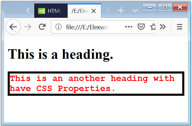
Example 1- Style h1 CSS Example
This is a heading.
This is an another heading with have CSS Properties.
The above code shows that how can you apply style on a heading or h1 tag.
Basic CSS Properties Apply On The Heading
| CSS Property | Application | Example |
|---|---|---|
| background-color | Change the background color. | background-color:blue; |
| text-transform | Change the text case to upercase. | text-transform: upercase; |
| letter-spacing | Change the text letter spacing. | letter-spacing: 6px; |
| line-height | Change the spacing between the lines of Heading. | line-height: 1.8; |
CSS h2 Style Example with more Properties
Example 2- Advance Properties of CSS which Apply on Heading
This is the Heading with have advance CSS Properties.
The above code have some advance CSS Styles which appealing the Heading.

 Posted in Learn CSS
  Tags: CSS, HTML, Web Design