Prevent body scrolling but allow overlay scrolling
I’ve been searching for a «lightbox» type solution that allows this but haven’t found one yet (please, suggest if you know of any). The behavior I’m trying to recreate is just like what you’d see at Pinterest when clicking on an image. The overlay is scrollable (as in the whole overlay moves up like a page on top of a page) but the body behind the overlay is fixed. I attempted to create this with just CSS (i.e. a div overlay on top of the whole page and body with overflow: hidden ), but it doesn’t prevent div from being scrollable. How to keep the body/page from scrolling but keep scrolling inside the fullscreen container?
isnt this just an «overlay» plugin like hundrets out there using position fixed with overflow-y scroll ?
2017 Update: even if you do log in to Pinterest, what you find is that the overlay effect described in the OP no longer exists — instead when you click on an image you just navigate to an ordinary page displaying a large version of the image.
23 Answers 23
Looking at current implementation of the pinterest site (it might change in the future), when you open the overlay, a noscroll class is applied to the body element (setting overflow: hidden ) making the body no longer scrollable.
The overlay created on-the-fly or already injected in the page and made visible via display: block — it makes no difference – has position : fixed and overflow-y: scroll , with top , left , right and bottom properties set to 0 : this style makes the overlay fill the whole viewport (but now we are in 2022, so you may use inset: 0 instead).
The div inside the overlay is in position: static so the vertical scrollbar is related to that element. This is resulting in a scrollable but fixed overlay.
When you close the overlay, you have to hide it (using display: none ) and you could even remove the node via javascript (or just the content inside, it’s up to you but also depends on the nature of the content).
The final step is to also remove the noscroll class applied to the body (so the overflow property gets back to the value it had previously)
(it works by changing the aria-hidden attribute of the overlay in order to show and hide it and to increase its accessibility).
Markup
(open button)
.noscroll < overflow: hidden; >.overlay < position: fixed; overflow-y: scroll; inset: 0; >[aria-hidden="true"] < display: none; >[aria-hidden="false"]
Javascript (vanilla-JS)
var body = document.body, overlay = document.querySelector('.overlay'), overlayBtts = document.querySelectorAll('button[class$="overlay"]'), openingBtt; [].forEach.call(overlayBtts, function(btt) < btt.addEventListener('click', function() < /* Detect the button class name */ var overlayOpen = this.className === 'open-overlay'; /* storing a reference to the opening button */ if (overlayOpen) < openingBtt = this; >/* Toggle the aria-hidden state on the overlay and the no-scroll class on the body */ overlay.setAttribute('aria-hidden', !overlayOpen); body.classList.toggle('noscroll', overlayOpen); /* On some mobile browser when the overlay was previously opened and scrolled, if you open it again it doesn't reset its scrollTop property */ overlay.scrollTop = 0; /* forcing focus for Assistive technologies but note: - if your modal has just a phrase and a button move the focus on the button - if your modal has a long text inside (e.g. a privacy policy) move the focus on the first heading inside the modal - otherwise just focus the modal. When you close the overlay restore the focus on the button that opened the modal. */ if (overlayOpen) < overlay.focus(); >else < openingBtt.focus(); openingBtt = null; >>, false); >); /* detect Escape key when the overlay is open */ document.body.addEventListener('keyup', (ev) => < if (ev.key === "Escape" && overlay.getAttribute('aria-hidden') === 'false') < overlay.setAttribute('aria-hidden', 'true'); body.classList.toggle('noscroll', false); openingBtt.focus(); openingBtt = null; >>) Finally, here’s another example in which the overlay opens with a fade-in effect by a CSS transition applied to the opacity property. Also a padding-right is applied to avoid a reflow on the underlying text when the scrollbar disappears.
.noscroll < overflow: hidden; >@media (min-device-width: 1025px) < /* not strictly necessary, just an experiment for this specific example and couldn't be necessary at all on some browser */ .noscroll < padding-right: 15px; >> .overlay < position: fixed; overflow-y: scroll; inset: 0; >[aria-hidden="true"] < transition: opacity 1s, z-index 0s 1s; width: 100vw; z-index: -1; opacity: 0; >[aria-hidden="false"]
increase width on overflow to adjust scrollbars

I want to adjust my div width automatically for scrollbars when it has overflow. Means when there is no scrollbar it should be like image on left side and when scrollbars becomes visible it should automatically adjust width for scrollbars. I do not want to use javascript but with pure CSS and HTML. And I believe it is possible with CSS and HTML only. Considering above UL Lists, my CSS is something like
#ListHolder < display:inline-block; >#ListHolder > ul < width:250px; //#ListHolder > ul > li < display:inline-block; >#LeftList < float:left; >#RightList
@BrianGlaz not I want the scroll to stay hidden and appear only when it overflows. The thing you say, scrollbar will always be there but inactive and activated when overflows.
@AbdulJabbarWebBestow Great for the fiddle, I’m also keen on that but please use «float» instead of «flaot» in your CSS though
12 Answers 12
The content width of an element includes the width of scrollbar, and as far as I know, you cannot fight this behavior.
Suppose you are trying to create a shrink-wrap div that contains two 250px wide columns. The browser calculate its width as 500px, then the height, and if a scrollbar is required, it fits the scrollbar inside those 500px reducing the available width to 483px (or so).
A tricky solution is as follows:
- Add sufficient amount of right padding on the box that (could) display scrollbar
- Set width property on that box or make that box shrink-wrap around its contents
- Set max-height to desired value and overflow-y property to auto to trigger automatic scrollbar
At this point the box will be as wide as desired and the scrollbar, if visible, draws over the right padding; not interfering with the width.
In order to display the chrome (border and padding) you need to create additional divs.
HTML Markup:
CSS (only the important bits)
#ListHolder ul < float: left; width: 250px; >#ListHolder < width: 500px; overflow: hidden; >#ListOverflow < width: 500px; overflow: auto; max-height: 350px; padding-right: 20px; >#ListBorder
- #ListHolder is used for clear-fix
- #ListBorder can be used to add a border and padding to match the desired output
That’s a nice trick. Thanks. I think this can be an alternate. I will award if no other better answer is provided.
You’re welcome. Note that you can reduce the padding on #ListBorder and #ListOverflow to get the result similar to the screenshot.
You won’t be able to increase the container’s div when it overflows by pure CSS.
However, if you want to keep your actual layout (the flexbox model would be a better fit here, as @AlecMoore suggested), here’s a workaround for webkit only : use the overlay value for overflow . It’ll appear above your content, so it’ll not slide down.
Or, you could just adapt your div, make it slightly wider, so the scrollbar will fit in when needed (demonstration).
Again, this is not the best solution ; if you aim to make something responsive, you should be using relative sizing units, and / or flex-box model.
Note to unicorn lovers: I do love kittens, but I prefer unicorns. I’m using kittens, cause I miss an image placeholder website with cute unicorns. Please tell if you know one!
@AbdulJabbarWebBestow Damn, I forgot that overlay is a webkit special value. Prefer the second solution for now
As other people have mentioned, there is not way to adapt the width of the div based on the scrollbar condition only with CSS.
You could find a workaround like including the width of the scroll bar in your fixed width demo here. This is simple, effective, scollbar appears right of your content but it doesn’t change the width of the container when the scrollbar appears.
CSS can’t set a conditional width to the container based on scrollbar presence like :
- if I have a scrollbar give me this width
- if I don’t have a scrollbar, give me this other width
So to achieve this exact behaviour you can’t use CSS.
I wrote this simple JS (no library needed so it is lightweight) code that gives you the behaviour you are looking for :
var div= document.getElementById('ListHolder'); var hasVerticalScrollbar= div.scrollHeight>div.clientHeight; if (hasVerticalScrollbar > 0) Now, this only works on page load. If you also want this behaviour when the window is resized, you can add :
window.addEventListener( 'resize', function( event ) < var hasVerticalScrollbar= div.scrollHeight>div.clientHeight; if (hasVerticalScrollbar > 0) < div.style.width = '530px' ; >else < div.style.width = '500px' ; >>, false ); Note for unicorn lovers, I know april is nearly finished but there is a late easter egg for you in demos
Make scroll bar take no space / prevent layout shift
I am making an application with html and am needing to have a scroll bar. But whenever I add one it shifts everything over to make the necessary room needed for the scroll bar. This screws up the layout of the application. So I need a way to make the scroll bar simply overlay on top of the page, meaning the page is still there behind it. I already know how to style the scroll bar to make the back transparent, I just need the scroll bar to not take up any space. Thanks In Advance!
Can you provide your current code, perhaps with this?. My psychic powers aren’t working well today. Furthermore, if the scrollbar isn’t taking up any space. how would you scroll. Your best bet here is to force the scroll bar to ALWAYS show. Alternatively, use padding on your elements so that won’t happen.
If posting code to JSFiddle, then it should also be posted here so that the question is self-contained. Of course, the code should be posted here regardless, but posting only to JSFiddle or the like is not satisfactory.
i mean the scrollbar is there it’s just that the content of the site could be behind it, as if the scrollbar wasn’t there, but you can still see it
@NicholasHazel, if the content doesn’t reach to the bottom of the page, the scrollbar will not appear.
6 Answers 6
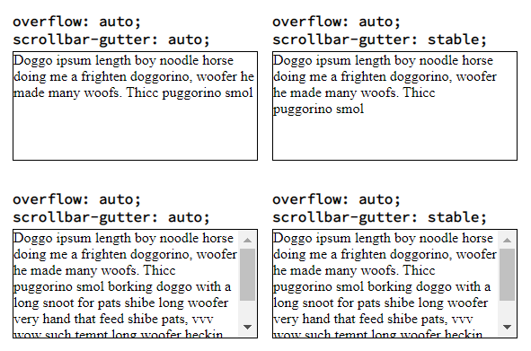
Update 2021 — Use scrollbar-gutter
The scrollbar-gutter CSS property allows authors to reserve space for the scrollbar, preventing unwanted layout changes as the content grows while also avoiding unnecessary visuals when scrolling isn’t needed.
Example
Demo in Stack Snippets and jsFiddle
body < padding: 16px; >.grid < display: grid; grid-template-columns: repeat(2, 273px); grid-gap: 16px; >.card-header < margin-bottom: 4px; white-space: pre-line; font-weight: bold; >.card-body < overflow: auto; border: 1px solid black; height: 120px; >.scrollbar-stable
scrollbar-guttersampleoverflow: auto; scrollbar-gutter: auto;Doggo ipsum length boy noodle horse doing me a frighten doggorino, woofer he made many woofs. Thicc puggorino smoloverflow: auto; scrollbar-gutter: stable;Doggo ipsum length boy noodle horse doing me a frighten doggorino, woofer he made many woofs. Thicc puggorino smoloverflow: auto; scrollbar-gutter: auto;Doggo ipsum length boy noodle horse doing me a frighten doggorino, woofer he made many woofs. Thicc puggorino smol borking doggo with a long snoot for pats shibe long woofer very hand that feed shibe pats, vvv wow such tempt long woofer heckin fluffer. Long water shoob smol corgo sub wooferoverflow: auto; scrollbar-gutter: stable;Doggo ipsum length boy noodle horse doing me a frighten doggorino, woofer he made many woofs. Thicc puggorino smol borking doggo with a long snoot for pats shibe long woofer very hand that feed shibe pats, vvv wow such tempt long woofer heckin fluffer. Long water shoob smol corgo sub wooferFurther Reading
- Docs
- scrollbar-gutter | MDN
- scrollbar-gutter | CanIUse
- Prevent unwanted Layout Shifts caused by Scrollbars with the scrollbar-gutter
- Explainer for the «scrollbar-gutter» CSS property.
- scrollbar-gutter | CSS-Tricks
- CSS WG Blog – Minutes Telecon 2021-08-04
- CSS Overflow Module Level 3
- HTML reserve space for scrollbar
- Prevent scroll-bar from adding-up to the Width of page on Chrome
- Chrome reserves space for scrollbar even if it is hidden
- CSS 100% width but avoid scrollbar
- Hide scroll bar, but while still being able to scroll