grid-column
Baseline is determined by this web feature being supported on the current and the previous major versions of major browsers.
The grid-column CSS shorthand property specifies a grid item’s size and location within a grid column by contributing a line, a span, or nothing (automatic) to its grid placement, thereby specifying the inline-start and inline-end edge of its grid area.
Try it
Constituent properties
This property is a shorthand for the following CSS properties:
Syntax
/* Keyword values */ grid-column: auto; grid-column: auto / auto; /* values */ grid-column: somegridarea; grid-column: somegridarea / someothergridarea; /* + values */ grid-column: somegridarea 4; grid-column: 4 somegridarea / 6; /* span + + values */ grid-column: span 3; grid-column: span somegridarea; grid-column: 5 somegridarea span; grid-column: span 3 / 6; grid-column: span somegridarea / span someothergridarea; grid-column: 5 somegridarea span / 2 span; /* Global values */ grid-column: inherit; grid-column: initial; grid-column: revert; grid-column: revert-layer; grid-column: unset;
This property is specified as one or two values.
If two values are given, they are separated by / . The grid-column-start longhand is set to the value before the slash, and the grid-column-end longhand is set to the value after the slash.
Each value can be specified as:
- either the auto keyword
- or a value
- or an value
- or both and , separated by a space
- or the keyword span together with either a or an or both.
Values
Is a keyword indicating that the property contributes nothing to the grid item’s placement, indicating auto-placement, an automatic span, or a default span of 1 .
If there is a named line with the name -start / -end , it contributes the first such line to the grid item’s placement.
Note: Named grid areas automatically generate implicit named lines of this form, so specifying grid-column: foo; will choose the start/end edge of that named grid area (unless another line named foo-start / foo-end was explicitly specified before it).
Otherwise, this is treated as if the integer 1 had been specified along with the .
Contributes the nth grid line to the grid item’s placement. If a negative integer is given, it instead counts in reverse, starting from the end edge of the explicit grid.
If a name is given as a , only lines with that name are counted. If not enough lines with that name exist, all implicit grid lines are assumed to have that name for the purpose of finding this position.
Contributes a grid span to the grid item’s placement such that the corresponding edge of the grid item’s grid area is n lines from the opposite edge.
If a name is given as a , only lines with that name are counted. If not enough lines with that name exist, all implicit grid lines on the side of the explicit grid corresponding to the search direction are assumed to have that name for the purpose of counting this span.
If the is omitted, it defaults to 1 . Negative integers or 0 are invalid.
Formal definition
Formal syntax
Полное визуальное руководство/шпаргалка по CSS Grid

Сегодня мы с вами рассмотрим свойства CSS Grid (далее также — Грид), позволяющие создавать адаптивные или отзывчивые макеты веб-страниц. Я постараюсь кратко, но полно объяснить, как работает каждое свойство.
Что такое CSS Grid ?
Грид — это макет для сайта (его схема, проект).
Грид-модель позволяет размещать контент сайта (располагать его определенным образом, позиционировать). Она позволяет создавать структуры, необходимые для обеспечения отзывчивости сайтов на различных устройствах. Это означает, что сайт будет одинаково хорошо смотреться на компьютере, телефоне и планшете.
Вот простой пример макета сайта, созданного с помощью Грида.


Архитектура CSS Grid
Как же Грид работает? Элементы Грида (grid items) располагаются вдоль главной или основной (main) и поперечной (cross) оси (axis). При помощи различных свойств мы можем манипулировать элементами для создания макетов.
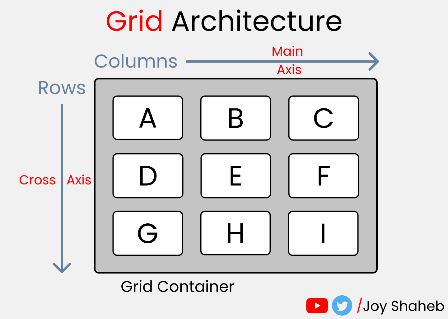
Помимо прочего, у нас имеется возможность объединять строки и колонки подобно тому, как мы это делаем в Excel , что предоставляет нам большую гибкость, чем Флекс ( Flexbox ).
К слову, если вас интересует Флекс, вот соответствующая статья.
Схема CSS Grid

Схема содержит все возможные свойства, предоставляемые Гридом. Эти свойства делятся на:
Обратите внимание: красным цветом отмечены сокращения для свойств:


К концу настоящей статьи у вас будет полное понимание того, как работает каждое из них.
Настройка проекта
Для данного проекта требуются начальные знания HTML , CSS и умение работать с VSCode (или другим редактором по вашему вкусу). Делаем следующее:
- Создаем директорию для проекта, например, Project1 и открываем ее в редакторе ( cd Project1 , code . )
- Создаем файлы index.html и style.css
- Устанавливаем в VSCode сервер для разработки ( Live Server , расширение) и запускаем его
Или вы можете просто открыть Codepen (или любую другую песочницу) и начать писать код.
Все готово, можно приступать к делу.

HTML
Создаем 3 контейнера внутри body :