- 9 Custom Open Source File Upload Field Snippets
- 1. Flat File Upload
- 2. Custom File Upload
- 3. Responsive Animated Uploader
- 4. Custom Uploader
- 5. Stock Photo Upload Interface
- 6. Simple Blue Upload UI
- 7. jQuery Custom File Upload Input
- 8. Flat UI Input File
- 9. Multi-Upload Fields
- Related Posts
- Related Topics
- Custom styled input type file upload button with pure CSS
- Markup
- Styling
- Styling the upload file block
- Styling the upload file button
- Styling the the click/drop zone
- Handling drag and drop events
- Demo
9 Custom Open Source File Upload Field Snippets
You can find amazing tools for improving web forms, ranging from UI kits to advanced jQuery plugins.
But one of the toughest input fields to edit is the upload field. This is a default HTML input element and it lets users upload files from their computer. Restyling the upload field is a massive challenge compared to other form elements.
If you’re hoping to customize your upload inputs, this gallery will help. I’ve collected 9 handmade upload fields from CodePen that prove you can restyle the field to look however you want.
1. Flat File Upload
Developer Wallace Erick created this flat upload field with just a bit of CSS and JavaScript. It borrows on the trend of flat design, which avoids gradients by focusing on single colors – often with a monochromatic color scheme.
You can add this file upload design onto any page and get it looking great. All you’ll have to do is change up the color scheme and position it properly within your form.
It works just as you’d expect and it runs on the standard HTML input element. So this is also usable with older browsers and should work on mobile, too.
2. Custom File Upload
Here’s a design that gets a little more abstract with the upload field. Developer Aaron Vanston created this file upload as a replica of the ones we see on larger websites.
Think about big tech sites like Dropbox, Google+ and Facebook. They often have a drag and drop area with a big “click here” space to launch the upload window. That’s exactly what Aaron did with this snippet.
It does rely on jQuery and a good amount of JS/CSS to work. And while it does use the standard HTML input field, it also handles the uploading process with custom JS functions.
If you know your way around JavaScript, this can work as a handy template for building your own file upload UI.
3. Responsive Animated Uploader
If you do any sort of modern web design, then you know you have to go responsive. Mobile users may upload files to the web through these same forms, so utilizing a responsive input field is a great idea.
Take a look at this design for an example of a quality mobile-friendly upload field. It’s very basic, with just a small square upload space with drag & drop support.
Just note this does not use the input element – so there’s no way to click for uploading. I think that’s a usability nightmare, but this is also just a sample snippet used for testing – so it’s not geared towards perfect usability.
If you do bring this snippet into your site, it’s recommended that you add a typical upload field alongside the drag & drop area.
4. Custom Uploader
Daily dev projects are a great way to sharpen your skills. Drew Vosburg followed this approach to build a sweet upload form hosted freely on CodePen.
It’s heavily customized with JavaScript functions handling the drag and drop effect. But this input field is actually built to support both touch and click, along with drag and drop.
The clickable area is an HTML label styled with CSS. That label element is attached to the input field, which is hidden off the page. It works just like a clickable field. Definitely a smart idea and it’s fully semantic to boot.
5. Stock Photo Upload Interface
Here’s one of the most complex, yet impressive snippets I’ve seen on CodePen. It lets you upload photos into a gallery right from your computer. With each photo you upload, it’ll show you a preview right on the page.
It works by pulling images through JavaScript, then converting them into base64 to embed into CSS.
Whenever you upload images to a server, they’ll generate a temporary file. On your own server, you can use this temporary file to display the picture. But now that CSS supports base64, this is another alternative.
The interface is super-clean and the upload feature blends right in.
6. Simple Blue Upload UI
If you’re looking for a JS-free upload field then have a look at this example, created by Stephen Baker.
It uses pure CSS3 to change the input style into one large button. It works with the Font Awesome upload icon and simply wraps a whole circular area around the upload field.
You can change the style, color, icon or anything else to get this matching your site. It’s basically a super-clean alternative to the default input style and it runs on pure CSS3.
7. jQuery Custom File Upload Input
Developer Terry Young took a bit of jQuery and used it to enhance some existing upload fields. This is the result (and it’s one heck of a result, if I can say so).
Through these styles you can change the upload field text, size, button color or remove the text field to just use a single button.
Note that this does require a good amount of jQuery because most of these features cannot be altered with CSS. If you don’t mind working with jQuery, these options are phenomenal.
8. Flat UI Input File
Here’s a slightly different flat upload field created by Geoffrey Crofte. This one also relies on some JavaScript, but styles the entire input with CSS3 properties.
Since this is a sample snippet, you can’t actually upload files anywhere. But, that’s easy enough to change if you move this into your own site. The core design and setup is really what gives this snippet some life.
The return function runs in JavaScript, so that’s where you’d handle the file uploads, on-screen changes or anything else.
Best of all, these codes work in browsers dating back to IE 8! So it’s a pretty solid option if you’re concerned about accessibility.
9. Multi-Upload Fields
Here’s one final custom field with a twist: it looks pretty simple aesthetically – but the real prize is in the functionality.
This upload field was designed to support multiple files all at once. You don’t typically see this with input fields – or at least not by default. Users have to select multiple files in the same window and the backend needs to support that.
With this snippet, you can list all the filenames in one upload field. You could even use JavaScript to append those filenames elsewhere on the page in plain view.
Related Posts
Related Topics
This page may contain affiliate links. At no extra cost to you, we may earn a commission from any purchase via the links on our site. You can read our Disclosure Policy at any time.
Custom styled input type file upload button with pure CSS
In this guide I’ll show you how to create a stylish and user friendly file upload button with pure CSS and HTML.
Markup
To upload files you’ll need to use the input tag with type=»file» attribute. Additionally you can specify which file types you’re allowing to upload via accept attribute.
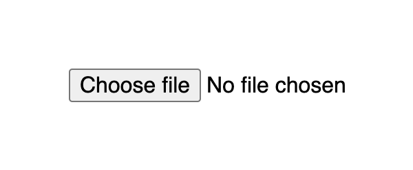
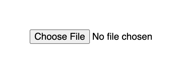
This markup produces a button with a Choose file title followed by a text which indicates the file name when selected. By default it is No file chosen.
Input with type file default look differs on different browsers:


Styling
The upload file widget structure consists of a block that displays a button and a file name. A user can click anywhere inside the block or drag a file from the desktop and it will open up the upload window.
Styling the upload file block
If you apply styles for the input[type=file] selector it will set them for the whole widget block, that is the button and text.
input[type=file] width: 350px; max-width: 100%; color: #444; padding: 5px; background: #fff; border-radius: 10px; border: 1px solid #555; > The result already looks much better as it indicates the zone where user is able to click or drag the file.
Styling the upload file button
By default, the Choose file button has a plain user-agent style. To style the button with CSS you should use the ::file-selector-button pseudo-element to select it. It is supported in all modern browsers.
input[type=file]::file-selector-button margin-right: 20px; border: none; background: #084cdf; padding: 10px 20px; border-radius: 10px; color: #fff; cursor: pointer; transition: background .2s ease-in-out; > input[type=file]::file-selector-button:hover background: #0d45a5; > Styling the the click/drop zone
If you wich to go a bit further, you can create a large zone where user can click and drag files. This large zone will make it easier for people to use the widget, as it don’t require to be that precise when dragging a file, especially on smaller screens.
To implement a large drop zone, you’ll need to wrap your file upload input into a label tag and specify a description text that will let users know how to use the widget.
for="images" class="drop-container" id="dropcontainer"> class="drop-title">Drop files here or type="file" id="images" accept="image/*" required> For the layout, we need to set display to flex with flex related properties for positioning. The height and padding properties for proportion. And finally add some fancy styles like border and hover effects to highlight the file upload zone and you’re ready to go.
.drop-container position: relative; display: flex; gap: 10px; flex-direction: column; justify-content: center; align-items: center; height: 200px; padding: 20px; border-radius: 10px; border: 2px dashed #555; color: #444; cursor: pointer; transition: background .2s ease-in-out, border .2s ease-in-out; > .drop-container:hover background: #eee; border-color: #111; > .drop-container:hover .drop-title color: #222; > .drop-title color: #444; font-size: 20px; font-weight: bold; text-align: center; transition: color .2s ease-in-out; > Handling drag and drop events
Additionally, you can handle cases when the user will try to drag the file over the drop area. CSS alone cannot handle such cases, so we can add a little bit of JavaScript.
There are two points to consider to improve UX for the drop field:
- Indicate the drop area when the user is dragging a file over it
- Make it possible to drop a file inside the drop area, and not just the input element
To indicate drop area when user is dragging a file over it, we’ll need to use the dragenter and dragleave events. Both on the label tag, since it represents the drop area. For each event we add or remove a CSS class accordingly.
Since user will be dropping to the label tag we also need to set the input value with the file. To do that we need to do 2 things:
- Set dragover event for the label tag, set e.preventDefault() and pass false as the third parameter for the addEventListener method
- On drop event, we need to set the input’s files property to the file via fileInput.files = e.dataTransfer.files
const dropContainer = document.getElementById("dropcontainer") const fileInput = document.getElementById("images") dropContainer.addEventListener("dragover", (e) => // prevent default to allow drop e.preventDefault() >, false) dropContainer.addEventListener("dragenter", () => dropContainer.classList.add("drag-active") >) dropContainer.addEventListener("dragleave", () => dropContainer.classList.remove("drag-active") >) dropContainer.addEventListener("drop", (e) => e.preventDefault() dropContainer.classList.remove("drag-active") fileInput.files = e.dataTransfer.files >) As for styles, we can use similar styles to :hover state, but this time with a designated class:
.drop-container.drag-active background: #eee; border-color: #111; > .drop-container.drag-active .drop-title color: #222; > Demo
See the full example on CodePen:
See the Pen Untitled by Nikita Hlopov (@nikitahl) on CodePen.
