- Абсолютное горизонтальное и вертикальное центрирование
- Достоинства
- Недостатки
- Совместимость с браузерами
- Внутри контейнера
- С использованием viewport
- Адаптивность
- Смещения
- Много контента
- Изображения
- Изменяемая высота
- Другие способы
- Отрицательный margin
- Использование transform
- Table-cell
- Flexbox
- Итог
- Web Style Sheets CSS tips & tricks
- Centering a block or image
- Centering vertically
- Centering vertically in CSS level 3
- Centering vertically and horizontally in CSS level 3
- Centering in the viewport in CSS level 3
- Nicely centered
- Site navigation
Абсолютное горизонтальное и вертикальное центрирование
Сколько уже было сломано копий о задачу выравнивания элементов на странице. Предлагаю вашему вниманию перевод отличной статьи с решением этой проблемы от Стефана Шоу (Stephen Shaw) для Smashing Magazine — Absolute Horizontal And Vertical Centering In CSS.
Все мы знали о margin: 0 auto; для горизонтального центрирования, но margin: auto; не работало для вертикального. Это можно легко исправить, просто задав высоту и применив следующие стили:
Я не первый, кто предложил это решение, однако такой подход редко применяется при вертикальном выравнивании. В комментариях к статье How to Center Anything With CSS Simon ссылается на пример jsFiddle, где приводится отличное решение для вертикального центрирования. Вот еще несколько источников на эту тему.
Рассмотрим способ поближе.
Достоинства
- Кроссбраузерность (включая IE 8-10)
- Никакой дополнительной разметки, минимум стилей
- Адаптивность
- Независимость от padding (без box-sizing!)
- Работает для изображений
Недостатки
- Должна быть задана высота (см. Variable Height)
- Рекомендуется задать overflow: auto, чтобы контент не расползался
- Не работает на Windows Phone
Совместимость с браузерами
Метод был протестирован, и прекрасно работает в Chrome, Firefox, Safari, Mobile Safari и даже IE 8-10. Один пользователь упоминал, что контент не выравнивается по вертикали на Windows Phone.
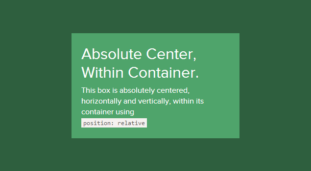
Внутри контейнера
Контент, размещенный в контейнер с position: relative будет прекрасно выравниваться:
С использованием viewport
Установим для контента position: fixed и зададим z-index:
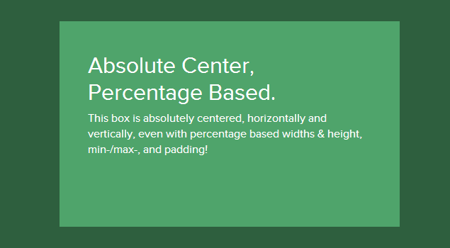
Адаптивность
Главное преимущество описываемого способа — это прекрасная работа, когда высота или ширина задана в процентах, да еще и понимание min-width/max-width и min-height/max-height.
.Absolute-Center.is-Responsive
Смещения
Если на сайте присутствует фиксированная шапка или требуется сделать какой-то другой отступ, просто нужно добавить в стили код вроде top: 70px; Пока задан margin: auto; блок с контентом будет корректно центрироваться по высоте.
Еще можно выравнивать контент по нужной стороне, оставляя центрирование по высоте. Для этого нужно использовать right: 0; left: auto; для выравнивания справа или left: 0; right: auto; для выравнивания слева.

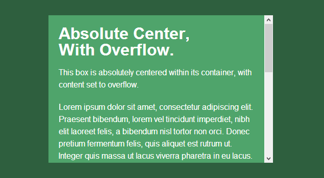
Много контента
Для того, чтобы большое количество контента не позволяло верстке разъезжаться, используем overflow: auto. Появится вертикальная прокрутка. Также можно добавить max-height: 100%; если у контента нет дополнительных отступов.
Изображения
Способ отлично работает и для изображений! Добавим стиль height: auto; тогда картинка будет масштабироваться вместе с контейнером.

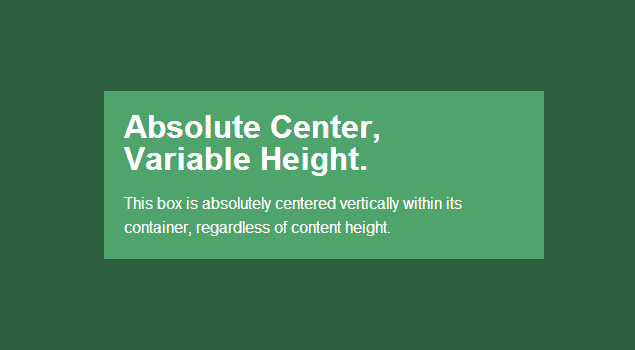
Изменяемая высота
Описываемый способ требует заданной высоты блока, которая может быть указана в процентах и контролироваться с помощью max-height, что делает метод идеальным для адаптивных сайтов. Один из способов не задавать высоту — использование display: table. При этом блок контента центрируется независимо от размера.
Могут возникнуть проблемы с кроссбраузерностью, возможно следует использовать способ с table-cell (описан ниже).
- Firefox/IE8: использование display: table выравнивает блок вертикально по верхней границе документа.
- IE9/10: использование display: table выравнивает блок по левому верхнему углу страницы.
- Mobile Safari: если ширина задана в процентах, страдает горизонтальное центрирование
Другие способы
Описанный способ отлично работает в большинстве случаев, но есть и другие методы, которые могут быть применимы для решения специфических задач.
Отрицательный margin
Наверное, самый популярный способ. Подходит, если известны размеры блока.
- Не адаптивный
- Ползет верстка, если в контейнере слишком много контента
- Приходится компенсировать отступы или использовать box-sizing: border-box
Использование transform
Один из самых простых способов, поддерживает изменение высоты. Есть подробная статья на эту тему — «Centering Percentage Width/Height Elements» от CSS-Tricks.
- Не работает в IE 8
- Использование префиксов
- Может мешать работе других эффектов с transform
- В некоторых случаях при рендеринге размываются края блока и текст
Table-cell
Возможно один из самых лучших и простых способов. Подробно описан в статье «Flexible height vertical centering with CSS, beyond IE7» от 456bereastreet. Главный недостаток — дополнительная разметка: требуется аж три элемента:
.Pos-Container.is-Table < display: table; >.is-Table .Table-Cell < display: table-cell; vertical-align: middle; >.is-Table .Center-Block
- Изменяемая высота
- Верстка не едет при большом количестве текста в блоке
- Кроссбраузерность
Flexbox
Будущее CSS, flexbox будет решать множество сегодняшних проблем верстки. Подробно об этом написано в статье Smashing Magazine, которая называется Centering Elements with Flexbox.
- Контаент может быть любой высоты или ширины
- Может использоваться в более сложных случаях
- Нет поддержки IE 8-9
- Требуется контейнер или стили в body
- Требует множество разнообразных префиксов для корректной работы в современных браузерах
- Возможные проблемы производительности
Итог
Каждый способ имеет преимущества и недостатки. По сути, выбор сводится к выбору браузеров, которые должны поддерживаться
Web Style Sheets CSS tips & tricks
The most common and (therefore) easiest type of centering is that of lines of text in a paragraph or in a heading. CSS has the property ‘text-align’ for that:
renders each line in a P or in a H2 centered between its margins, like this:
The lines in this paragraph are all centered between the paragraph’s margins, thanks to the value ‘center’ of the CSS property ‘text-align’.
Centering a block or image
Sometimes it is not the text that needs to be centered, but the block as a whole. Or, phrased differently: we want the left and right margin to be equal. The way to do that is to set the margins to ‘auto’. This is normally used with a block of fixed width, because if the block itself is flexible, it will simply take up all the available width. Here is an example:
This rather narrow block of text is centered. Note that the lines inside the block are not centered (they are left-aligned), unlike in the earlier example.
This is also the way to center an image: make it into block of its own and apply the margin properties to it. For example:

The following image is centered:
Centering vertically
CSS level 2 doesn’t have a property for centering things vertically. There will probably be one in CSS level 3 (see below ). But even in CSS2 you can center blocks vertically, by combining a few properties. The trick is to specify that the outer block is to be formatted as a table cell, because the contents of a table cell can be centered vertically.
DIV.container < min-height: 10em; display: table-cell; vertical-align: middle >.This small paragraph.
This small paragraph is vertically centered.
Centering vertically in CSS level 3
CSS level 3 offers other possibilities. At this time (2014), a good way to center blocks vertically without using absolute positioning (which may cause overlapping text) is still under discussion. But if you know that overlapping text will not be a problem in your document, you can use the ‘transform’ property to center an absolutely positioned element. For example:
This paragraph is vertically centered.
For a document that looks like this:
the style sheet looks like this:
div.container3 < height: 10em; position: relative > /* 1 */ div.container3 p < margin: 0; position: absolute; /* 2 */ top: 50%; /* 3 */ transform: translate(0, -50%) > /* 4 */
- Make the container relatively positioned, which declares it to be a container for absolutely positioned elements.
- Make the element itself absolutely positioned.
- Place it halfway down the container with ‘top: 50%’. (Note that 50%’ here means 50% of the height of the container.)
- Use a translation to move the element up by half its own height. (The ‘50%’ in ‘translate(0, -50%)’ refers to the height of the element itself.)
Recently (since about 2015), another technique has also become available in several CSS implementations. It is based on the new ‘flex’ keyword for the ‘display’ property. This keyword is meant for use in graphical user interfaces (GUIs), but nothing stops you from using it in a document, if the document happens to have the right structure.
This paragraph is vertically centered.
the style sheet looks like this:
div.container5 < height: 10em; display: flex; align-items: center > div.container5 p
Centering vertically and horizontally in CSS level 3
We can extend both methods to center horizontally and vertically at the same time.
A side-effect of making the paragraph absolutely positioned is that it is then only as wide as it needs to be (unless we give it an explicit width, of course). In the example below, that’s precisely what we want: We center a paragraph with just one word (“Centered!”), so the width of the paragraph should be exactly the width of that word.
The yellow background is there to show that the paragraph is indeed only as wide as its contents. We assume the same mark-up as before:
The style sheet is similar to the previous example with respect to the vertical centering. But we now move the element halfway across the container as well, with ‘left: 50%’, and at the same time move it leftwards by half its own width in the ‘translate’ transformation:
div.container4 < height: 10em; position: relative >div.container4 p < margin: 0; background: yellow; position: absolute; top: 50%; left: 50%; margin-right: -50%; transform: translate(-50%, -50%) >
The next example below explains why the ‘margin-right: -50%’ is needed.
When the CSS formatter supports ‘flex’, it’s even easier:
div.container6 < height: 10em; display: flex; align-items: center; justify-content: center > div.container6 p
i.e., the only addition is the ‘justify-content: center’. Just like ‘align-items’ determines the vertical alignment of the container’s contents, ‘justify-content’ determines the horizontal alignment. (It’s actually a bit more complex, as their names suggest, but in a simple case that’s how it works.) A side-effect of ‘flex’ is that the child element, the P in this case, is automatically made as small as possible.
Centering in the viewport in CSS level 3
The default container for absolutely positioned elements is the viewport. (In case of a browser, that means the browser window). So centering an element in the viewport is very simple. Here is a complete example. (This example uses HTML5 syntax.)
Nicely centered
This text block is vertically centered.
Horizontally, too, if the window is wide enough.
You can see the result in a separate document.
The ‘margin-right: -50%’ is needed to compensate the ‘left: 50%’. The ‘left’ rule reduces the available width for the element by 50%. The renderer will thus try to make lines that are no longer than half the width of the container. By saying that the right margin of the element is further to the right by that same amount, the maximum line length is again the same as the container’s width.
Try resizing the window: You’ll see that each sentence is on one line when the window is wide enough. Only when the window is too narrow for the whole sentence will the sentence be broken over several lines. When you remove the ‘margin-right: -50%’ and resize the window again, you’ll see that the sentences will be broken already when the window is still twice as wide as the text lines.
Site navigation

Bert Bos, style activity lead
Copyright © 1994–2021 W3C ® Privacy policy
Created 5 May 2001;
Last updated Wed 06 Jan 2021 05:40:49 AM UTC