- 17+ CSS Round Buttons [Examples & How to create]
- How Do You Make A Button More Rounded CSS?
- CSS Round Buttons Examples
- 1. CSS Round Buttons With Hover Effect
- 2. Minimal Circular 3D Buttons
- 3. CSS Round Checkbox Button
- 4. 3D CSS Round Button With Check Mark
- 5. Subtle 3D Toggle Round Button (CSS)
- 6. Arcade Round Button (CSS)
- 7. CSS Round Button Badges
- 8. Round Buttons With Padding
- 9. Animated Circular Buttons
- 10. Animated Round CSS Buttons
- 11. Round Buttons With Border
- 12. Square To Round CSS Buttons
- 13. Rounded Plus And Minus Buttons
- 14. Floating Round CSS Buttons
- 15. Round CSS Social Media Buttons
- 16. Bootstrap Round Buttons (CSS)
- 17. Custom CSS Circle Buttons
- 18. Social Media Circle Buttons
- Related Articles
- Round Buttons
- How to create a Button with Rounded Corners using CSS
- Adding Rounded Corners to Buttons
- Categories
17+ CSS Round Buttons [Examples & How to create]
When building UI for a web application, each browser comes with default styles, buttons, textboxes and any input UI has its own default style.
With CSS you can edit these default styles and create a unique look. HTML Round buttons styled with CSS will make your website more interesting and engaging because you have your own style.
A CSS round button can look way more stylish and elegant than the boxy default style, which can look a bit sharp and brutal. Minimalism and a modern look go well with rounded corners, this makes UI look and feel softer and less harsh.
How Do You Make A Button More Rounded CSS?
To create a rounded button you have to make use of the border-radius CSS property.
The higher the value for that property the more rounder the corners will be.
You can use any CSS unit for the boorder-radius property. It can be pixels, ems, rems, percentages etc.
Here’s an example of a button with slightly rounded corners:
.my-button
/* Adding the rounded corners */
border-radius: 5px;

border: 1px solid #000;
padding: 10px 20px;
background: yellow;
font-size: 2em;
cursor: pointer;
>
The HTML markup doesn’t require anything special. In this case we’ll be using a button elemen but you can use any other such as div , span or p .
button class="my-button">Examplebutton>And here’s the codepen with the example so you can play a bit with it:
CSS Round Buttons Examples
Whether you are getting inspiration or just need something different other than the default browser style — We have a little something for everyone, so here are over 15 amazing round buttons styled with CSS that you can use.
1. CSS Round Buttons With Hover Effect
In our first example, we have some cool CSS round buttons that have a hover effect on them. They lose their solid background colour when you hover, try it out!
If you are thinking in adding hover effects to your round buttons, check out this list with the 10 Best CSS Button Hover Effects
The spacing between the icons is nice and they look very minimal, you can easily change the colours in the CSS code as there are some variables you can edit.
The buttons are made using HTML link tags, so you know they will be useful in terms of SEO.
2. Minimal Circular 3D Buttons
Built with pure CSS (no third-party libraries). The CSS is easy to understand as everything is named appropriately.
Each button uses an HTML link tag, so it will be good for SEO reasons and the HTML markup is easily reused and clear.
The style is minimal and looks very modern.
3. CSS Round Checkbox Button
Not every CSS round button needs to be a basic HTML link tag, this one is using a checkbox in the background and acts as a toggle switch.
It is 3D and animated when you toggle between the two states. It looks super cool and is very engaging.
4. 3D CSS Round Button With Check Mark
A 3D HTML button that has a checkmark inside it, once pressed it lights up as a blue colour — you could also change this colour if it doesn’t match your style.
Just pure CSS, no third-party libraries, so very portable and no pre-renders needed to use this one.
You can use the pre-defined CSS variables to change the colours as well. Makes it very easy for you.
5. Subtle 3D Toggle Round Button (CSS)
Another checkbox based CSS round button. It is cleverly set up to be very reusable as in the HTML, a wrapper class is used and the structure is simple enough.
The subtle animation change between the two states looks amazing and is extremely minimal, not overpowering at all.
It basically just uses a shadow to pull off the effect of the button going up and down, very lightweight indeed.
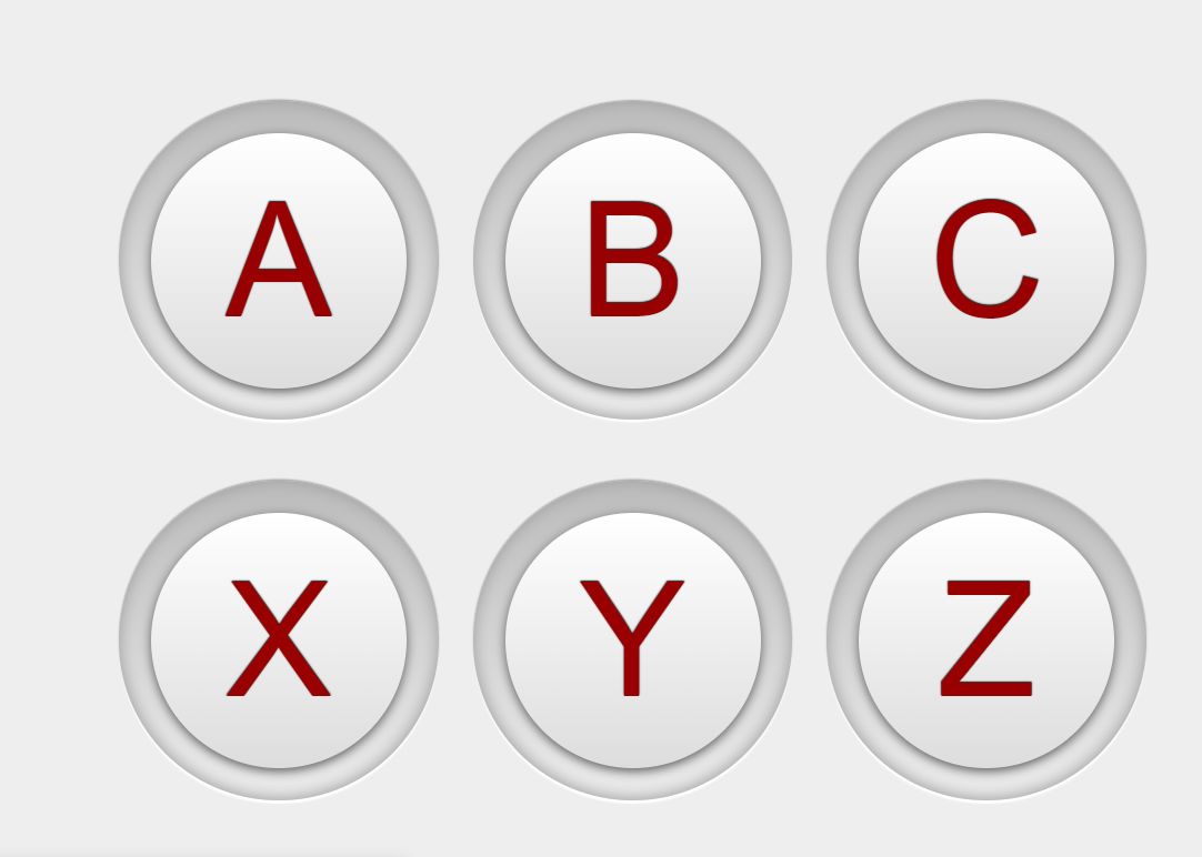
6. Arcade Round Button (CSS)
Something a little different and more specific: a great looking 3D arcade button that has a cool effect when you click it.
This would be great for a games website or some other arcaded related design. A fun button which can be used to create an engaging UI.
7. CSS Round Button Badges
Pure CSS round button badges with text and a split background between the top and bottom of each button.
The HTML structure is super clean and easy to understand, you can enter your own text, subtitle and bottom icon.
Even though these are badges, you can use them and make them clickable so that a user can enter a new page or trigger an action.
8. Round Buttons With Padding
A set of round buttons which a clean HTML structure that uses link tags, so they are great for SEO purposes.
You can easily change the text and add more to each button. They have a minimal look to them and will fit in with any modern and clean design.
9. Animated Circular Buttons
Two examples of some round buttons that are animated. The first one has a rotor effect, the outside padding spins around when you hover. The second button pulses its border when hovered.
The HTML structure is clean and easy to understand. You can change the text inside the link tag, which is also great for SEO purposes as web crawls can follow these buttons with ease.
The animations are both smooth and subtle.
10. Animated Round CSS Buttons
Minimal and subtle animated CSS round buttons with icons in the middle of them.
Each button has its own text below as well. The icons are nicely centred within the button and the HTML structure is clean.
Upon hovering, there is a cool effect and when you move the mouse off, there is an exit animation.
11. Round Buttons With Border
A set of very simple but effective CSS round buttons, just pure HTML and CSS, no third-party libraries or CSS pre-renderers.
Change the colour within the CSS code to match your design. They have a nice subtle hover effect on them as well.
12. Square To Round CSS Buttons
This example shows you how you can slowly increase the roundness of CSS buttons, starting off with a square and moving towards a full circle.
Sometimes a fully rounded button doesn’t work well in every design and you may want to only create a rounded button with the corners, check out the CSS, it is simple enough and shows you how you can create this style.
13. Rounded Plus And Minus Buttons
If you are looking for dark themed buttons, this one is for you. We have some plus and minus buttons with hover and click effects, very subtle effects but not overpowering.
Both the HTML and CSS are simple and easy to understand, great if you wish to make changes or improvements.
14. Floating Round CSS Buttons
Here in this example, we have some pure HTML and CSS round buttons, they use the ‘a’ tag, so they are great for SEO.
The coolest thing here is the fact that these buttons are using CSS float to position them, check out the CSS to see how it all works.
15. Round CSS Social Media Buttons
Built using the bootstrap CSS framework and a little jQuery to trigger the pop-in animation for each button.
These buttons have their own hover effects and a pop-in animation which clicked, the border expands and stays there for a few seconds. Very subtle and lightweight.
Also, there are some hexagonal alternatives as well if you like them.
16. Bootstrap Round Buttons (CSS)
A selection of round buttons that are built using the CSS framework Bootstrap.
You have a range of uses for these, and as you can see they all have their own icons to show off.
17. Custom CSS Circle Buttons
A cool custom look for a set of round CSS buttons, a little rustic. They have an animation on hover and click.
If you hold down the click, the button travels further during its animation.
18. Social Media Circle Buttons
A set of pure HTML and CSS buttons that are using a circular design with social icons in the middle — Great for use inside a website footer or at the bottom of a website.
Try hovering over each button and watch the hover effect they have.
Related Articles
Luke Embrey is a full-stack developer, BSc in Computer Science and based in the UK.
You can find out more about him at https://lukeembrey.com/
Join 2,000+ readers and learn something new every month!
Round Buttons
CSS provides a handy property of border-radius, that lets us create round corners for our elements. This brief article will demonstrate how to build aesthetic rounded buttons.
Let’s create a button with an edit icon.
Let’s give it a pleasant color, spacing, and a subtle shadow.
Let’s make our button a perfect circle by applying a border-radius of at least 50%.
There we go. Let’s give it realistic hover and active state effects with a gentle transition.
Let’s change the background color and box-shadow placement when the button is pressed. On top of these, adding a y-axis translate creates a realistic keypress effect.
button.round:hover < background-color: #65b9e6; >button.round:active
And our button is complete. Try clicking on it!
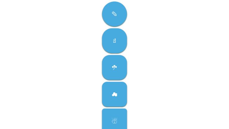
Here is a catalog of buttons with different border radii.
* < font-family: sans-serif; >.parent < display: flex; flex-direction: column; align-items: center; >button < background-color: #48abe0; color: white; border: none; padding: 5px; font-size: 31px; height: 130px; width: 130px; box-shadow: 0 2px 4px darkslategray; cursor: pointer; transition: all 0.2s ease; >button:hover < background-color: #65b9e6; >button:active < box-shadow: 0 0 2px darkslategray; transform: translateY(2px); >button < margin-bottom: 10px; >.round-1 < border-radius: 5%; >.round-2 < border-radius: 10%; >.round-3 < border-radius: 20%; >.round-4 < border-radius: 30%; >.round-5 < border-radius: 40%; >.round-6
Here are some more examples.
A collection of rounded buttons.
See the Pen Rounded buttons by Elena Scherer (@eksch) on CodePen.
Rounded buttons with several hover effects.
Simple rounded button with a fancy hover effect.
UnusedCSS helps website owners remove their unused CSS every day. See how much you could save on your website:
You Might Also Be Interested In
How to create a Button with Rounded Corners using CSS
In CSS3 you can give elements rounded corners with the border-radius property. Let’s look at an example of this.
Suppose you have the following markup.
To make the div visible, we’ll set its width and height and give it a background color of red.
.red_div background-color: red; width: 200px; height: 100px; > The following is the resulting output of the above.
To make the div’s borders rounded, you could add the following styling:
The above sets a 15 pixel radius on the top-left, top-right, bottom-left and bottom-right corners of the element. The higher the value of the radius, the more rounded the edge becomes.
Below you can see the result of the above markup.
The border-radius property can be written in several ways.
Specifying one value for the property will set all four edges of the element to a radius of that value.
With two values, the first will be applied to the top-left and bottom-right corner while the second is applied to the top-right and bottom-left corners
border-radius: 15px 15px 15px; With three values, the first will be used for the top-left corner, the second value for the top-right and bottom-left corners, and the third value will be applied to the bottom-right corner.
border-radius: 15px 15px 15px 15px; The above explicitly sets a value for each edge. The above is a shorthand for the below CSS, which also eplicitly gives a value for each edge.
border-top-left-radius: 15px; border-top-right-radius: 15px; border-bottom-right-radius: 15px; border-bottom-left-radius: 15px; In the example we’ve looked at, we set the same value for all edges. You can of course set different values for each edge if you so wish.
Adding Rounded Corners to Buttons
border-radius can be used on other elements as well. Below, we see it used to add rounded corners to a button.
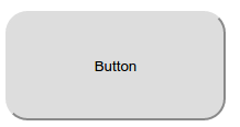
button width: 200px; height: 100px; border-radius: 20px; > The button will look like this:
Here are some more examples of complete buttons
Categories
- Form Action
- Contact Forms
- Code Snippets
- HTML Forms
- Best Practices
- HTML5 Forms
- Form Widgets
- PHP Form Handling
- jQuery Form Handling
- Email Forms
- Form Mail
- Web Forms
- Calculation Forms
- Checkboxes
- File Upload
- Google Forms
