blur()
Функция blur() задаёт размытие по Гауссу изображений, фоновых картинок или текста. К элементу напрямую применить размытие нельзя, только к его потомкам.
Синтаксис
Синтаксис
| Описание | Пример | |
|---|---|---|
| Указывает тип значения. | ||
| A && B | Значения должны выводиться в указанном порядке. | && |
| A | B | Указывает, что надо выбрать только одно значение из предложенных (A или B). | normal | small-caps |
| A || B | Каждое значение может использоваться самостоятельно или совместно с другими в произвольном порядке. | width || count |
| [ ] | Группирует значения. | [ crop || cross ] |
| * | Повторять ноль или больше раз. | [,]* |
| + | Повторять один или больше раз. | + |
| ? | Указанный тип, слово или группа не является обязательным. | inset? |
| Повторять не менее A, но не более B раз. | ||
| # | Повторять один или больше раз через запятую. | # |
Значения
В качестве значения указывается радиус размытия, он пишется в любых доступных единицах размера CSS (к примеру: 5px). Чем больше значение, тем сильнее будет размыто изображение.
Отрицательное значение не допускается. Пустое значение воспринимается как 0px.
Песочница

Пример
Результат данного примера показан на рис. 1.
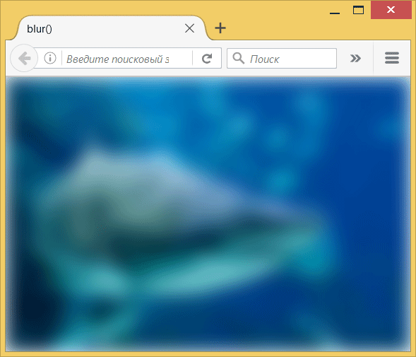
Рис. 1. Размытие фоновой фотографии
Примечание
Chrome до версии 53, Opera до версии 40 и Safari до версии 9.1 поддерживают свойство -webkit-filter .
Спецификация
Каждая спецификация проходит несколько стадий одобрения.
- Recommendation ( Рекомендация ) — спецификация одобрена W3C и рекомендована как стандарт.
- Candidate Recommendation ( Возможная рекомендация ) — группа, отвечающая за стандарт, удовлетворена, как он соответствует своим целям, но требуется помощь сообщества разработчиков по реализации стандарта.
- Proposed Recommendation ( Предлагаемая рекомендация ) — на этом этапе документ представлен на рассмотрение Консультативного совета W3C для окончательного утверждения.
- Working Draft ( Рабочий проект ) — более зрелая версия черновика после обсуждения и внесения поправок для рассмотрения сообществом.
- Editor’s draft ( Редакторский черновик ) — черновая версия стандарта после внесения правок редакторами проекта.
- Draft ( Черновик спецификации ) — первая черновая версия стандарта.
Браузеры
В таблице браузеров применяются следующие обозначения.
- — элемент полностью поддерживается браузером;
- — элемент браузером не воспринимается и игнорируется;
- — при работе возможно появление различных ошибок, либо элемент поддерживается с оговорками.
Число указывает версию браузреа, начиная с которой элемент поддерживается.
См. также
Рецепты
Справочник CSS
- !important
- ::after
- ::backdrop
- ::before
- ::first-letter
- ::first-line
- ::placeholder
- ::selection
- :active
- :blank
- :checked
- :default
- :disabled
- :empty
- :enabled
- :first-child
- :first-of-type
- :focus
- :focus-within
- :fullscreen
- :hover
- :in-range
- :indeterminate
- :invalid
- :lang
- :last-child
- :last-of-type
- :link
- :not
- :nth-child
- :nth-last-child
- :nth-last-of-type
- :nth-of-type
- :only-child
- :only-of-type
- :optional
- :out-of-range
- :placeholder-shown
- :read-only
- :read-write
- :required
- :root
- :target
- :valid
- :visited
- @charset
- @document
- @font-face
- @import
- @keyframes
- @media
- @page
- @supports
- @viewport
- accent-color
- align-content
- align-items
- align-self
- all
- animation
- animation-delay
- animation-direction
- animation-duration
- animation-fill-mode
- animation-iteration-count
- animation-name
- animation-play-state
- animation-timing-function
- aspect-ratio
- backdrop-filter
- backface-visibility
- background
- background-attachment
- background-blend-mode
- background-clip
- background-color
- background-image
- background-origin
- background-position
- background-position-x
- background-position-y
- background-repeat
- background-size
- block-size
- border
- border-bottom
- border-bottom-color
- border-bottom-left-radius
- border-bottom-right-radius
- border-bottom-style
- border-bottom-width
- border-collapse
- border-color
- border-image
- border-left
- border-left-color
- border-left-style
- border-left-width
- border-radius
- border-right
- border-right-color
- border-right-style
- border-right-width
- border-spacing
- border-style
- border-top
- border-top-color
- border-top-left-radius
- border-top-right-radius
- border-top-style
- border-top-width
- border-width
- bottom
- box-decoration-break
- box-shadow
- box-sizing
- caption-side
- caret-color
- clear
- clip
- color
- column-count
- column-fill
- column-gap
- column-rule
- column-rule-color
- column-rule-style
- column-rule-width
- column-span
- column-width
- columns
- content
- counter-increment
- counter-reset
- cursor
- direction
- display
- empty-cells
- filter
- flex
- flex-basis
- flex-direction
- flex-flow
- flex-grow
- flex-shrink
- flex-wrap
- float
- font
- font-family
- font-kerning
- font-size
- font-stretch
- font-style
- font-variant
- font-weight
- height
- hyphens
- image-rendering
- justify-content
- left
- letter-spacing
- line-clamp
- line-height
- list-style
- list-style-image
- list-style-position
- list-style-type
- margin
- margin-bottom
- margin-left
- margin-right
- margin-top
- marks
- max-height
- max-width
- min-height
- min-width
- mix-blend-mode
- object-fit
- opacity
- order
- orphans
- outline
- outline-color
- outline-offset
- outline-style
- outline-width
- overflow
- overflow-x
- overflow-y
- padding
- padding-block
- padding-block-end
- padding-block-start
- padding-bottom
- padding-inline
- padding-inline-end
- padding-inline-start
- padding-left
- padding-right
- padding-top
- page-break-after
- page-break-before
- page-break-inside
- perspective
- perspective-origin
- place-content
- pointer-events
- position
- quotes
- resize
- right
- scroll-behavior
- tab-size
- table-layout
- text-align
- text-align-last
- text-decoration
- text-decoration-color
- text-decoration-line
- text-decoration-skip-ink
- text-decoration-style
- text-emphasis
- text-emphasis-color
- text-emphasis-position
- text-emphasis-style
- text-fill-color
- text-indent
- text-orientation
- text-overflow
- text-shadow
- text-stroke
- text-stroke-color
- text-stroke-width
- text-transform
- top
- transform
- transform-origin
- transform-style
- transition
- transition-delay
- transition-duration
- transition-property
- transition-timing-function
- unicode-bidi
- user-select
- vertical-align
- visibility
- white-space
- widows
- width
- word-break
- word-spacing
- word-wrap
- writing-mode
- z-index
- zoom
Fun With Blurred Text
That’s dangerous though, because there are browsers that support color but not text shadow, so the end result would be totally invisible text. Of course, the solution is to feature detect and only apply this effect if you are in a browser that supports it:

The color of the shadow is the only thing visible, so make sure it has enough contrast enough to be seen. See the Pen Fun with Blurred Text by Chris Coyier (@chriscoyier) on CodePen. Thems the basics. Now let’s do some fun stuff.
Now instead of of having to apply the shadow on the entire word, we can do it letter-by-letter. Let’s make the blur zoom across the text like a crazy Eko-killing smoke monster. First we’ll make a keyframe animation 1 which animates from solid to blurry. For the sake of demo, this we’re using the -webkit- prefix, but you should use all the prefixes.
@-webkit-keyframes blackblur < from < text-shadow: 0 0 72px black; color: transparent; >to < text-shadow: 0; color: black; >>Now we can call that animation on every single letter. The further the letter along in the word 2 , the longer the delay before it starts.
.smokemonster span:nth-of-type(1) < -webkit-animation: blackblur 2s 1 alternate; >.smokemonster span:nth-of-type(2) < -webkit-animation: blackblur 2s 0.1s 1 alternate; >.smokemonster span:nth-of-type(3) < -webkit-animation: blackblur 2s 0.15s 1 alternate; >.smokemonster span:nth-of-type(4) < -webkit-animation: blackblur 2s 0.2s 1 alternate; >.smokemonster span:nth-of-type(5) < -webkit-animation: blackblur 2s 0.25s 1 alternate; >.smokemonster span:nth-of-type(6) < -webkit-animation: blackblur 2s 0.3s 1 alternate; >.smokemonster span:nth-of-type(7) < -webkit-animation: blackblur 2s 0.35s 1 alternate; >.smokemonster span:nth-of-type(8) < -webkit-animation: blackblur 2s 0.4s 1 alternate; >.smokemonster span:nth-of-type(9) < -webkit-animation: blackblur 2s 0.45s 1 alternate; >.smokemonster span:nth-of-type(10) < -webkit-animation: blackblur 2s 0.5s 1 alternate; >.smokemonster span:nth-of-type(11) < -webkit-animation: blackblur 2s 0.55s 1 alternate; >.smokemonster span:nth-of-type(12)

Now that’s awfully repetitive, but hey, that’s the deal with CSS sometimes. It’s not really a programming language…
Let’s say we had an unknown number of letters we wanted to deal with individually. Or we wanted to programmatically decide what color to use for the shadow. Or we wanted to randomly choose the blur level. CSS isn’t suited for any of these things, we’ll want to use JavaScript instead. As usual around here, I’m going to lean on jQuery. jQuery can SET a text shadow like this:
Luckily, text-shadow doesn’t come with a bunch of vendor prefixes to deal with. But still, we’re a little little hamstrung here. What if we just want to set the offset, blur, or color? There isn’t specific CSS properties for those things. We’d have to repeat the whole string with repetitive values to make a change. Not the end of the world, but what’s worse, we can’t animate! That’s where the jquery-cssHooks project comes in. It extends jQuery to be able to handle individual parts of complex CSS properties like text-shadow, box-shadow, border-image, transform, etc. Once we load up the scripts we need (order is important)…
Fancy! Let’s get our random on and animate random letters to random blur values with random color saturation.
var text = $("#some-word"), // assuming lettering() has already been called on it numLetters = text.find("span").length; // how many letters? function randomBlurize() < text // pick random letter .find("span:nth-child(" + (Math.floor(Math.random()*numLetters)+1) + ")") .animate(< 'textShadowBlur': Math.floor(Math.random()*25)+4, 'textShadowColor': 'rgba(0,100,0,' + (Math.floor(Math.random()*200)+55) + ')' >); // Call itself recurssively setTimeout(randomBlurize, 100); > // Call once randomBlurize();
Funny how much easier animating text-shadow is in CSS. But doing it this way is cool too as it has all those programatic advantages. View Demo Download Files Play on CodePen 1 While keyframe animations are WebKit only right now, rumor has it they might make Firefox 5. Update July 2012: keyframe animations are in all major browsers now and need the prefixes: -webkit-, -moz, -ms-, and -o-. 2 Notice we are using :nth-of-type here. I generally find that way more useful than :nth-child. Especially in this case where we wouldn’t want other tags screwing up the flow.