- 20 Beautiful CSS Contact Forms Code Examples
- CSS Contact Form Beautiful Design Examples with Source Code
- 1. UI Challenge – Contact Us Form
- 2. Contact Us Form – Frontend
- 3. Vintage Inspired Contact Form
- 4. Responsive Contact Form
- 5. Responsive Contact Form
- 6. Full CSS Drop Down Contact Form
- 7. Elegant Contact Form
- 8. Pure CSS Contact Forms
- 9. CSS Only, Responsive Modal Forms
- 10. Responsive CSS 3D Contact Forms
- 11. Floating Contact Form CSS
- 12. Simple, flat contact form
- 13. Pure CSS Contact Form
- 14. Simple HTML/CSS Contact
- 15. MINIMALISTIC FORM
- 16. Contact Form HTML + CSS
- 17. Responsive Contact Form with Map
- 18. Sass Flip Contact us
- 19. Contact Us
- 20. Under the sea form
- 21. Contact us with animation
- Conclusion
- 21 CSS Contact Forms
- Latest Post
- 55 Cool CSS Calendars
- 19 Barcodes in CSS
- 25 CSS Masonry Layout Examples
- 23 CSS Card Layouts
- 27 CSS Subscribe Forms
20 Beautiful CSS Contact Forms Code Examples
Want some feedbacks from your viewers on your website. Well you must know feedbacks are one of the important part of any project whether if it is software development or web development. In Order to get these feedback you can simply use Contact forms which can be made with simple CSS coding. All you need to do in your HTML or CSS code is make a contact form as shown in the example below. As you read this article you find lots of contact form template which are made with CSS and HTML. If you want to go even further with css coding then you can simply make new tab and add a new page saying contact us. You see when you use contact form then you not only get suggestions but ideas which can be later on implemented in your website.
But let’s assume that you do not have enough time to code for contact form then why not try the forms given to you in the example below. They are beautiful and does not take much time to code as all the codes are included in the demo. Here you can find almost every contact form template are made with HTML and CSS and even in some example you can find some JavaScript.
CSS Contact Form Beautiful Design Examples with Source Code
Some people might like to call it contact form and some might like to call them contact page let me tell you they might sound little same and both of they are made with css and html but they are not. As contact forms are simply form which can be implemented in any page but when it comes to contact page they are a whole different page just to contact the developers.
I will now just stop and let you decide what do you want in your webpage. So let’s look at some of the examples.
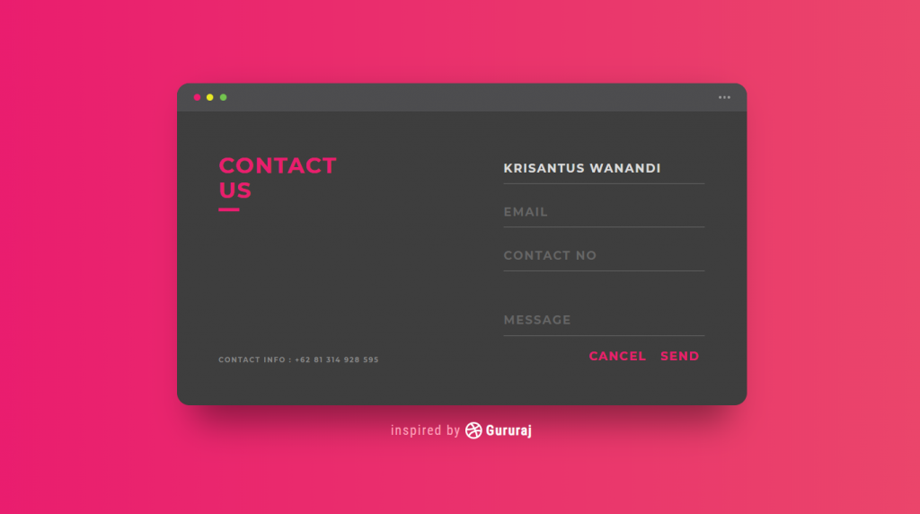
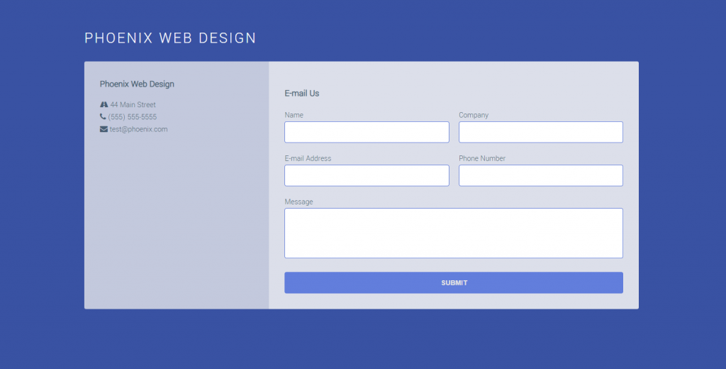
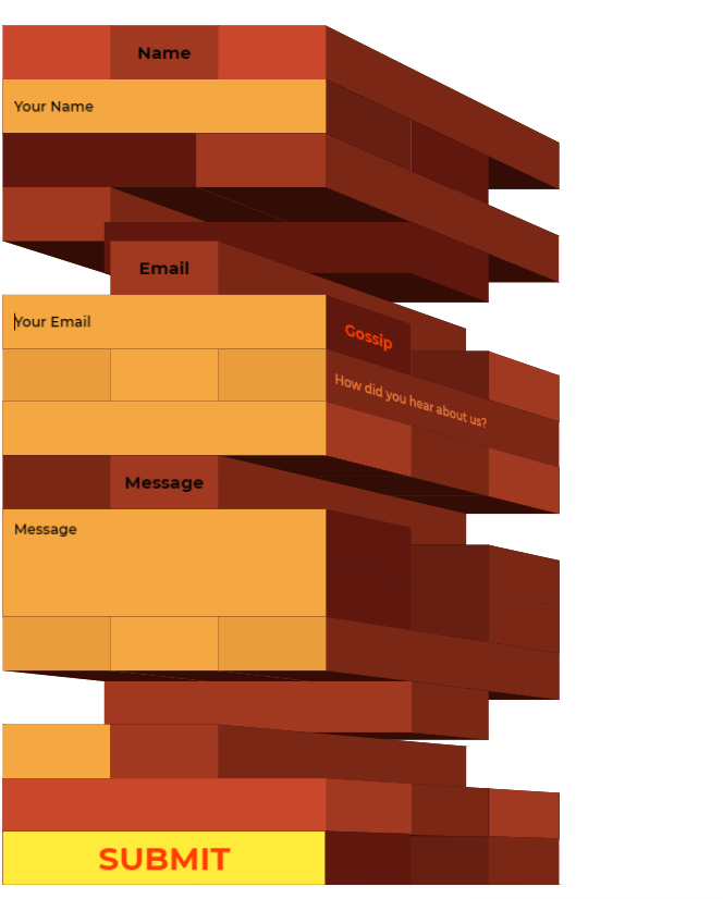
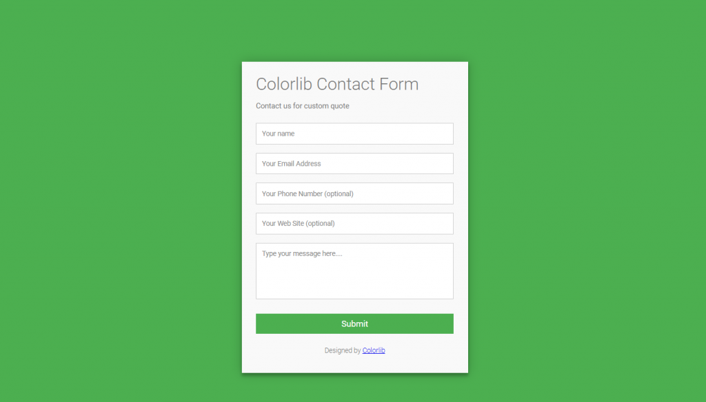
1. UI Challenge – Contact Us Form
If you are looking for some amazing contact forms then what are you waiting for. Why not try the one right before you. This contact form is so attractive as you can see their is background color which matches the text colors. You can see from this example that when you mix in a little css in your main HTML code than what you can get. This contact form may not be as responsive as others but daam does it look good.
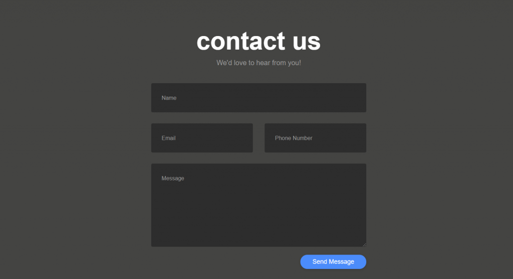
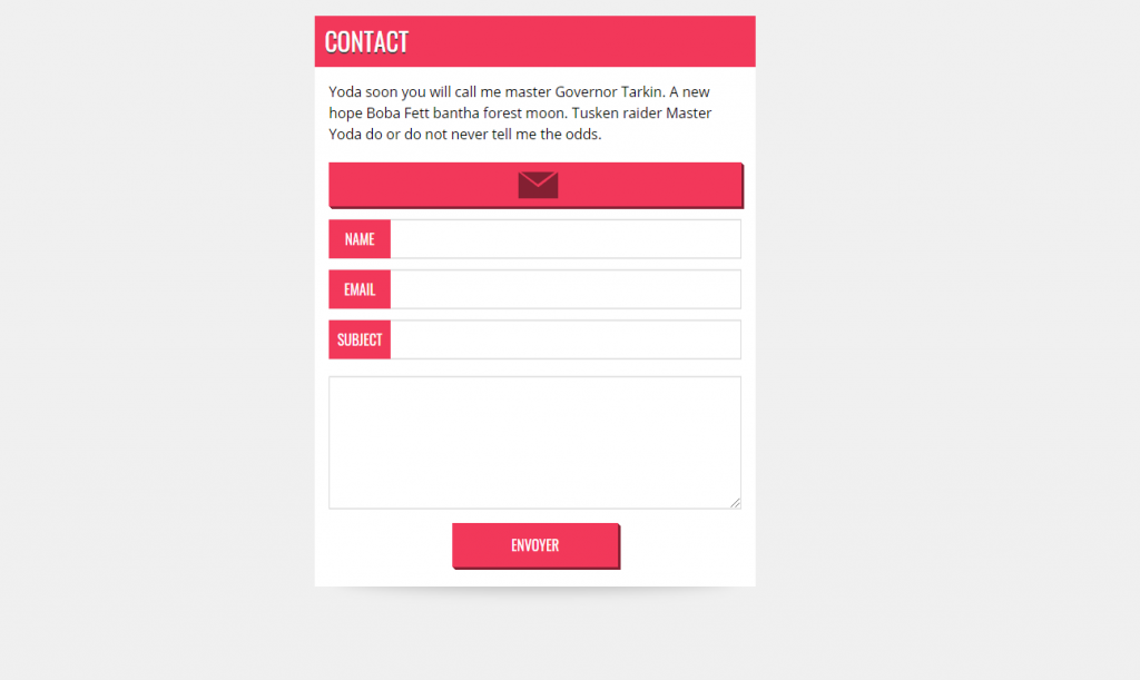
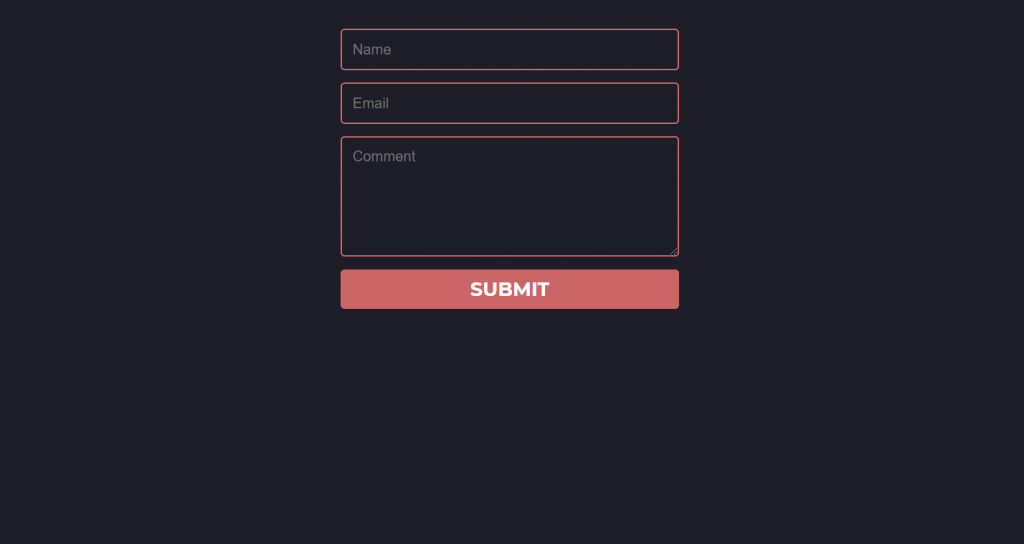
2. Contact Us Form – Frontend
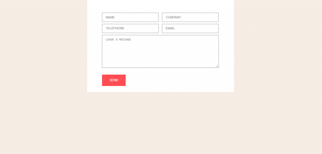
Well as you saw in the example above that how background color can make difference in contact forms. Now let’s look at something that has no border and inherits the entire background color. The more you make the background attractive the more your website looks good. So you can see that with the help of little css and HTML you can set such an amazing contact form.
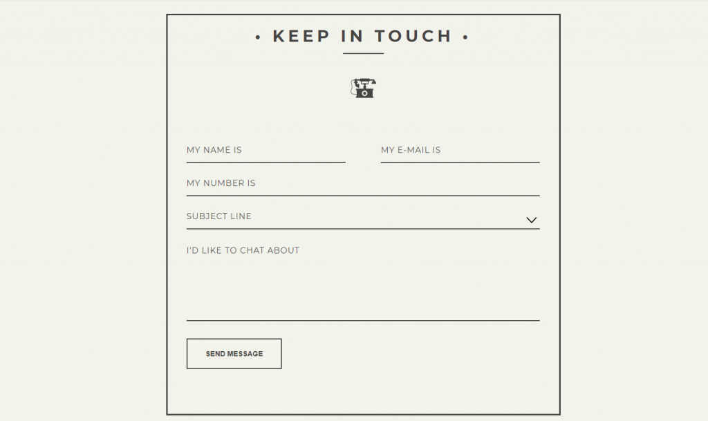
3. Vintage Inspired Contact Form
You see using modern way might be the best way to go but what if you can add something that is a little old fashion. Like in the demo below you can see that the contact form is using little old style. But dont be fooled by it appearance as this contact form is more responsive than other we have seen so far. Here CSS and HTML is used in such as way that this contact page will not take any errors and if any errors are found you will get a little warning sign.
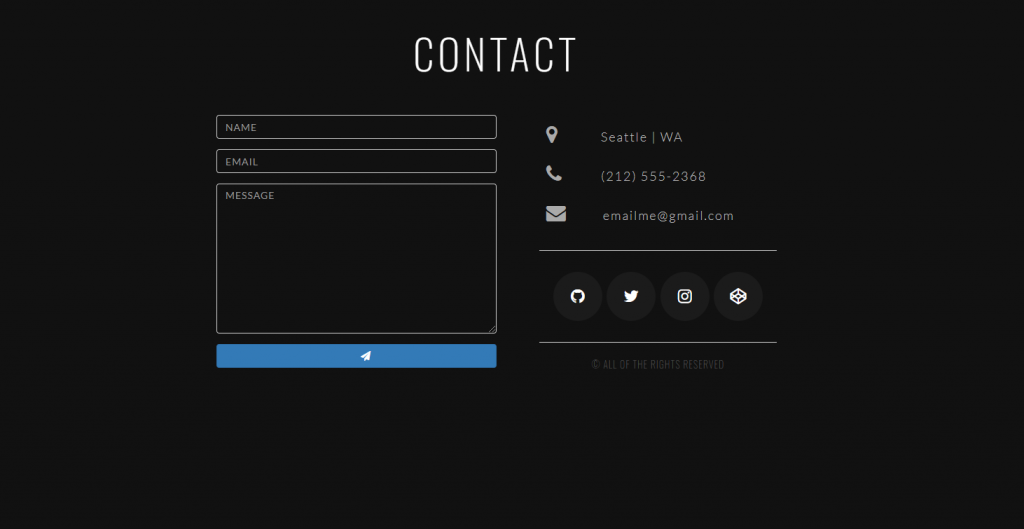
4. Responsive Contact Form
As you already know that contact form are used to contact you through your website but what if you add your company address and phone number with social media links. As you can see in the demo below that this CSS template which is used as contact form is not only offering you to contact through website but with other means as well. In this contact form example you can see how HTML and CSS are used to make form look attractive and responsive at the same time.
5. Responsive Contact Form
The more responsive your contact forms are the more your viewers can give you proper feedback. As seen in the demo below when you fill out the form and if you have made some mistake than those mistakes are indicated with the help of little warning signs. You see this responsive form will make the feedback more accurate than any other forms we have seen so far.
6. Full CSS Drop Down Contact Form
Just because you have contact form that is responsive does not necessarily mean you have the best. The more attractive you can make the contact form the better. When you look at the demo below you can see that one little click and the hidden form will emerge where you can fill the form. This is possible if you can make some adjustment to your CSS and HTML code.
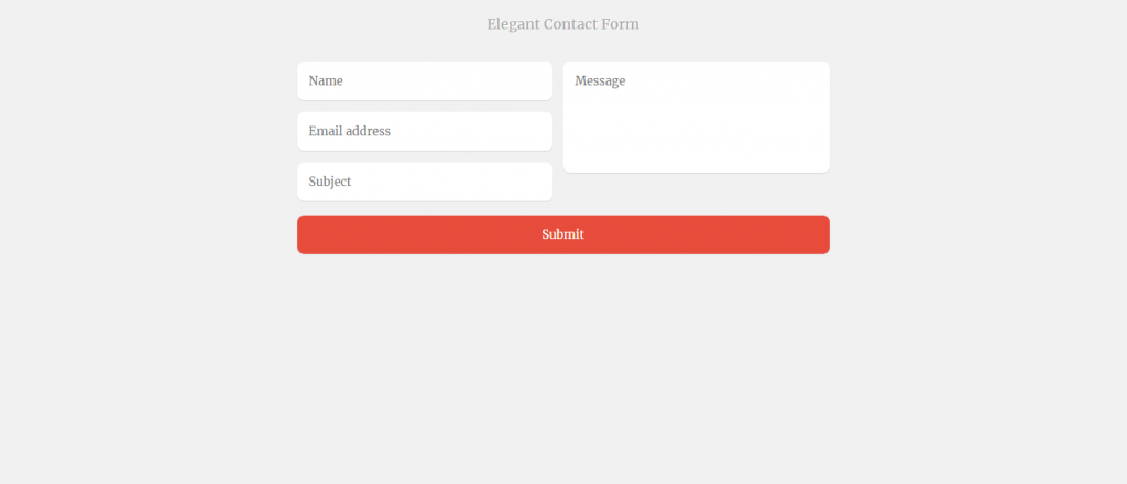
7. Elegant Contact Form
Having animation and responsive form is not something that is always that is best for your website. If you can make a contact forms with simple CSS and make it work then it is enough to get all the feedback you want. That is something that you can see in the demo below. You can see how the author has used simple css to make this contact form. This form may be simple but can get the job done.
8. Pure CSS Contact Forms
Elegant and form made with css is always lit. When you open the form in this demo all you will see is name, email and others but as soon as you hover your mouse you will see places to fill the form. They are hidden until and unless you don’t hover your mouse over them. They look amazing and make the form have that elegant look you might have wanted.
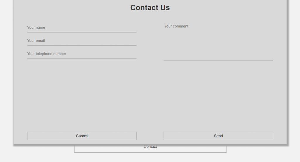
9. CSS Only, Responsive Modal Forms
If you are fan of responsive forms than you must check out this form. In this form you see how the contact form will rise as soon as you click the contact button. You see with the help of css and HTML you too can get something like this in no time. When you use contact form like this then you can not only make the contact form look good but you can also reduce the space in the webpage.
10. Responsive CSS 3D Contact Forms
While the entire world is shifting towards the 3D from 2D why should we stop at 2D. As this demo clearly shows us that how can we use CSS to make some responsive contact form like these. This contact form is not like any other forms you will see in the list above or below. All you need to do is fill the form and hit the submit button and not worry about the codes as you will find them in the demo.
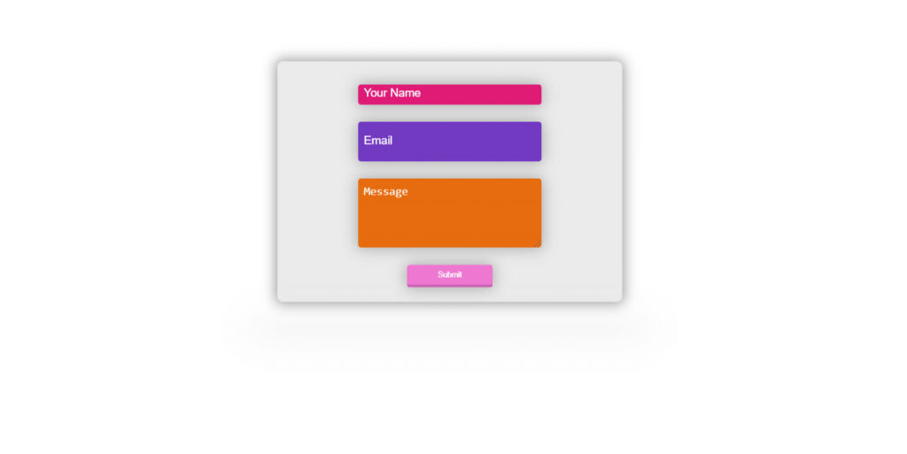
11. Floating Contact Form CSS
Simple but elegant is something that most of us go for. As you can see in the demo below how the contact form is being developed as the form hovers in the screen. The input fields in this contact form example are using different color which can be simply adjusted with the help of CSS and HTML. Although contact form like these are simple related to other template and their CSS codes may be a little different they can still set the job right.
12. Simple, flat contact form
If you are looking for something that saves time but still looks good then why not try this form. This form is rather simple but with its color combination it still looks good. If you have a different contact page for all your forms then you can use this form with little changes in the css of course. Just by looking at the simple css codes you might have already starting to like this contact page. But hey don’t take my word for it try it yourself.
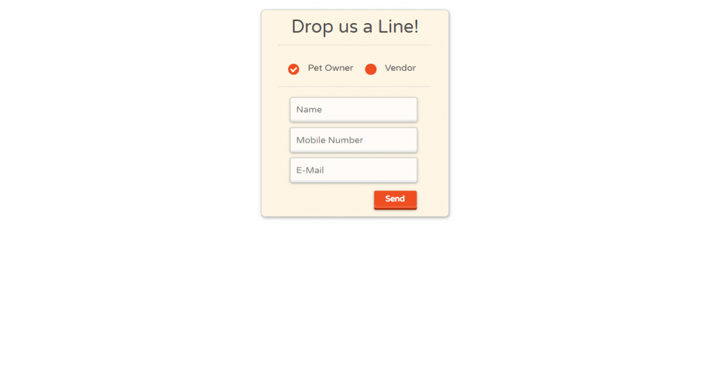
13. Pure CSS Contact Form
In your website you may have more than one content and those content may have their own meaning. Then you might want to add something a little different. As you can see in the demo here there are two options for you to choose. As soon as you choose one of thoses option you can send your feedback for that specific content. This makes the work of both the developer and reader work much more easier.
14. Simple HTML/CSS Contact
Simple yet responsive form is not something to be overlooked. In the demo below you can see how the simple form can be made to be more responsive. When you look at the demo you might say what is different here. But when you start to fill up the contact form you can see how CSS and HTML makes this example form more responsive. When you use template like these to make contact form i will always suggest you to use more CSS to make it as attractive as possible.
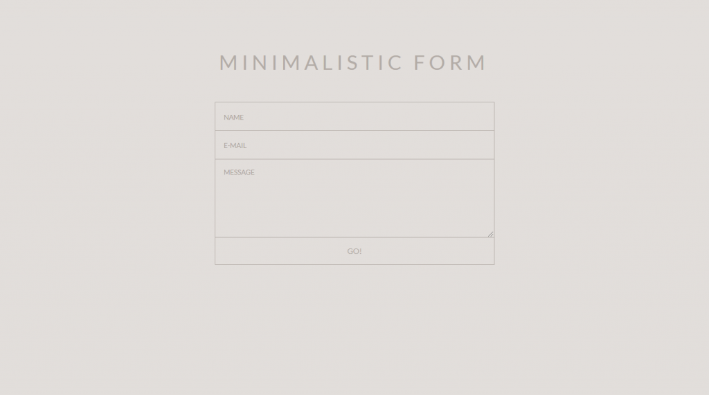
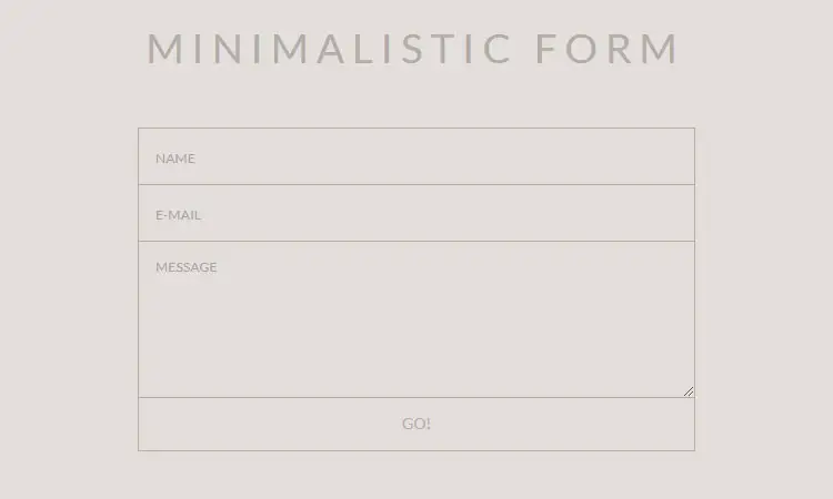
15. MINIMALISTIC FORM
With the use of additional effects in the contact form you can always expect to have some lit forms. For example you can use hover effect on the form. As you can see in the demo here when you hover your mouse in the input section here you will see how they hover. But as soon you fill the form the hover effect will be gone. The background color used in the demo is little light but yet darker for you to see what is inside it. Contact forms like these can be made with simple CSS codes in no time at all.
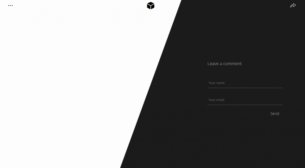
16. Contact Form HTML + CSS
With little JavaScript mixed with CSS and HTML can make something so amazing. The demo below clearly shows you that how can they be used as one to make something amazing. When you first open the contact form all you are going to see is how css is being used to make this simple contact form. But one you start to use it you can feel the difference. The demo here will make you want to use them. Once you click on the menu button on the top left entire contact form will simple be hidden behind.
Author: Trevor L.J.M. McIntire
Demo/Code
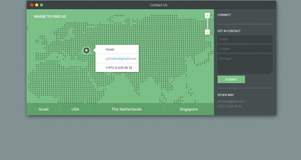
17. Responsive Contact Form with Map
Ok giving some additional information about the company is something that you must keep in mind. But what if you can give the entire location of your company in maps. Here you can see this contact form not only give you space where you can fill the form but you can see the location of the company as well. This contact page will make JavaScript lovers more happy as this form is the combination of JavaScript and CSS.
18. Sass Flip Contact us
Contact forms using CSS has some amazing capabilities to make forms more elegant and amazing. But with little JS you can make the form even more amazing. As you can see in the demo below when you open the page all you will see is a red button. But when you press the button then the magic starts. As soon as you press the button the card flips and revels you the contact form. So if you are looking for something like this then i would like to recommend you this contact form.
19. Contact Us
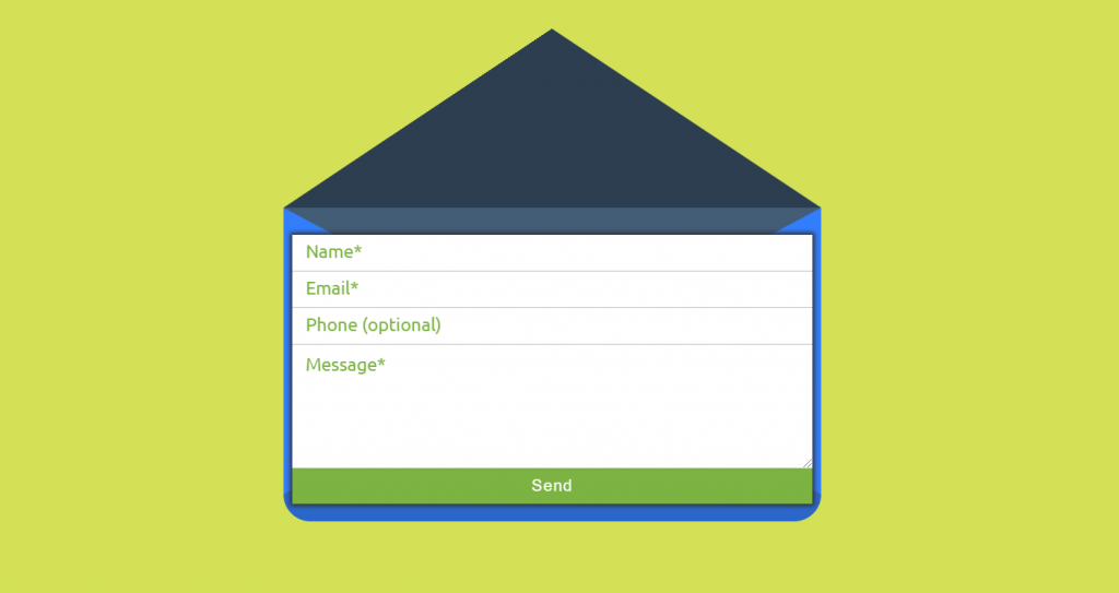
Remember those time time when you used to get every mail in some envelope. Well here their is a similar concept but in digital form. When you can see with the help of CSS and JS the contact page is made with something unique in mind. As you use this demo you will see that in order to fill the form you must click the button. When you click the button then the form will come out of the envelope. So if you are look for something like this then here you go.
20. Under the sea form
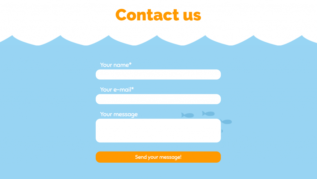
Are you JS lover then here is another example for you. This is not something that we have discussed above. Although this may seem like any other contact page this is much different. Just by looking at the background will make you want to add it. Contact form like these are great example how you can use HTML and CSS in your template. The background in on a loop so don’t worry about running out of images.
21. Contact us with animation
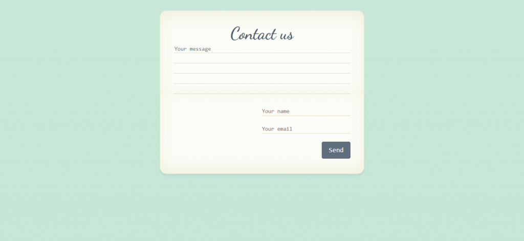
Until this point you might have seen almost every type of contact form. But have you seen contact form that takes the message first and then the other information. Well then just look at the example below. Here you can see how the form first takes the message and then takes the your information. This look simple and is simple enough to code as well.
Conclusion
I don’t think you will now have any problem selecting your perfect contact form anymore. We have already shown you over 20 example form which you can choose you contact form or page made with either HTML and CSS or HTML, CSS and JS. Just follow the codes provided for each template and make sure to write or copy the CSS and JS code in right way to make you contact form. So with this last line i would like to sign out and wish you best of luck for your beautiful website.
21 CSS Contact Forms
See the Pen Contact Form by Aina Requena (she/her) (@ainarela) on CodePen.
Dev: Aina Requena
Contact Form
Dev: Leena Lavanya
Responsive Contact Form
Dev: Lisa Wagner
Expanding Contact Form
Dev: Joe Harry
Responsive Contact Form
Dev: Bobby Korec
Elegant Contact Form
Dev: Grandvincent Marion
MINIMALISTIC FORM
Dev: Matheus Marsiglio
Contact Form Template
Dev: Chris Holder
RESPONSIVE MATERIAL DESIGN CONTACT FORM
Dev: Nikhil Krishnan
Elegant Contact Form
Dev: Mark Murray
HTML5 Contact Form
Dev: ssbalakumar
Latest Post
55 Cool CSS Calendars
19 Barcodes in CSS
25 CSS Masonry Layout Examples
23 CSS Card Layouts
27 CSS Subscribe Forms
We use cookies to ensure that we give you the best experience on our website. If you continue to use this site we will assume that you are happy with it. Ok
