- How to Plot a Confidence Interval in Python
- Libraries for Plotting Confidence Intervals
- Simple Confidence Interval Plot
- Plotting Confidence Intervals for Comparison
- Plotting Confidence Intervals for Regression Models
- Conclusion
- Как построить доверительный интервал в Python
- Построение доверительных интервалов с использованием lineplot()
- Построение доверительных интервалов с использованием regplot()
- How to Plot the Confidence Interval in Python?
How to Plot a Confidence Interval in Python
In the field of statistics, the concept of confidence intervals provides a useful way to understand the degree of uncertainty associated with a point estimate. A confidence interval gives an estimated range of values that is likely to contain the true value of the parameter we’re interested in, with a certain level of confidence. Visualizing this interval can provide a much more intuitive understanding of the range of possible values.
Python, a popular programming language among data scientists, offers various libraries to help calculate and visualize confidence intervals, such as matplotlib, seaborn, scipy, and statsmodels.
This article will provide a comprehensive guide on how to plot confidence intervals in Python. It will include an introduction to the different libraries and methods used, how to calculate and plot a simple confidence interval, how to plot confidence intervals for comparison between different categories, and how to plot confidence intervals for regression models.
Libraries for Plotting Confidence Intervals
To plot confidence intervals in Python, we will mainly rely on the following libraries:
- Matplotlib: The base plotting library in Python. It’s highly customizable and can create almost any type of plot.
- Seaborn: A higher-level interface to Matplotlib. It has built-in functions to create complex statistical plots with less code.
- Scipy: A library for scientific computing. We will use it to calculate confidence intervals.
- Statsmodels: Another library for scientific computing, focused on statistical models. It’s used to calculate and plot confidence intervals for regression models.
You can install any of these libraries with pip:
pip install matplotlib seaborn scipy statsmodelsSimple Confidence Interval Plot
Let’s start by plotting a simple confidence interval for a population mean. First, we need to import the necessary libraries:
import numpy as np import scipy.stats as stats import matplotlib.pyplot as pltNext, let’s assume we have some sample data:
data = [4.5, 4.75, 4.0, 3.75, 3.5, 4.25, 5.0, 4.6, 4.75, 4.0]We can calculate a 95% confidence interval for the mean using the t.interval() function from the scipy library:
confidence = 0.95 mean = np.mean(data) sem = stats.sem(data) # standard error of the mean interval = stats.t.interval(confidence, len(data) - 1, loc=mean, scale=sem)Now, we can plot the mean and the confidence interval:
plt.figure(figsize=(9, 6)) plt.errorbar(x=0, y=mean, yerr=(interval[1]-mean), fmt='o') plt.xticks([]) plt.ylabel('Value') plt.title('Confidence interval for the mean') plt.show()
In this plot, the dot represents the sample mean, and the vertical line represents the confidence interval. If the interval contains the true population mean, we will capture it 95% of the time with this method.
Plotting Confidence Intervals for Comparison
Often, we want to compare the means of different groups. For this, we can plot the confidence intervals of each group side by side.
Let’s say we have data for two groups:
group1 = [4.5, 4.75, 4.0, 3.75, 3.5, 4.25, 5.0, 4.6, 4.75, 4.0] group2 = [5.5, 5.75, 5.0, 5.75, 5.5, 5.25, 6.0, 5.6, 5.75, 5.0]We can calculate the confidence intervals for both groups:
mean1, sem1 = np.mean(group1), stats.sem(group1) interval1 = stats.t.interval(confidence, len(group1) - 1, loc=mean1, scale=sem1) mean2, sem2 = np.mean(group2), stats.sem(group2) interval2 = stats.t.interval(confidence, len(group2) - 1, loc=mean2, scale=sem2)plt.figure(figsize=(9, 6)) plt.errorbar(x=0, y=mean1, yerr=(interval1[1]-mean1), fmt='o', label='Group 1') plt.errorbar(x=1, y=mean2, yerr=(interval2[1]-mean2), fmt='o', label='Group 2') plt.xticks([]) plt.ylabel('Value') plt.title('Confidence intervals for the means of Group 1 and Group 2') plt.legend() plt.show() 
In this plot, we can easily compare the means and the ranges of the two groups.
Plotting Confidence Intervals for Regression Models
Finally, let’s see how to plot confidence intervals for regression models. For this, we will use the statsmodels library. Let’s say we have the following data:
import statsmodels.api as sm import pandas as pd # Sample data x = [4, 5, 6, 7, 8, 9, 10] y = [3.5, 4.2, 5.3, 7.2, 8.8, 9.7, 11.5] df = pd.DataFrame()We can fit a simple linear regression model to this data:
model = sm.OLS(df['y'], sm.add_constant(df['x'])).fit()We can then use the get_prediction() function from the statsmodels library to get the predictions and the confidence intervals:
predictions = model.get_prediction(sm.add_constant(df['x'])) intervals = predictions.conf_int(alpha=0.05) # 95% confidence intervalFinally, we can plot the regression line and the confidence interval:
plt.figure(figsize=(9, 6)) plt.plot(df['x'], df['y'], 'o', label='Data') plt.plot(df['x'], model.predict(sm.add_constant(df['x'])), label='Regression line') plt.fill_between(df['x'], intervals[:, 0], intervals[:, 1], color='gray', alpha=0.5, label='Confidence interval') plt.xlabel('x') plt.ylabel('y') plt.title('Confidence interval for a regression model') plt.legend() plt.show()
In this plot, the line represents the regression model, and the shaded area represents the confidence interval for the predicted values.
Conclusion
In this article, we learned how to calculate and plot confidence intervals in Python, using libraries like matplotlib, scipy, and statsmodels. We covered how to plot a simple confidence interval, how to plot confidence intervals for comparison between different categories, and how to plot confidence intervals for regression models.
These plots can provide a visual understanding of the range of possible values for our estimates, allowing us to better understand the uncertainty associated with our data. Always remember that different samples can yield different confidence intervals, so it’s always important to consider the sample size and variability when interpreting these intervals.
Как построить доверительный интервал в Python
Доверительный интервал — это диапазон значений, который может содержать параметр генеральной совокупности с определенным уровнем достоверности.
В этом руководстве объясняется, как построить доверительный интервал для набора данных в Python с помощью библиотеки визуализации Seaborn .
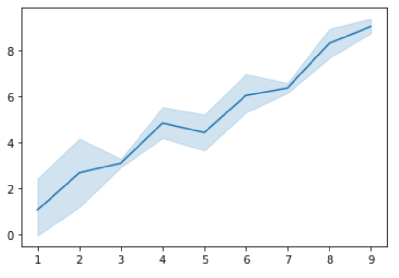
Построение доверительных интервалов с использованием lineplot()
Первый способ построить доверительный интервал — использоватьфункцию lineplot() , которая соединяет все точки данных в наборе данных линией и отображает доверительный интервал вокруг каждой точки:
import numpy as np import seaborn as sns import matplotlib.pyplot as plt #create some random data np.random.seed(0) x = np.random.randint(1, 10, 30) y = x+np.random.normal(0, 1, 30) #create lineplot ax = sns.lineplot(x, y) 
По умолчанию функция lineplot() использует доверительный интервал 95%, но может указать уровень достоверности для использования с командой ci .
Чем меньше уровень достоверности, тем более узким будет доверительный интервал вокруг линии. Например, вот как выглядит доверительный интервал 80% для точно такого же набора данных:
#create lineplot ax = sns.lineplot(x, y, ci= 80 ) 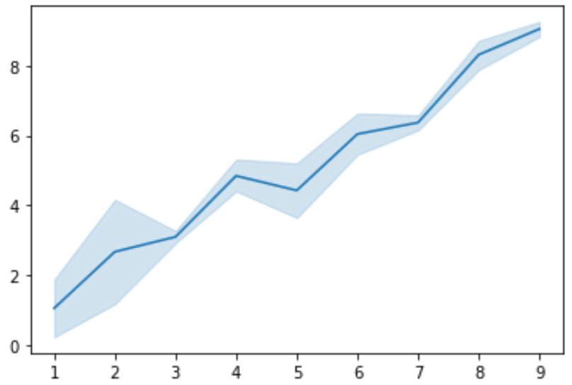
Построение доверительных интервалов с использованием regplot()
Вы также можете построить доверительные интервалы с помощью функции regplot() , которая отображает диаграмму рассеяния набора данных с доверительными диапазонами вокруг оценочной линии регрессии:
import numpy as np import seaborn as sns import matplotlib.pyplot as plt #create some random data np.random.seed(0) x = np.random.randint(1, 10, 30) y = x+np.random.normal(0, 1, 30) #create regplot ax = sns.regplot(x, y) 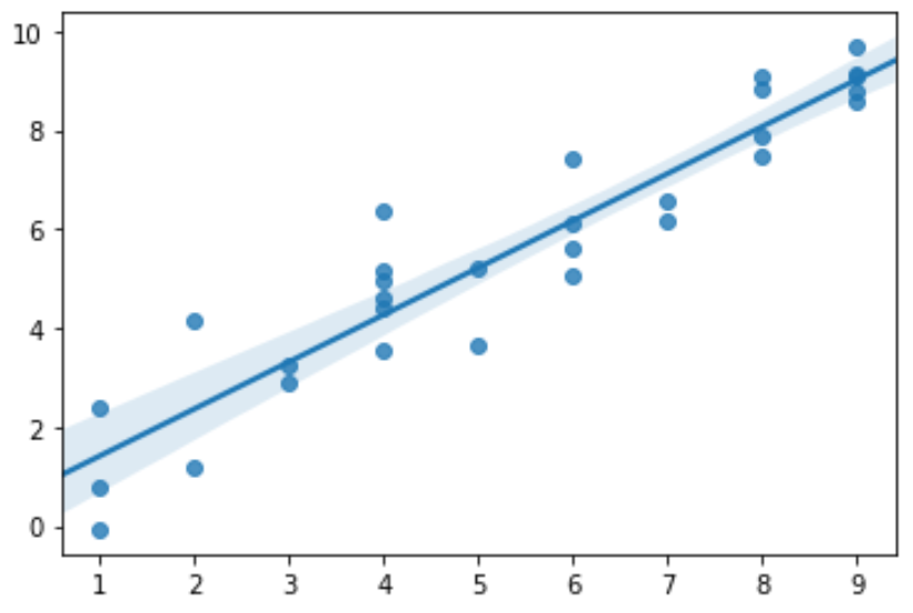
Подобно функции lineplot(), функция regplot() по умолчанию использует доверительный интервал 95%, но может указать уровень достоверности для использования с командой ci .
Опять же, чем меньше уровень достоверности, тем более узким будет доверительный интервал вокруг линии регрессии. Например, вот как выглядит доверительный интервал 80% для точно такого же набора данных:
#create regplot ax = sns.regplot(x, y, ci= 80 ) How to Plot the Confidence Interval in Python?

Problem Formulation: How to plot the confidence interval in Python?
To plot a filled interval with the width ci and interval boundaries from y-ci to y+ci around function values y , use the plt.fill_between(x, (y-ci), (y+ci), color=’blue’, alpha=0.1) function call on the Matplotlib plt module.
- The first argument x defines the x values of the filled curve. You can use the same values as for the original plot.
- The second argument y-ci defines the lower interval boundary.
- The third argument y+ci defines the upper interval boundary.
- The fourth argument color=’blue’ defines the color of the shaded interval.
- The fifth argument alpha=0.1 defines the transparency to allow for layered intervals.
from matplotlib import pyplot as plt import numpy as np # Create the data set x = np.arange(0, 10, 0.05) y = np.sin(x) Define the confidence interval ci = 0.1 * np.std(y) / np.mean(y) # Plot the sinus function plt.plot(x, y) # Plot the confidence interval plt.fill_between(x, (y-ci), (y+ci), color='blue', alpha=0.1) plt.show()

You can also plot two layered confidence intervals by calling the plt.fill_between() function twice with different interval boundaries:
from matplotlib import pyplot as plt import numpy as np # Create the data set x = np.arange(0, 10, 0.05) y = np.sin(x) # Define the confidence interval ci = 0.1 * np.std(y) / np.mean(y) # Plot the sinus function plt.plot(x, y) # Plot the confidence interval plt.fill_between(x, (y-ci), (y+ci), color='blue', alpha=0.1) plt.fill_between(x, (y-2*ci), (y+2*ci), color='yellow', alpha=.1) plt.show()
The resulting plot shows two confidence intervals in blue and yellow:

You can run this in our interactive Jupyter Notebook:

You can also use Seaborn’s regplot() function that does it for you, given a scattered data set of (x,y) tuples.
import numpy as np import seaborn as sns import matplotlib.pyplot as plt #create some random data x = np.random.randint(1, 10, 20) y = x + np.random.normal(0, 1, 20) #create regplot ax = sns.regplot(x, y)
This results in the convenient output:

Note that the 95% confidence interval is calculated automatically. An alternative third ci argument in the sns.regplot(x, y, ci=80) allows you to define another confidence interval (e.g., 80%).
To boost your skills in Python, Matplotlib and data science, join our free email academy and download your Python cheat sheets now!

While working as a researcher in distributed systems, Dr. Christian Mayer found his love for teaching computer science students.
To help students reach higher levels of Python success, he founded the programming education website Finxter.com that has taught exponential skills to millions of coders worldwide. He’s the author of the best-selling programming books Python One-Liners (NoStarch 2020), The Art of Clean Code (NoStarch 2022), and The Book of Dash (NoStarch 2022). Chris also coauthored the Coffee Break Python series of self-published books. He’s a computer science enthusiast, freelancer, and owner of one of the top 10 largest Python blogs worldwide.
His passions are writing, reading, and coding. But his greatest passion is to serve aspiring coders through Finxter and help them to boost their skills. You can join his free email academy here.
Be on the Right Side of Change 🚀
- The world is changing exponentially. Disruptive technologies such as AI, crypto, and automation eliminate entire industries. 🤖
- Do you feel uncertain and afraid of being replaced by machines, leaving you without money, purpose, or value? Fear not! There a way to not merely survive but thrive in this new world!
- Finxter is here to help you stay ahead of the curve, so you can keep winning as paradigms shift.
Learning Resources 🧑💻
⭐ Boost your skills. Join our free email academy with daily emails teaching exponential with 1000+ tutorials on AI, data science, Python, freelancing, and Blockchain development!
Join the Finxter Academy and unlock access to premium courses 👑 to certify your skills in exponential technologies and programming.
New Finxter Tutorials:
Finxter Categories: