- brightness()
- Синтаксис
- Значения
- Песочница
- Пример
- Примечание
- Спецификация
- Браузеры
- См. также
- Рецепты
- Справочник CSS
- brightness()
- CSS
- Result
- Applying brightness using the filter property
- Applying brightness using the url() SVG brightness filter
- Specifications
- Browser compatibility
- See also
- Found a content problem with this page?
- MDN
- Support
- Our communities
- Developers
- CSS фильтры
- Blur – размытие
- Brightness – яркость
- Contrast – контраст
- Grayscale – обесцвечивание
- Hue-rotate – замена цветов
- Invert – инверсия цветов
- Opacity – прозрачность
- Saturate – насыщенность
- Sepia – сепия
- Комментарии
- Другие публикации
brightness()
Функция brightness() понижает или повышает яркость изображений или фоновых картинок.
Синтаксис
Синтаксис
| Описание | Пример | |
|---|---|---|
| Указывает тип значения. | ||
| A && B | Значения должны выводиться в указанном порядке. | && |
| A | B | Указывает, что надо выбрать только одно значение из предложенных (A или B). | normal | small-caps |
| A || B | Каждое значение может использоваться самостоятельно или совместно с другими в произвольном порядке. | width || count |
| [ ] | Группирует значения. | [ crop || cross ] |
| * | Повторять ноль или больше раз. | [,]* |
| + | Повторять один или больше раз. | + |
| ? | Указанный тип, слово или группа не является обязательным. | inset? |
| Повторять не менее A, но не более B раз. | ||
| # | Повторять один или больше раз через запятую. | # |
Значения
Значение 100% или 1 оставляет изображение исходным. Любые значения меньше 100% (или меньше 1) понижают яркость изображения. Таким образом, 0 даёт полностью чёрную картинку. Значения больше 100% (или больше 1) повышают яркость изображения.
Отрицательное значение не допускается. Пустое значение воспринимается как 1.
Песочница

Пример

.pic
Результат данного примера показан на рис. 1.
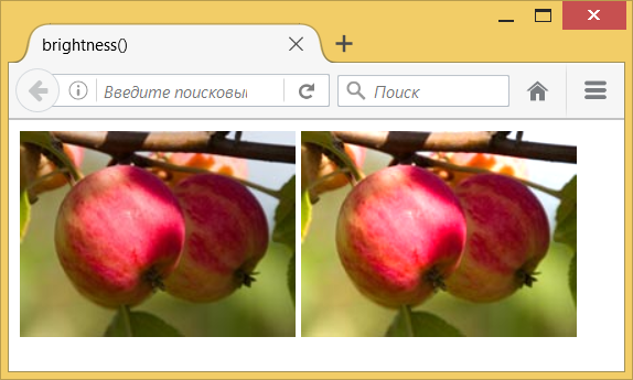
Рис. 1. Повышение яркости. Слева — оригинал, справа фотография с фильтром
Примечание
Chrome до версии 53, Opera до версии 40 и Safari до версии 9.1 поддерживают свойство -webkit-filter .
Спецификация
Каждая спецификация проходит несколько стадий одобрения.
- Recommendation ( Рекомендация ) — спецификация одобрена W3C и рекомендована как стандарт.
- Candidate Recommendation ( Возможная рекомендация ) — группа, отвечающая за стандарт, удовлетворена, как он соответствует своим целям, но требуется помощь сообщества разработчиков по реализации стандарта.
- Proposed Recommendation ( Предлагаемая рекомендация ) — на этом этапе документ представлен на рассмотрение Консультативного совета W3C для окончательного утверждения.
- Working Draft ( Рабочий проект ) — более зрелая версия черновика после обсуждения и внесения поправок для рассмотрения сообществом.
- Editor’s draft ( Редакторский черновик ) — черновая версия стандарта после внесения правок редакторами проекта.
- Draft ( Черновик спецификации ) — первая черновая версия стандарта.
Браузеры
В таблице браузеров применяются следующие обозначения.
- — элемент полностью поддерживается браузером;
- — элемент браузером не воспринимается и игнорируется;
- — при работе возможно появление различных ошибок, либо элемент поддерживается с оговорками.
Число указывает версию браузреа, начиная с которой элемент поддерживается.
См. также
Рецепты
Справочник CSS
- !important
- ::after
- ::backdrop
- ::before
- ::first-letter
- ::first-line
- ::placeholder
- ::selection
- :active
- :blank
- :checked
- :default
- :disabled
- :empty
- :enabled
- :first-child
- :first-of-type
- :focus
- :focus-within
- :fullscreen
- :hover
- :in-range
- :indeterminate
- :invalid
- :lang
- :last-child
- :last-of-type
- :link
- :not
- :nth-child
- :nth-last-child
- :nth-last-of-type
- :nth-of-type
- :only-child
- :only-of-type
- :optional
- :out-of-range
- :placeholder-shown
- :read-only
- :read-write
- :required
- :root
- :target
- :valid
- :visited
- @charset
- @document
- @font-face
- @import
- @keyframes
- @media
- @page
- @supports
- @viewport
- accent-color
- align-content
- align-items
- align-self
- all
- animation
- animation-delay
- animation-direction
- animation-duration
- animation-fill-mode
- animation-iteration-count
- animation-name
- animation-play-state
- animation-timing-function
- aspect-ratio
- backdrop-filter
- backface-visibility
- background
- background-attachment
- background-blend-mode
- background-clip
- background-color
- background-image
- background-origin
- background-position
- background-position-x
- background-position-y
- background-repeat
- background-size
- block-size
- border
- border-bottom
- border-bottom-color
- border-bottom-left-radius
- border-bottom-right-radius
- border-bottom-style
- border-bottom-width
- border-collapse
- border-color
- border-image
- border-left
- border-left-color
- border-left-style
- border-left-width
- border-radius
- border-right
- border-right-color
- border-right-style
- border-right-width
- border-spacing
- border-style
- border-top
- border-top-color
- border-top-left-radius
- border-top-right-radius
- border-top-style
- border-top-width
- border-width
- bottom
- box-decoration-break
- box-shadow
- box-sizing
- caption-side
- caret-color
- clear
- clip
- color
- column-count
- column-fill
- column-gap
- column-rule
- column-rule-color
- column-rule-style
- column-rule-width
- column-span
- column-width
- columns
- content
- counter-increment
- counter-reset
- cursor
- direction
- display
- empty-cells
- filter
- flex
- flex-basis
- flex-direction
- flex-flow
- flex-grow
- flex-shrink
- flex-wrap
- float
- font
- font-family
- font-kerning
- font-size
- font-stretch
- font-style
- font-variant
- font-weight
- height
- hyphens
- image-rendering
- justify-content
- left
- letter-spacing
- line-clamp
- line-height
- list-style
- list-style-image
- list-style-position
- list-style-type
- margin
- margin-bottom
- margin-left
- margin-right
- margin-top
- marks
- max-height
- max-width
- min-height
- min-width
- mix-blend-mode
- object-fit
- opacity
- order
- orphans
- outline
- outline-color
- outline-offset
- outline-style
- outline-width
- overflow
- overflow-x
- overflow-y
- padding
- padding-block
- padding-block-end
- padding-block-start
- padding-bottom
- padding-inline
- padding-inline-end
- padding-inline-start
- padding-left
- padding-right
- padding-top
- page-break-after
- page-break-before
- page-break-inside
- perspective
- perspective-origin
- place-content
- pointer-events
- position
- quotes
- resize
- right
- scroll-behavior
- tab-size
- table-layout
- text-align
- text-align-last
- text-decoration
- text-decoration-color
- text-decoration-line
- text-decoration-skip-ink
- text-decoration-style
- text-emphasis
- text-emphasis-color
- text-emphasis-position
- text-emphasis-style
- text-fill-color
- text-indent
- text-orientation
- text-overflow
- text-shadow
- text-stroke
- text-stroke-color
- text-stroke-width
- text-transform
- top
- transform
- transform-origin
- transform-style
- transition
- transition-delay
- transition-duration
- transition-property
- transition-timing-function
- unicode-bidi
- user-select
- vertical-align
- visibility
- white-space
- widows
- width
- word-break
- word-spacing
- word-wrap
- writing-mode
- z-index
- zoom
brightness()
This example shows how to apply the brightness() filter to a paragraph via the backdrop-filter CSS property.
CSS
.container background: url(image.jpg) no-repeat right / contain #d4d5b2; > p backdrop-filter: brightness(150%); text-shadow: 2px 2px #ffffff; > .container padding: 5rem 3rem 1rem; width: 30rem; > p padding: 0.5rem; color: #000000; font-size: 2rem; font-family: sans-serif; > div class="container" style="background-image: url(be_fierce.jpg);"> p> Text on images can be illegible and inaccessible even with a drop shadow. p> div>
Result
In this example, the colors in the area behind the
element shift linearly. If the backdrop-filter property was set to brightness(0%) , the area with the
element would have been black and hidden the image behind. At brightness(100%) , the area color would be the same as the input #d4d5b2 , and the image behind would be completely transparent. With the brightness set to 150% as in this example, the colors in the image behind are getting hidden by the brightness of the element.`
Applying brightness using the filter property
In this example, a brightness() filter is applied to the entire element, including content, border, and background image via the filter CSS property. The result shows three variations of different brightness values.
p:first-of-type filter: brightness(50%); > p:last-of-type filter: brightness(200%); > p text-shadow: 2px 2px blue; background-color: magenta; color: palegoldenrod; border: 1em solid rebeccapurple; box-shadow: inset -5px -5px red, 5px 5px yellow; padding: 0.25rem; font-size: 1.25rem; font-family: sans-serif; width: 85vw; > p>This paragraph has reduced brightness.p> p>This paragraph has normal brightness.p> p>This paragraph has increased brightness.p>
Applying brightness using the url() SVG brightness filter
In this example, to create a filter that darkens the content on which it is applied by 25% (i.e., 75% of the original brightness), the slope attribute is set to 0.75 . We can then reference the filter by id .
.filter filter: brightness(0.75); > svg position: absolute; > svg role="none"> filter id="darken25" color-interpolation-filters="sRGB"> feComponentTransfer> feFuncR type="linear" slope="0.75" /> feFuncG type="linear" slope="0.75" /> feFuncB type="linear" slope="0.75" /> feComponentTransfer> filter> svg>
The following declarations produce similar effects:
filter: brightness(75%); filter: url(#darken25); /* with embedded SVG */ filter: url(folder/fileName.svg#darken25); /* external svg filter definition */
In the images below, the first one has a brightness() filter function applied, the second one has a similar SVG brightness function applied, and the third is the original image for comparison.
table cellpadding="5"> thead> tr> th>Live exampleth> th>SVG Equivalentth> th>Original imageth> tr> thead> tbody> tr> td>img class="filter" src="flag.jpg" alt="darkened pride flag" />td> td> img style="filter: url(#darken25)" src="flag.jpg" alt="darkened pride flag" /> td> td> img src="flag.jpg" alt="Pride flag" /> td> tr> tbody> table>
Specifications
Browser compatibility
BCD tables only load in the browser
See also
- CSS filter effects module
- The other functions available to be used in values of the filter and backdrop-filter properties include:
- blur()
- contrast()
- drop-shadow()
- grayscale()
- hue-rotate()
- invert()
- opacity()
- saturate()
- sepia()
Found a content problem with this page?
This page was last modified on Jul 17, 2023 by MDN contributors.
Your blueprint for a better internet.
MDN
Support
Our communities
Developers
Visit Mozilla Corporation’s not-for-profit parent, the Mozilla Foundation.
Portions of this content are ©1998– 2023 by individual mozilla.org contributors. Content available under a Creative Commons license.CSS фильтры
CSS3-свойство filter позволяет применить фильтры к элементам, с помощью них можно инвертировать цвета, осветлить или затемнить элементы, полное описание на developer.mozilla.org.
В данной статье представлены только основные фильтры по цвету, по мимо них есть наложение тени и фильтры с использованием SVG.
Blur – размытие
Размытие по Гауссу, значение задается в px или em, по умолчанию 0, отрицательные значения не допускается.
Brightness – яркость
Понижение или повышение яркости изображения, значение задается в процентах или числом. По умолчанию 100% или 1, отрицательное значение не допускается.
Contrast – контраст
Понижение или повышение контраста изображения, значение задается в процентах или числом, по умолчанию 100% или 1, отрицательное значение не допускается.
Grayscale – обесцвечивание
Обесцвечивание, значение от 0% до 100% или число от 0 до 1, отрицательное значение не допускается.
Hue-rotate – замена цветов
Замена цветов, в качестве значения указывается угол (deg) от 0 до 360, значение может быть отрицательным.
Invert – инверсия цветов
Инверсия цветов, значение от 0% до 100% или число от 0 до 1, отрицательное значение не допускается.
Opacity – прозрачность
Прозрачность элемента. Значение от 0% до 100% или от 0 до 1, по умолчанию 100%.
Saturate – насыщенность
Насыщенностью цветов, интенсивность задаётся положительным числом или процентами, по умолчанию 1 или 100%.
Sepia – сепия
Сепия или эффект старины, значение от 0% до 100%.
Комментарии
Другие публикации

Если добавить атрибут contenteditable к элементу, его содержимое становится доступно для редактирования пользователю, а.