Boxplots#
The following examples show off how to visualize boxplots with Matplotlib. There are many options to control their appearance and the statistics that they use to summarize the data.
import matplotlib.pyplot as plt import numpy as np from matplotlib.patches import Polygon # Fixing random state for reproducibility np.random.seed(19680801) # fake up some data spread = np.random.rand(50) * 100 center = np.ones(25) * 50 flier_high = np.random.rand(10) * 100 + 100 flier_low = np.random.rand(10) * -100 data = np.concatenate((spread, center, flier_high, flier_low)) fig, axs = plt.subplots(2, 3) # basic plot axs[0, 0].boxplot(data) axs[0, 0].set_title('basic plot') # notched plot axs[0, 1].boxplot(data, 1) axs[0, 1].set_title('notched plot') # change outlier point symbols axs[0, 2].boxplot(data, 0, 'gD') axs[0, 2].set_title('change outlier\npoint symbols') # don't show outlier points axs[1, 0].boxplot(data, 0, '') axs[1, 0].set_title("don't show\noutlier points") # horizontal boxes axs[1, 1].boxplot(data, 0, 'rs', 0) axs[1, 1].set_title('horizontal boxes') # change whisker length axs[1, 2].boxplot(data, 0, 'rs', 0, 0.75) axs[1, 2].set_title('change whisker length') fig.subplots_adjust(left=0.08, right=0.98, bottom=0.05, top=0.9, hspace=0.4, wspace=0.3) # fake up some more data spread = np.random.rand(50) * 100 center = np.ones(25) * 40 flier_high = np.random.rand(10) * 100 + 100 flier_low = np.random.rand(10) * -100 d2 = np.concatenate((spread, center, flier_high, flier_low)) # Making a 2-D array only works if all the columns are the # same length. If they are not, then use a list instead. # This is actually more efficient because boxplot converts # a 2-D array into a list of vectors internally anyway. data = [data, d2, d2[::2]] # Multiple box plots on one Axes fig, ax = plt.subplots() ax.boxplot(data) plt.show()


Below we’ll generate data from five different probability distributions, each with different characteristics. We want to play with how an IID bootstrap resample of the data preserves the distributional properties of the original sample, and a boxplot is one visual tool to make this assessment
random_dists = ['Normal(1, 1)', 'Lognormal(1, 1)', 'Exp(1)', 'Gumbel(6, 4)', 'Triangular(2, 9, 11)'] N = 500 norm = np.random.normal(1, 1, N) logn = np.random.lognormal(1, 1, N) expo = np.random.exponential(1, N) gumb = np.random.gumbel(6, 4, N) tria = np.random.triangular(2, 9, 11, N) # Generate some random indices that we'll use to resample the original data # arrays. For code brevity, just use the same random indices for each array bootstrap_indices = np.random.randint(0, N, N) data = [ norm, norm[bootstrap_indices], logn, logn[bootstrap_indices], expo, expo[bootstrap_indices], gumb, gumb[bootstrap_indices], tria, tria[bootstrap_indices], ] fig, ax1 = plt.subplots(figsize=(10, 6)) fig.canvas.manager.set_window_title('A Boxplot Example') fig.subplots_adjust(left=0.075, right=0.95, top=0.9, bottom=0.25) bp = ax1.boxplot(data, notch=False, sym='+', vert=True, whis=1.5) plt.setp(bp['boxes'], color='black') plt.setp(bp['whiskers'], color='black') plt.setp(bp['fliers'], color='red', marker='+') # Add a horizontal grid to the plot, but make it very light in color # so we can use it for reading data values but not be distracting ax1.yaxis.grid(True, linestyle='-', which='major', color='lightgrey', alpha=0.5) ax1.set( axisbelow=True, # Hide the grid behind plot objects title='Comparison of IID Bootstrap Resampling Across Five Distributions', xlabel='Distribution', ylabel='Value', ) # Now fill the boxes with desired colors box_colors = ['darkkhaki', 'royalblue'] num_boxes = len(data) medians = np.empty(num_boxes) for i in range(num_boxes): box = bp['boxes'][i] box_x = [] box_y = [] for j in range(5): box_x.append(box.get_xdata()[j]) box_y.append(box.get_ydata()[j]) box_coords = np.column_stack([box_x, box_y]) # Alternate between Dark Khaki and Royal Blue ax1.add_patch(Polygon(box_coords, facecolor=box_colors[i % 2])) # Now draw the median lines back over what we just filled in med = bp['medians'][i] median_x = [] median_y = [] for j in range(2): median_x.append(med.get_xdata()[j]) median_y.append(med.get_ydata()[j]) ax1.plot(median_x, median_y, 'k') medians[i] = median_y[0] # Finally, overplot the sample averages, with horizontal alignment # in the center of each box ax1.plot(np.average(med.get_xdata()), np.average(data[i]), color='w', marker='*', markeredgecolor='k') # Set the axes ranges and axes labels ax1.set_xlim(0.5, num_boxes + 0.5) top = 40 bottom = -5 ax1.set_ylim(bottom, top) ax1.set_xticklabels(np.repeat(random_dists, 2), rotation=45, fontsize=8) # Due to the Y-axis scale being different across samples, it can be # hard to compare differences in medians across the samples. Add upper # X-axis tick labels with the sample medians to aid in comparison # (just use two decimal places of precision) pos = np.arange(num_boxes) + 1 upper_labels = [str(round(s, 2)) for s in medians] weights = ['bold', 'semibold'] for tick, label in zip(range(num_boxes), ax1.get_xticklabels()): k = tick % 2 ax1.text(pos[tick], .95, upper_labels[tick], transform=ax1.get_xaxis_transform(), horizontalalignment='center', size='x-small', weight=weights[k], color=box_colors[k]) # Finally, add a basic legend fig.text(0.80, 0.08, f'N> Random Numbers', backgroundcolor=box_colors[0], color='black', weight='roman', size='x-small') fig.text(0.80, 0.045, 'IID Bootstrap Resample', backgroundcolor=box_colors[1], color='white', weight='roman', size='x-small') fig.text(0.80, 0.015, '*', color='white', backgroundcolor='silver', weight='roman', size='medium') fig.text(0.815, 0.013, ' Average Value', color='black', weight='roman', size='x-small') plt.show()

Here we write a custom function to bootstrap confidence intervals. We can then use the boxplot along with this function to show these intervals.
def fake_bootstrapper(n): """ This is just a placeholder for the user's method of bootstrapping the median and its confidence intervals. Returns an arbitrary median and confidence interval packed into a tuple. """ if n == 1: med = 0.1 ci = (-0.25, 0.25) else: med = 0.2 ci = (-0.35, 0.50) return med, ci inc = 0.1 e1 = np.random.normal(0, 1, size=500) e2 = np.random.normal(0, 1, size=500) e3 = np.random.normal(0, 1 + inc, size=500) e4 = np.random.normal(0, 1 + 2*inc, size=500) treatments = [e1, e2, e3, e4] med1, ci1 = fake_bootstrapper(1) med2, ci2 = fake_bootstrapper(2) medians = [None, None, med1, med2] conf_intervals = [None, None, ci1, ci2] fig, ax = plt.subplots() pos = np.arange(len(treatments)) + 1 bp = ax.boxplot(treatments, sym='k+', positions=pos, notch=True, bootstrap=5000, usermedians=medians, conf_intervals=conf_intervals) ax.set_xlabel('treatment') ax.set_ylabel('response') plt.setp(bp['whiskers'], color='k', linestyle='-') plt.setp(bp['fliers'], markersize=3.0) plt.show()

Here we customize the widths of the caps .
x = np.linspace(-7, 7, 140) x = np.hstack([-25, x, 25]) fig, ax = plt.subplots() ax.boxplot([x, x], notch=True, capwidths=[0.01, 0.2]) plt.show()

The use of the following functions, methods, classes and modules is shown in this example:
Total running time of the script: ( 0 minutes 2.167 seconds)
seaborn.boxplot#
seaborn. boxplot ( data = None , * , x = None , y = None , hue = None , order = None , hue_order = None , orient = None , color = None , palette = None , saturation = 0.75 , width = 0.8 , dodge = True , fliersize = 5 , linewidth = None , whis = 1.5 , ax = None , ** kwargs ) #
Draw a box plot to show distributions with respect to categories.
A box plot (or box-and-whisker plot) shows the distribution of quantitative data in a way that facilitates comparisons between variables or across levels of a categorical variable. The box shows the quartiles of the dataset while the whiskers extend to show the rest of the distribution, except for points that are determined to be “outliers” using a method that is a function of the inter-quartile range.
This function always treats one of the variables as categorical and draws data at ordinal positions (0, 1, … n) on the relevant axis, even when the data has a numeric or date type.
See the tutorial for more information.
Parameters : data DataFrame, array, or list of arrays, optional
Dataset for plotting. If x and y are absent, this is interpreted as wide-form. Otherwise it is expected to be long-form.
x, y, hue names of variables in data or vector data, optional
Inputs for plotting long-form data. See examples for interpretation.
order, hue_order lists of strings, optional
Order to plot the categorical levels in; otherwise the levels are inferred from the data objects.
orient “v” | “h”, optional
Orientation of the plot (vertical or horizontal). This is usually inferred based on the type of the input variables, but it can be used to resolve ambiguity when both x and y are numeric or when plotting wide-form data.
color matplotlib color, optional
Single color for the elements in the plot.
palette palette name, list, or dict
Colors to use for the different levels of the hue variable. Should be something that can be interpreted by color_palette() , or a dictionary mapping hue levels to matplotlib colors.
saturation float, optional
Proportion of the original saturation to draw colors at. Large patches often look better with slightly desaturated colors, but set this to 1 if you want the plot colors to perfectly match the input color.
width float, optional
Width of a full element when not using hue nesting, or width of all the elements for one level of the major grouping variable.
dodge bool, optional
When hue nesting is used, whether elements should be shifted along the categorical axis.
fliersize float, optional
Size of the markers used to indicate outlier observations.
linewidth float, optional
Width of the gray lines that frame the plot elements.
whis float, optional
Maximum length of the plot whiskers as proportion of the interquartile range. Whiskers extend to the furthest datapoint within that range. More extreme points are marked as outliers.
ax matplotlib Axes, optional
Axes object to draw the plot onto, otherwise uses the current Axes.
kwargs key, value mappings
Other keyword arguments are passed through to matplotlib.axes.Axes.boxplot() .
Returns : ax matplotlib Axes
Returns the Axes object with the plot drawn onto it.
A combination of boxplot and kernel density estimation.
A scatterplot where one variable is categorical. Can be used in conjunction with other plots to show each observation.
A categorical scatterplot where the points do not overlap. Can be used with other plots to show each observation.
Combine a categorical plot with a FacetGrid .
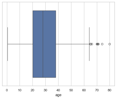
Draw a single horizontal boxplot, assigning the data directly to the coordinate variable:
df = sns.load_dataset("titanic") sns.boxplot(x=df["age"])
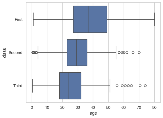
Group by a categorical variable, referencing columns in a dataframe:
sns.boxplot(data=df, x="age", y="class")
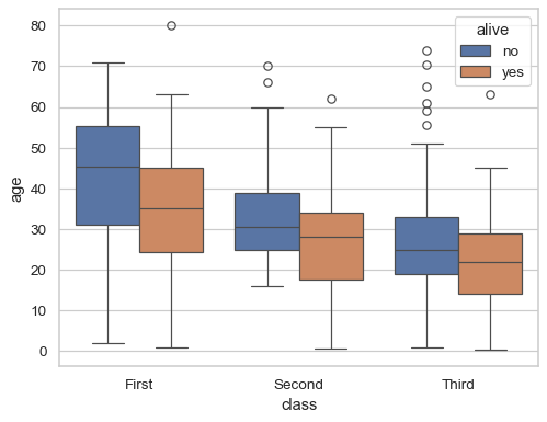
Draw a vertical boxplot with nested grouping by two variables:
sns.boxplot(data=df, x="age", y="class", hue="alive")
Control the order of the boxes:
sns.boxplot(data=df, x="fare", y="alive", order=["yes", "no"])
Draw a box for multiple numeric columns:
sns.boxplot(data=df[["age", "fare"]], orient="h")

Use a hue variable whithout changing the box width or position:
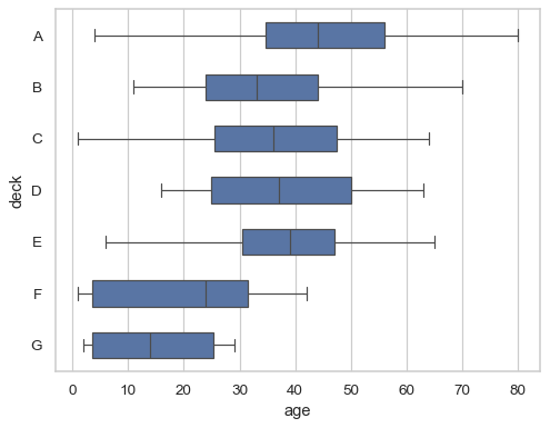
sns.boxplot(data=df, x="fare", y="deck", hue="deck", dodge=False)
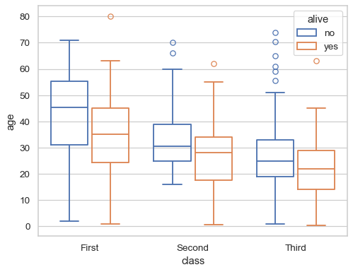
Pass additional keyword arguments to matplotlib:
sns.boxplot( data=df, x="age", y="class", notch=True, showcaps=False, flierprops="marker": "x">, boxprops="facecolor": (.4, .6, .8, .5)>, medianprops="color": "coral">, )