- 8 Point full control Border Radius
- Syntax
- Usage
- Make your design better with border radius
- How WebKit border radius property works?
- Facts infography about the border-radius property
- Border Radius Generator: Simplifying Fancy Border Designs
- How the border radius can improve your UX design ?
- What is a Border Radius Generator?
- Creating Custom Border Designs
- Adjusting border radius
- Visual preview
- Copying Generated Code
- Boosting Creativity with Fancy Border Designs
- Stylish Buttons
- Unique Image Frames
- Artistic Dividers
- CSS Border Radius Generator
- How to use Online CSS Border Radius Generator?
8 Point full control Border Radius
The CSS property border-radiusallows web developers to define how rounded the corners will be. The roundness of each corner is defined using one or two values for the radius that defines its shape depending on whether it is a circle or an ellipse.
The radius is applied to the whole background, even if the element has no borders; the exact position of the cutout is defined by the property background-clip.
This property is a shortcut to set the four properties border-top-left-radius, border-top-right-radius, border-bottom-right-radiusand border-bottom-left-radius.
This property can have from one to eight values. Here are the rules:
border-radius: 10% 15% 15% 10% / 10% 15% 15% 10%;
(This property is a shorthand for the eight properties — border-top-left-radius, border-top-right-radius, border-bottom-right-radius, border-bottom-left-radius / border-top-left-radius, border-top-right-radius, border-bottom-right-radius, border-bottom-left-radius).
border-radius: 15px 50px 30px 5px;
(This property is a shorthand for the four properties — border-top-left-radius, border-top-right-radius, border-bottom-right-radiu sand border-bottom-left-radius).
border-radius: 15px 50px 30px;
(first value applies to top-left corner, second value applies to top-right and bottom-left corners, and third value applies to bottom-right corner):
(The radius is defined for all 4 sides, which are rounded equally:
Syntax
/ * This syntax allows you to specify only one value, together four * / / * The rounding is applied to all four corners * / border-radius: 10px; / * top-left-and-bottom-right | top-right-and-bottom-left * / border-radius: 10px 5%; / * top-left | top-right-and-bottom-left | bottom-right * / border-radius: 2px 4px 2px; / * top-left | top-right | bottom-right | bottom-left * / border-radius: 1px 0 3px 4px; / * Two-radius syntax can also be applied to all four corners * / / * (first radius values) / radius * / border-radius: 10px 5% / 20px; / * (first radius values) / top-left-and-bottom-right | top-right-and-bottom-left * / border-radius: 10px 5% / 20px 30px; / * (first radius values) / top-left | top-right-and-bottom-left | bottom-right * / border-radius: 10px 5px 2em / 20px 25px 30%; / * (first radius values) / top-left | top-right | bottom-right | bottom-left * / border-radius: 10px 5% / 20px 25em 30px 35em; / * Global values * / border-radius: inherit; border-radius: initial; border-radius: unset;
Usage
Insert this template within a style tag of any block-style element:
- If one value is set, this radius applies to all 4 corners.
- If four values are set, they apply to the top-left, top-right, bottom-right, bottom-left corner in that order.
Make your design better with border radius
Border-radius is shorthand for the properties border-top-left-radius, border-top-right-radius, border-bottom-right-radius, and border-bottom-left-radius, used to set four corners of an element individually. The CSS border-property is a format to configure radii with four properties on border-top-left, border-top-right, border-bottom-right, and border-bottom-left.
Either border radius property will accept either one or two values, represented either by a length or percentage (percentage relative to the border-box dimensions in question). The CSS3 border-radius property will embrace either one or two sets of values, each of which is composed of between one and four lengths or percentages.
How WebKit border radius property works?
The WebKit border radius property takes either one or two values, and uses them to style all four corners, creating a nice, symmetrical shape. The border radius CSS generator property takes between one and four length values, or percentages, with one setting the radius on all four corners at once, while four sets each individual corner. As with many CSS properties related to margins, padding, and borders, there are four separate properties — one for each box-element corner — and one shorthand property.
The CSS border-radius property can be used together with the border property (or another border-related property) to set an actual border, however, it can also be used without setting these properties explicitly. It is an overall border radius generator , and does not actually need a border in order for it to have an effect. Browser support is strong for border-radius, it has been supported by all major browsers for years (for instance, it is supported as far back as version 9 of Internet Explorer) and does not require any prefixes like -webkit- and -moz-.
Facts infography about the border-radius property
- The CSS property «border-radius,» which allows you to create rounded corners on elements, was introduced in CSS Level 2 (CSS2) specification. Please note that CSS2 was introduced in 1998, so the border-radius property has been available for use since then.
- You can use percentage values for the border-radius property to create responsive and scalable rounded corners. For example, setting «border-radius: 50%» will create a perfect circle regardless of the element’s size. (source)
- By combining multiple values, you can create complex shapes using the border-radius property. For instance, using «border-radius: 50% 0 50% 0» will create a pill shape with rounded ends. (Source: Smashing Magazine — How To Create A Responsive 8-Bit Drum Machine Using Web Audio, SVG And CSS)
- The maximum value for the border-radius property is 50%. Setting it higher than that will not create a larger curve.
Border Radius Generator: Simplifying Fancy Border Designs
Have you ever wondered how web designers effortlessly create those fancy border designs with rounded corners and unique shapes? The secret lies in a powerful tool called the Border Radius Generator. This tool allows designers to generate custom border radius code without the need for complex calculations or coding skills. In this article, we will explore the significance of the border radius generator, its role in creating fancy border designs, and how it simplifies the web design process.
How the border radius can improve your UX design ?
Web design has evolved significantly over the years, with aesthetics and user experience taking center stage. One popular design element that adds a touch of elegance and creativity to websites is the border radius property. The ability to create rounded corners and unique border shapes can transform a bland design into a visually appealing masterpiece. However, manually calculating and implementing the border radius code can be time-consuming and prone to errors. This is where the border radius generator comes to the rescue.
What is a Border Radius Generator?
A border radius generator is an online tool that simplifies the process of creating fancy border designs by generating the necessary CSS code. Instead of manually calculating and inputting border radius values, designers can use the generator to experiment with different settings and instantly preview the results. This eliminates the need for tedious trial-and-error and enables designers to achieve the desired border design more efficiently.
Creating Custom Border Designs
The border radius generator offers a wide range of options to create custom border designs. Let’s explore some of the key features and functionalities that make this tool invaluable for web designers.
Adjusting border radius
With the border radius generator, designers can easily adjust the radius of each corner individually or apply a uniform radius to all corners. This flexibility allows for precise control over the shape of the css border-radius property, enabling designers to create various effects, such as rounded corners, elliptical shapes, and even complex asymmetrical designs.
Visual preview
One of the most valuable aspects of the border radius generator is the real-time visual preview. As designers tweak the border radius settings, the generator instantly displays the updated design. This immediate feedback enables designers to make informed decisions and fine-tune the border design until it matches their vision.
Copying Generated Code
Once designers are satisfied with the border design generated by the tool, they can simply copy the CSS code provided by the generator and paste it into their stylesheet. This eliminates the need to manually write or calculate the code, saving time and reducing the chances of errors.
Boosting Creativity with Fancy Border Designs
The border radius generator opens up a world of possibilities for designers to unleash their creativity and create stunning border designs. Let’s explore a few ways in which designers can use the generator to enhance their web designs.
Stylish Buttons
Buttons are a crucial element in web design, often used for calls to action or interactive elements. By leveraging the border radius generator, designers can easily create stylish buttons with rounded corners, giving them a more modern and inviting appearance. The generator allows for fine-tuning the border radius to achieve the perfect balance between aesthetics and usability.
Unique Image Frames
Border radius isn’t limited to traditional rectangular shapes. By using the generator, designers can apply custom border designs to image frames, transforming them into eye-catching elements. Whether it’s creating circular image frames or more intricate shapes, the border radius generator provides the necessary flexibility to bring creative visions to life.
Artistic Dividers
Dividers play an essential role in structuring web page content. Instead of using plain horizontal lines, designers can use the border radius generator to create artistic dividers with rounded corners. These unique dividers add a touch of elegance
allCornerBorderGeneratorNumber
topLeftBorderGeneratorSlider
bottomLeftBorderGeneratorSlider
bottomLeftBorderGeneratorNumber
CSS Border Radius Generator
CSS Border Radius Generator is a free online tool for generating CSS border radius. «border-radius» is one of the most used CSS properties to soften corners of HTML boxes. If you use equal border-radius on all corners, it is relatively easy to apply, and you don’t need any helper tool to set it. Even most developers don’t know, CSS border radius may take arguments up to 8, 2 for each corner and each one determines slope of each axis of the corner. By setting all these 8 parameters, you can use CSS border-radius property in a more professional way to mask colors, images, and html elements.
You can either use standard CSS units like pixel (px), rem, em or percentages for border-radius. Percentages will be used in this tool to represent a more general solution, but you can convert them to standard units by your own if you prefer.
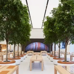
Here is a representation of an advanced usage of border-radius for masking an image. By settings border-radius of each corner individually, it is possible to obtain artistic results with images, gradients, or event with solid colors.
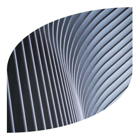
There are 2 main options for settings radius of each border. By default, there are 8 dots to set, 2 for each corner. If you enable «Merge Edge Radiuses» option, number of dots will reduce to 4 and each dot will control 2 radii at the same time. This option is better for setting more curvy shapes.
How to use Online CSS Border Radius Generator?
You can generate CSS code for border-radius property by following these steps.
- Set the positions of each dot by dragging them to desired positions.
- There are 3 preview types. Solid color, gradient, or image. You can preview border-radius in each mode, either with guides or by hiding them with «Hide Guides» option to see result.
- Width and height of the image can be set if you need.
- If you want to merge edge radiuses, you can enable this option to control 2 neighbor radiuses with one dot.
- If you get the desired result in preview, you can copy the CSS code by clicking «Copy» button and paste it in your project’s styles directly.