- Creating gradient animation with CSS
- How do we create background gradients?
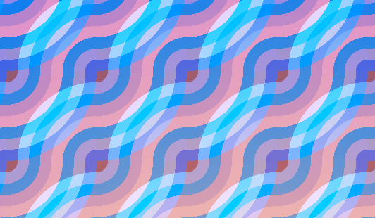
- Background gradient animation with pure CSS
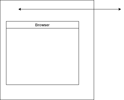
- Browser support
- Some tips
- Final thoughts
- Сборник анимированных градиентов
- Плавная смена цветов по горизонтали
- Результат:
- Плавная смена цветов по вертикали
- Результат:
- Плавная смена цветов по диагонали
- Результат:
- Бегущие полоски
- Результат:
- Бегущие полоски 2
- Результат:
- Комментарии
- Другие публикации
- Анимированный градиент на чистом CSS
- Анимированный градиент — код и пояснения
- Результат
Creating gradient animation with CSS
In this post, I will go through on how to create gradient animations for your web design. Having the background gradient animations can make the design modern and grab the user’s attention at a specific area of the page.
For example, you can have a gradient background that animates on the hero or marketing section of the page.
We can also incorporate this into buttons or cards when people hover over.
How do we create background gradients?
Before figuring out how to animate the background, we first need to figure out how to create a background gradient. The simplest way to create a background gradient is with the CSS property:
linear-gradient is a CSS function that creates a image that transitions between two or more colours along a linear line (more info here: https://developer.mozilla.org/en-US/docs/Web/CSS/gradient/linear-gradient)
So for the above code, we have a background that has a linear gradient of start colour #e66465 and end colour of #9198e5
The linear-gradient function can be even more complex examples. For example you can specify the angle of 45 degrees and go from blue to red:
Another complex example is to specify the colour going from bottom to top, start with blue colour, turn green at 40% of the transition and finally finish transition into red:
Background gradient animation with pure CSS
So now that we know how gradients work, we can add @keyframe animations to animate the gradient
The HTML that we need to create this effect is just making sure that we have body :
As with the CSS, it will look like the following. I will go through it line by line:
The body stying, we use background: linear-gradient(-45deg, #ee7752, #e73c7e, #23a6d5, #23d5ab); . This means that we want the background to have a linear gradient of negative 45 degrees. The background will have 4 colours - starting with #ee7752 , #e73c7e , #23a6d5 , and finally finishing with #23d5ab .
We also want the background to be huge: background-size: 400% 400%; . The basic idea is that we have a huge background with 4 colours. So when viewing the background, you can only see one or two colours at a time. When we animate, we will move the background along the x axis (horizontal). This will give the impression that the gradient is animating.
To create the animation, we define the @keyframes gradient . This just animates the background along horizontally and repeats infinitely.
When the animation starts, we set background-position: 0% 50%; .
At the 50% @keyframe we move the background position 100% in the x axis (horizontal) and back to 0% at the end of the animation.
Note: that we need to move 100% along the x position when we are at the 50% — this is because we are making our animation to be infinite. Moving along to 100% of the x axis at the end of the animation will make it look janky.
Browser support
Since this technique relies on the linear-gradient function — it is mostly supported across modern browsers — even IE 10 and 11. Lower versions of IE will need to use the property:
Additionally keep in mind the angle parameter! Based on the MDN spec, value of 0deg is equivalent to to top; when we increase the values rotate clockwise from there.
linear-gradient(0deg, blue, green 40%, red);
However with some browser versions such as Safari or Opera angle is treated differently. For example on Safari 5-6, and Opera browsers, the angle starts to the right, instead of the top. For example, it considered an angle of 0deg as a direction indicator pointing to the right.
Some tips
- Keep in mind animation principles with this since having too much of this in your design can ruin it. Make sure this effect supports your content — eg not animate for its own sake.
- Make sure to use appropriate colours and contrasts. Keep to save web accessible colours to not disorient and confuse the user. For our example above, I would prefer to have white text for the purple/ blue background to keep high contrast.
- Keep performance in mind when using this technique. Having @keyframes will add to your site’s performance cost and can reduce it further if you have a lot objects animating at the same time.
Final thoughts
Animating backgrounds with CSS can be a great way to grab a user’s attention or bring a design to be more modern.
We can acheive this by using a combination of linear-gradient CSS function and @keyframes . The basic idea is that we have a huge background with 4 colours that transition to create the gradient background. We will then animate this infinitely by moving the background horizontally — back and forth.
Сборник анимированных градиентов
Сборник анимированных градиентов c использованием CSS keyframes.
Плавная смена цветов по горизонтали
body < background: linear-gradient(90deg, #ee7752, #e73c7e, #23a6d5, #23d5ab); background-size: 400% 400%; animation: gradient 10s ease infinite; transform: translate3d(0, 0, 0); >@keyframes gradient < 0% < background-position: 0% 50%; >50% < background-position: 100% 50%; >100% < background-position: 0% 50%; >>Результат:
Плавная смена цветов по вертикали
body < background: linear-gradient(180deg, #641e39, #98749b, #ddf810, #8f4ff4); background-size: 400% 400%; animation: gradient 10s ease infinite; >@keyframes gradient < 0% < background-position: 50% 0%; >50% < background-position: 50% 100%; >100% < background-position: 50% 0%; >>Результат:
Плавная смена цветов по диагонали
body < background: linear-gradient(-45deg, #ed193b, #a98055, #f286e2, #681d7a); background-size: 400% 400%; animation: gradient 10s ease infinite; >@keyframes gradient < 0% < background-position: 0% 50%; >50% < background-position: 100% 50%; >100% < background-position: 0% 50%; >>Результат:
Бегущие полоски
Результат:
Бегущие полоски 2
Результат:
Комментарии
Другие публикации

Такой эффект можно сделать с помощью :before у родительского элемента. Поверх изображения помещается абсолютный блок с.

Анимированный градиент на чистом CSS
Приветствую, друзья, сегодня создадим анимированный градиент на чистом CSS, без использования библиотек, плагинов или даже JavaScript’a. Очень многих новичков, да и не только, интересует как сделать анимированный градиентный фон для сайта. Сегодня мы реализуем это в несколько строк кода. В результате вы научитесь делать анимированный градиент для сайта. В будущем вы можете его использовать для создания красивых фонов.
Как всегда, готовый пример анимированного градиента и код вы можете посмотреть на codepen .
Анимированный градиент — код и пояснения
Для начала разберемся с HTML частью. Тут ничего особенного не нужно, только создать элемент, для которого мы будем делать градиент. Я буду делать для элемента с class=»gradient» . Вы можете использовать это даже для тега , если градиент нужен на всем сайте.
Теперь перейдем к css части. Вся суть анимации в том, что мы делаем градиент больше самого блока. У меня это 400% его размера. После чего добавляем анимацию, которая будет двигать градиент по нашему блоку. За счет этого мы и получим анимацию градиента.
Код достаточно простой. Единственная сложность, которая может у вас возникнуть, это создание самого градиента и подбор цветов. Что бы упростить этот этап — вы можете использовать один из генераторов css градиента .
.gradient < height: 300px; // Тут высота блока width: 100%; // Тут длина background: linear-gradient(149deg, rgba(24,187,156,1) 0%, rgba(106,57,175,1) 42%, rgba(187,24,148,1) 72%, rgba(115,53,134,1) 100%); animation: gradient 10s infinite linear; // 10s - скорость анимации background-size: 400%; // Можно менять и подбирать интенсивность >@keyframes gradient < 0% < background-position: 80% 0%; >50% < background-position: 20% 100%; >100% < background-position: 80% 0%; >>Результат
Спасибо, что прочитали! Если у вас остались любые вопросы — задавайте их в комментариях на Youtube, или напишите мне в Telegram. С радостью помогу и отвечу на ваши вопросы.
Так же буду очень благодарен, если вы ознакомитесь с другими моими уроками:
Full Stack разработчик, Frontend: Vue.js (2,3) + VueX + Vue Router, Backend: Node.js + Express.js. Раньше работал с РНР, WordPress, написал несколько проектов на Laravel. Люблю помогать людям изучать что-то новое)